Art Commission greenlights design for Discovery Center in Strawberry Mansion
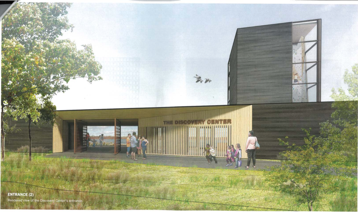
On Wednesday, the Philadelphia Art Commission glowingly approved designs for the 14,000-square-foot Discovery Center at the East Park Reservoir, a long-anticipated project that seeks to provide public access to a unique wilderness experience in the heart North Philadelphia.
The truth is that most people don’t know even know the reservoir exists.
“Unless you’re a longtime resident of Strawberry Mansion, or a water department employee, or a bird, chances are you’ve never seen this 37-acre lake that sits right in the middle of Fairmount Park,” said Jules Dingle, principal at Digsau, the architecture firm behind the center’s design.
More than five years in the making, the Discovery Center is the brainchild of Audubon and Outward Bound. The concept was first introduced to the Art Commission more than a year ago. Since that time, project leaders have negotiated a five-year lease with the city to develop and preserve part of the East Park Reservoir. They’re almost completed fundraising, said Sharon Barr, the project director for the Discovery Center. It is one of five Civic Commons projects, which received $1 million in joint funding from the Knight and William Penn foundations in 2015.
The low-slung building will hug the southern berm of reservoir’s decommissioned West Basin, which will be walled off save for the Discovery Center’s main entry portal. In reimagining the property, Digsau and landscape architect Julie Bush, of Ground Reconsidered, tried to “amplify the idea of ascent,” in which visitors scale a low-lying hill to discover the 19th century man-made lake. The idea, in short, is to evoke wonder.
The center itself will house a climbing wall, community spaces, a lobby, and offices for Audubon and Outward Bound. A bird sanctuary will sit on the north end of the West Basin, connected to the Discovery Center by a walking path that circles the reservoir. Commission members were wowed by the building’s charred-wood aesthetic, as well as ecologically friendly flourishes like a drainage system from the asphalt-shingled roof that, with permission from the city, will feed runoff right into the basin.
But with the Art Commission’s nod came a few caveats. Their big concern was signage.
While the space will remain free to the public during business hours, how does the space invite the surrounding community in? Commissioners saw a lack of signage at the base of the hill leading up to the reservoir as problematic. As commission member Carmen Febo San Miguel emphasized, access is critical factor for marginalized, low-income communities like Strawberry Mansion.
Barr, from the Discovery Center, promised that signage would be given full consideration before the project moves toward construction.
“It’s important to the community,” Barr said. “They want it to be clear that this is a welcoming setting and not just intended for people who drive in. So we’re very conscious of it, we just don’t have anything to share today.”
Digsau equated the center’s design to designing “a mini airport.” While public access remains a high priority, so too is security. One compromise: The center’s pivoting gates, designed through the Percent for Art program, will provide a clear view of the reservoir even when the doors are closed.
Commission members also raised concerns about access for emergency vehicles, to which project leaders responded that they are pending inspections from the city.
José Almiñana, a commission member, applauded the project’s overall ability to “match aspirations with resources.” The commission pushed the design ahead on the condition that it revisit some of these details upon later review of the center’s center gateway, which will receive separate consideration next month.
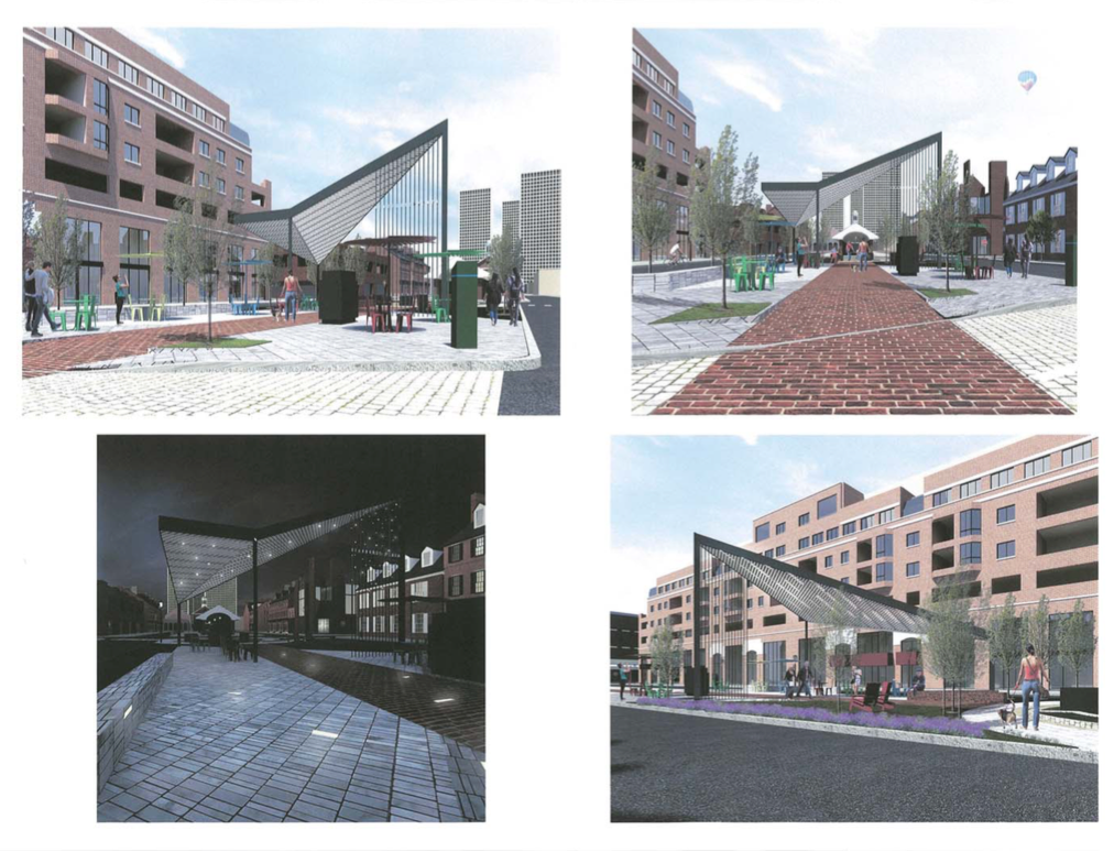
Two thumbs up for South Street Headhouse and American Street Plazas
Plans to revamp the parking strip between South and Lombard streets in the middle of 2nd Street date back more than 20 years. Previous ideas included closing off the space as a pedestrian-only area, but concerns about parking – the dominant force of all conversations about public space in Philadelphia – sent plan after plan back to the drawing board.
That is until the Art Commission OK’d the latest design Wednesday, which preserves the plaza’s 40 parking spots while also improving lighting, plantings, public safety, community space, and traffic calming measures.
“This is the one that we have tried [hardest] to bring to fruition,” Michael E. Harris, executive director of the South Street Headhouse District, said of the design.
The Lombard Street fountain, which is extremely popular in the summer, sits just six feet away from curb line and traffic. There are scarce amenities nearby, so visitors tend are left to sit on the mulch or on traffic-heavy curbside. The space offers some flexibility in its current state – for example, they close is off to cars for half a dozen festivals each year, like the South Street Spring Festival on May 6 – but that could be maintained at no sacrifice to pedestrian friendliness, Harris noted.
New renderings show the now-crumbling median between parking spaces expanded to a 10-foot width. The plaza design, which is fully funded, would bump out the curb line by several foot from the fountain, and create a distinct turning lane for cars on Lombard Street.
José Almiñana smacked down certain features of the plaza, like the proposed line of gingko trees that he said have “no ecological value.” The semi-exposed shade structure also raised eyebrows, but project leaders insisted that neighbors wanted an “inviting space” that was “comfortable but not too comfortable.”
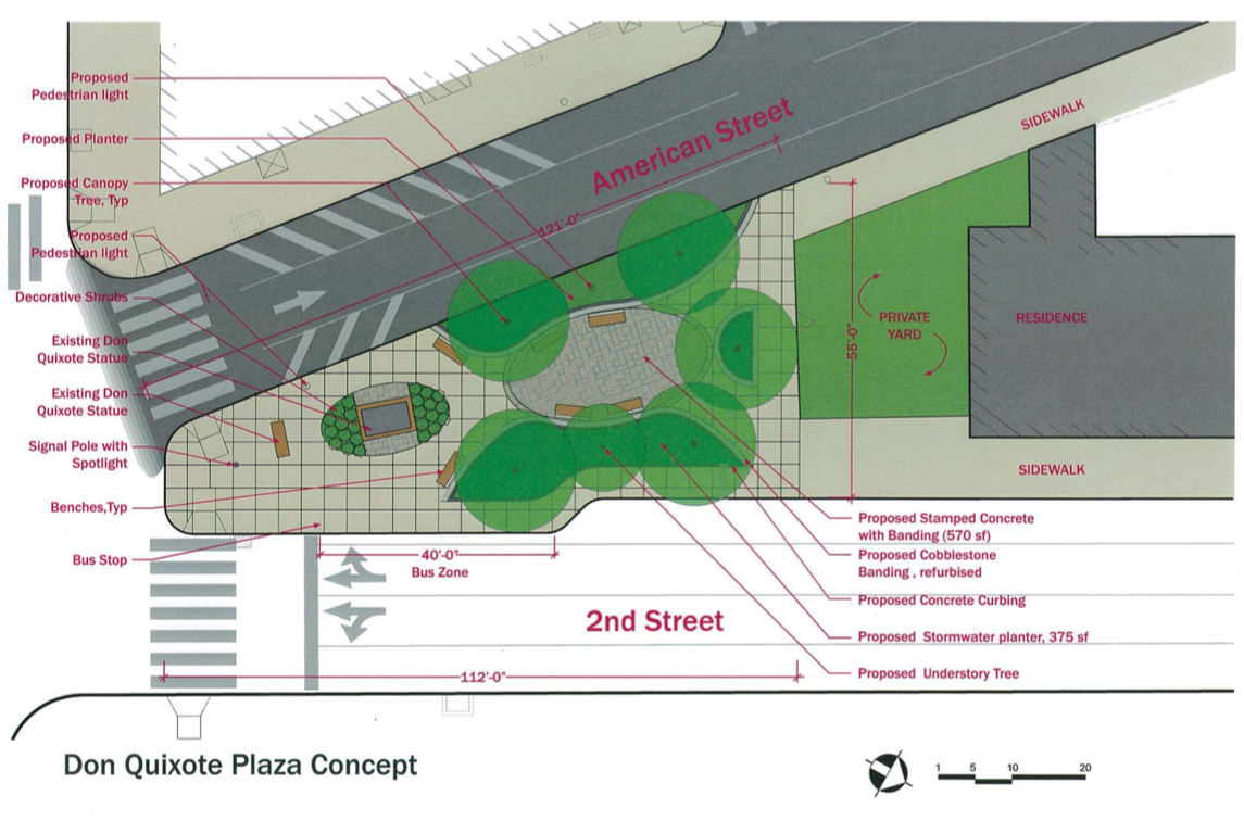
In a separate plaza-related musing, the commission delivered final approval on expanded designs for the American Street plaza. Recommendations from an art commission review months ago have been incorporated into the design, which looks to revamp the home of the Don Quixote statue on the triangular corner 2nd Street and Girard Avenue at American.
Those new features include an intentional space for social interaction, as well as details in lighting and material design.
Final signoff on Holocaust memorial design
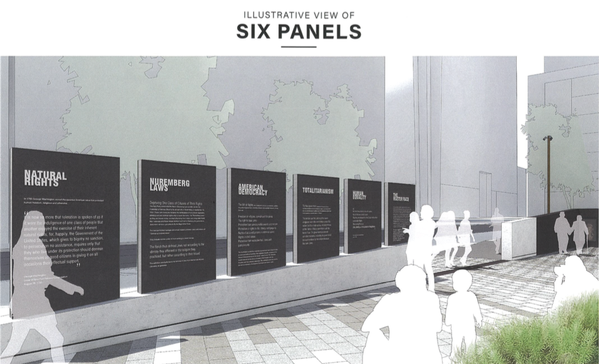
It was more of an additional confirmation than anything, as the concept had already been approved. But the Art Commission returned to the reworked Philadelphia Holocaust Memorial renderings, which offer a reflective vision for the triangular park at 15th and Arch streets where Jewish sculptor Nathan Rapoport’s 1964 work, “Monument to Six Million Jewish Martyrs” has stood in isolation for more than five decades.
Last summer, the commission favorably reviewed the new designs, but had some reservations about its thematic elements. At a subsequent meeting in December, the team behind the memorial’s redesign — a partnership among The Remembrance Foundation, design firm WRT, Post Brothers, and the Center City District — came to a general agreement. But they still had to figure out what text would be on the six pillars at the heart of the park, a visual metaphor for the six million Jews killed in the Holocaust.
Alan Greenberger, the commission’s chairman, stressed back in December that the commission had no intention to “wordsmith on these panels,” but rather look at the intent. Project leaders concluded that a two-sided message on either side of the pillars would confuse visitors, so they opted to print the text on one side of the pillars.
“We want visitors to do a side-by-side comparison,” said Eszter Kutas, project manager at Fairmount Ventures, one of the memorial’s numerous partners.
On the first pillar, the constitutional commitment to equality is juxtaposed with the Nazi concept of the master race. The pillars go on to contrast American democracy with that of Hitler’s totalitarian government, George Washington’s letter to Newport Hebrew Congregation with legislation preventing marriage between Jewish and non-Jewish people, and first amendment freedoms with kristallnacht, the 1938 pogrom that began Hitler’s systematic targeting of the Jewish population.
By way of finalizing their approval of the memorial, the commission offered light praise for the text and the pillars’ newly configured layout.
30th Street’s Elevator Headhouses and Torresdale playground
The Art Commission also gave final approval for SEPTA’s 30th Street Station new elevator headhouses. It’s a small but significant addendum to SEPTA’s larger overhaul to the city’s busiest transit hub.
SEPTA officials and architects outlined some tactical changes to the headhouses following the commission’s suggestions from a prior review, and presented a new rendering showing the underground anatomy of the elevators leading to ground level.
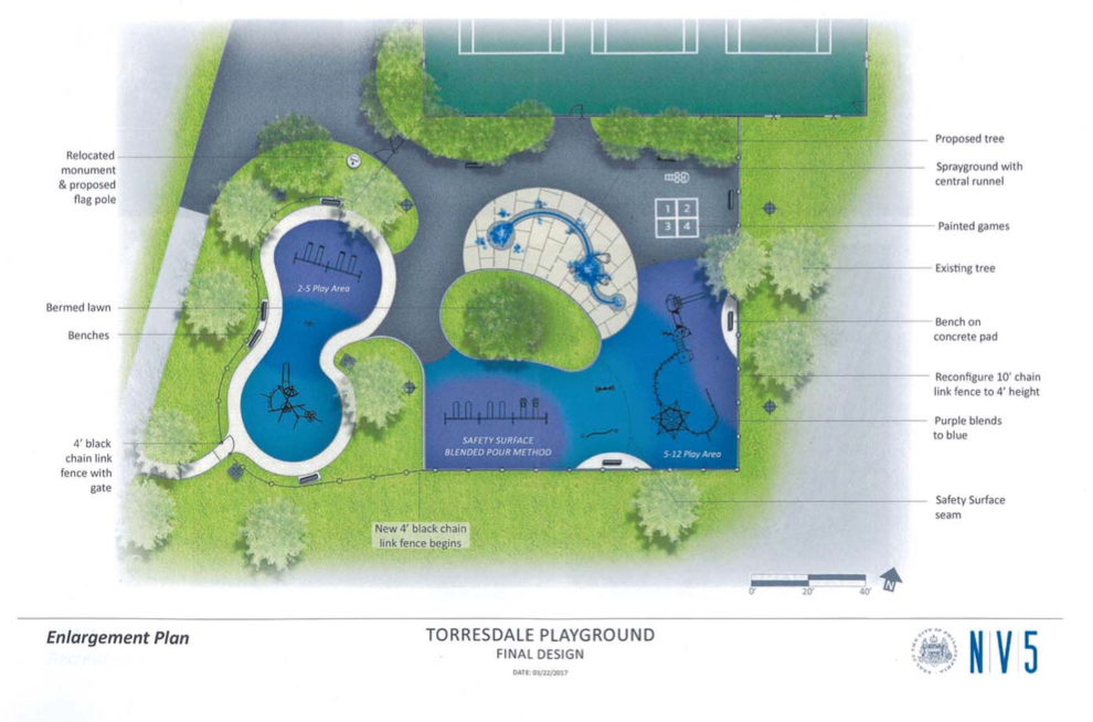
The commission also approached improvement concepts for the Torresdale Playground at 9550 Frankford Avenue, which had fallen into deep disrepair. New designs show repairs to tennis courts, basketball courts, as well as site amenities like a sprayground, benches and a memorial area.
WHYY is your source for fact-based, in-depth journalism and information. As a nonprofit organization, we rely on financial support from readers like you. Please give today.


