You weren’t the only one: After hundreds of riders accidentally get 2nd Key card, SEPTA pledges to fix kiosks, website
We all make mistakes. Often, they are our fault, a product of our own haste or laziness or stupidity. These are the blunders which we ourselves must own. We end up ashamed—mortified—and rightly so.
This is a story about a mistake. But it’s not the mortifying kind we’re most familiar with. This is a story about the mistake that’s not your fault, the mistake where blame is righteously lain at the feet of another, the one that produces schadenfreude instead of shame.
This is a story about SEPTA Key.
SEPTA riders have been using the long-awaited fare card system for about a year now, and have had the option to go token-free for a little over seven months. SEPTA reports that they’ve issued around 250,000 Key cards in this time.
But the authority can’t begin to guess just how many riders have a Key, because so many customers have accidentally obtained a second card (or a third, or fourth) when they’ve tried to add money or a travel pass to their first.
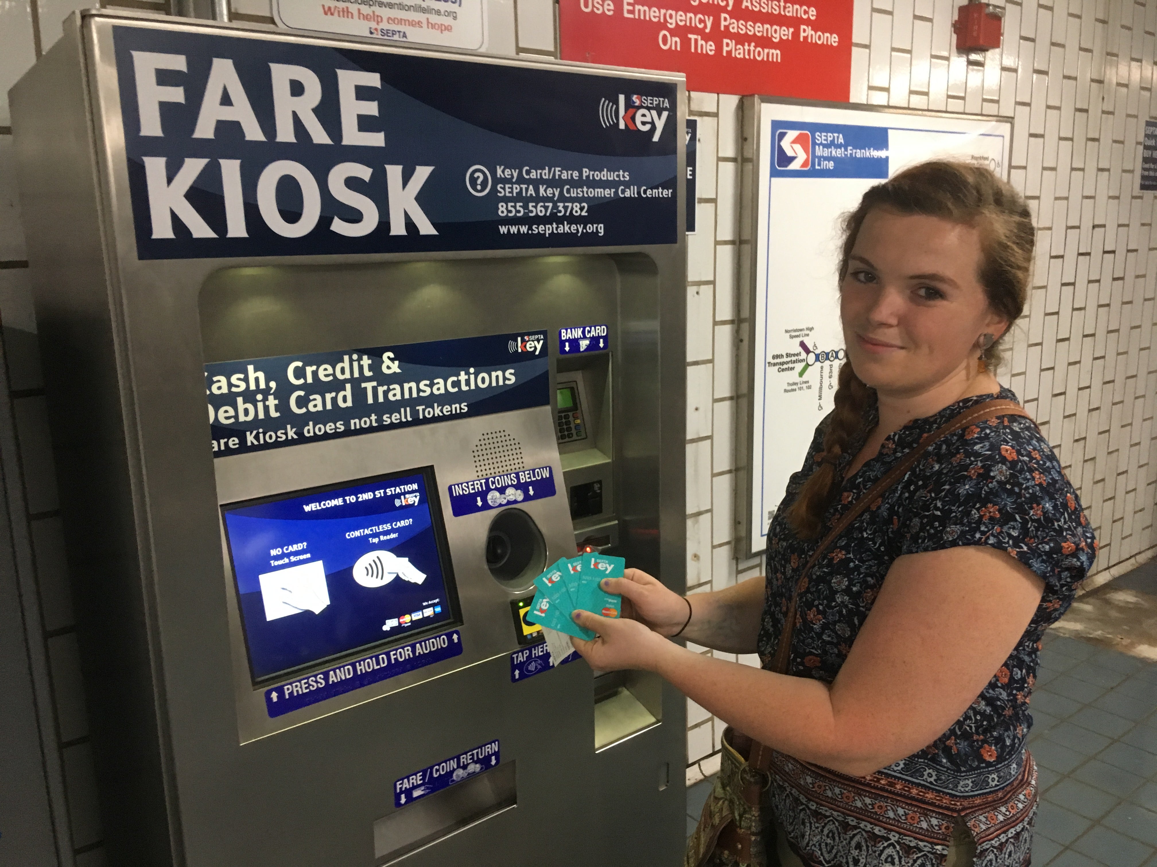
The problem is with SEPTA Keys kiosks, the 220 farecard machines found in SEPTA stations and bus loops across the city. The user interface is profoundly confusing. Many riders who want to add funds into their account end up ordering a new card instead. The computer system never warns an unwitting customer until it’s too late—your first inkling that something is wrong is when a new Key pops out.
The kiosks have bad user experience (UX) design, said Dave Brindley, a campus minister with CRU and an organizer behind Not In Philly. When Brindley first encountered the clunky kiosk UX, he worried it was just him who had problems with it. But those fears were quickly allayed when he talked to a few friends.
It’s worth making this clear: If this has happened to you—if you’ve accidentally gotten a second SEPTA Key when all you wanted was to add money to a first—you are not alone. PlanPhilly spoke to dozens and dozens of smart, well-educated, thoughtful SEPTA riders who are now the not-so-proud owners of numerous Keys. Their ranks include a former city planner, a computer programmer, an Ivy League-educated city official who took wedding photos in front of a SEPTA train, a furniture maker, a professor, and a bunch of reporters (but not this one).
Olivia Duffy has four cards, having tried to add money multiple times without success. In front of a reporter, she managed the process successfully for the first time.
“This is my fifth time doing it and the first time it worked,” said Duffy.
Steve McCaffrey suffered a similar problem. He wanted to add money to his account. “I hit contactless card, [add] twenty bucks, boom! Now, I have a second card,” said McCaffrey.
The same thing happened to Magda Konieczna. “I thought I punched in all the right things, but out came a second SEPTA Key card.”
All of the dozens of frustrated riders PlanPhilly spoke with were bewildered by the experience. Many wondered why the kiosks seemed to have so many problems, given that the long, slow rollout of SEPTA Key was supposed to prevent those problems. Most found a use for that second card — a boyfriend or girlfriend to hand it to, usually. If it’s happened to you, SEPTA says you can call customer service to get the balance on one card transferred to another.
Thankfully for these riders, SEPTA Key cards are still free. Eventually, SEPTA will charge riders to get a new one, but officials say that won’t happen until they’ve worked out the system’s kinks.
“I love SEPTA, and I know they’re getting there,” said Michelle Freeman, another victim of the confusing kiosks, “But I am an owner of four SEPTA Keys.”
When everyone makes the same mistake, it’s not a mistake—it’s a design flaw, said Brian McIntire, the chief design officer of Think Company, a UX firm based in Philadelphia. McIntire is the guy Brindley first called when he encountered SEPTA Key’s klutzy kiosks.
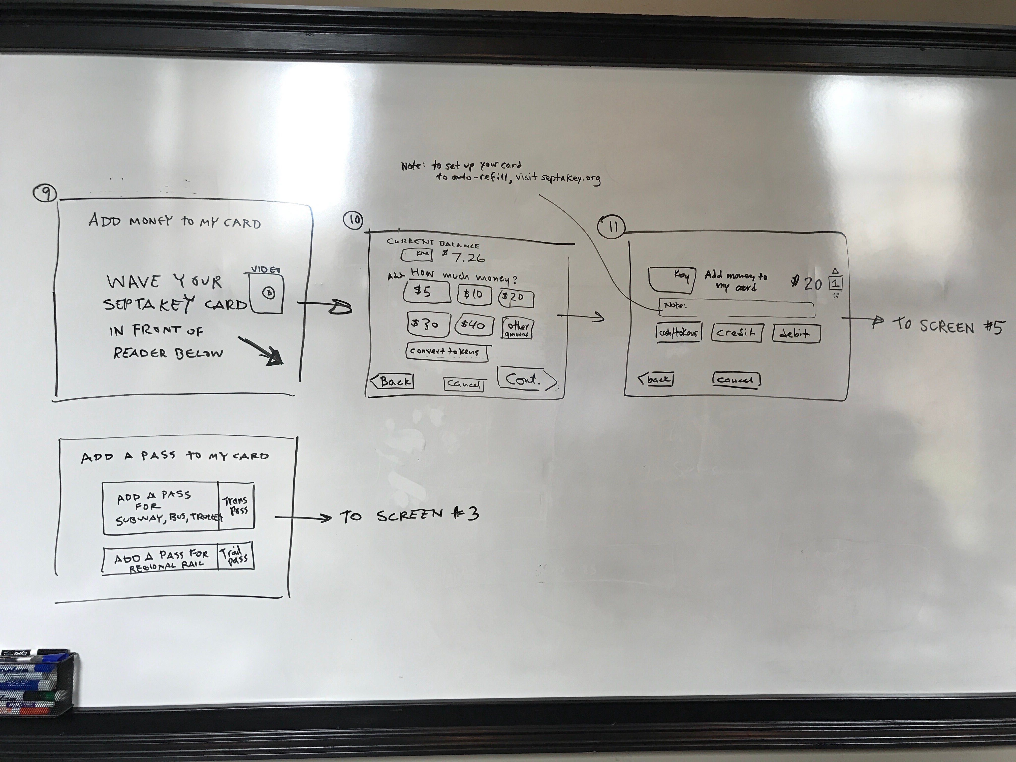
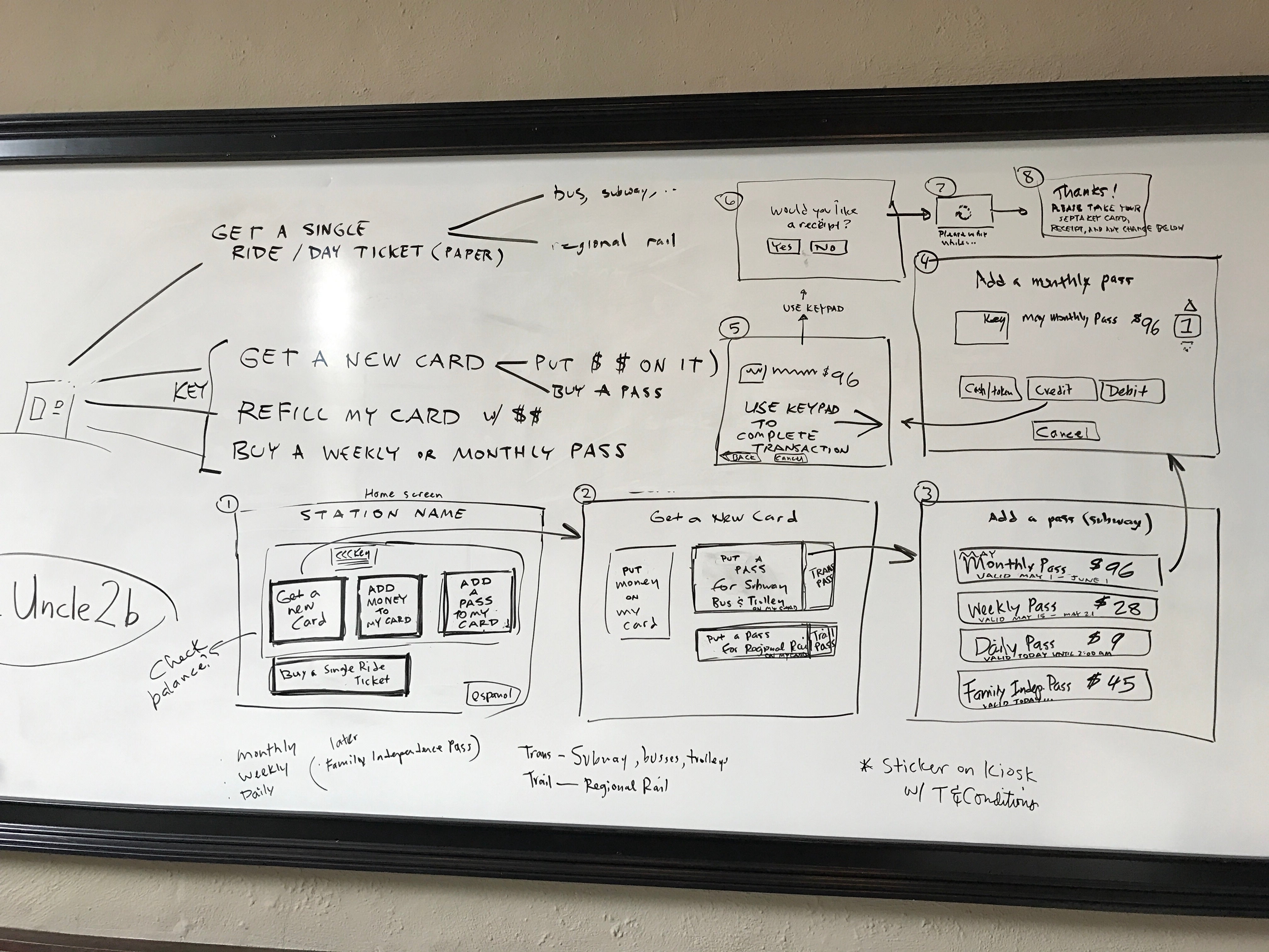
Together with a few comrades from Code for Philly and the 5th Square, they got together one Sunday afternoon to brainstorm ideas for improving the kiosk’s UX. After about three hours of talking through the kiosks’ design flaws and drawing on a whiteboard, they came up with a few simple fixes that they say would vastly improve the customer’s experience.
The biggest problem is the first screen someone sees when they try to use the kiosk.
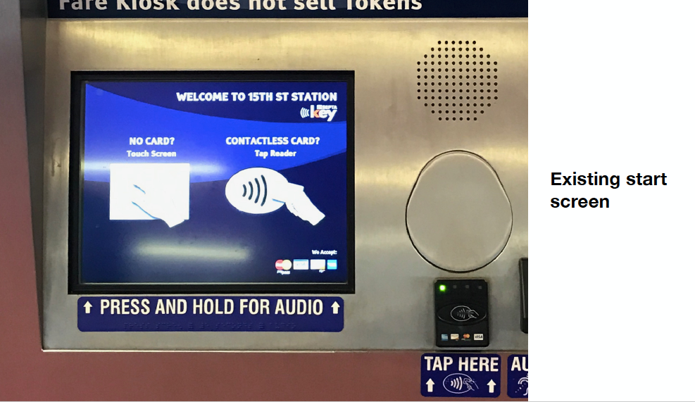
The screen shows what appear to be two buttons, one for “ NO CARD?” and the other if you have a “CONTACTLESS CARD?”
Lots of riders walk up, see the buttons, and if they already have a SEPTA Key, press the Contactless Card option. And that’s where they go wrong.
What they should do is tap their SEPTA Key against a card reader to the side of the screen. In small font wedged between “CONTACTLESS CARD” and an image of a hand holding a card, the screen says “tap reader”.
Of course, no one does this. They just press the big button, as we’ve been trained to do by countless screens with good UX design: ATMs, iPhones, Wawa hoagie touchscreens. We’ve been programmed by thousands of faceless Pavlovs to habitually poke the things we want on a screen. Perhaps to their credit, SEPTA simply expected too much from us; they expected us to read.
Under the “NO CARD?” button, the teeny-tiny text says “touch screen” and so when riders press the big “CONTACTLESS CARD?” button, it sends them down the path towards a new SEPTA Key.
To fix that, the group suggested a start screen with four simple options: “Get a new card,” “Add money to my card,” and “Add a pass to my card,” plus an option for buying a single ride ticket.
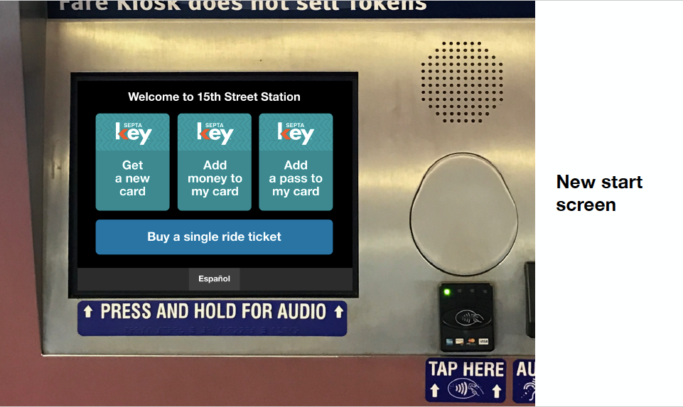
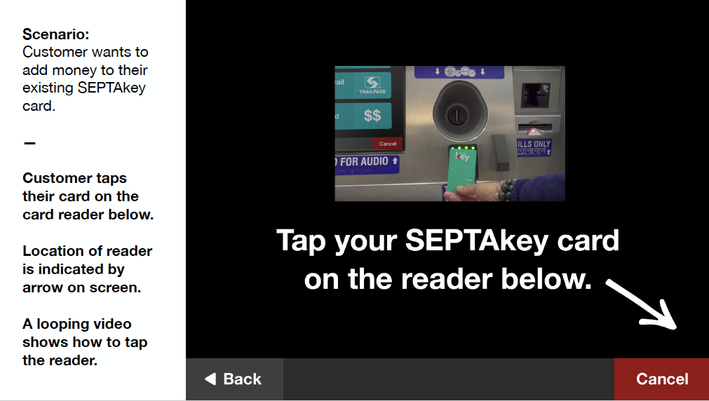
If a user picked the add money or add pass option, the screen would then direct them to tap their card, pointing to the card reader with an arrow.
The team came up with a 27-page document highlighting a bunch of different ways of improving the system. Some were subtle: McIntire noticed that SEPTA’s icon meant to demonstrate that that the system was working spun counter-clockwise, instead of clockwise, which feels backward. They changed the color schemes and font to match the teal color of the Key Cards; When the screen directs a user to tap their card, it should play a video showing that happening; When it’s time to add money, give people a handful of round number options, like an ATM.
The team said they shared their recommendations with SEPTA but never heard back. SEPTA’s top Key project managers said didn’t see the recommendations until PlanPhilly shared them.
SEPTA knows they have a problem on their hands. Conduent Inc., the contractor SEPTA hired to implement SEPTA Key, runs a SEPTA Key Customer Call Center. For the week of July 9th – 15th, Conduent received 17,487 calls from customers with questions about the system.
Since January 1st, the authority’s own customer service contact center has received 307 complaints about the kiosks, including confusion with the kiosks interfaces “such as getting an additional Key card when trying to reload one,” per the Key complaint report. The second most common complaint: “Website: not user friendly in navigation, such as finding how to set up Auto Load for Travel Wallet.” That has received 237 complaints so far this year.
While Think Company and the volunteers focused on improving the kiosks, they had nothing good to say about the website. “The website is just a hot mess that just needs to be nuked and rebuilt from scratch,” said Brindley.
“It was pretty obvious as we delved into the website as well… that this was a site that was designed to be backend site for the site administrators, that they’ve just disabled some of the buttons and then presented it to the public,” said McIntire. “The smoking gun in that regard was the phrase ‘hotlist’, which no first-time user would understand what that is for.”
Hotlist is the button on the SEPTA Key website used for reporting lost, stolen or broken cards.
Even though SEPTA claims that it didn’t recieve Think Company’s recommendations, the authority says they’re already working to implement some of them. SEPTA has been hearing customers complain about the kiosks and the website for months now, and they’re about to do something about it.
Starting next week, SEPTA will pilot a new kiosk workflow at it’s headquarters at 1234 Market Street. SEPTA will replace the existing start screen with a three button screen: one button for purchasing a new card, one for quick trips, and a third for reloading an existing card.
If all goes well, and customers stop accidentally picking up new cards, the pilot will expand to SEPTA’s major stations before rolling out systemwide.
“We’ve heard from our customers about the website, about the fare kiosks, so we are working with Conduent to make changes,” said Richard Burnfield, deputy general manager of SEPTA.
On Thursday, the SEPTA Board approved another change order with Conduent, the company implementing SEPTA Key, increasing the total cost of SEPTA Key $7,869,340 to $157,492,342. Among the changes: A new website for the farecard system, one that is easier to use and responsive, meaning it should work seamlessly across all devices. It’s the sixteenth change order on the contract with Conduent, which has undergone two name changes since it started work in 2011. (The original contract was awarded to ACS Transport Solutions Group, which was then bought out by Xerox, which subsequently spun off the company into Conduent.)
There’s no time table yet on when the new website will be ready. But SEPTA’s getting there.
WHYY is your source for fact-based, in-depth journalism and information. As a nonprofit organization, we rely on financial support from readers like you. Please give today.
