Building Stories: Skirkanich Hall

For our spring series Building Stories, we’re bringing you design postcards from around the city. We’re asking Philadelphia architects to take us to their favorite underappreciated or misunderstood buildings in Philadelphia, and explain what makes them great. First up, Jeff Pastva on Skirkanich Hall.
Building: Skirkanich Hall
Designed by: Tod Williams Billie Tsien Architects
Completed: 2006
Location: University of Pennsylvania, 210 S. 33rd Street, Philadelphia [MAP]
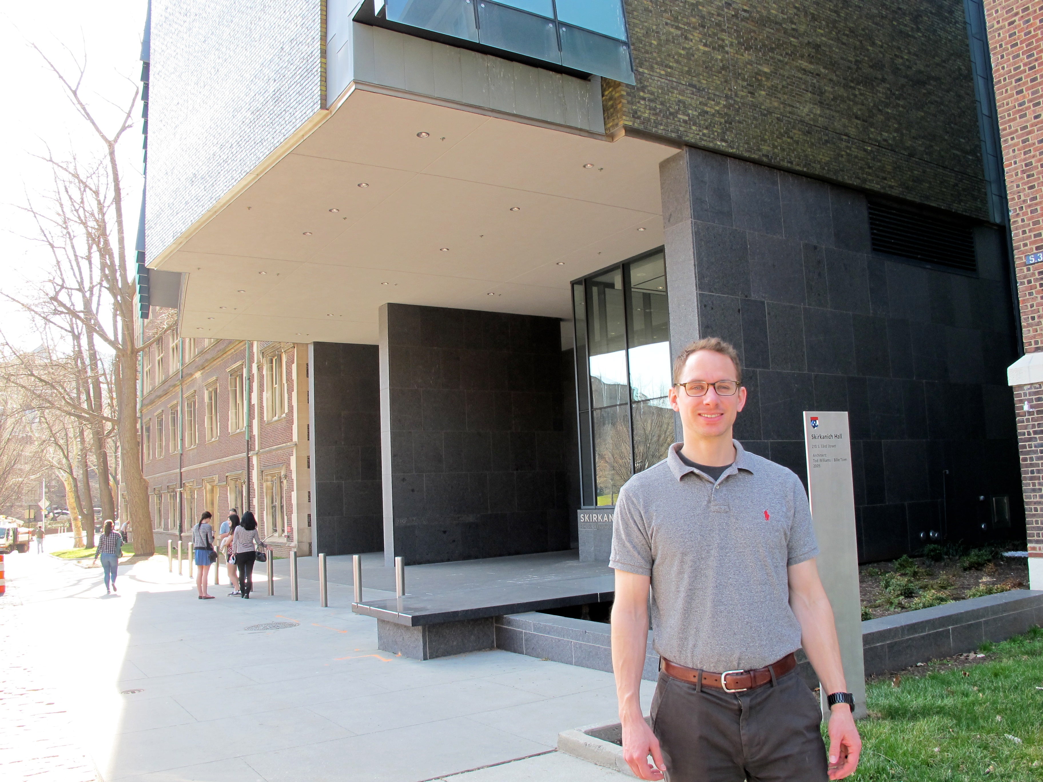
Who: Jeff Pastva, architect at JDavis Architects
Why Skirkanich: Hidden in plain sight, use of materials
Tod Williams and Billie Tsien are the architects behind the Barnes Museum on the Benjamin Franklin Parkway. But you might not know the pair’s other masterwork in Philly: Skirkanich Hall at the University of Pennsylvania, and architect Jeff Pastva makes the case for this tucked-away treasure.
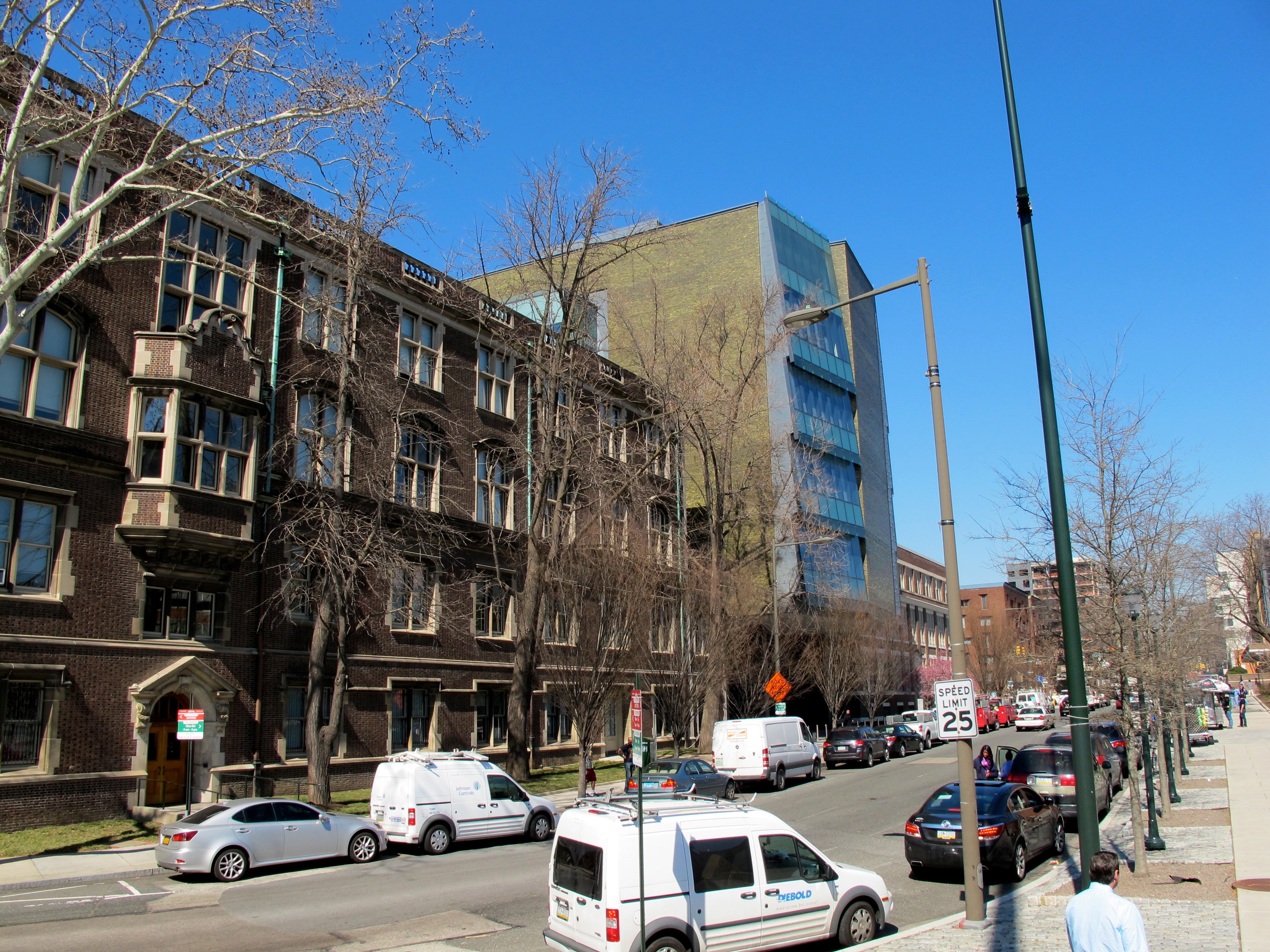
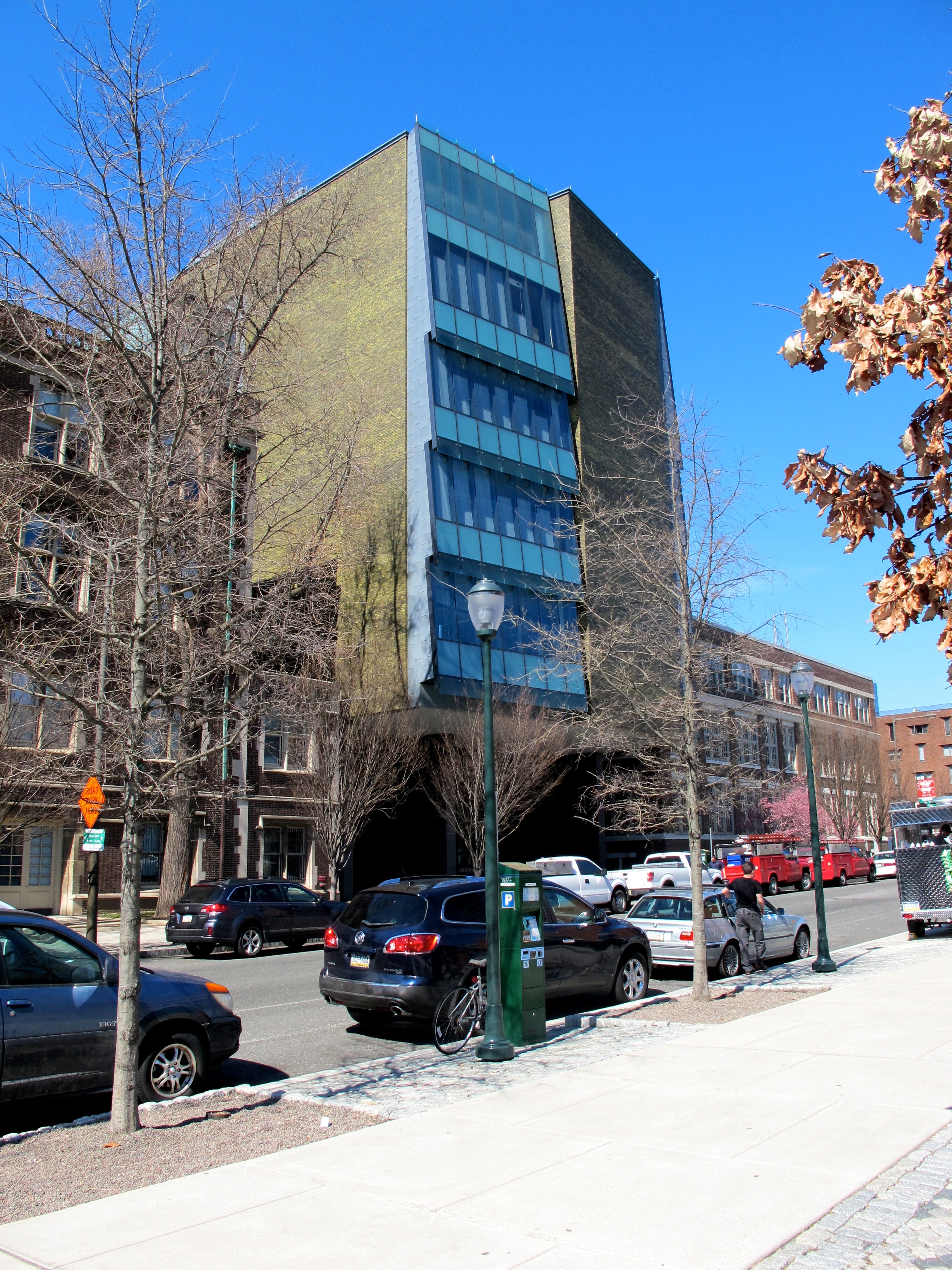
“It’s almost hidden in plain sight. It’s there, but it’s not there, it blends in but it’s bold,” Pastva told me when we met at the building in March.
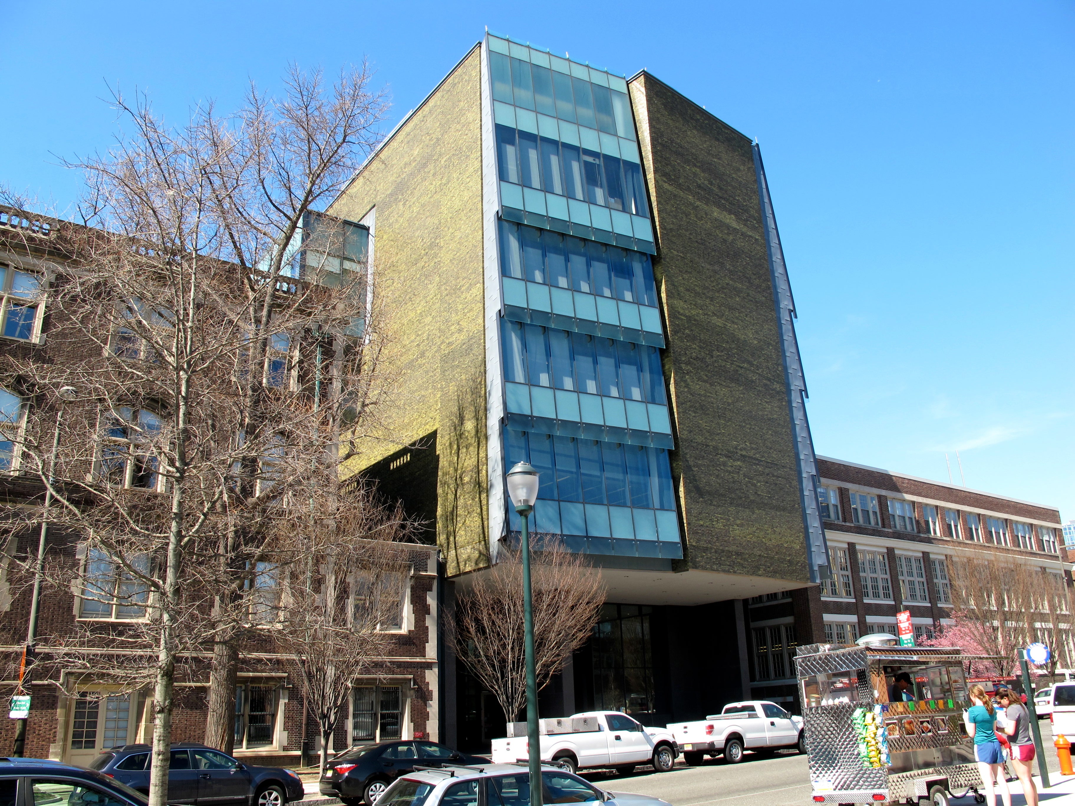
It’s the green brick, iridescent “almost like an oyster pearl,” that’s the showstopper. Tsien and Williams are known for their careful attention to texture, craft, and finish, and Skirkanich is no exception.
“There are very few buildings, and very few architects, in the world who can pull off an iridescent green brick and have it be something that is spectacular yet blends in to the rest of this campus. So I think it is a masterpiece of materiality,” Pastva said.
To him, the materials are what make Skirkanich Hall as contextual as it is bold in its modernism.
“You have a lot of thicker bases, you have a lot of stone, you have a lot of materials that denote strength. This still has that modern aesthetic with traditional material usage that I think makes it blend quite well.”
WHYY is your source for fact-based, in-depth journalism and information. As a nonprofit organization, we rely on financial support from readers like you. Please give today.


