Art Commission grants final approval to Mormon Temple
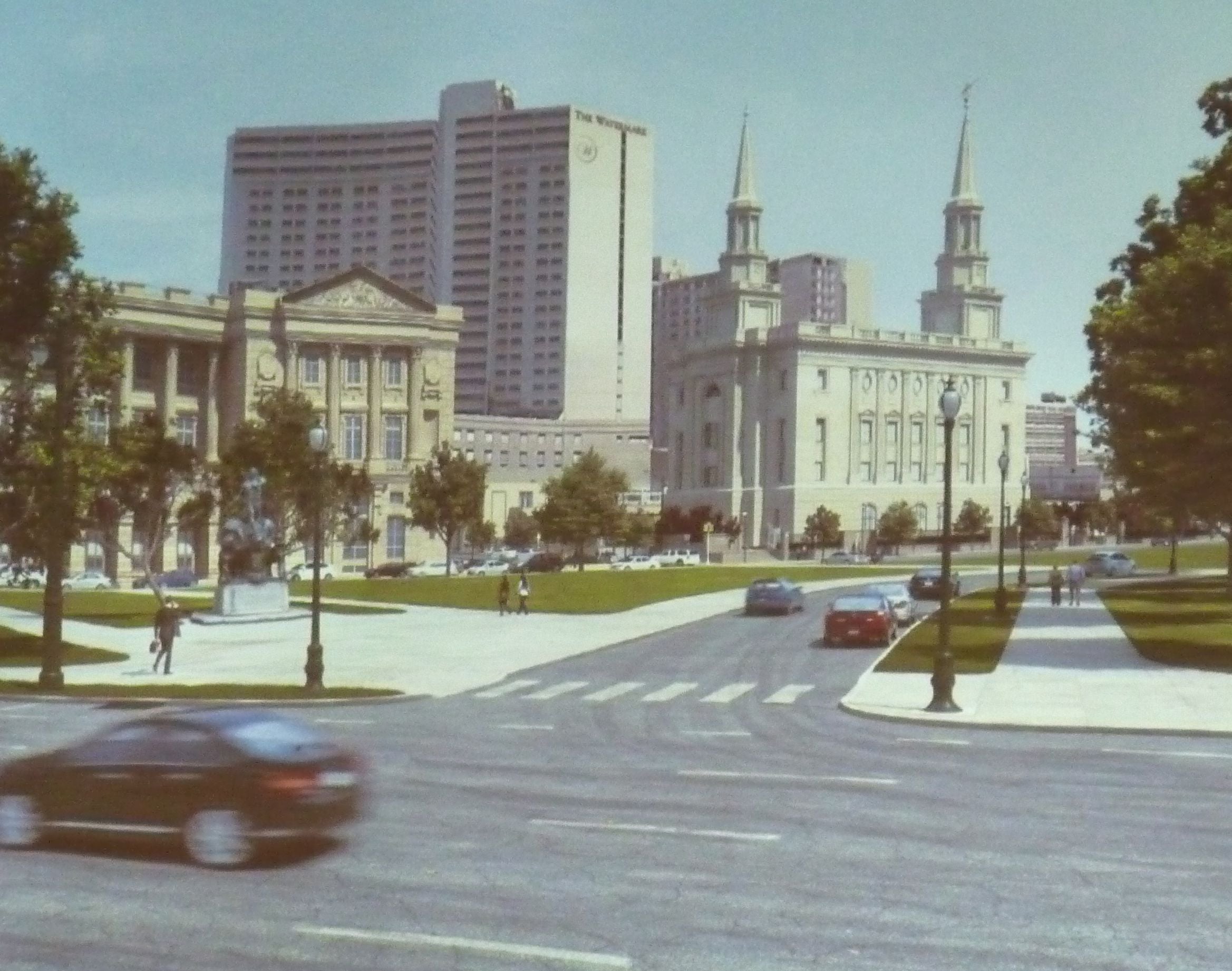
The design for the new Philadelphia Temple of the Church of Jesus Christ of Latter-Day Saints on the 1700 block of Vine Street received final approval from the Art Commission Wednesday, even though at the last moment two commissioners dissented.
Applicants presented additional details and materials to address questions from their previous appearance before the Commission. These included more information on the site’s stormwater management, greater details on a lighting scheme, a better articulation of the material used in the facade, and a fuller look at landscaping elements.
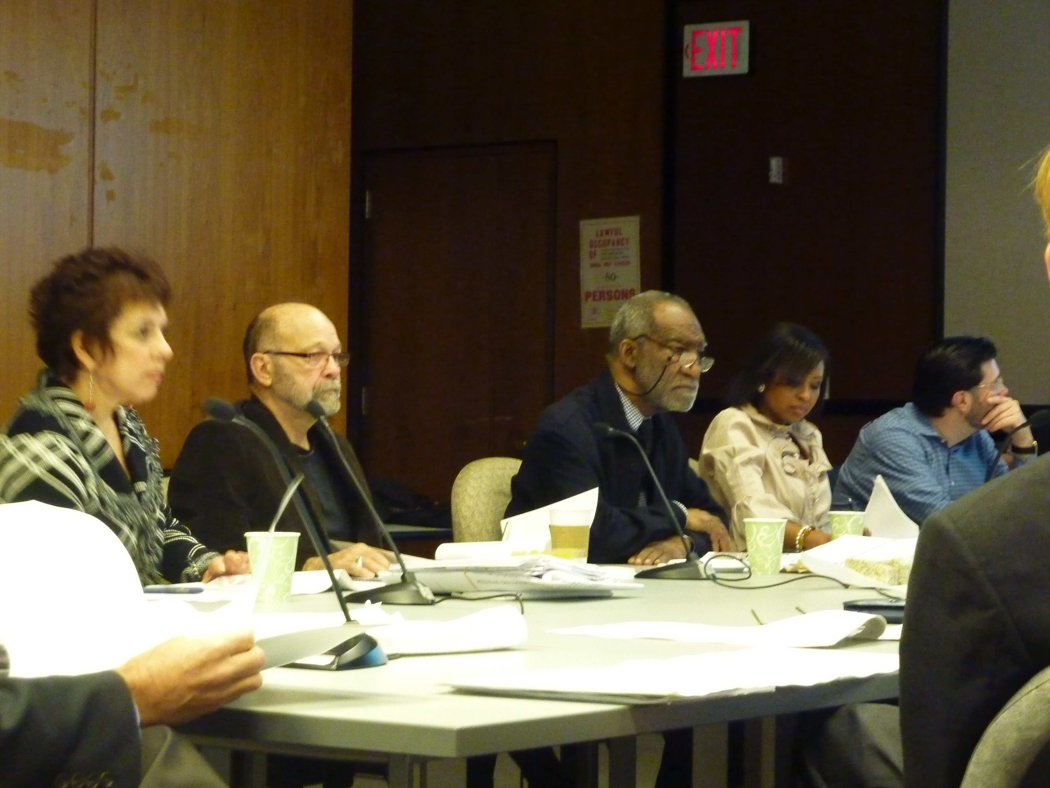
Although commissioners pressed the applicants on some of these matters — particularly Commissioner Jose Alminana who argued that honey locusts might be too lacy a choice for such a massive building — they seemed ready to give the project the nod.
Commissioner Emmanuel Kelly then asked to speak, voicing an opinion that while certain elements were praiseworthy, the overall building was “too literal” in its classicism, too imitative of its neighboring structures, the Free Library of Philadelphia and the Family Court building. (Kelly was not in attendance at the last meeting, but had apparently weighed in with this opinion at some point.)
Commission Chair Sean Buffington asked if anyone supported Kelly’s comments, but no one responded. When a motion to approve the project was put forth, only Kelly and Alminana voted “no.”
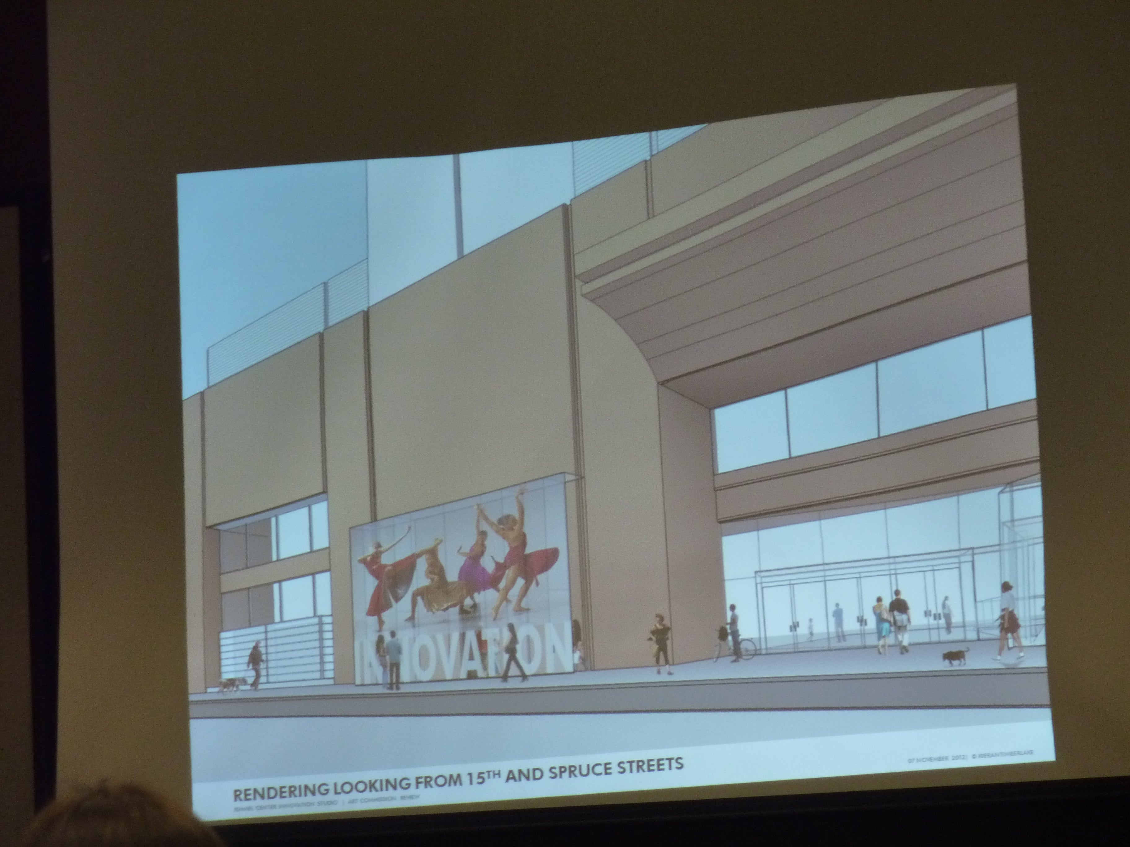
Next, Richard Maimon of KieranTimberlake presented a look at a proposed extension to the Kimmel Center that will serve as a distinct entrance to the below-grade Innovation theater space. As presented, the 4′ glass box intervention features a small door on each side and the word Innovation and a graphic of dancers on its main facade.
Alminana asked if there was the chance that this be considered a “sign,” and opened a can of worms.
Commissioners batted the ideas around of whether text or no text, changing images or one image forever would make this a sign or simply a branding graphic. Ultimately, explained Commission Executive Director William Burke, it is a sign and would be regarded as such by the Zoning Board of Adjustment.
Given that, Buffington asked for a vote on the matter most under discussion — the encroachment — and suggested to the applicants that they come before the Commission again with a specific presentation on the messaging that will appear on the glass. And, he and Burke reminded Commissioners, they would be required to do so every time after that when and if the sign changed.
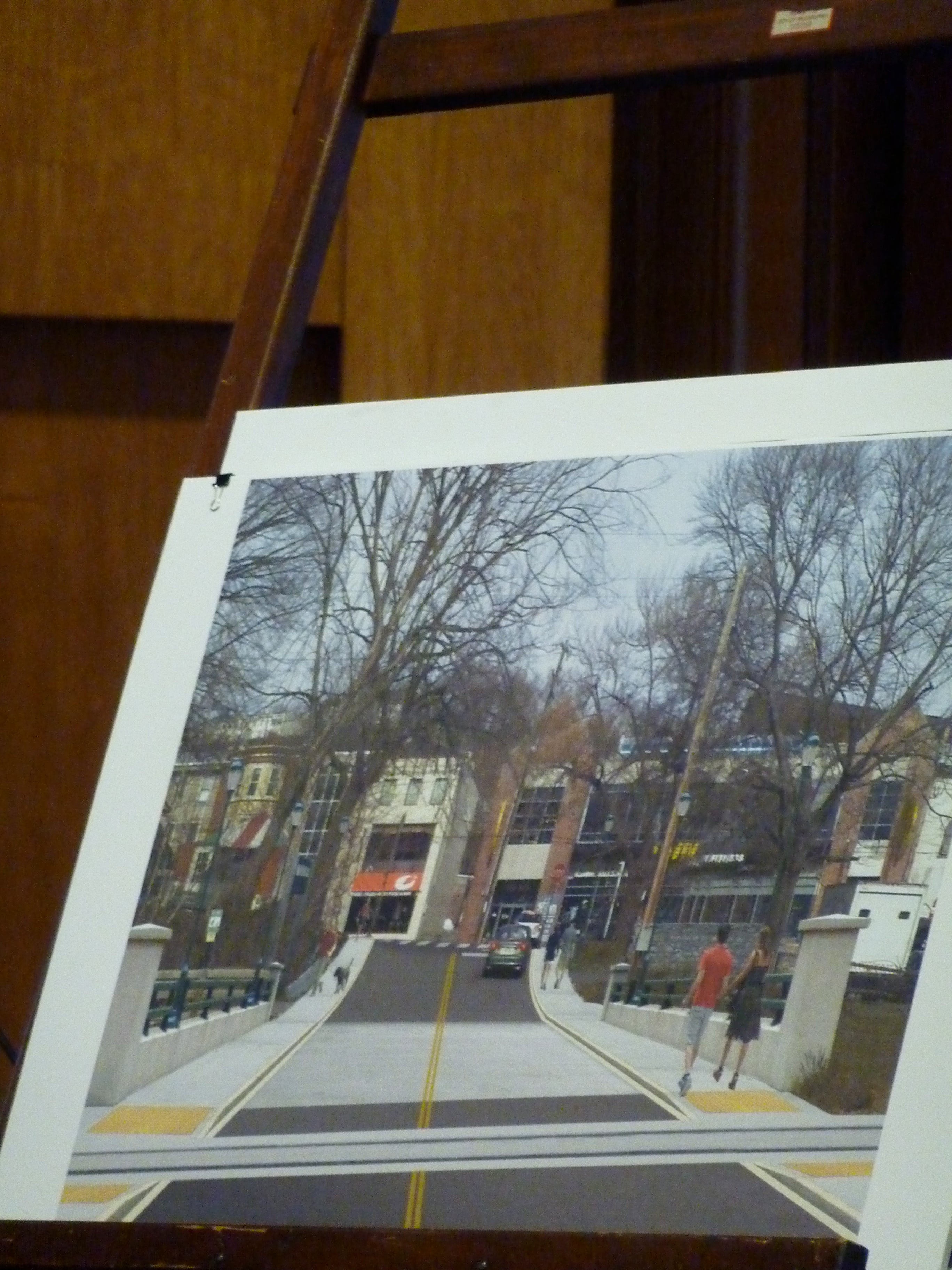
A third case concerned the design of a replacement bridge on Lock Street leading to Venice Island in Manayunk, part of a more expansive construction project.
Unlike its predecessor, this bridge will more directly align with the Main Street grid, but will be wider overall to allow for sidewalks on either side of the roadway. That improvement, planners say, will be necessary in anticipation of increased foot traffic as the island benefits from new amenities (plans call for a new rec center and a new performing arts space).
In reviewing the plans, Kelly asked that iron railing be used, instead of concrete, to give the bridge a lighter appearance. Other Commissioners picked up on that, and suggested that overall the bridge design should be more responsive to its surroundings. They also requested that the designers come back with drawings that indicate where and what kind of signage will be included.
Commissioners also asked for a response to the One Percent for Art Requirement — even if the applicants elected to put the money in escrow. (The bridge’s budget is estimated at $1.5 million). With those provisions, the plan received conceptual approval.
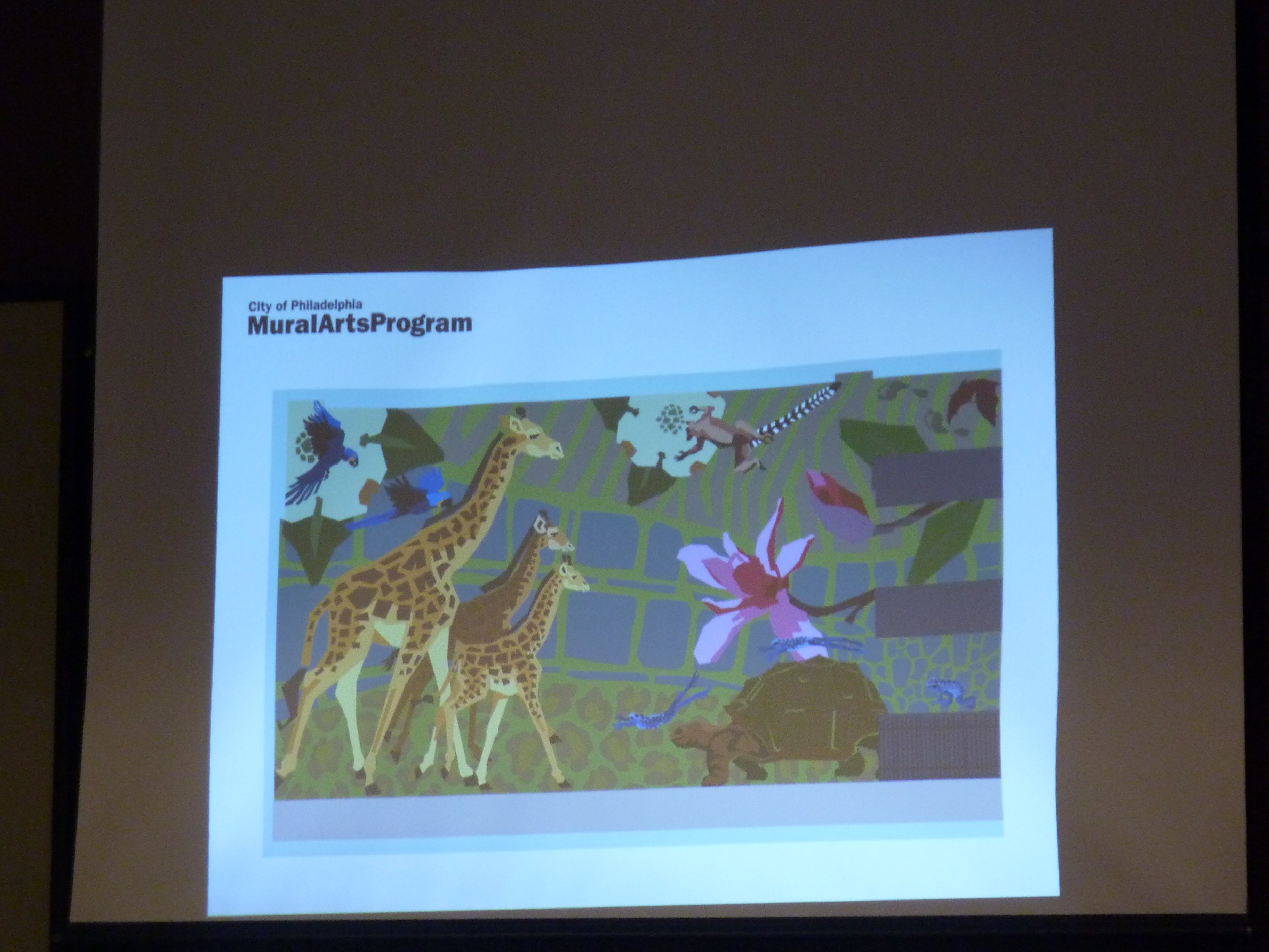
Finally, the Commission reviewed a proposed Mural Arts work that will adorn one side of a new transit center now underway at the Zoo. (This garage and its attendant issues has been making the rounds for quite some time now.)
Muralist Euhri Jones’ illustrations showed a whimsical romp — inspired, she said, both by the garage’s ramps and by the Zoo’s own overhead “trails” — of wild animals nestled against a backdrop of patterns that resemble iconic skins (zebra, leopard, etc) and interspersed with graphic representations of the native vegetation used at the Zoo.
She also explained that in crafting her design, she had considered that the primary view of the work would be from the window of Septa trains.
Several commissioners wondered if the mural was packed with too much detail — Commissioner Robert Nix even called it “noisy” — that would be missed in the blur a not-so-speeding locomotive. Later, he suggested that perhaps some animals and flowers could be rendered in differing scales so the overall effect would not be so “monotonous.”
Buffington countered that the work “wasn’t meant to be a narrative” and praised it as “handsome” and “highly contextual.” A separate discussion concerned whether the graphic should more totally cover the surface (as presented, it includes a few breaks in the image to accommodate vents and other openings in the facade) or even other facades of the structure.
In wording his motion, Buffington suggested granting the proposal final approval, while noting that the artist should take into consideration some of the points made during the discussion. The motion received unanimous assent. /p>
Contact the reporter at jgreco@planphilly.com and follow her on Twitter @joanngreco
WHYY is your source for fact-based, in-depth journalism and information. As a nonprofit organization, we rely on financial support from readers like you. Please give today.

