After hundreds accidentally get multiple Key cards, SEPTA takes a step to fix confusing kiosks
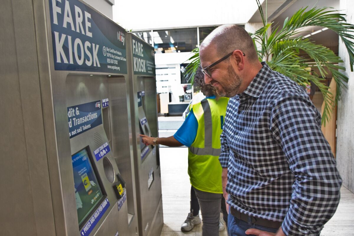
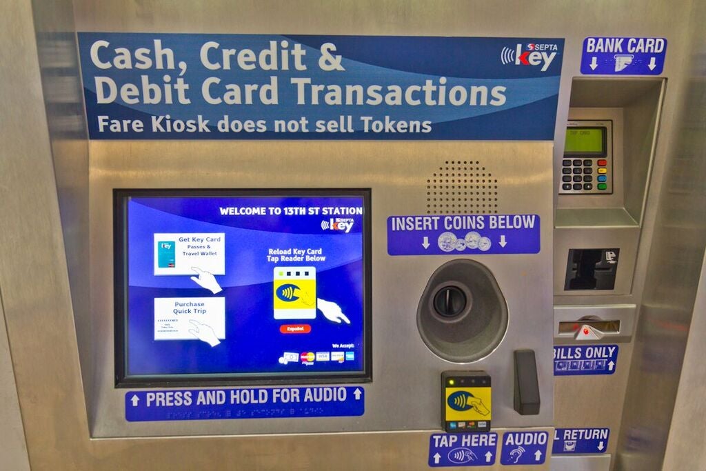
SEPTA is taking a tentative step towards improving the user interfaces on its new fare card kiosks, piloting a new set of screens at its headquarters. If the user experience (UX) public beta-test works, the new system will rollout to all 209 kiosks systemwide in a few weeks.
Hundreds, if not thousands, of SEPTA Key holders have mistakenly ordered a second card from the kiosks when attempting to simply add money to their first. The clunky user interface of the kiosks confused customers and the issuance of unwanted extra cards was a frequent complaint about the new payment system.
The kiosks’ UX was so bad that a group of civic do-gooders and some designers from Think Company spent a sunny Sunday afternoon inside trying to fix it. After a few hours, they produced 27 pages of recommendations for improving the kiosks’ design.
At the time when they were handed the suggestions, SEPTA said they were already working on the biggest problem — multiple cards — and promised to pilot an improved user interface. That pilot began last week at one of the two kiosks in the lobby of SEPTA’s headquarters at 1234 Market Street, so PlanPhilly grabbed Brian McIntire, Think Company’s co-founder and chief design officer, to test it out.
UX designers work by asking a simple question — “What might a user want to do?” — and meticulously working through each step in a system, looking for ways to streamline processes or clarify choices. So to test the UX of the kiosks, McIntire simply uses it while taking careful notes.
Despite leading the UX-fix session for SEPTA Key, McIntire hadn’t yet gotten one himself, so that’s where he started.
After pressing on “Get Key Card”, the second screen lists a dozen lines of legalese in small, thin font. “There is a lot of stuff I don’t feel like reading,” says McIntire of SEPTA Key’s terms and conditions. “I’m not gonna read it. Neither is anybody. No one is going to read that.”
As most consumers do when confronted with terms and conditions, McIntire hits accept and moves on without pausing to consider the potential legal ramifications and contractual obligations.
The next screen offers two choices: “Purchase Transit Pass” or “Add Travel Wallet”. It’s a small, subtle change from earlier screens, which offered “Purchase Transit” or “Add SEPTA Travel Wallet Value”, but McIntire doesn’t consider it much of an improvement. “This kinda feels like we’re back where we began with the old interface.”
Unsure which to pick McIntire pauses for a second, causing the kiosk to restart due to the inactivity. He runs through the terms and conditions again and then cautiously opts for “Add Travel Wallet.”
So far, McIntire finds the machine just as abstruse as its predecessor. “ I don’t even know what a travel wallet is, and I don’t know what ‘add’ means at this point,” he says.
By a stroke of luck, it turns out that “Add Travel Wallet” is the right choice. The next screen asks how much he wants to put on, offering a number pad. McIntire types in $10.00 and then pays using his credit card, confusion free.
But the moment of clarity doesn’t last.
Earlier, PlanPhilly talked to McIntire about why SEPTA should care about bad UX. He said it was bad for business and pointed at Uber.
SEPTA’s ridership has dropped since Uber and Lyft began operations here. Riders who would have waited for a bus are now ordering a ride through their smartphones. It may be in his interest to do so, but McIntire gives credit to the new competition’s UX.
“They put design front and center. They made it their main focus, making sure their app was ridiculous easy to use,” he said. “It’s even kind of fun to use, when you see the little cars moving around the screen.”
“I’m positive that has a lot to do with their success, is just that they made it so easy for you to get a car.”
SEPTA Key makes it hard for you to get what you want. The kiosks require people to slow down, stop, and read, expend mental energy they’d rather spend on work, contemplating the news, or figuring out what they want to eat for dinner.
Forcing riders to figure out a new system effectively assigns them homework for a class they didn’t sign up for.
And more frustratingly for SEPTA’s kiosk users, many were failing that assignment, ending up unexpectedly with a second card that might as well come stamped with a red ‘F’.
Testing out the reload function now, McIntire says that problem, arguably the largest with the system’s UX, appears solved: Users shouldn’t mistakenly end up with a second card any more.
The new interface replaces the initial screen. Instead of a singular button screen that, whenever touched, sent users down the path to a new card, passengers will now see three buttons: One for one-way trips, one for getting new cards, and a third for reloading an existing card, which points users toward the card reader nearby. If users touch ‘Reload Key Card’, the next screen directs them again to the reader on the side.
McIntire does this and arrives at an account status screen that momentarily gives him pause. There are no real options here — it just shows how much money and what kind of passes are on the card.
McIntire once again picks ‘Add Travel Wallet’ at the next screen, lamenting the technical jargon. “I don’t know what it means to ‘purchase a transit pass’ and I don’t know about the ‘add wallet’ thing,” he says. “All they got to do is change the language. They just have to say: ‘Put money on my card,’ just like the screenshots that we sent them told them to do.”
He goes to add money and muses, “I wonder if there is a minimum?” He sees none. “No, good, so I can add a buck.” McIntire punches out $1.00 into the paid, hits next and waits for the next screen to load. A few seconds later, it does.
“Business rules not satisfied?!” McIntire exclaims, reading the argot-filled error message that has popped up. “So I can only add ten dollars?” That is the minimum, even though SEPTA has heard hundreds of customers complaints about being prevented from adding the $2 in their pocket — sufficient for one transit fare — onto their SEPTA Key.
Experiment over, McIntire declares the pilot a partial success. “They solved that main problem,” he says, meaning the issuance of multiple cards. “It’s all about iteration — incremental change, that’s okay.”
SEPTA says they have no further tweaks to the user interface planned at this time, but McIntire hopes that will change as the authority grows to appreciate the drop in customer complaints that’ll accompany the improved UX.
“We’re getting there. Baby steps, right?”
WHYY is your source for fact-based, in-depth journalism and information. As a nonprofit organization, we rely on financial support from readers like you. Please give today.

