Kimmel design concept feedback
April 14
By Alan Jaffe
For PlanPhilly
Invite a couple of hundred people to become critics, and you’re bound to get mixed reviews.
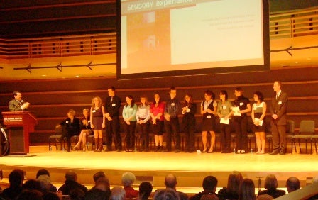
That’s what the Kimmel Center and PennPraxis heard tonight from citizens who had been invited to respond to proposals by students of the University of Pennsylvania and the University of the Arts for redesigns of the public portions of the performing arts building.
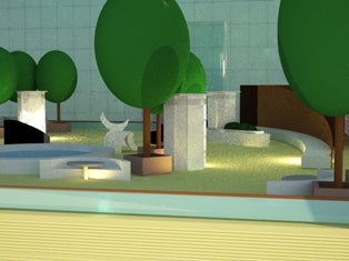
The students’ ideas ranged from the whimsical (a huge rock-climbing wall) to the possible (a sidewalk café) to the inspired (a rooftop oasis with a translucent aqua floor).
The reactions ranged from excitement to apprehension to rejection. But it was obvious that the proposals offered much to embrace and build upon.
Kimmel officials began the conversation about enlivening the center’s public spaces last fall, explained executive vice president Natalye Paquin. While its Perelman and Verizon Halls have drawn crowds and a degree of success since the building opened in 2001, it had never realized the goal of becoming a cultural mecca for events that are not performance-driven, Paquin said.
So the Kimmel partnered with PennPraxis, the Penn Project for Civic Engagement, and the Philadelphia Inquirer’s Great Expectations program to initiate a “dynamic dialogue” with city residents about the overall space, she said. Four public discussions, involving about 200 people, were held in January to develop guiding principles for rethinking the exterior and interior spaces. That input was combined with online suggestions to serve as the foundation of the undergraduate and graduate students’ redesigns.
Cafe Corner
“Tonight’s ideas are preliminary,” said PennPraxis executive director Harris Steinberg, “and they are part of an ongoing dialogue about achieving excellence in design, with the Kimmel at the heart of it.” The goal is to make the building “a beacon and an icon” for future audiences, but the ideas may take years to achieve, he said.
One group of students attempted to humanize the Kimmel’s public spaces, seeking ways to make portions of the grand center more intimate. Among the group’s more dramatic suggestions was a stairway that wrapped around the Perelman Hall and around a new elevator to the rooftop. The garden at the top was transformed into a sculptural playground. Comfortable lounge seating was introduced in the Commonwealth Plaza for lingering and wifi use. Large graphic signs and maps directed visitors to the seldom-visited corners of the Kimmel. A new entrance was created at Spruce and 15th Streets, and glass was added along Spruce to invite passers-by inside.
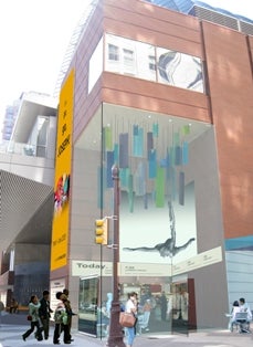
The second group of students tried to reconnect the center to other forms of art. A tower was erected in the middle of Commonwealth Plaza with stairs that connected to the tiers of the building. The plan also called for the creation of small performance spaces, a reflective pool on the rooftop, and a hanging mobile in a glass enclosure at Broad and Spruce.
The third group added sensory dimensions to the center. The rooftop floor would be glass, with water flowing underneath and into a seven-story water wall. A vertical garden with plush greenery and a rock-climbing wall to “invigorate the entire body” were among the other creative suggestions.
In smaller group discussions, the audience offered their critiques.
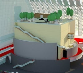
Humanize Perelman stairs
Many applauded the proposals to open a second entrance to the Kimmel and increase the use of glass on the ground floor to bring the inside out and the outside in. “I like anything that brings in more light,” said Sheila Rosenbloom.
But Rosenbloom was concerned about the cost of some of the student ideas, and she wondered if any of the young planners had attended events at the Kimmel that attracted large crowds. The proposals for new furnishings and architectural additions might work for daytime audiences but would be intrusive in the evening, she said. “The space has to accommodate the primary purpose – the concerts.”
Identifying herself as a psychologist, Ruth Harvey emphasized the need for spaces and uses that would take advantage of “interactive qualities,” and “not interactivity with a computer.” The rock-climbing wall was one of the few activities proposed that “people could do together.” Rather than reflective, meditative interior spaces, the Kimmel needs to create opportunities “where people can involve themselves with each other, and make connections with each other,” she said.
Marsha Moss was opposed to the proposed tower for Commonwealth Plaza, a vertical structure that would “undermine the integrity” of the building, which she described as “a work of art.”
Josepha Gayer, an opera singer, agreed that the tower was “imposing,” but she liked the idea of stairs emanating from the tower that linked the many levels of the interior. Other participants in the group discussions liked scaled-down versions of the students’ visions.
Large graphic signs would interfere with the architecture of the Kimmel, many said, but most agreed that more signs are sorely needed.
“I’ve been here 100 times,” said Beth-Ellen Kroope. “But I’ve only gone up to the roof once – on a tour,” because it is so hard to find. “We need easy access,” she said.
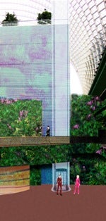
Water and vegetation elements
Thomas Morr liked the proposal for a water wall, but not seven stories high. He suggested a smaller version behind the bar to “create visual interest in that space.” Marsha Moss suggested a “meandering, human-scale” stream of water would be more appropriate.
A younger member of the discussion group, Donald Maley, cast his support for the “bolder ideas.”
“To me, they are more exciting. Speaking for the 20-something crowd, I like the large, bold outdoor signage” proposed by the students, which would inform him when there is a concert he’d like to attend while he was walking home from work.
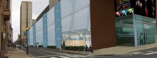
Spruce Street facade
Maley’s friend and peer, Clinton Randall, noted that 70 percent of the Kimmel space is not used. “It’s not about adding, but repositioning what’s already here,” he said. “I like the idea of subtle modifications, which help people realize there’s more space than they’re using.”
A still younger participant, 10-year-old David Bulack, would like the Kimmel to add more stores to the retail space and add more color in the windows. Colors, rather than signage, could lead guests through the building, suggested his mother, Patty Bulack.
“We should think of this space as a hotel,” said Morr, “with many uses that can accommodate many kinds of interests.”
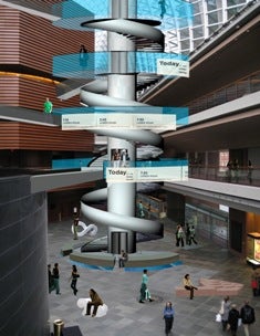
Plaza tower
Adding a closing note to the group discussion was Jack Nixon, who revealed that he is the director of engineering for the Kimmel Center. “There needs to be something to do when you get here,” besides attending a concert, Nixon agreed. “We realize there are things that need to change – and can change. There are some relatively simple things, like better seating and more programming. Anything that attracts people into the building is good.
“I’d like to think that this is going to be here in 100 years.”
Over the next three weeks, the Penn and University of the Arts students will incorporate tonight’s public feedback into a process book that will be presented to the Kimmel Center for its consideration. The contents will be made available online at www.planphilly.com.
WHYY is your source for fact-based, in-depth journalism and information. As a nonprofit organization, we rely on financial support from readers like you. Please give today.


