2016 Storefront Design Challenge honors
When a business owner invests in new awnings or distinctive signage, fresh paint or new lighting, she’s telegraphing community pride, expressing her business’ identity, and offering a vote of confidence in her commercial corridor.
Every other year the Community Design Collaborative and Commerce Department acknowledge these investments through the Storefront Design Challenge, awarding the finest in refreshed storefronts across the city.
This year’s crop of 75 nominations represent improvements made since fall 2014, spanning commercial corridors citywide – from East Passyunk Avenue to Richmond Street, from Torresdale Avenue to Fairmount Avenue. Competition jurors picked two finalists for each of 12 categories, honoring power of the good design as well as new commitments to corridors that may not have seen a lot of investment in recent years.
The North 5th Street Revitalization Project was honored with The Instigator Award, for a concentration of small but mighty projects that collectively made a positive impact on the corridor in Olney.
Many storefront improvement projects are made possible because of the city’s Storefront Improvement Program, which reimburses business owners for half the cost of storefront renovations up to a certain amount. The jury recognized Councilman Bobby Henon with The Corridor Catalyst award for his work to find city funding to enable the Storefront Improvement Program to continue at the Commerce Department.
Honorees were recognized at an event late Wednesday afternoon at the Center for Architecture as part of DesignPhiladelphia. Here’s a look at each award:
Best Overall – tie: Neighborhood Potters + Philly CAM
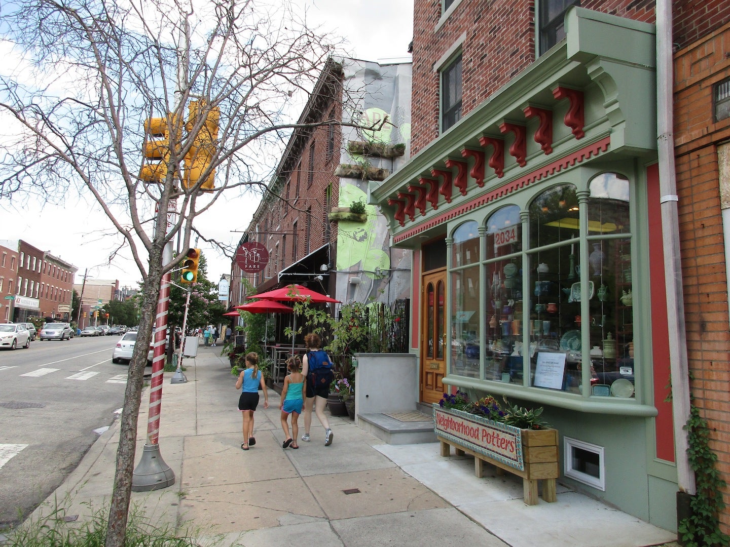
Top honors this year were shared by two very different kinds of projects. Neighborhood Potters (2034 Fairmount Ave.) has been in its space for 16 years and reinvested recently in its storefront. The design recreates a Victorian storefront seen just a few doors down on Fairmount Avenue. Their contractor salvaged the cornice from a building demolished in Old City and the color scheme is based on the ceramics within.
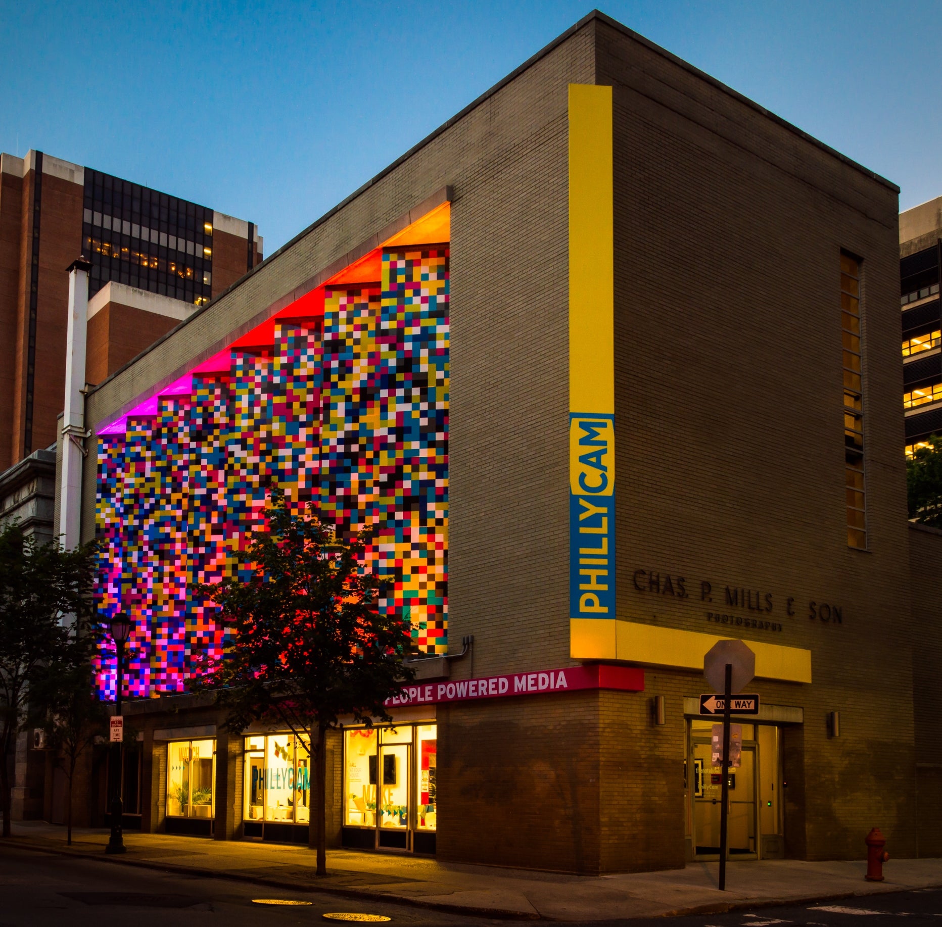
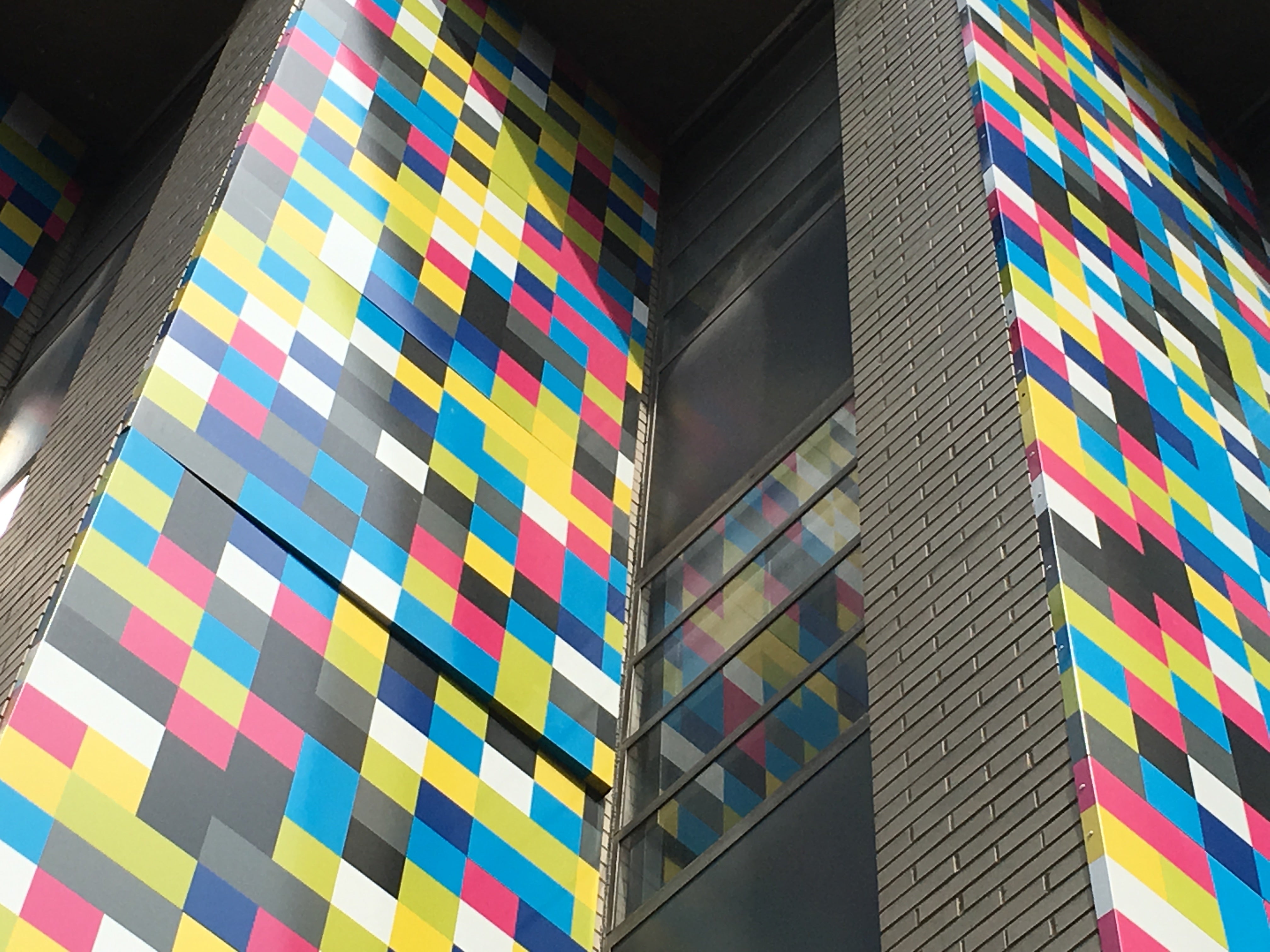
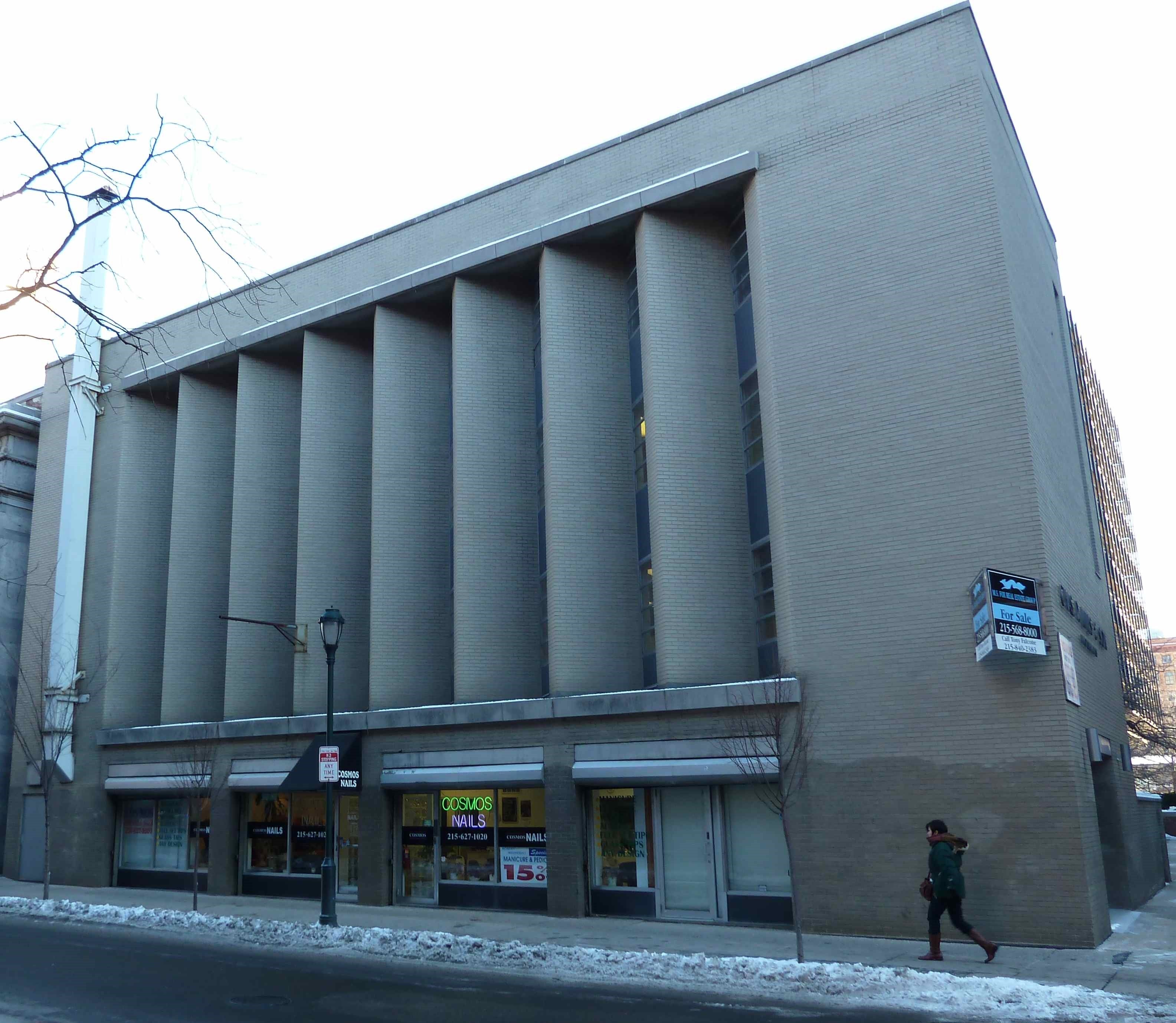
PhillyCAM (699 Ranstead St.) moved to a mid-century building on a dreary block a few years ago and they took total advantage of the building as a billboard for their “people powered media” enterprise. Vertical panels with colorful pixels shimmer in LED light, while the big sidewalk-level windows help activate the street and showcase the media production within.
Best DeSign: Little Spoon Cafe (winner) + Tailored Home (finalist)
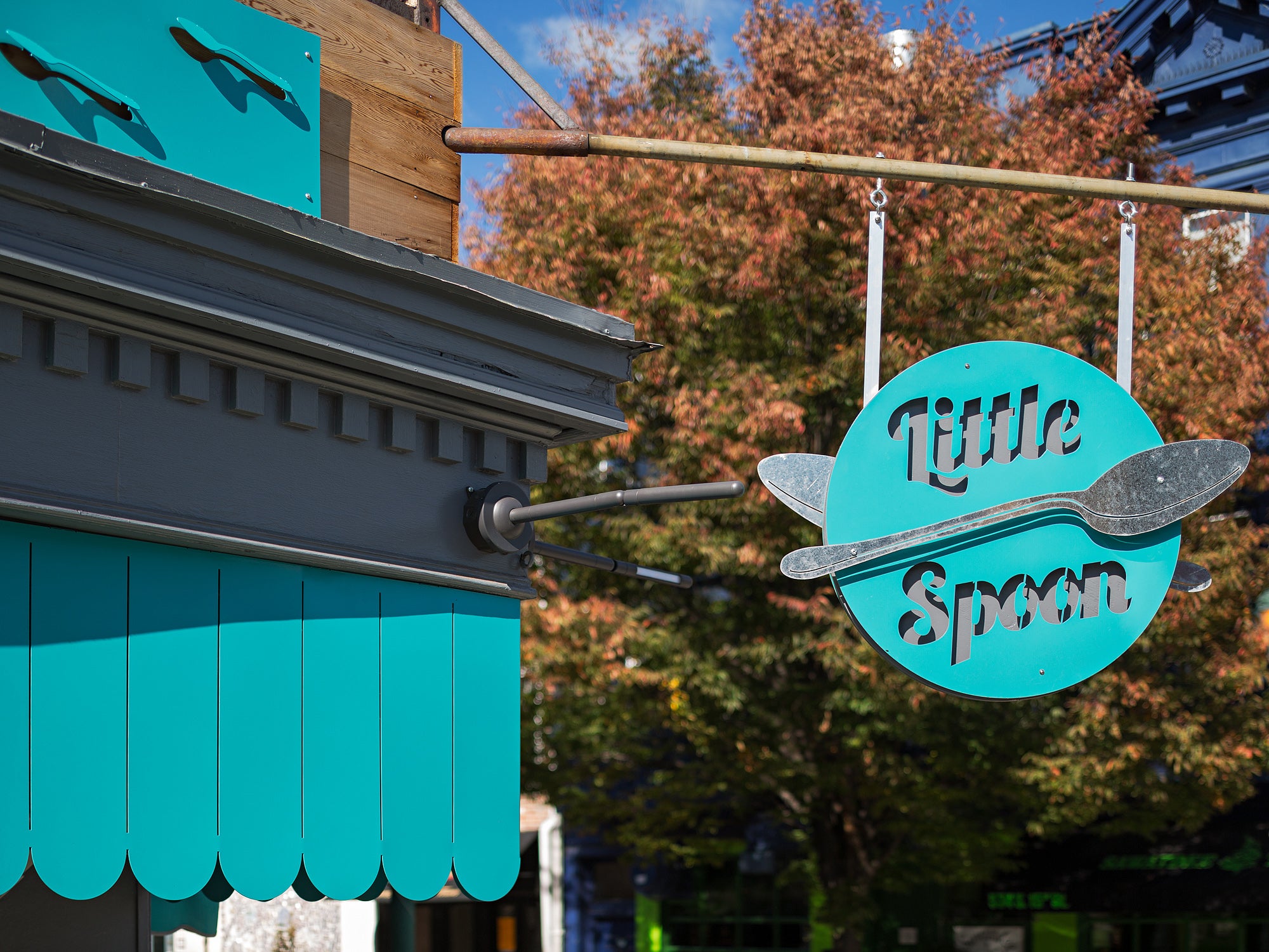
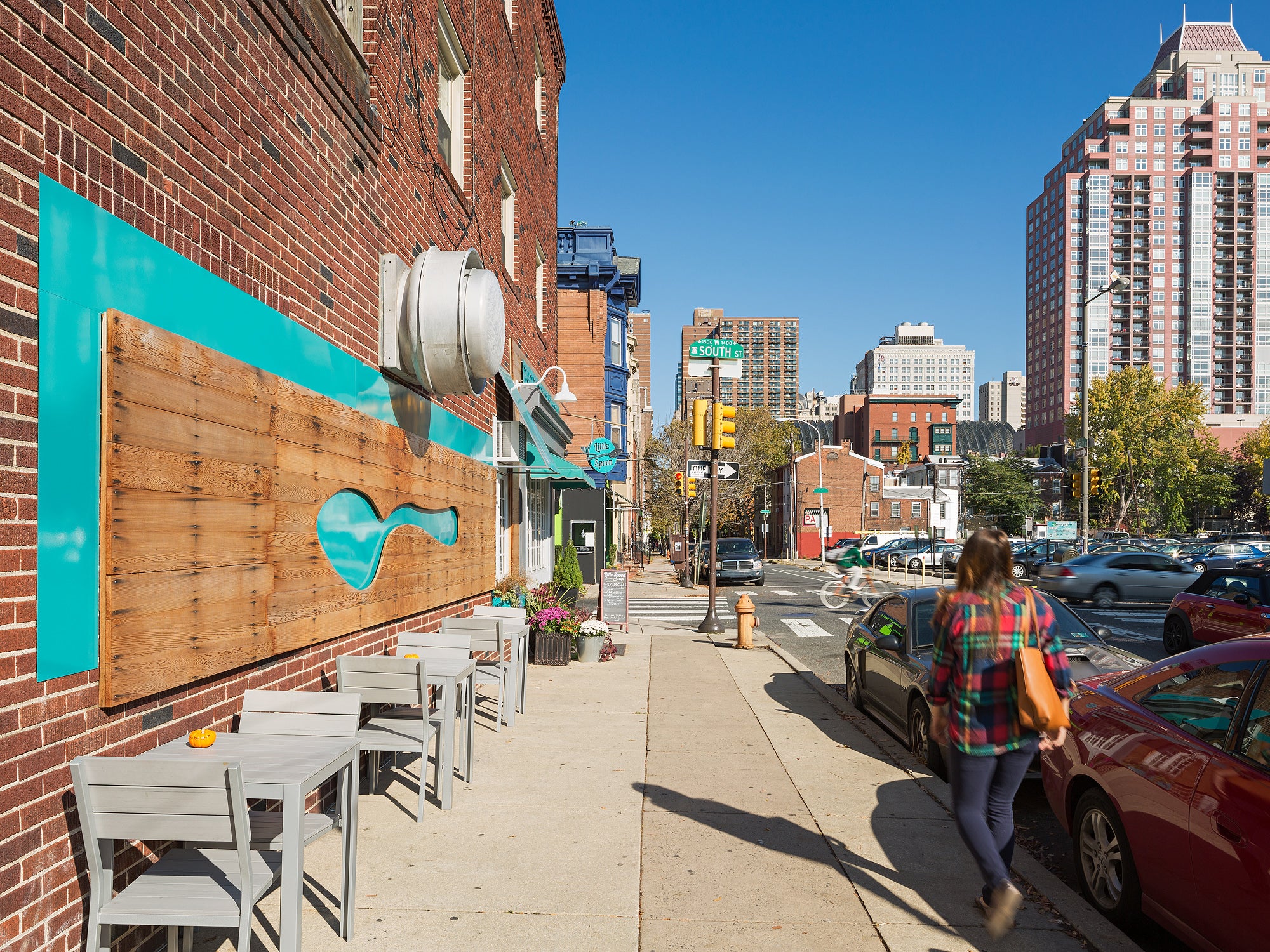
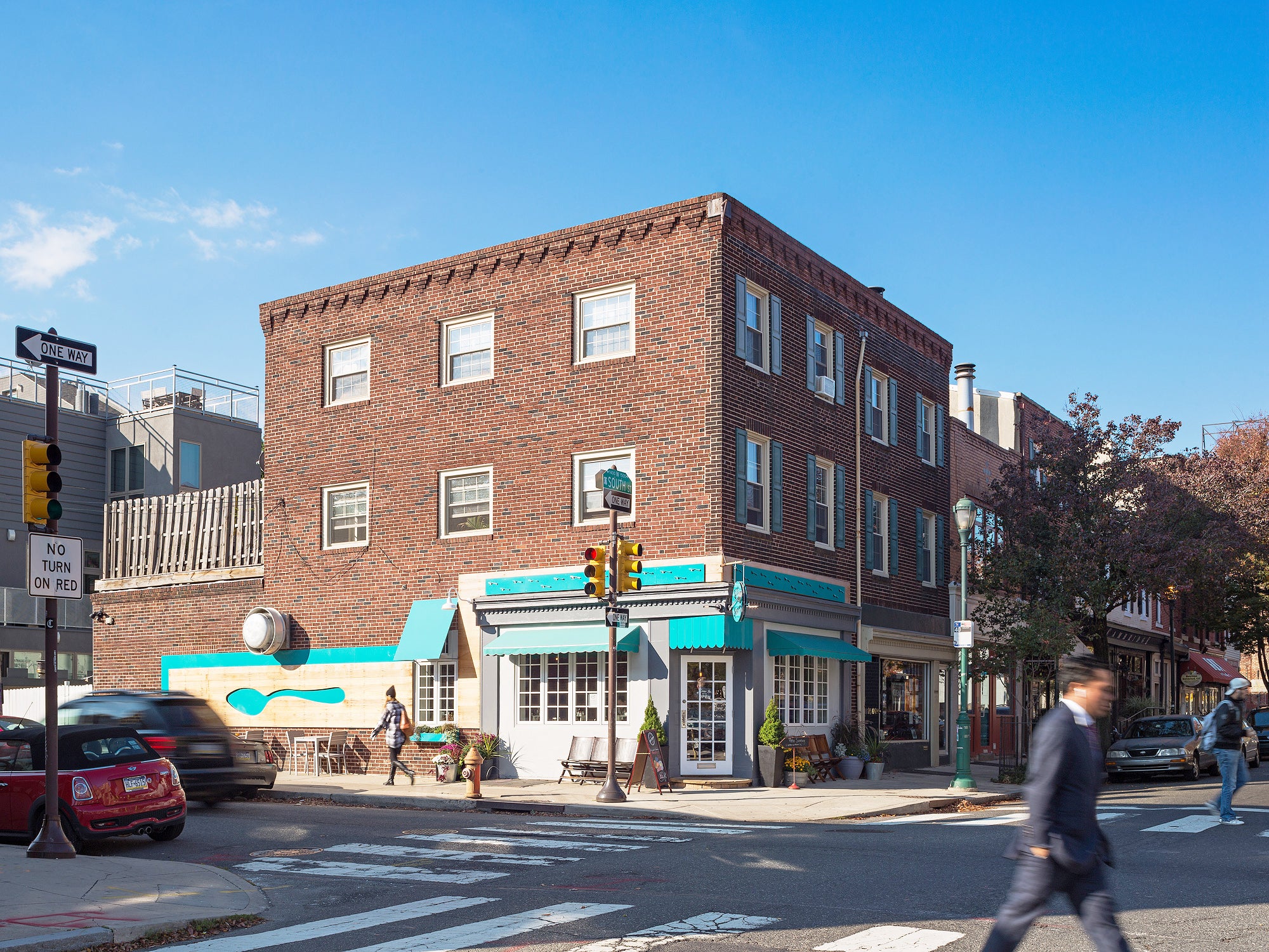
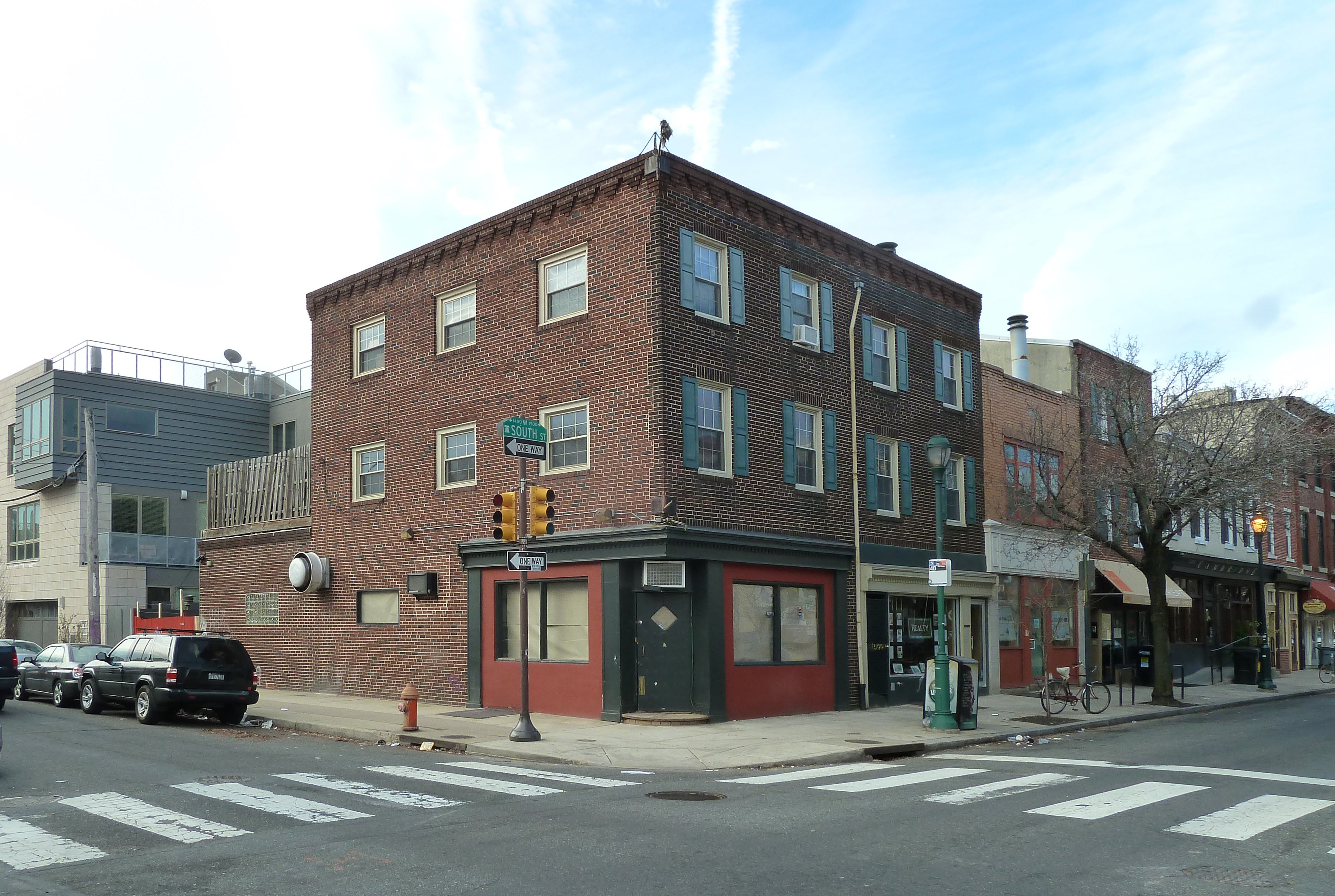
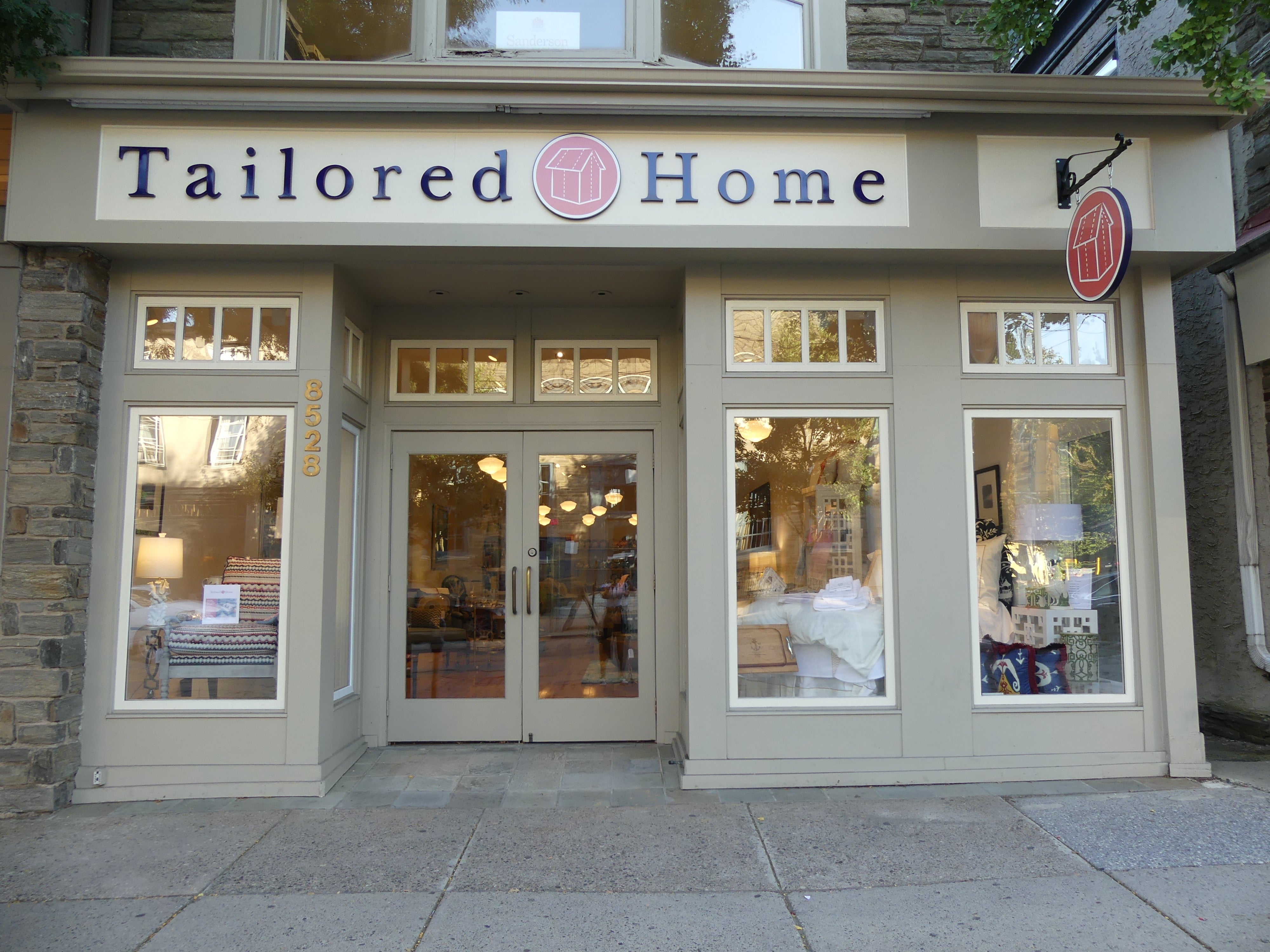
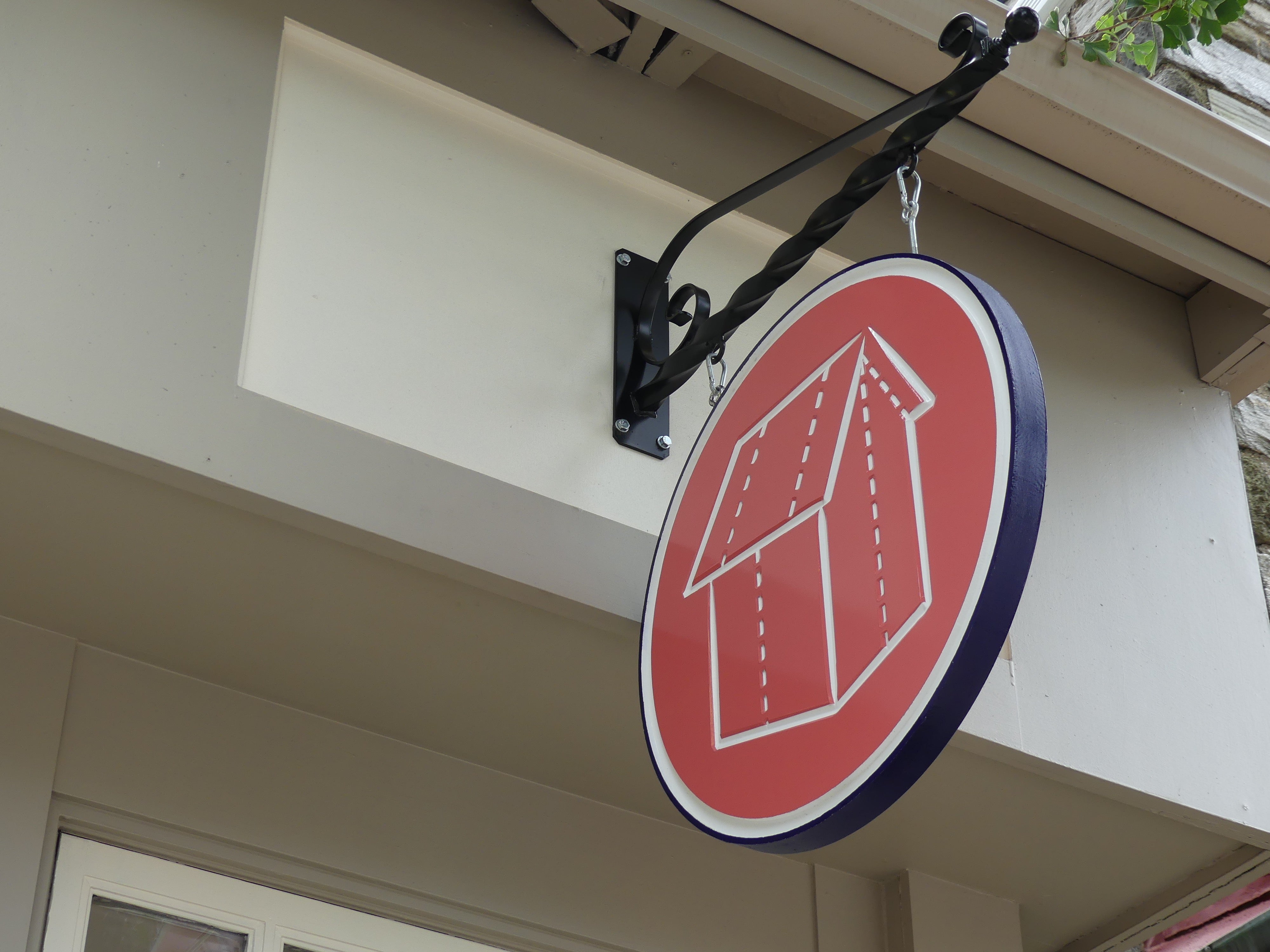
Little Spoon Café (1500 South Street) takes great signage to new levels – from a giant spoon on the 15th street side to a round sign with a cutout spoon – that really anchors this corner. Jurors also appreciated the charm of Tailored Home’s (8528 Germantown Ave.) stitched sign.
Bang for the Buck: Zakian Carpets (winner) + Amelie’s Bark Shop (finalist)
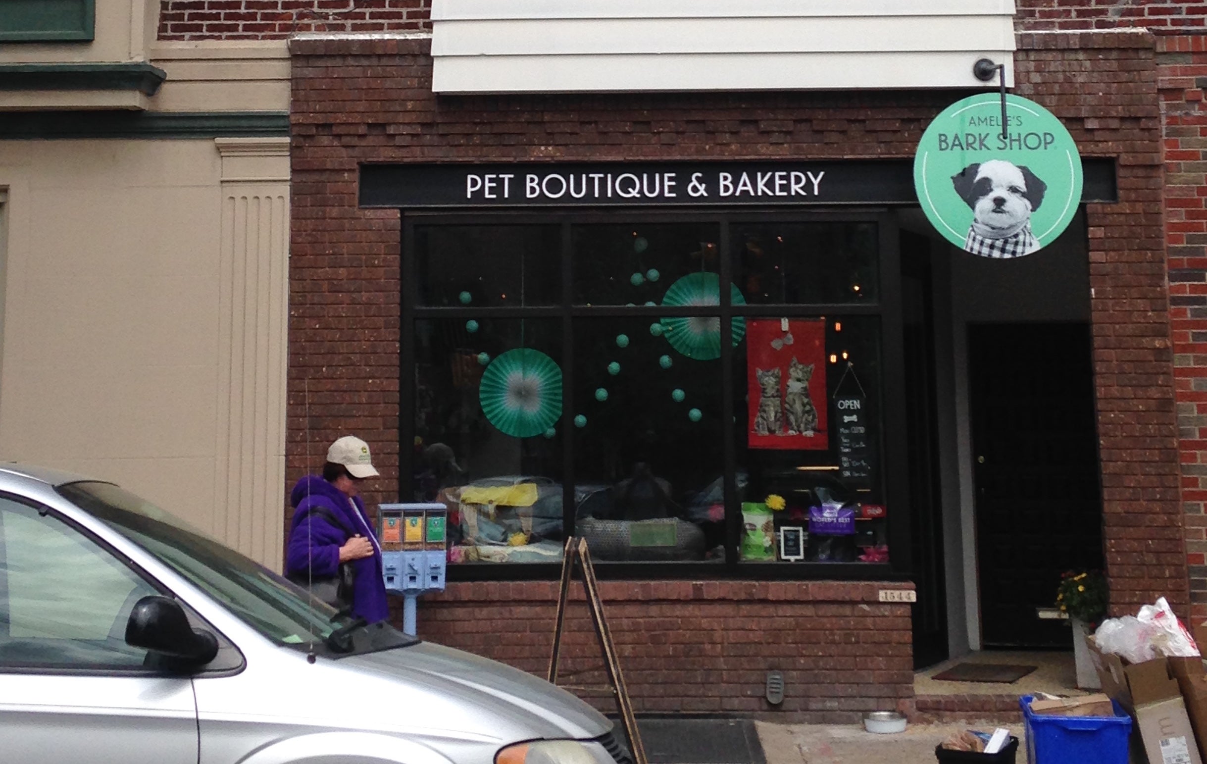
This category honors a high-impact but low cost improvement. The winner will be a familiar one to anyone who knows West Parkside: Zakian Carpets, which has been at 4930 W. Parkside Ave. since 1923. This multi-generational family business refreshed its storefront while honoring the family’s Armenian heritage, with a mural depicting patterns from an Armenian carpet. Amelie’s Bark Shop on East Passyunk Avenue was this category’s finalist. This project reopened a storefront on this busy corridor using a simple scheme in black and white, with a pop of turquoise in an eye-catching hanging sign.
Extreme Makeover: Larchwood Flats (winner) + Mercer Cafe (finalist)
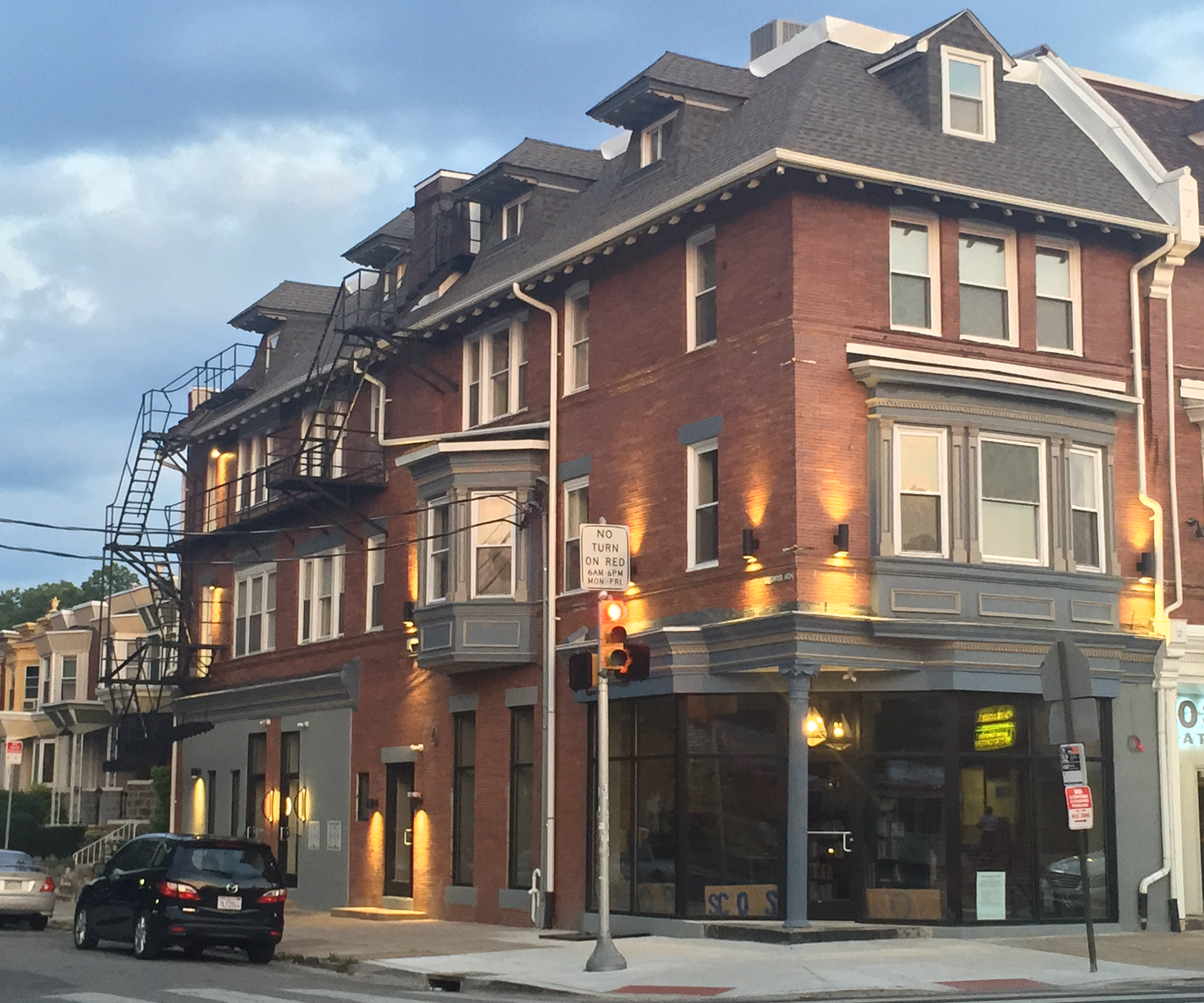
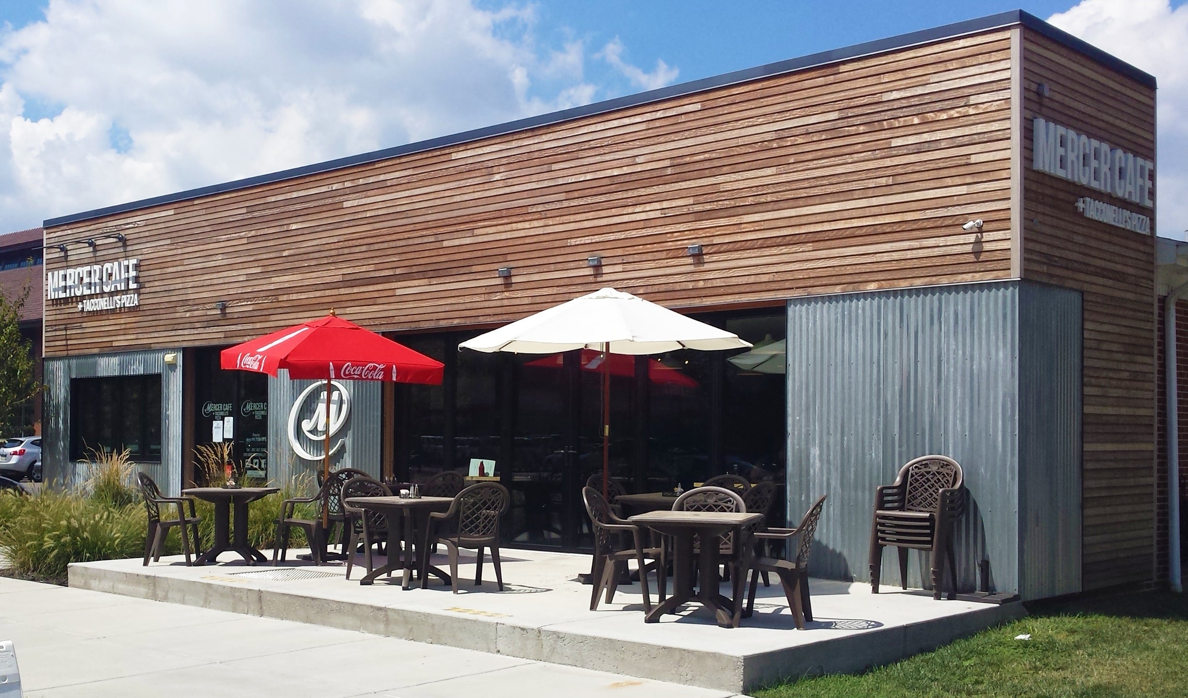
Some storefront projects take over a whole building, marking a transformative improvement. Winner Larchwood Flats (501 S. 52nd St.) overcame serious structural damage to be resurrected as a mixed-use building with a new roof, new storefront, and façade lighting on a block across from Malcolm X Park. Finalist Mercer Café + Taconelli’s Pizza at the Navy Yard overhauled an old single-story bank building with a contemporary design in metal and wood.
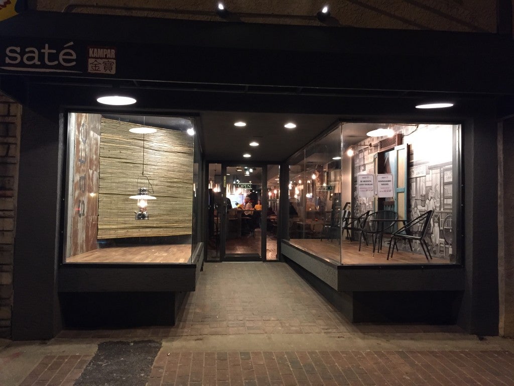
Nightlife: Canton 11/Lair KTV/Chatime (winners) + Sate Kampar (finalist)
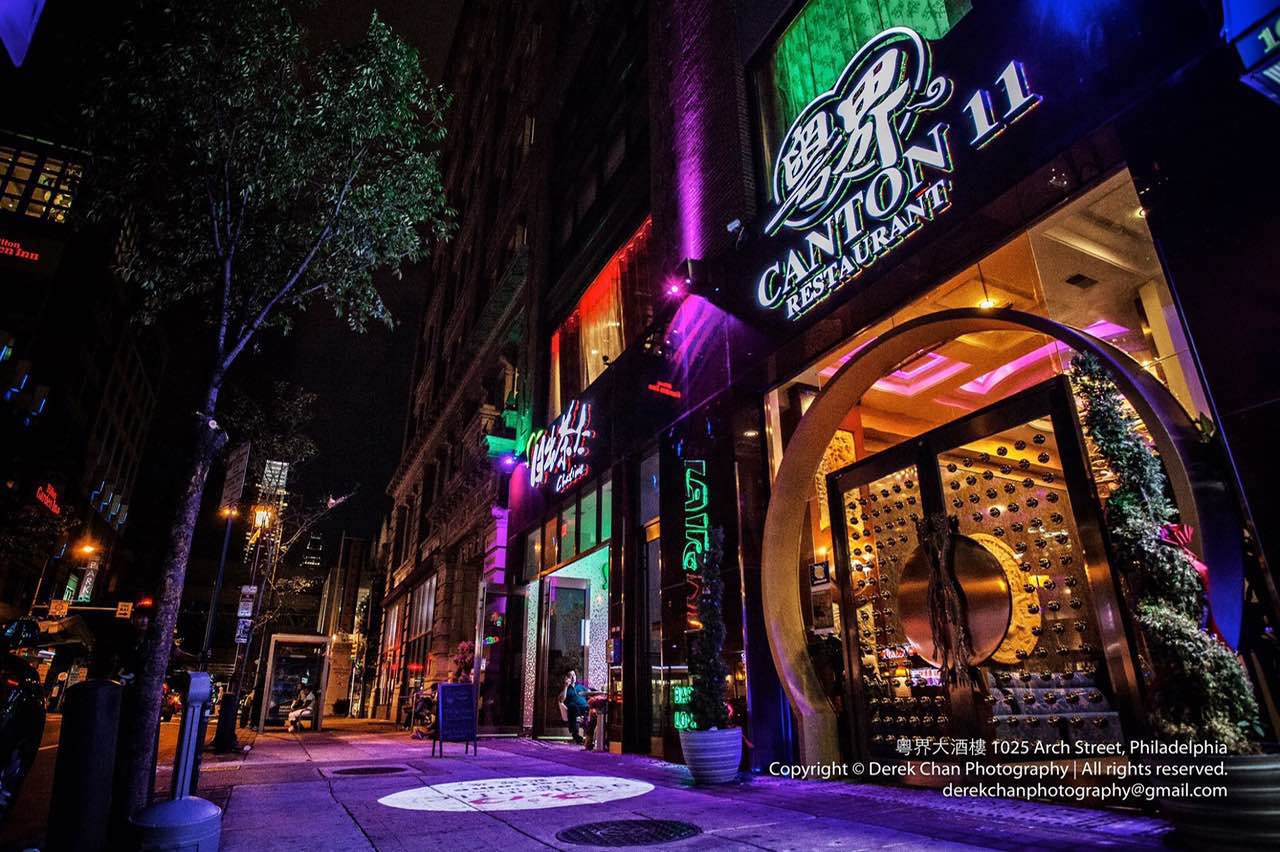
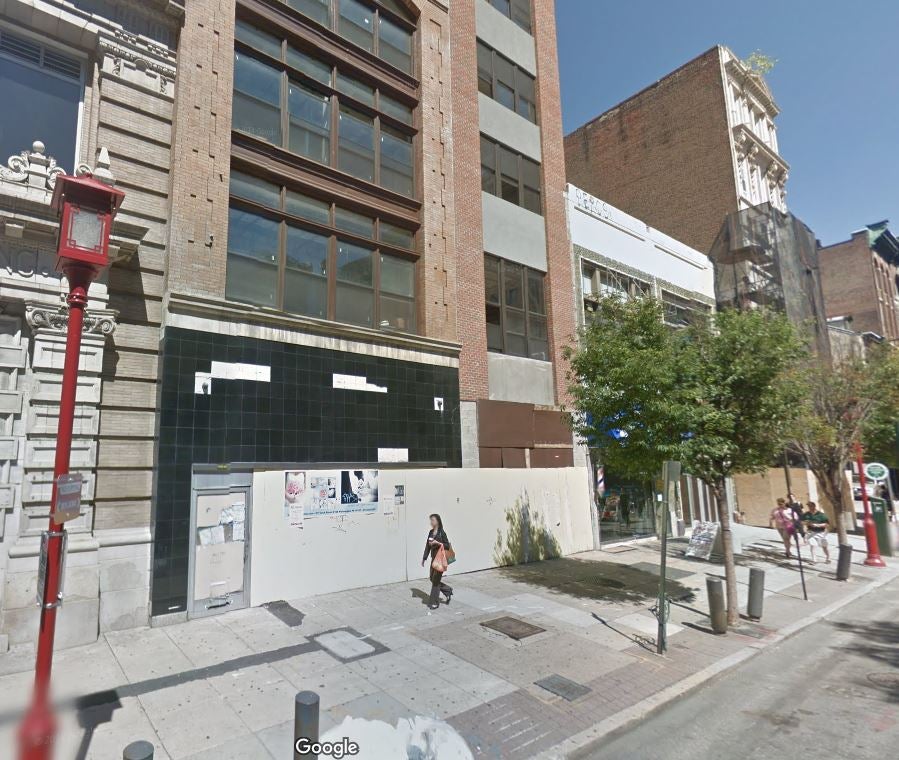
A trio of businesses at 1025 Arch Street in Chinatown threw everything they could at enlivening their spaces – colored LEDs, sidewalk projections, up-lighting on the building, and interior illumination make this spot come alive at night. The finalist was Sate Kampar (1837 E. Passyunk Ave.), which makes the most of a deep storefront with refined, bright white lighting.
Trendsetter Award – tie: The River Wards Cafe + Sam Stern
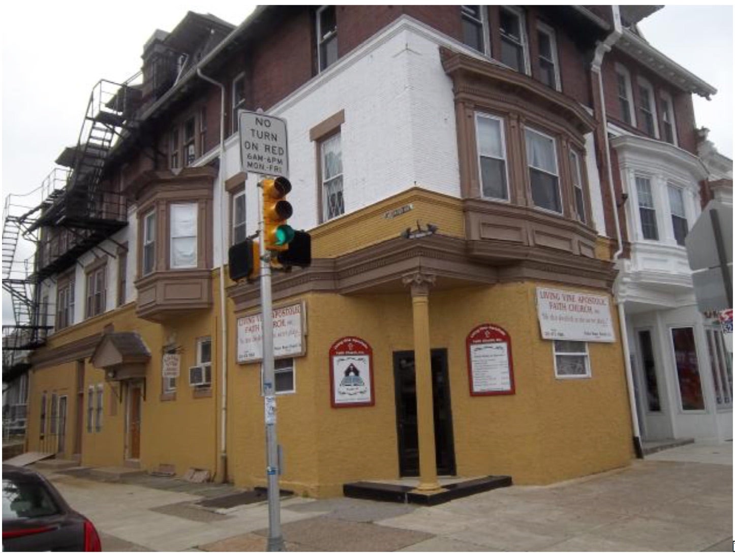
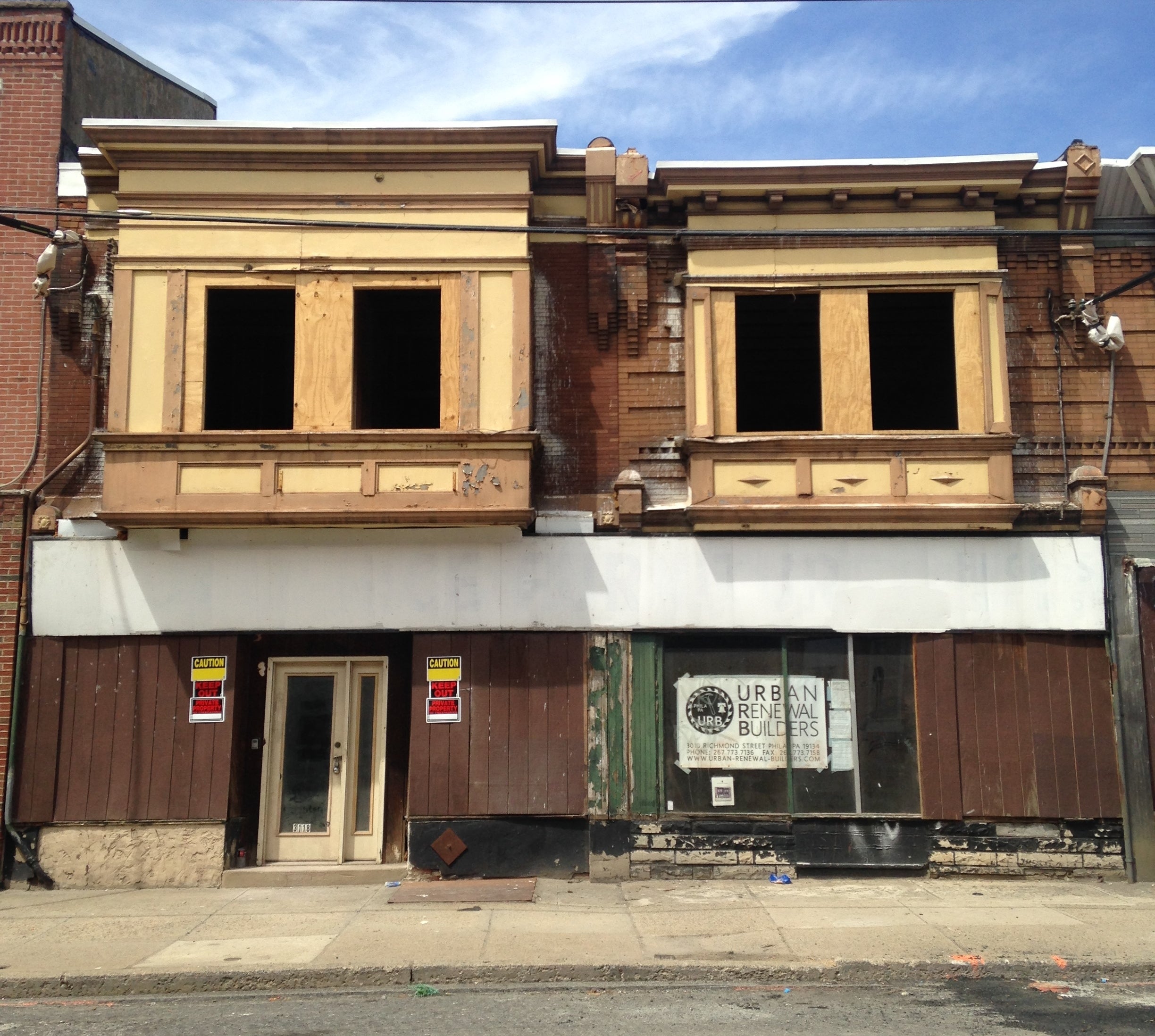
This award honors early projects in an area where reinvestment has been slow, and jurors reached a tie. Property owner Sam Stern has a great corner building at 3621 Germantown Ave. (near Erie) with a lot of intact features. He restored the recessed entry, polished granite sills, and restored the terrazzo floor. Upstairs lights with timers give a sign of life and offer hope for apartment tenants sometime in the future. River Wards Café (3118-20 Richmond Street) is a new investment on an awakening corridor. One special feature in the design is a garage door instead of a large storefront window, which doesn’t go floor-to-ceiling, offering a sense of enclosure that still feels part of the street.
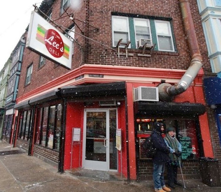
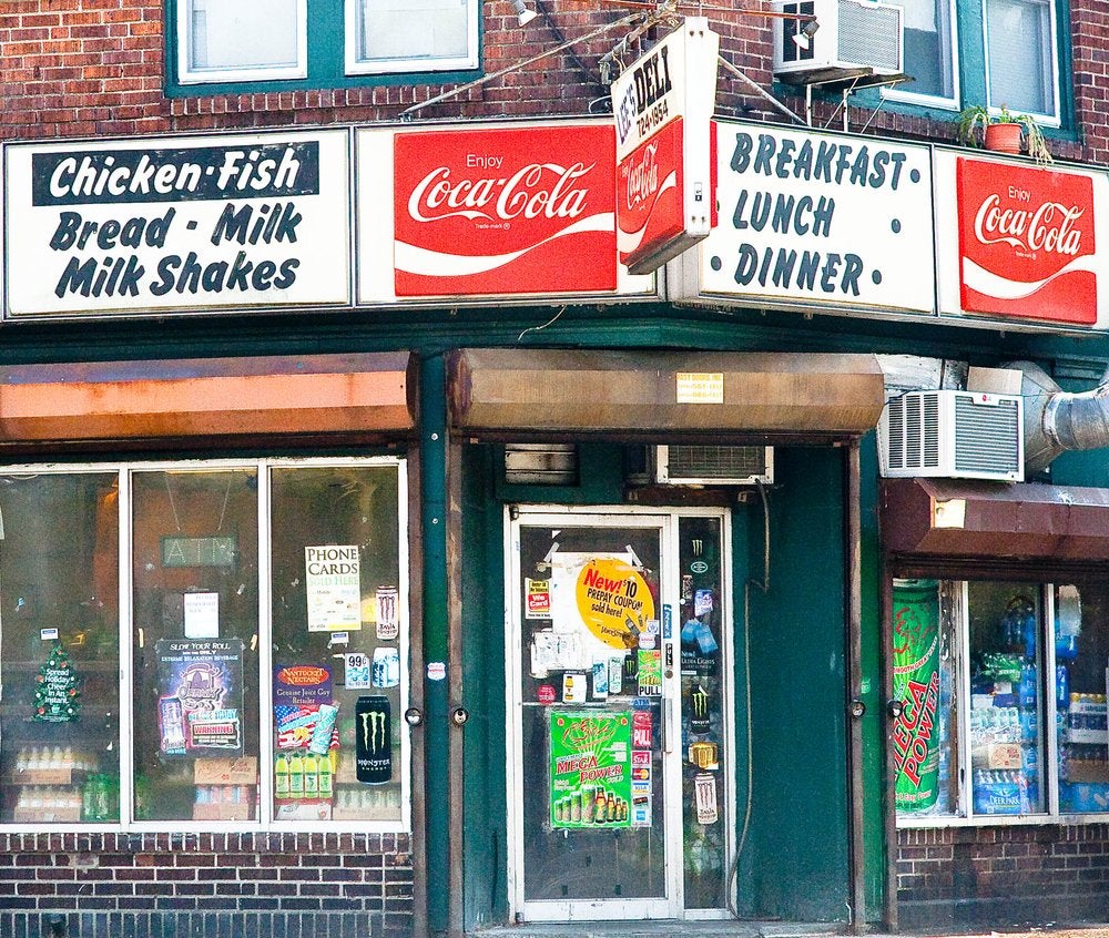
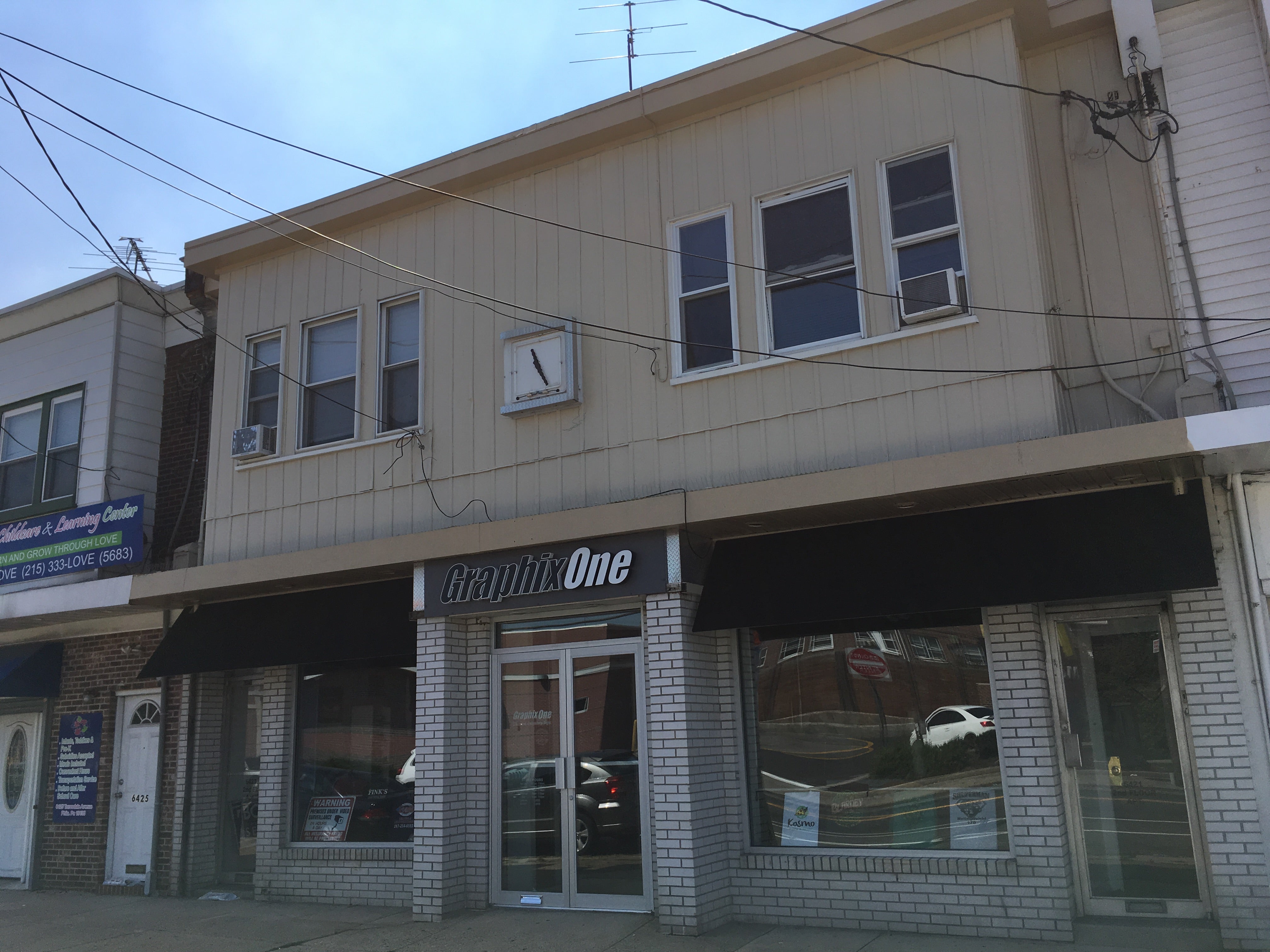
Less is More: Lee’s Deli (winner) + GraphixOne (finalist)
Good design doesn’t have to be complicated. Lee’s Deli (4700 Baltimore Ave.), a longtime fixture of its corridor, kept it simple when it updated its look (and its menu) to keep up with the changing neighborhood. New windows, new signage, fresh paint, and a new logo updated its image. GraphixOne (6423 Torresdale Ave.) was chosen as a finalist for its simple, monochromatic awnings and sign.
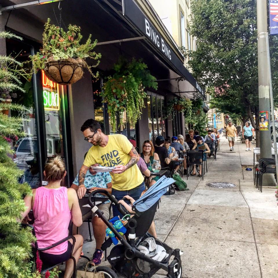
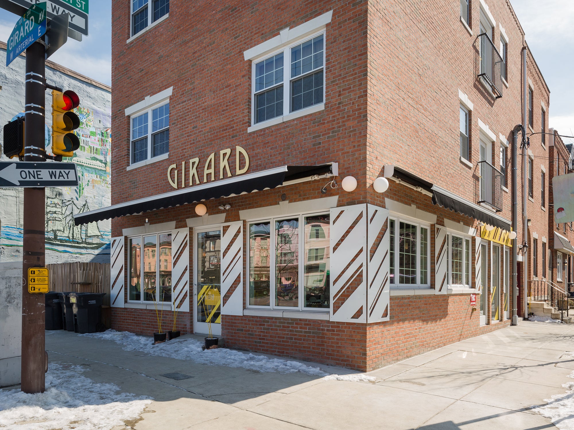
Lemons to Lemonade: Bing Bing Dim Sum (winner) + Girard Brasserie (finalist)
Some buildings have challenges that are creative constraints for great storefronts – where owners have to turn lemons to lemonade. This year’s winner was Bin Bing Dim Sum (1648 E. Passyunk Ave.), which took a thin, wedge-shaped building and made the most of a long façade and maximum street exposures. Tall windows open to the street and create a lively presence. The finalist, Girard Brasserie (300 E. Girard Ave.), couldn’t attach much to its building so it deployed a bold yellow, black, and white color scheme and strong graphic elements to define its space.
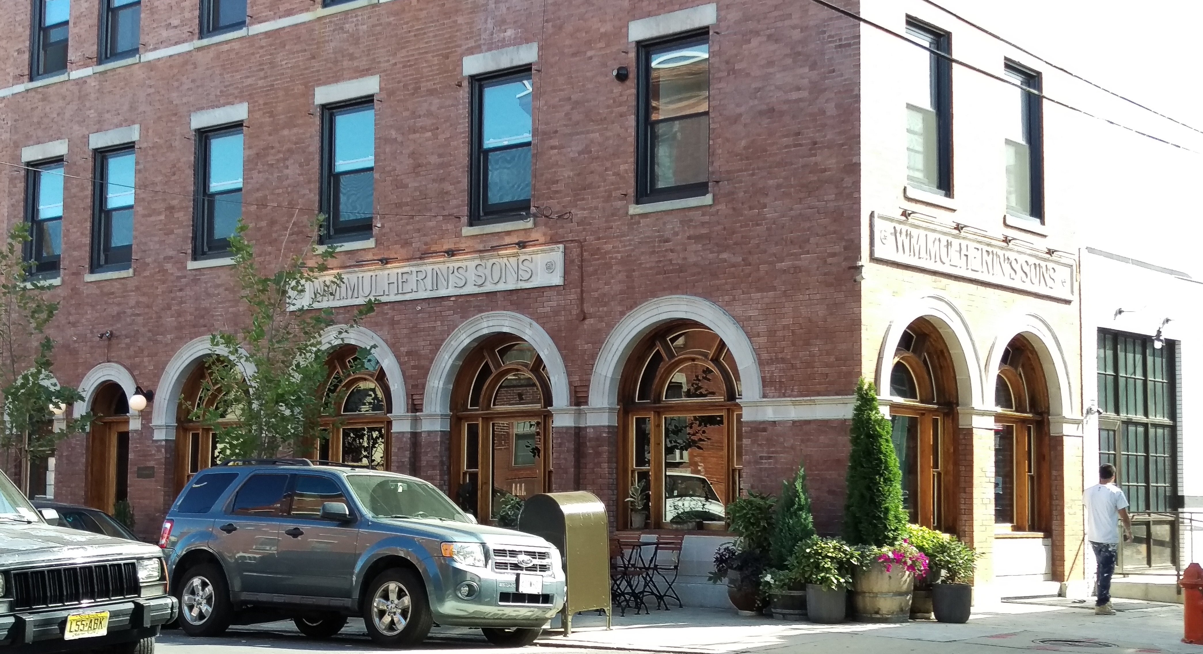
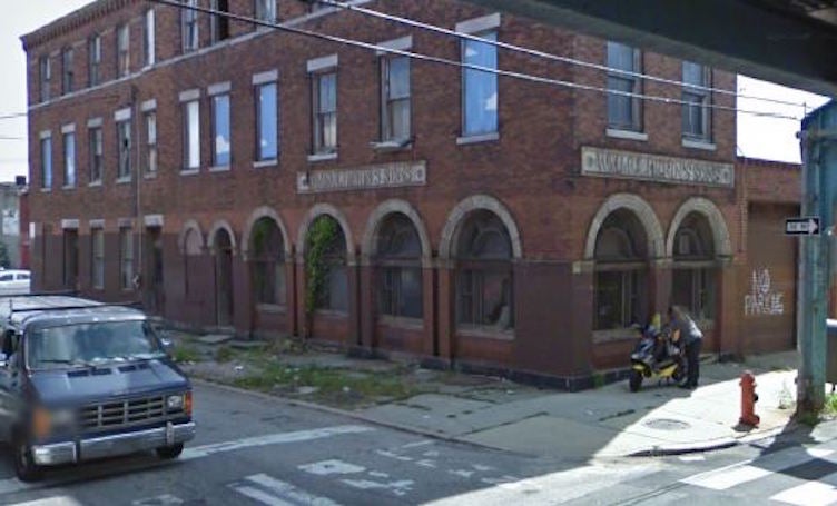
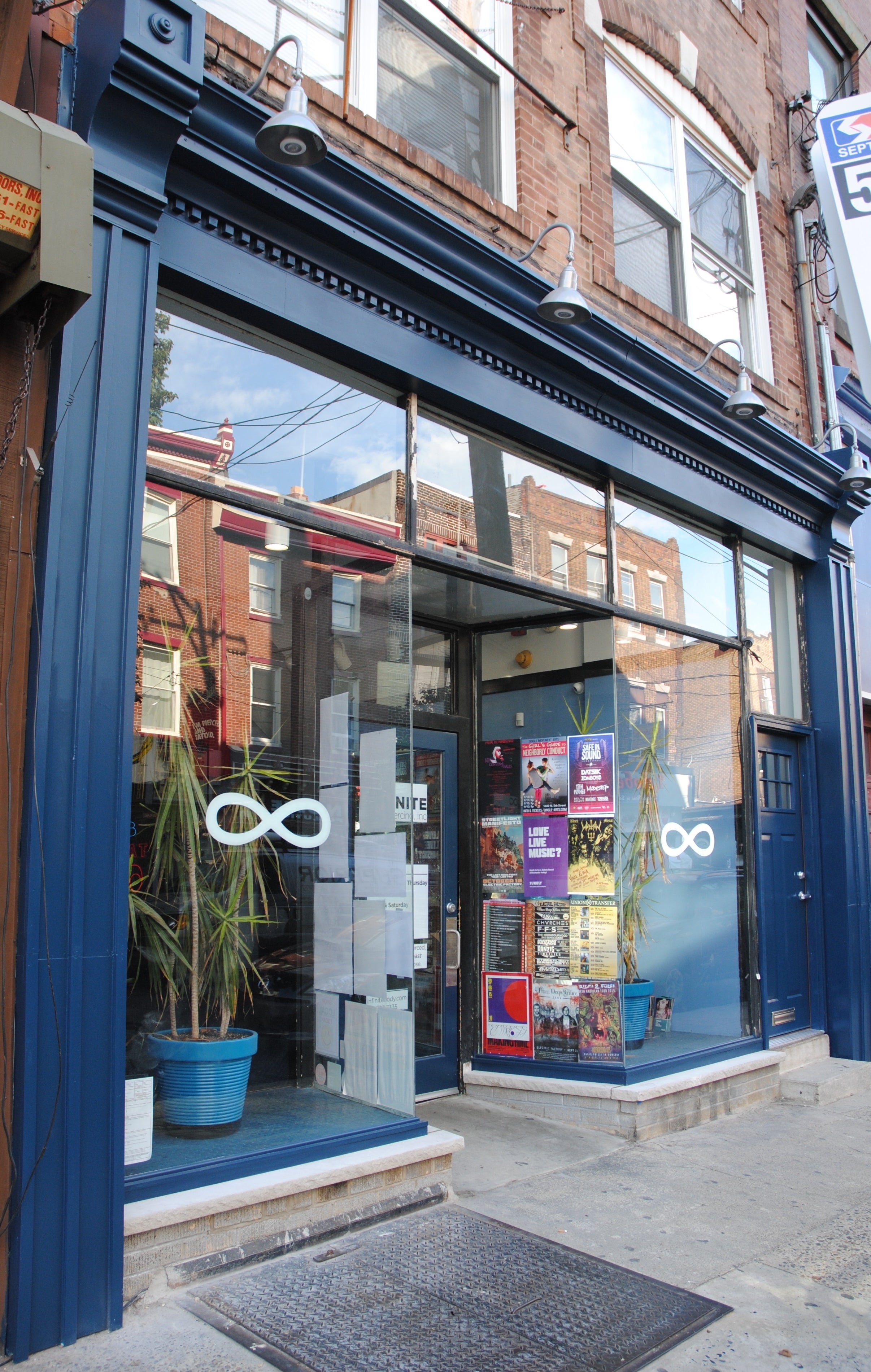
Honor the Past: Wm. Mulherin’s Sons (winner) + Infinite Body Piercing (finalist)
The award for best renovation of an historic building went to the new restaurant Wm. Mulherin’s Sons (1355 N. Front St.). The building’s past as a whiskey distillery was honored to the point of the business taking its name from the old entablature. Good bones gave this business a lot to work with. The finalist, Infinite Body Piercing (626 S. 4th St.) recreated its historic cornice to match other nearby businesses, removed its security gate and its large sign.
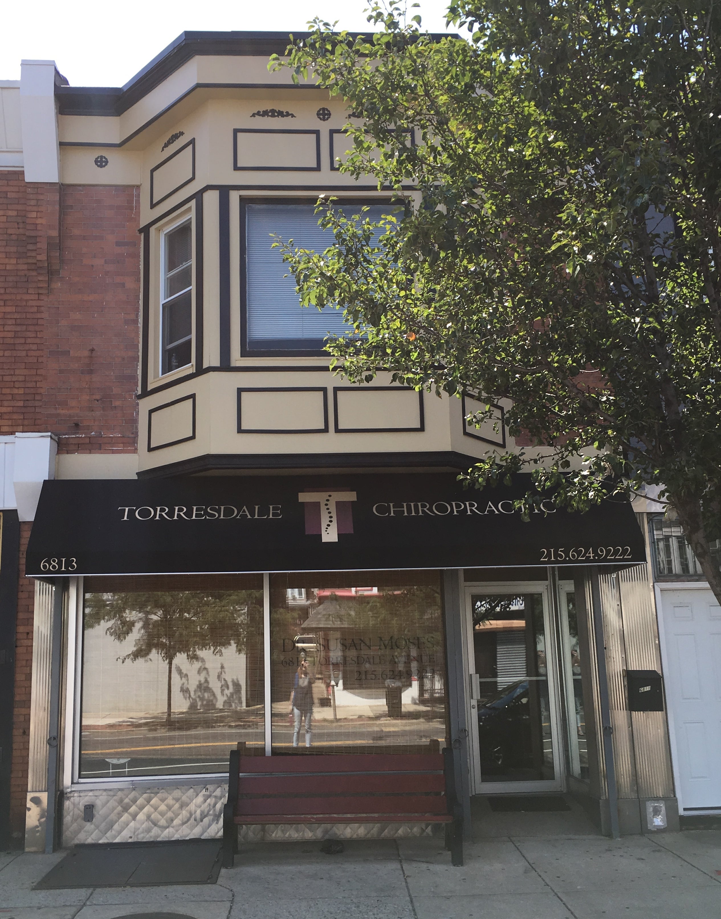
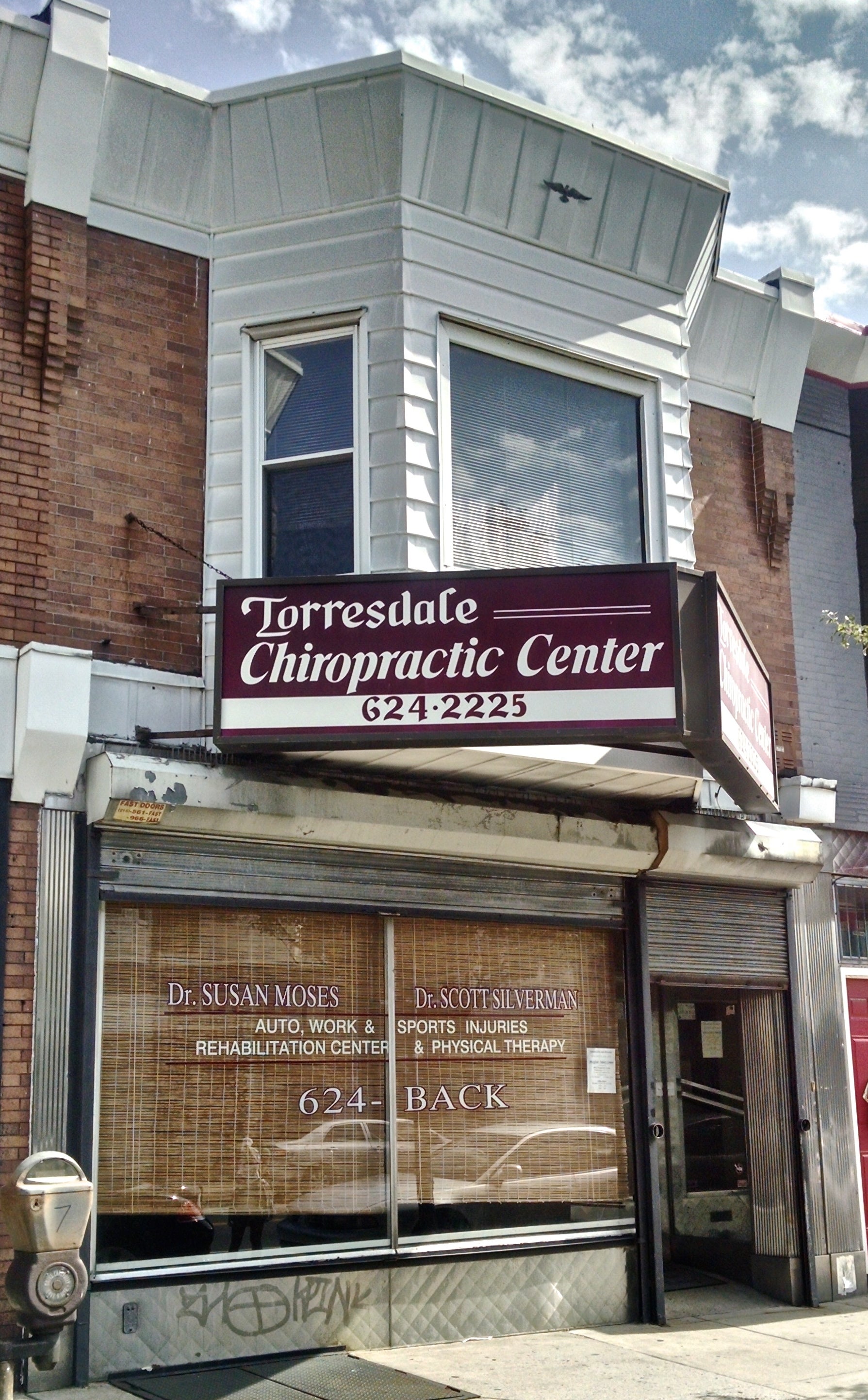
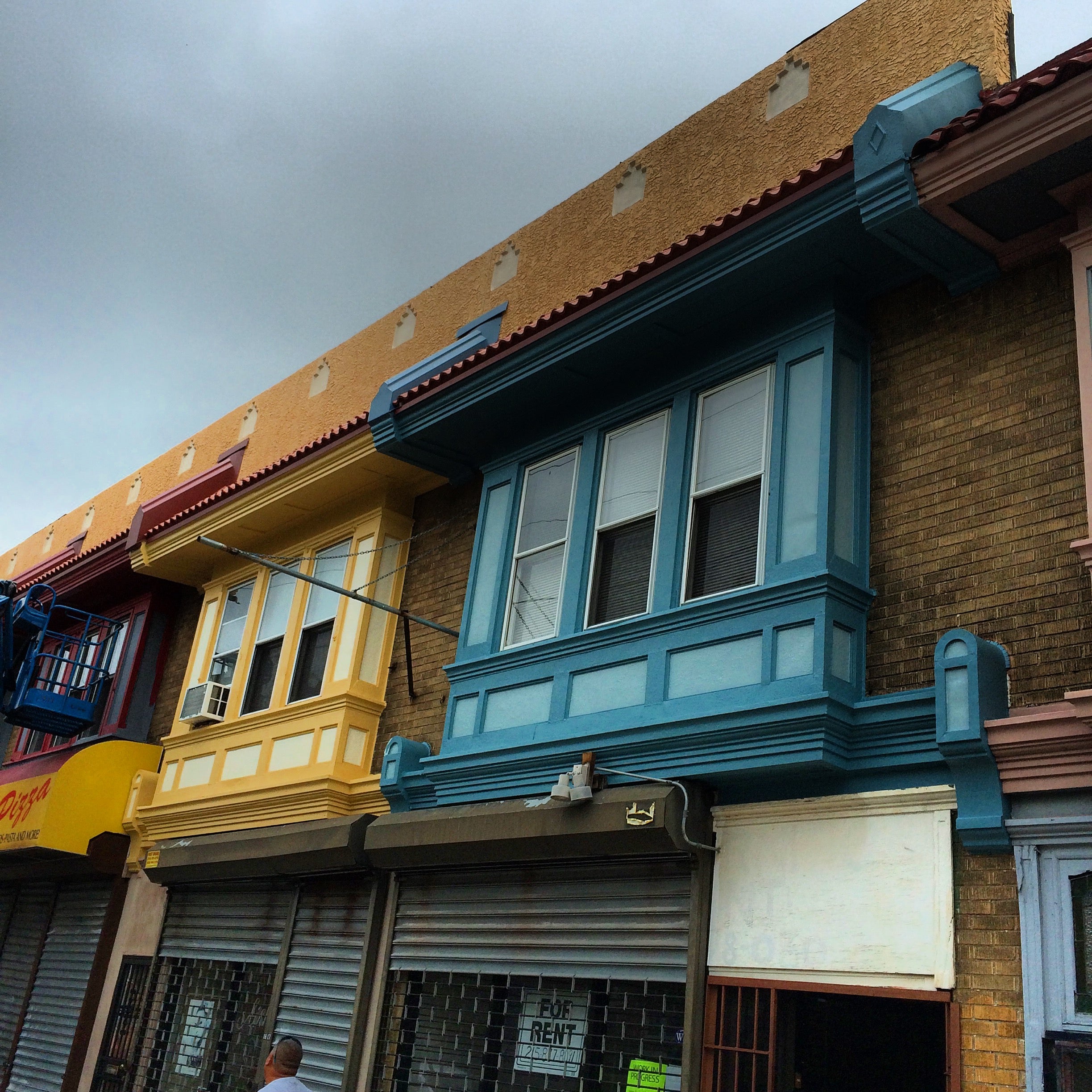
Best Bay: Torresdale Chiropractic (winner) + 54th and Butts Barbershop (finalist)
Winning entry Torresdale Chiropractic (6813 Torresdale Ave.) went back to basics: It stripped the vinyl siding off its second story bay and added traditional details. The work complements the business’ new signage and tidy retro storefront. Finalists were a set of buildings on 54th Street (1815-1823 N. 54th St.) where fresh paint in bold colors draws the eye upward to this attractive row.
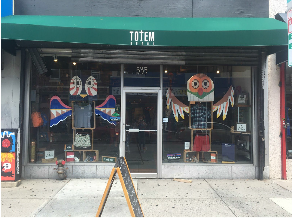
Window Display: Totem Brand (winner) + Common Table (finalist)
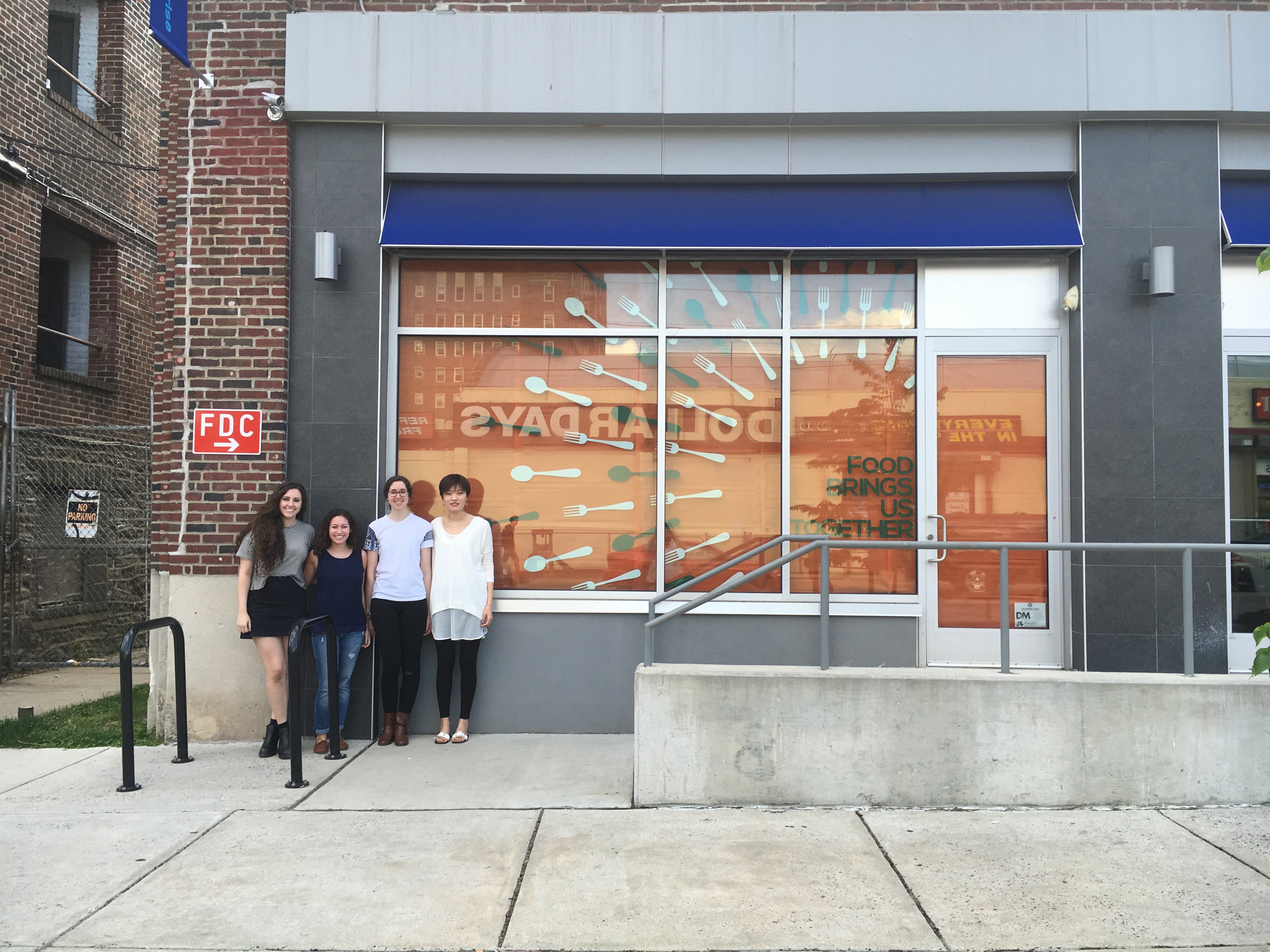
It’s not just what goes on outside a store that makes it come alive, good displays matter too. Students in visual merchandising at Drexel came through with winning and finalist entries. The winning team interpreted the totem concept for Totem Brands (535 South Street) to create a display armature for clothes and accessories. Another group created a display in a vacant storefront out of paper and plastic utensils to advertise Common Table (310 S. 48th St).
Amazing Awnings: Aztec Signs (winner) + Puddin’s Cake Corner (finalist)
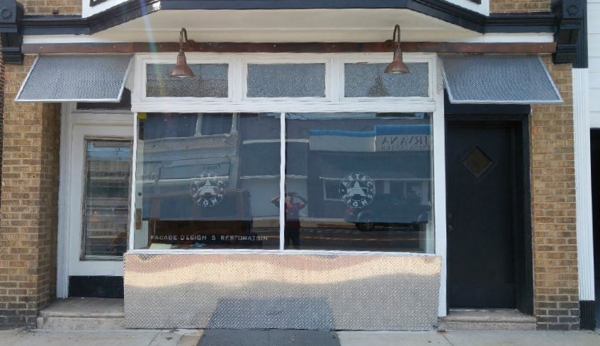
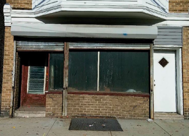
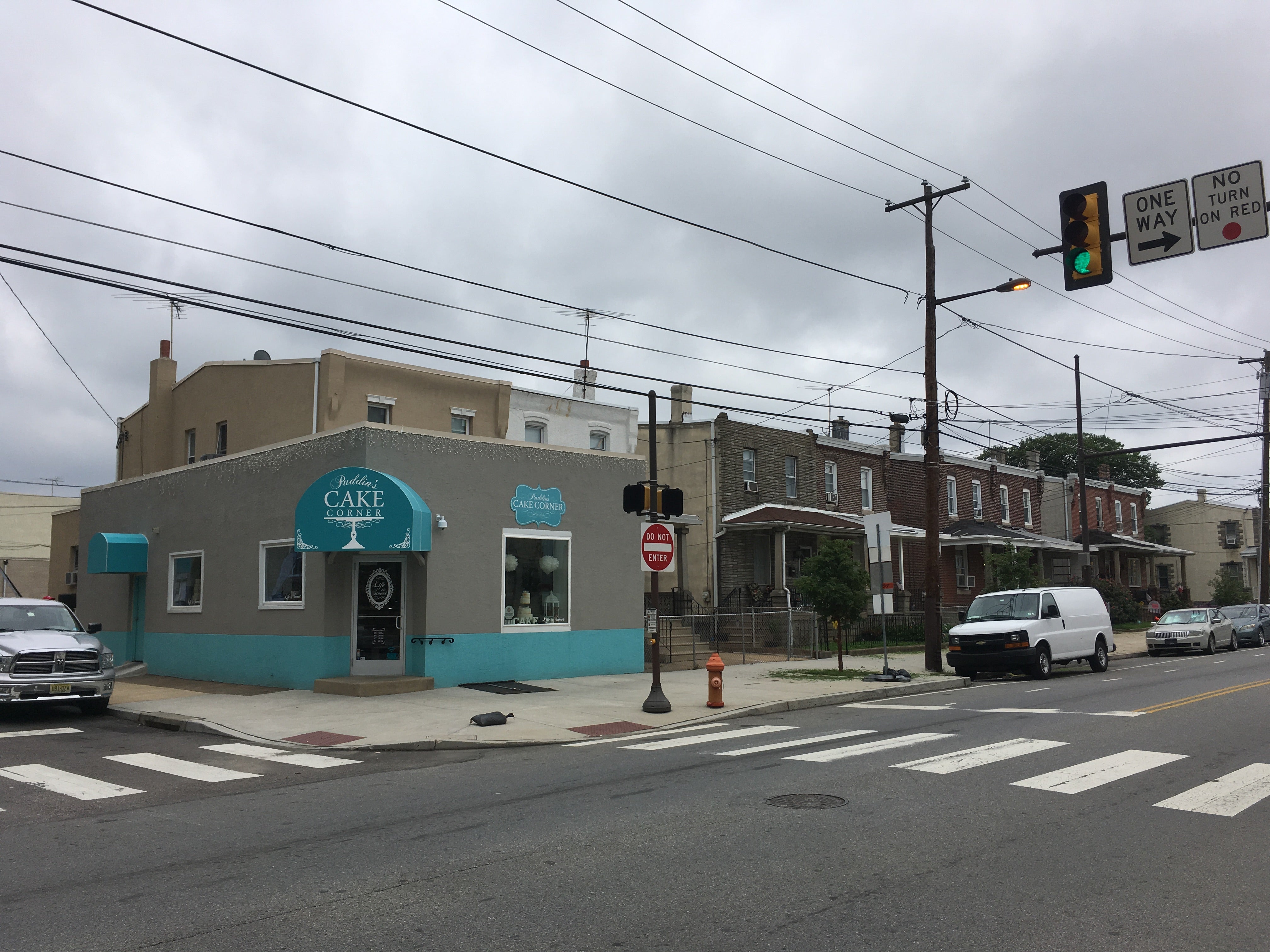
Winning entry Aztec Signs (5816 Torresdale Ave.) creates signage for all kinds of businesses, and now it’s getting into the facade restoration business too. The company expanded to an adjacent storefront and used wire mesh to create an inventive awning for this new space. The finalist was nearby Puddin’s Cake Corner (4814 Princeton Ave.) for its aqua awning, adorned with a cakestand, which contrasts nicely from the gray storefront.
WHYY is your source for fact-based, in-depth journalism and information. As a nonprofit organization, we rely on financial support from readers like you. Please give today.


