SEPTA gets bold with new transit map
New transit maps coming to 100 stations
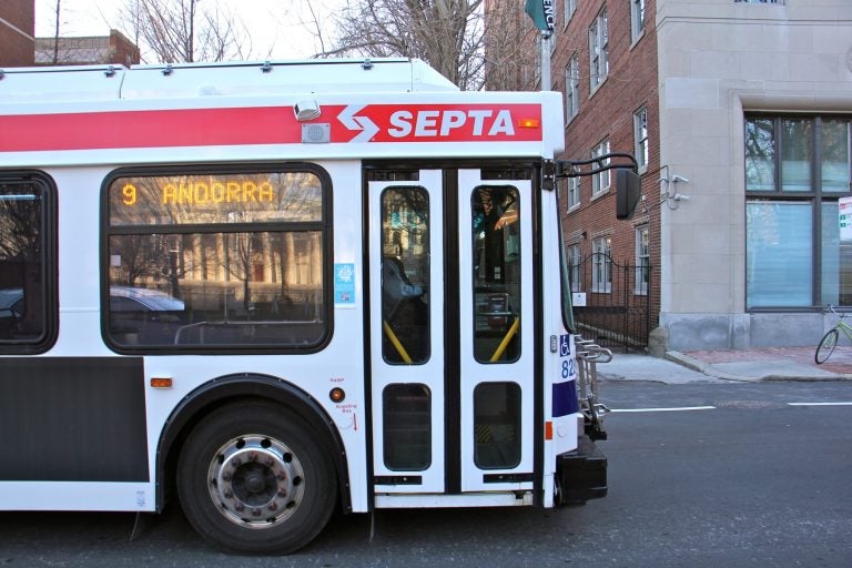
A SEPTA bus travels west on Walnut Street. (Emma Lee/WHYY)
SEPTA wants to add some color to your trip.
The authority is preparing to release a new transit map that combines subway, bus, regional rail — even the PATCO lines — all in one place. It’ll also indicate the frequency of the lines.
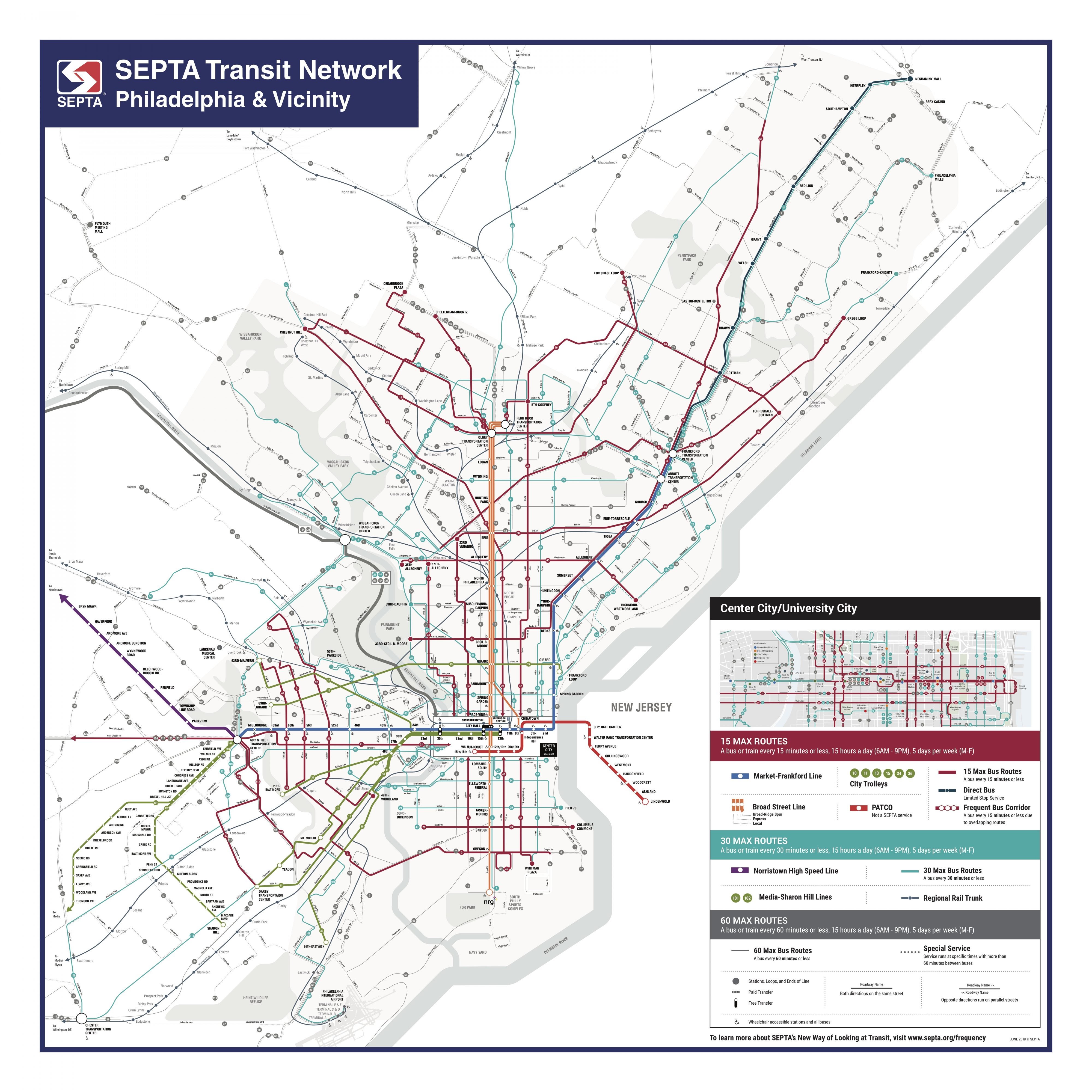
Officials say the goal is to simplify travel planning for riders.
“Our hope, really, is that they are intuitive enough that someone who’s not very familiar with the network can show up and start to figure out how to quickly and efficiently plan a trip on SEPTA,” said Lex Powers, long-range planner for SEPTA.
The new map uses color coding and line weight to indicate frequency throughout the system.
For example, the bus lines that run most frequently — every 15 minutes, 15 hours a day, five days a week — are in bold and colored burgundy. Bus lines that run every 60 minutes, by contrast, are thin and grey.
Riders had a chance to weigh-in on a conceptual version of the new design in February when SEPTA posted a survey for customer feedback.
About 64% of the 1,021 respondents found the new design easy to understand. Fifteen percent confessed that they were still baffled by the routes.
The survey also found 42% of respondents said because of the new design they are likely to use transit more, which is a good sign considering the authority’s sagging numbers in ridership.
Physical schedules color coordinated with the finalized map were released in June.
“We really wanted to make a schedule that was intuitive so that people know the value that these lines provide them,” Powers said.
The new maps should be installed in 100 high-traffic stations by the end of the summer.
SEPTA said it also hopes to publish an interactive online version of the map later in the year.
WHYY is your source for fact-based, in-depth journalism and information. As a nonprofit organization, we rely on financial support from readers like you. Please give today.
