City Hall surroundings need a guiding design vision
“Once you get renewal started it spreads out like a fan and benefits much greater sections of the city…”
Those words, from Mayor Richardson Dilworth in 1959, are etched into the granite at the southwestern entrance to Dilworth Park. More than a theory of urban renewal, Dilworth’s words are a hopeful projection about the impact of Dilworth Park itself.
Or, to hear Center City District’s Paul Levy echo the refrain, “If you start someplace and start raising standards … the ripple effect is real.” That Dilworthian logic is playing out around Center Square as the city and its partners work on ways to up City Hall’s public space game.
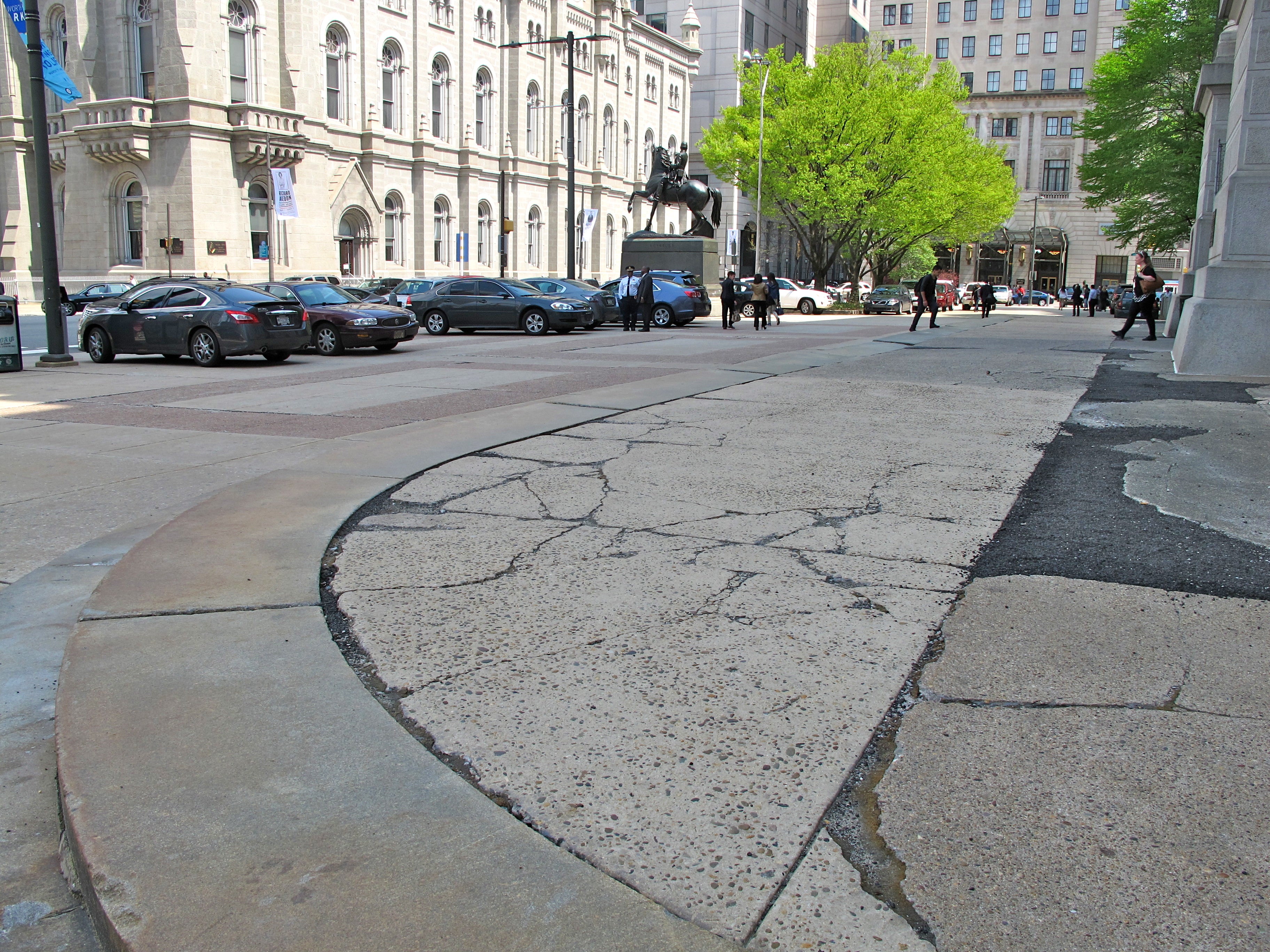
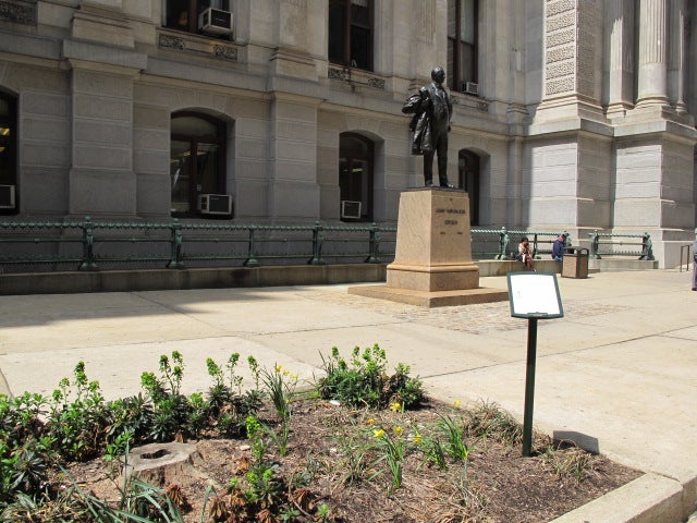
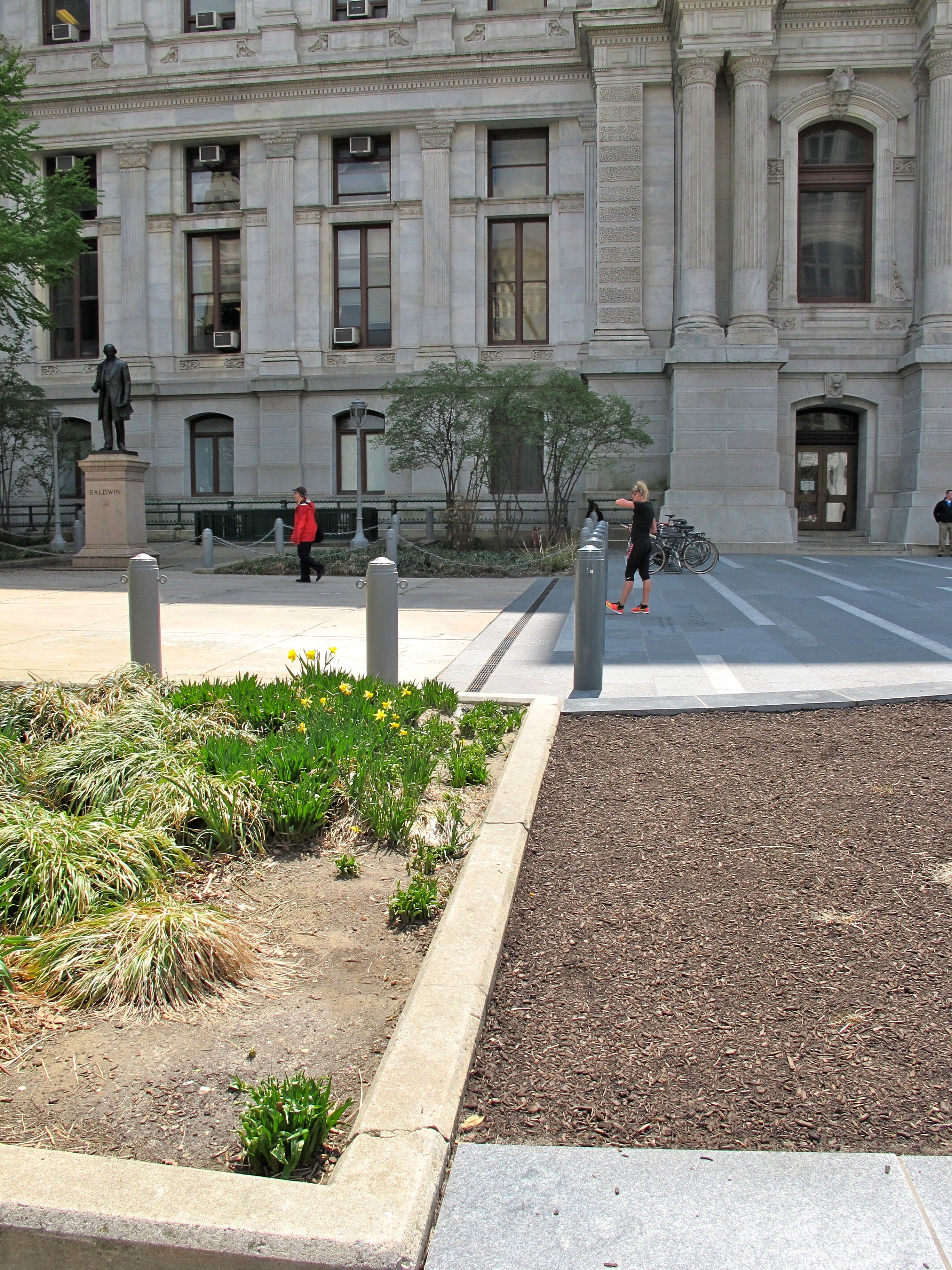
Thanks to a $55 million overhaul led by Center City District, the new Dilworth and its transit entrances create a more active and inviting western edge. Before that, the city spent millions to clean City Hall’s exterior, from William Penn’s hat down to the sidewalk. But City Hall’s other three sides and its courtyard have been left tired and threadbare, comprised of busted concrete, parked cars, forgotten statues, faded paint, scrappy landscaping, cleaving granite steps, and too few pedestrian amenities.
“We were hoping that Dilworth was going to give us some momentum to fix up the exterior of City Hall,” said Public Property Commissioner Bridget Collins-Greenwald, whose department is in charge of maintenance and capital projects for municipal buildings. But the city doesn’t have a Dilworth-sized budget to spend on the rest of City Hall’s environment. So smaller moves to complement the new Dilworth are in the works.
I should say here, I’m biased. I have borderline romantic feelings about City Hall as a building. It’s swoon-worthy public architecture that sweeps you off your feet and doesn’t miss a trick. But City Hall’s public environment falls so short of what the building deserves. From most angles City Hall looks like a wedding cake stuck on a hubcap.
Shouldn’t City Hall’s public realm reflect – or at least respect – the building’s stature?
So far the civic ripples from Dilworth are mostly piecemeal projects – from paving to plantings – to improve the baseline conditions around City Hall. But I fear these efforts are neither strategic nor coordinated enough to add up to the great public environment City Hall deserves.
Much of City Hall’s north apron– derisively known as City Hall Parking Lot – will be resurfaced with a textured concrete starting in May, and the area where parking is permitted will be shrunk. After the Pope passes through in September, a second phase will finish the north apron with green infrastructure, more resurfacing, and a ramp to make the north portal steps ADA accessible. The whole north apron project will cost about $2 million and will be complete before the DNC comes to town next year.
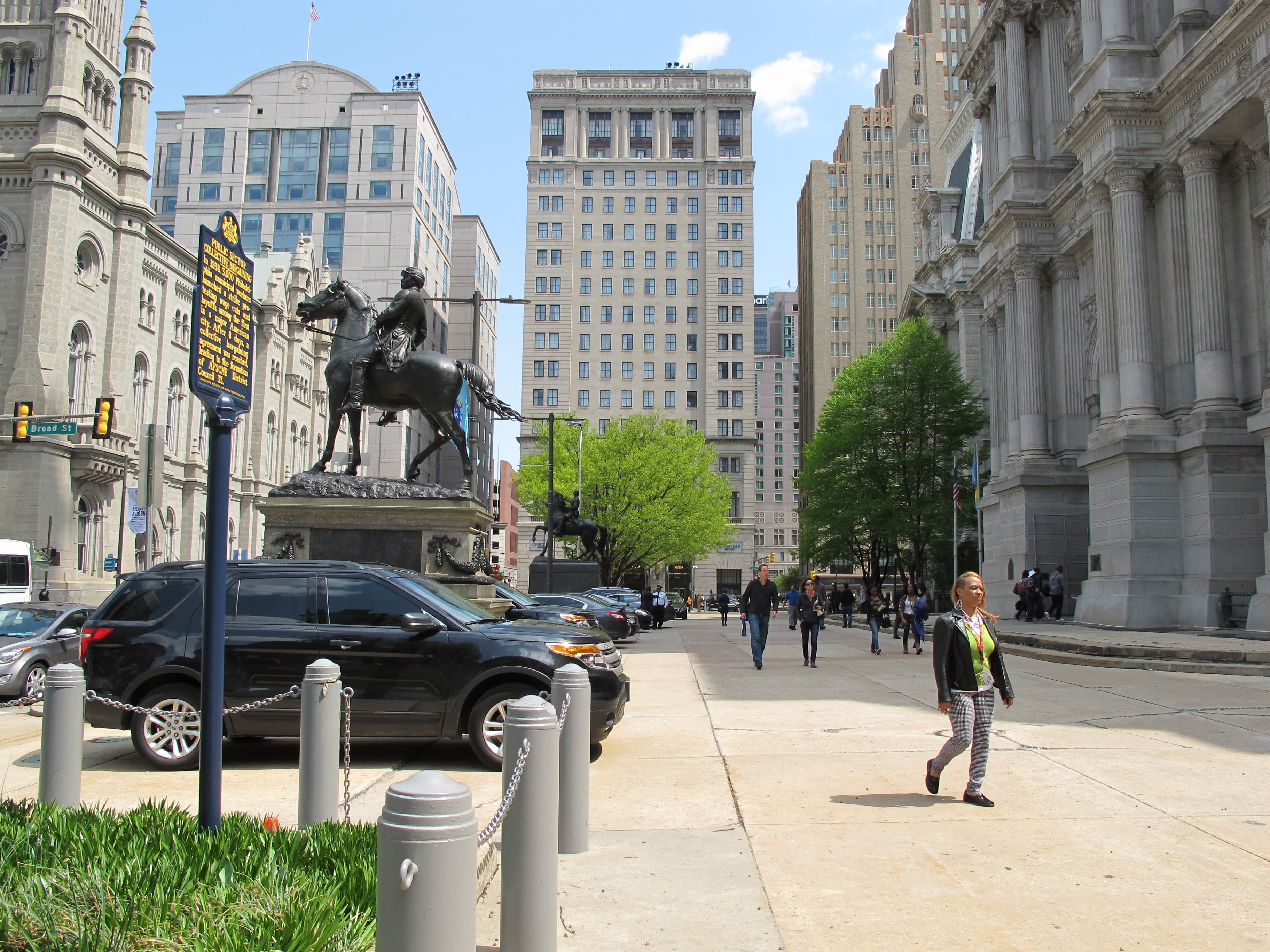
Before phase two Collins-Greenwald said the city would revisit the conversations about parking. No serious conversation about City Hall’s public environment is possible if the city is still going to treat the north apron as a parking lot. What does it say about Philly’s priorities that you must walk through parked cars to get to City Hall’s main public entrance? At best, City Hall Parking Lot is a mixed message, especially as city boosters try to draw people to spend time at Dilworth and in City Hall’s courtyard.
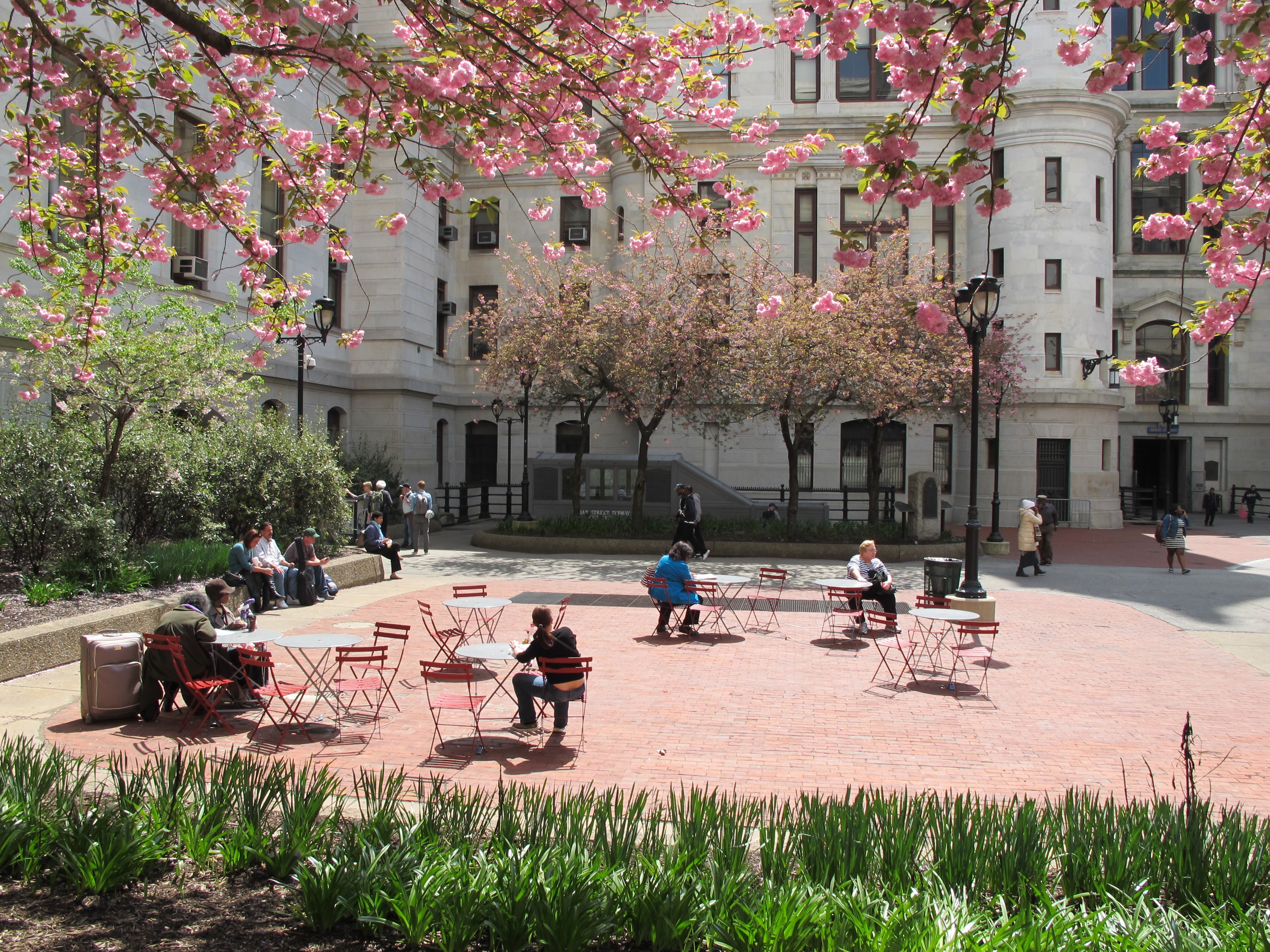
In the courtyard the city has been experimenting with temporary interventions like food trucks to concerts that treat the courtyard as a place instead of a crossroads. Collins-Greenwald said new plantings are on the way to make the courtyard “pop with color” and feel more inviting. Those plantings will join upgrades to the dated landscaping on City Hall’s east, south, and north aprons coming this year.
“If you sit [in the courtyard] and look up you actually see the building and appreciate the great architecture,” said Collins-Greenwald. “I really want to make it more of a destination, not just a pass through.”
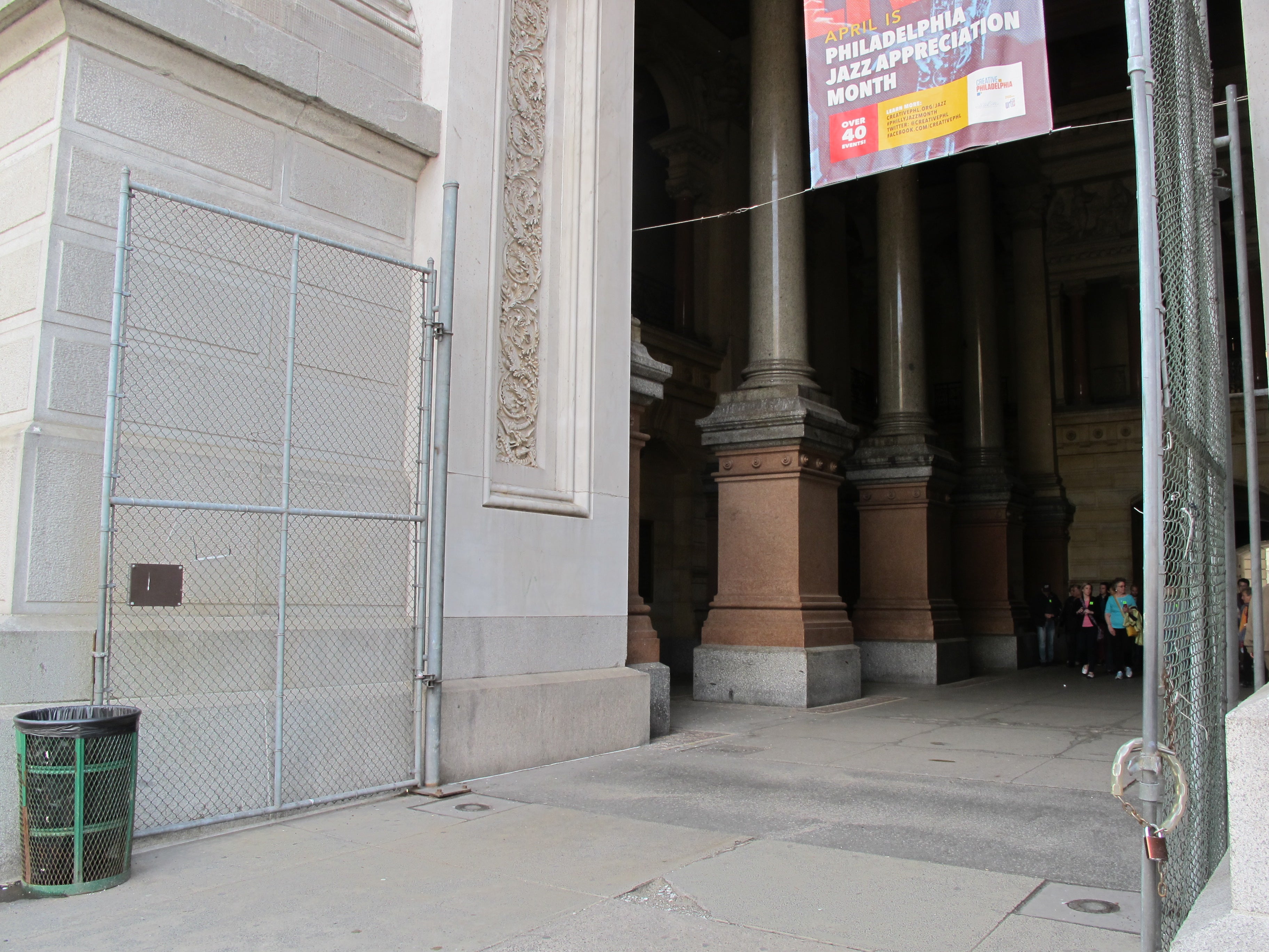
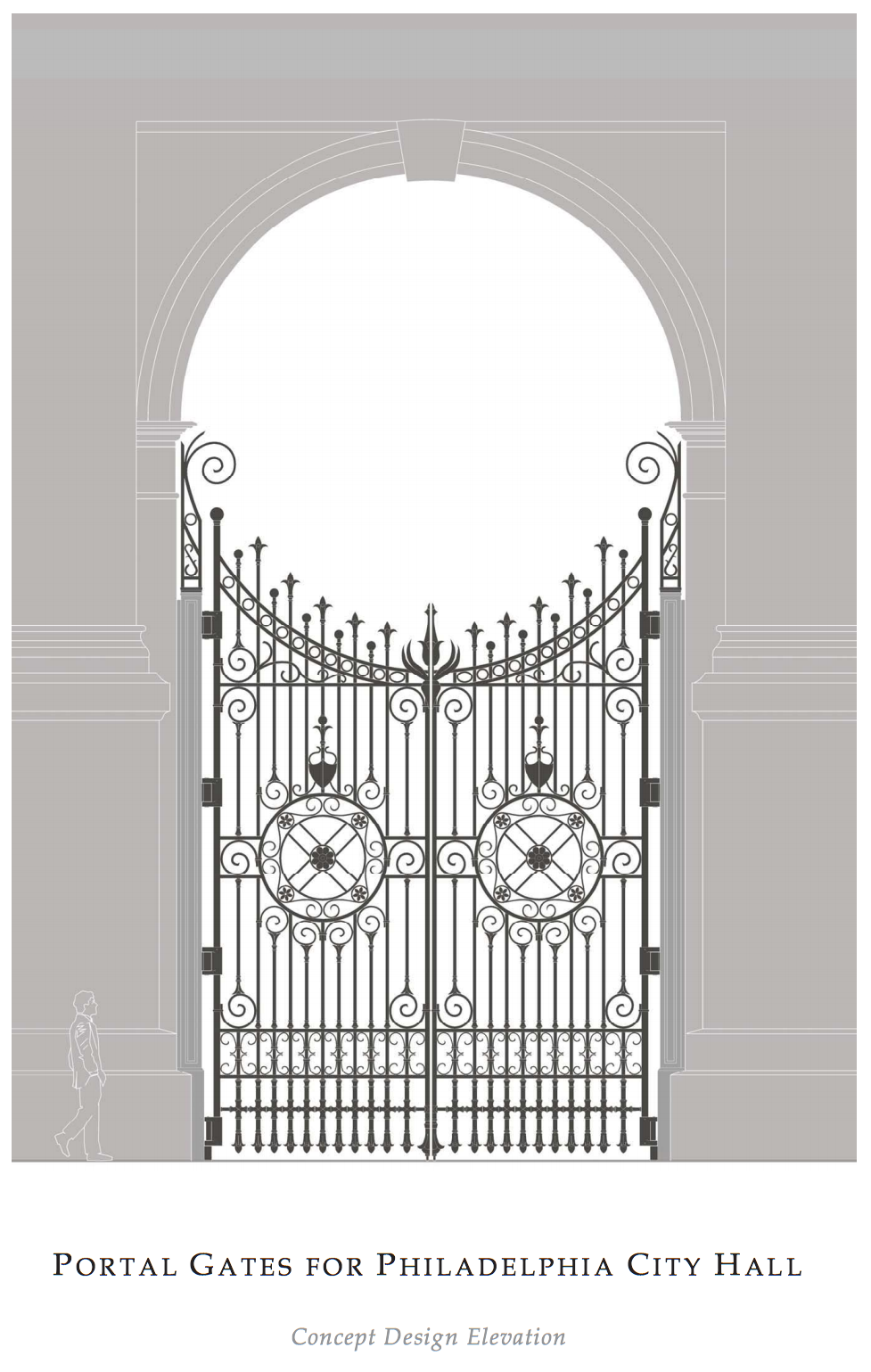
Passing through, however, is about to look a lot more polished. The city is making plans to install spectacular metal gates for the four portals, which were designed by City Hall’s architect John McArthur but left unbuilt. Plans to add these gates were originally floated 15 years ago, but were just recently resurrected and approved. The gates, expected to cost $1.5 million, will replace the long-present “temporary” chain link gates that secure the courtyard at night. Collins-Greenwald notes this is one of the Nutter administration’s attempts to leave the building better than they found it.
All of this is good news, but I wonder if these disparate parts will add up to an attractive whole? Will City Hall’s public environment flow together cohesively or will it read as a newer version of the same old civic jumble?
“I’m happy with the incremental changes that we are making,” said Collins-Greenwald.
Incrementalism works when the overall goal is clear, so what are the public design goals for City Hall’s surroundings? Design concepts floated years ago by the city and Center City District envision knitting together gaps in the pedestrian landscape. But no one has mapped out how that will be achieved, nor expressed design solutions that play off of the new Dilworth. If incremental change is all we can afford, shouldn’t we be thinking about the power of small investments that add up to a unified whole?
“It’s worth asking some broad questions about how [these changes] all fit together,” Levy acknowledged. But he encourages patience and realism. It’s important, he argues, to “recognize that there are going to be limited resources for these things and therefore we need to think strategically about them.”
That’s an argument for planning if I’ve ever heard one.
Investing even a moderate amount to upgrade City Hall’s surroundings may be politically unpalatable for the next mayor. But with the DNC coming to Philly next year the time is right to advance a broader public conversation about City Hall’s environment and its connectivity to nearby sites like the Convention Center. Moreover, a plan to guide investment at City Hall would be good political cover here, allowing for more phased and strategic improvements as funds becomes available. Will any of the mayoral hopefuls adopt this idea?
Change at City Hall is about playing the long game, so a design framework would also help rationalize what changes are and are not desirable. It could guide baseline investments like cohesive landscaping and public furniture that knit Dilworth back into the site. To that end there are glimmers of collaborative possibility. Center City District and the city are working together on the gates project, as well as planters to accent the gates and also harmonize with Dilworth’s design elements.
While the Historical and Art commissions must approve alterations to City Hall, their decisions aren’t weighed against any independent framework for what we as a city think belongs at City Hall and what doesn’t – from stormwater management tools to new monuments.
Design principles could also guide how the north, east, and south aprons are made into more welcoming pedestrian environments. The statues of Baldwin and Bullitt, McKinley and Wanamaker that ring City Hall like silent sentinels, but imagine these drawn into a more contemporary public space conversation as anchors for new micro-parks. Over at Sister Cities Park two old statues were given new relevance through a design by Studio Bryan Hanes that invited them into dialogue with new park features.
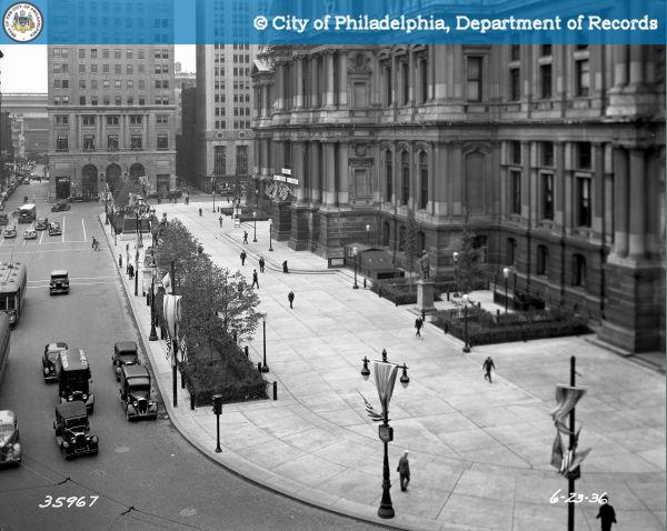
The shortcomings of City Hall’s public realm aren’t new. It’s more that our expectations for public spaces have changed.
Eighty years ago Philadelphians were having similar conversations about improvement as the exterior of City Hall was cleaned top to bottom and its landscaping improved during the depths of the Great Depression. As the Federal Writer’s Project 1937 Guide to Philadelphia explained: “Bare plots in the corners of the courtyard were gradually given the appearance of heavily wooded miniature parks … A compass in the center of the courtyard acts as a guide to pedestrians emerging from the subway.” Sound familiar?
Now that Center Square is on an upswing after years spent as a defensive landscape to avoid, it feels like the time is right to ask what we want out of that space and plan for its future.
How should we make room for people to enjoy City Hall’s surroundings? What kind of environment do we want to foster? We may sense the answers to these questions, but I don’t hear a clear plan.
It is not enough to hope that incremental projects will add up to a great public space. Every dime spent should count toward a clear vision that no one has bothered seriously articulating yet.
WHYY is your source for fact-based, in-depth journalism and information. As a nonprofit organization, we rely on financial support from readers like you. Please give today.


