Building for Discovery
The Discovery Center, a new kind of environmental and leadership education center opening this month, is unlike anything else in Fairmount Park.
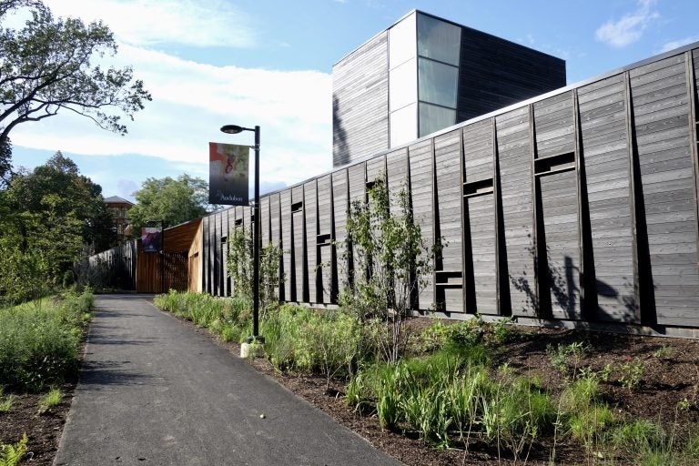
The Discovery Center (Ashley Hahn/PlanPhilly)
This story originally appeared on PlanPhilly.
—
The Discovery Center, a new kind of environmental and leadership education center opening this month, is unlike anything else in Fairmount Park. Ashley Hahn took a deep dive into the center’s backstory earlier this week and now takes a closer look at its design.
The Discovery Center, which opened at Strawberry Mansion Reservoir in East Fairmount Park on September 28, is a decidedly urban environmental center. It’s not some hefty timber structure you’d find in a state park. It is clad, moodily, in almost all-black. It’s got crisp lines. It is wholly unlike anything else in Strawberry Mansion or Fairmount Park.
Designed by the Philadelphia-based firm Digsau, the Discovery Center is a joint venture of Audubon Pennsylvania and Philadelphia Outward Bound School. It stands at the edge of a long locked-away 37-acre lake, a 130-year old piece of the city’s water system that was decommissioned in the early 1970s. Since then, it went from being a popular draw for near-neighbors, to an accidental wildlife sanctuary for native and migratory birds. In the Discovery Center the partners managed, on an $11 million construction budget, to deliver a dramatic architectural statement in support of an ambitious program.
“Building in the context of one of America’s great urban parks is a significant act,” said Jules Dingle, principal of Digsau. Gesturing toward the reservoir, he adds, “It’s about celebrating this, and what two great organizations are going to do with it. The intent was to do it pretty quietly.”
It is quiet in the way an entrance to the Batcave might try to hide in plain sight.
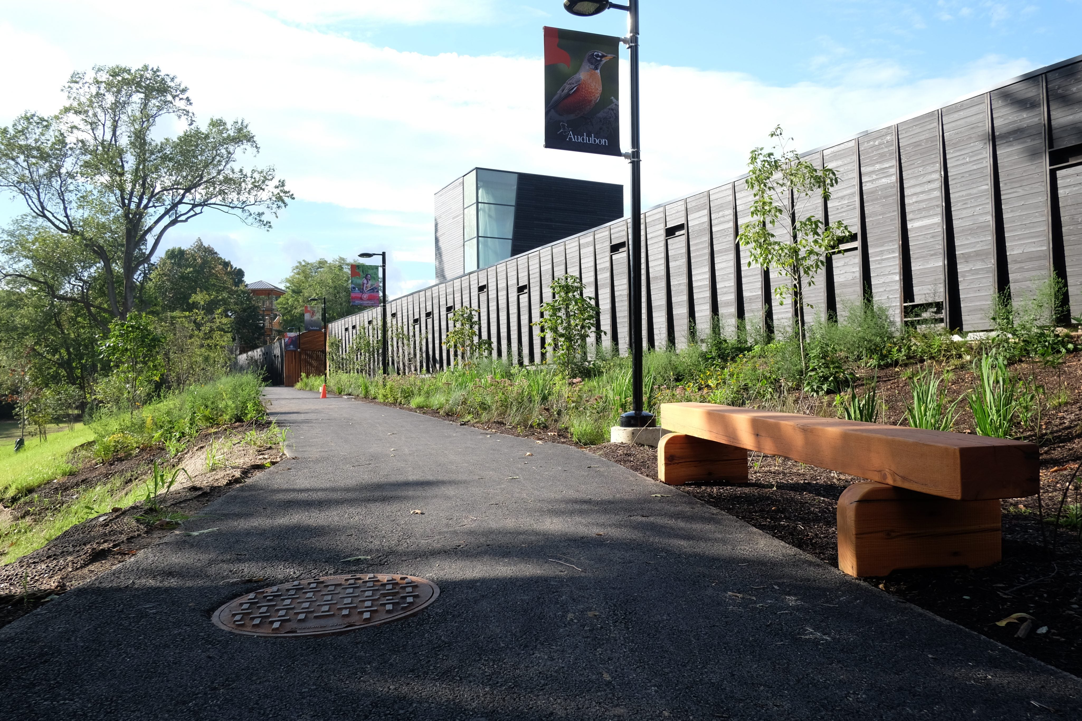
The primary street façade is a fortress-like 460-foot long wall, presenting a nearly windowless expanse to the street below, varying in height from 2 to 12 feet tall in order to hug an uneven depression carved out of the hilltop. It’s so opaque and solid that you’d be forgiven for thinking it was all wall and no building, but for a glass and wood box that extends up from behind the front wall, signaling that there’s something else back there. That message is reinforced by the sense that amid all of these woods, there’s a clearing behind that wall, where the sky feels more open.
To crack the Discovery Center’s mystery, you have to take the long way up. The design team, led by Digsau and landscape firm Ground Reconsidered, used the walk uphill to the building to build up a moment of transition and suspense. It took me 250 steps to walk up the newly planted path from its parking lot to the entry. For many neighbors I spoke to that feels like a long, slow hike, built in part to ensure the site would be accessible for individuals in wheelchairs. It gets you to focus on wondering what treasures might be waiting behind this huge wall.
“We thought this was way too powerful of a landscape to make a building that was about itself, and that it really should take more clues from the landscape of Fairmount Park,” Dingle said. Its long front wall, for example, isn’t so different from the straight-as-an-arrow eastern bank of the manmade reservoir. Rather than designing a self-centered object, Dingle said, they wanted the building to feel rooted in place.
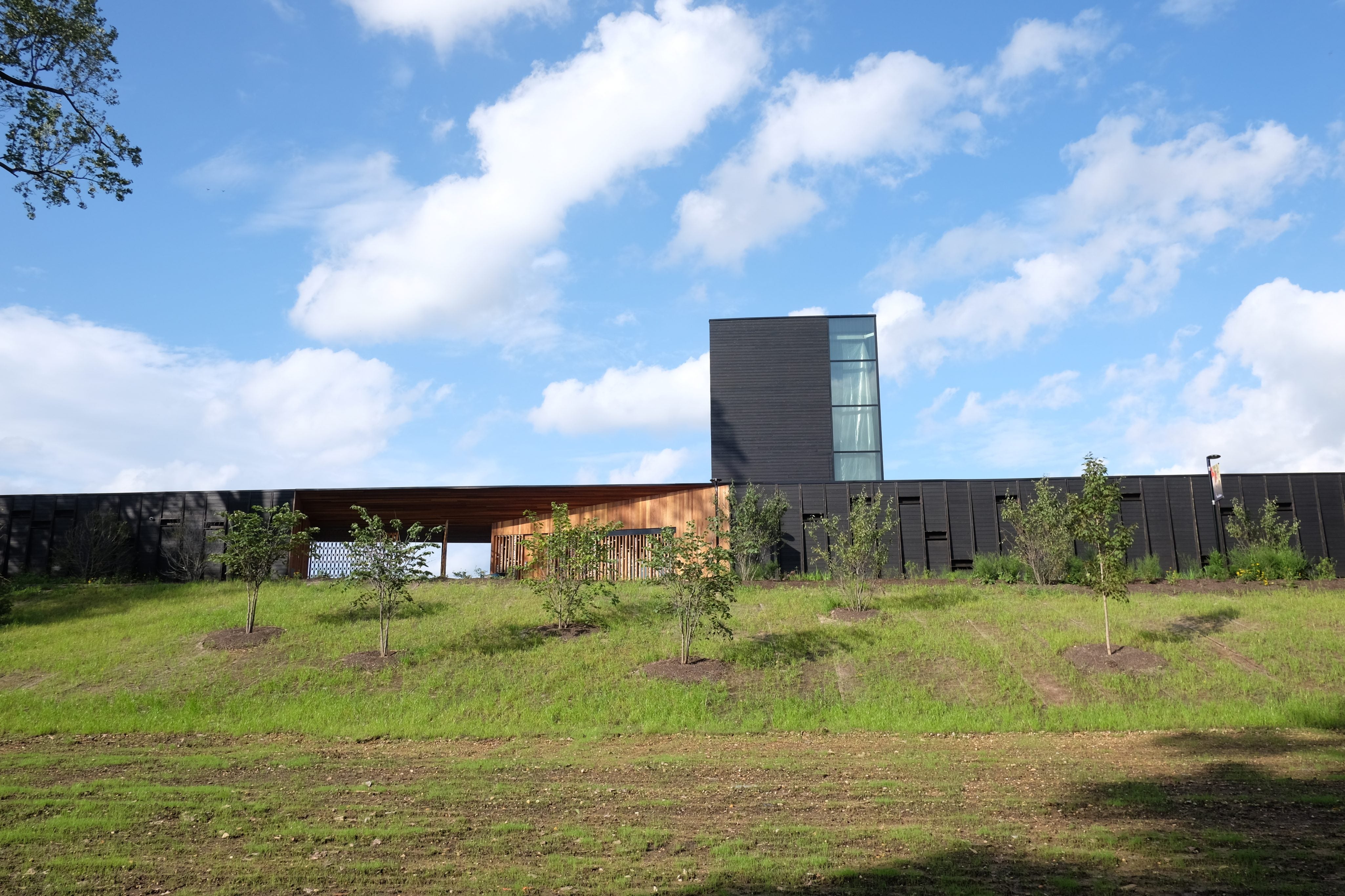
Facing the street, the building looks as earthbound as a dam – solidly grounded in the berm surrounding the reservoir. But the wall overlooking the reservoir is full of windows, oriented to create beautiful and ever-shifting- views of the site’s biggest asset. Seen from the trail around the reservoir, the building recedes into its park setting almost disappearing, but for the glint of glass.
The long street-side wall itself is made up of 168 blackened cypress panels, each comprised of broad boards set into frames that repeat like fins, adding shadow lines and a bit of depth to the wall’s otherwise monolithic expanse. It is varied only by shelves inset at various heights, hoping to invite birds to nest there. It is interrupted only around the building’s entrance, where a set of narrow windows and a wide opening are set back and framed by panels made from slender cedar planks.
The building’s design is all about these kinds of dualities, reflected in spaces to serve Outward Bound and Audubon and its design choices – playing with fire and water, lightness and weight, translucence and opacity. They make this building’s simple form feel more interesting.
The blackened cypress stands in sharp contrast to the warm-toned cedar panels that angle down and in to accentuate the center’s entrance. Where the cedar is smooth and coated with a clear, glossy finish, the cypress cladding has been finished using a Japanese wood preservation technique, shou sugi ban, that involves charring the wood to seal and preserve it. It helps make the wood more disease and insect resistant, serves as a fireproofing, and may even woodpecker-proof the building. Because it was done by the Challenge Program, which teaches at-risk youth construction skills, it was also a budget-friendly option that complemented the center’s educational emphasis.
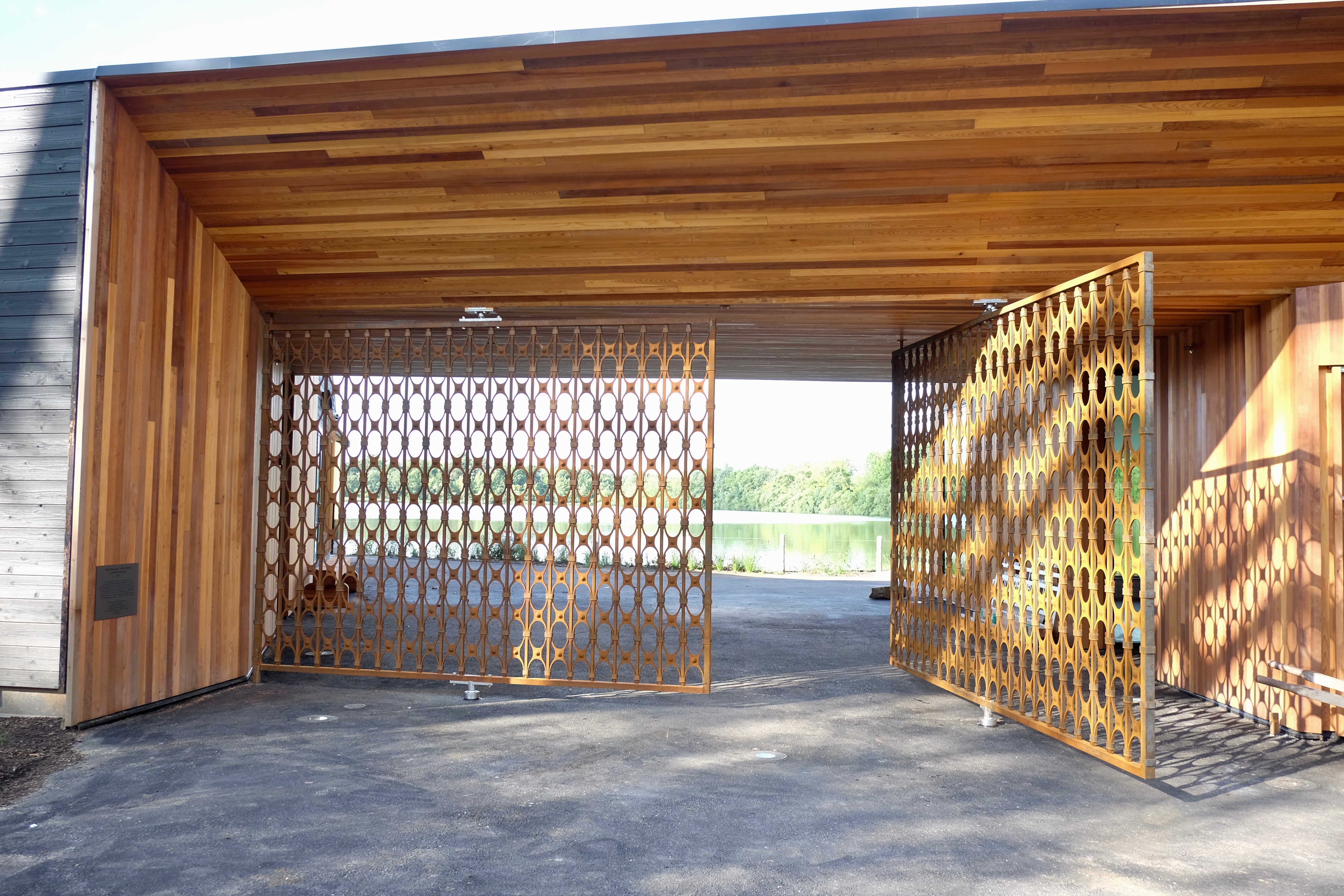
As you walk into the center, the entry’s ceiling height drops – a classic architectural play to make the revelation of more open space feel bigger than it might actually be. The passage’s compression beautifully sets up the Discovery Center’s dramatic reveal of the water beyond its walls – a surprise and delight to behold. Walk through forged metal gates and the deep threshold into a courtyard, set between the building’s two halves, and you see the reservoir and woods around the water. This view will be new for many visitors, but it’s an experience Strawberry Mansion residents have missed since the reservoir was sealed off nearly 50 years ago.
It’s tempting, these days especially, to think of a beefy wall like this as something that divides “us” and “them.” But the Discovery Center’s wall feels like it’s more about enclosure than exclusion, more about embracing a special space than about defensive architecture. It also illustrates the center’s promise – a sense of discovery.
The nearly opaque façade led one attendee at a public meeting this summer to confess that he had wondered if it was some “secret prison.” (He left hoping to bring the scouting troop he leads to the center.) Any lingering sense that the Discovery Center is foreboding may prove challenging given that neighborhood leaders have worried how welcome residents would feel going the Discovery Center. But the experience of the reservoir belongs to everyone, and the nonprofits who built it are eager to share it with the public.
“While it would have been cheaper to push these two buildings together and enter through the lobby, building something like this on public land, the gesture of public access was incredibly important,” Dingle said. “When you cross the threshold into a place that you don’t know about, to a lot of people that says ‘I’m not welcome.’ Instead, you have a big open door and it’s saying a deliberate message, that this is a place for everybody.”
When the building is closed, visitors will be able to see the water through the rust-hued metal gates, made by Philadelphia artisan Warren Holzman. Here again, the designers are using a material shaped by fire at a site defined by the experience of water. Heavy, but not imposing, the gates convey a sense of protection. They are the project’s percent for art requirement, put to work; For a building that has few flourishes, the gates are a grace note.
Off the building’s northeastern corner, overlooking the water, a tall glass and wood room reaches skyward, where Outward Bound’s rock climbing towers will be installed. A trapezoidal floor-to-ceiling window is carved out of the northwest corner of this room, framing a view of the lake and woods that widens as climbers will ascend. Windows hug the high tower’s southeastern corner as well, balancing the room and giving a contemplative glimpse of sky and clouds. They are there, it feels, simply to remind you that there’s a big beautiful world to explore.
The building’s western side has a big multi-purpose room designed to accommodate classes or community gatherings, and the building’s kitchen. The eastern side has an interpretive gallery about the site and region’s ecology, a small conference room, and space for both nonprofits’ staff offices.
The center has very simple interior finishes – walls painted soft blue, concrete floors, plain doors and fixtures. It has few fancy touches, and even these are functional bird-friendly features.
Some windows are etched glass, while others will have bird cords hanging inside to discourage bird strikes. The long exterior wall’s panels have nesting shelves built in at varying heights. Even the spacing of the iron gates’ repeating pattern and the lettering on the wood donor wall outside the façade’s only windows, are designed to be small enough that they help dissuade birds from trying to fly through. In that way, the building itself is also a kind of teaching tool.
Building anything new in Fairmount Park is thankfully rare, due to the city’s 2011 Open Lands Protection Ordinance. To do so, a project must survive a public review process and demonstrate through robust analyses that giving up any public parkland must truly be in the public’s interest. And when new buildings like the Discovery Center are built in our parks, it’s only fitting that we hold them to a higher standard for public design. They must be built to last. They should be aspirational, aiming to connect the public to public aseets in new ways, and honor their place in the park. By these measures, the Discovery Center gets many things right.
WHYY is your source for fact-based, in-depth journalism and information. As a nonprofit organization, we rely on financial support from readers like you. Please give today.


