

How emotions, ideas and senses influence our color perception
Listen

Kevin Connolly
In the 1950s, the DuPont chemical company, based in Delaware, came out with a product that might have made the biggest impact on how you live in your home: acrylic paint, in every color of the rainbow.
Oil paint required a crew of professionals, took forever to dry, and often contained lead. But acrylic paints were quick-dry: you could do it yourself in a day and change the color of your home whenever and however you wanted.
Access to color bolstered the idea of color psychology – the idea that color affects your behavior and mood. Red is aggressive, blue is calming, yellow is creative, green is restorative, etc. It is based in part on color investigations by the mid-century artist Josef Albers, a professor at Bauhaus and later at Yale University, then solidified in 1980 by the pop-culture bestseller “Color Me Beautiful,” a personal color analysis system that categorized people as seasons.
It’s still not clear why certain colors affect us in certain ways.
At 13th and Spring Garden streets in Philadelphia, is a casual, wood-fired pizza restaurant where there had been a long-closed Chinese take-out. It’s called Bufad, which is Italian slang for glutton. The glass of its front door is etched with the image of a crossed-armed man with a handlebar moustache, covered in tattoos.
Inside, the dimmed light fixtures warmly diffuse light against the restaurant’s lead-colored walls. The motif of rough wood planks carries from the exterior into the interior, which matches the faded brick walls. The exposed concrete floor still retains residual red from the original Chinese restaurant’s linoleum. The tables are held up by steel I-beam painted a bright red.
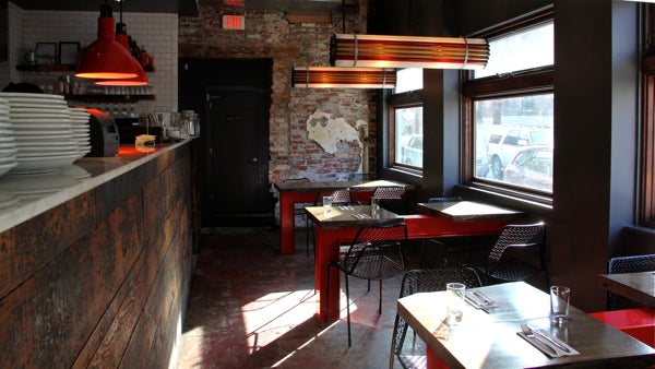 Bufad restaurant at 13th and Spring Garden streets. (Emma Lee/WHYY)
“It’s warm,” said Eve Quellman, an architectural lighting designer hired to make Bufad feel more inviting. “Lots of warm colors, and cool colors. There’s a balance.”
Quellman needed to blend the dark walls with the bright red and the rustic wood. The colors are reacting to each other, not channeling a prescribed emotion to the guests.
“People put those ideas on color. There’s historical references and cultural experience,” said Quellman. “I think you can use any color, anywhere. It has more to do with harmony – how color works together.”
The hard part about assigning certain emotions to certain colors is that color never exists on its own. It always appears with other colors around it. It’s hard – impossible, really – to isolate a color as an emotional trigger.
But scientists try. And they use M&Ms.
I poured out a pound of M&Ms on the desk of Kevin Connolly, a researcher at the University of Pennsylvania studying the senses.
Scientists have done studies where they give people different colored candies and ask if they taste differently. Even though the people eat the same candy, Connolly says people imagine different colors taste different. Red might taste sweeter, yellow might have hints of lemon citrus, green might remind you of mint. If those visual expectations are thwarted, the candy could taste bad to you.
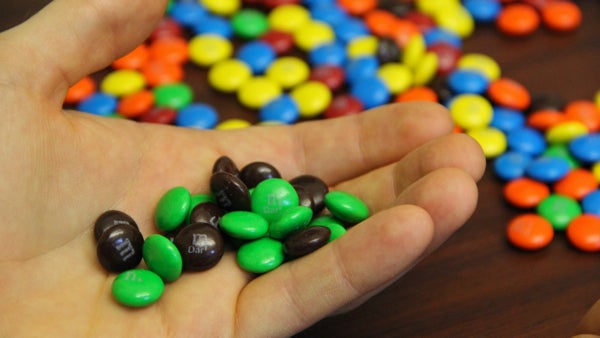 Researcher Kevin Conolly holds a handfull of M&Ms. (Emma Lee/WHYY)
“I have this green candy here, and I taste it,” said Connolly picking an M&M off his desk and chewing it. “If I didn’t know anything about M&Ms I might be shocked because it’s chocolatey, rather than mint flavored, which is what you might expect from a green-colored candy.”
What this experiment means to Connolly is that your sense of color is deeply integrated with your other senses. You never perceive pure color. Your brain is constantly filtering it through your sense of taste, touch, smell, and – most importantly – your memories.
The human eye is actually really bad at perceiving color. Your eyeball evolved mainly to see spatial relationships – like, how close is that tiger to me? Or, how can I maneuver myself to procreate with that person over there?
Mohan Mathan, a philosopher of perception at the University of Toronto, says very little space in your eye is devoted to receiving wavelengths of color. Your brain has to fill in the gaps.
“When color is processed by the brain, a lot of information has to be extracted from not very much incoming information,” said Mathan. “The color that we perceive doesn’t correspond – at all – with the colors that are in the world.”
So if you see red and react with alarm, or see brown and expect chocolate, what are you reacting to? Because your eye is a poor receptor of color, you are likely reacting to your own brain, and not the world around you.
Nevertheless, studies show people across cultures tend to react to certain colors in somewhat consistent ways.
“It’s certainly true that people have reaction to particular colors, but there is not a particular ‘why’ to that reaction,” said Mathan, who thinks those connections are, evolutionarily speaking, accidental. “It just happens to be wired up that way.”
Because color contains very little practical information about how to navigate the world, your ability to perceive it is almost purely aesthetic. Perhaps the reason to paint your bedroom blue is not because you want it to be calming, but because you like blue.
WHYY is your source for fact-based, in-depth journalism and information. As a nonprofit organization, we rely on financial support from readers like you. Please give today.
Brought to you by The Pulse
