Sculptor Sarah Sze brings exploration of landscapes to Philly
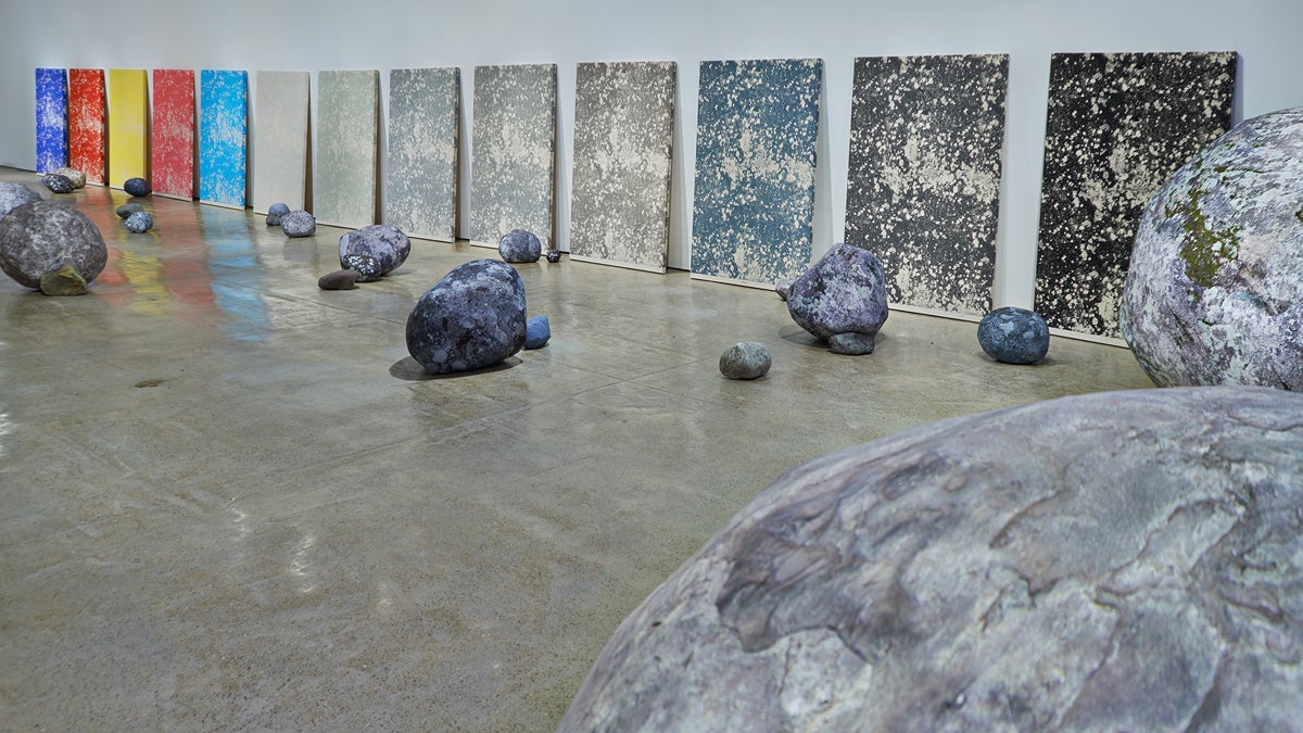
Sarah Sze at The Fabric Workshop and Museum (installation view, second floor), 2013. Mixed media. Dimensions variable. In collaboration with The Fabric Workshop and Museum, Philadelphia. (Photo: Tom Powel Imaging. Courtesy of the artist)
The Fabric Workshop and Museum in Philadelphia is showing work by Sarah Sze, the artist who just represented the United States at the 2013 Venice Biennale.
New York-based Sze had been chosen to display her installations at one of the most prestigious art events in the world. In her first exhibition since the international expo closed in November, “Sarah Sze at the Fabric Workshop and Museum” (until April 6), she explores landscapes natural, man-made, and imagined.
On the first floor of the the Fabric Workshop and Museum, Sze arranged a reception desk that looks remarkably like the museum’s reception desk; in fact, it is.
The next room has a replica of that desk built out of hundreds of small wire cubes, draped with broken pieces of clay, potted plants, a roll of adhesive tape, and a clipboard dripping with macrame. This is a workspace, exploded.
“How do you represent a landscape?” said Sze. “That’s an interest in how you locate yourself in the world. Those things come together.”
Sze took over all three galleries at the venue with three different installations — each taking a different approach to man-made objects versus natural, order versus chaos, and the warping of perception.
The second floor resembles a rockslide. Sze constructed large boulders out of wooden armature wrapped in Tyvek, the sturdy cloth used in building construction, which have been printed with images of lichen, the hardy fungus that slowly breaks down rocks. The rocks, some fist-sized and some car-sized, are arranged randomly around the large gallery space.
Sze got the idea of fabricating rocks that appear to be natural, but in fact are not, during her stay in Venice for the Biennale.
“Venice is basically a landfill. It’s not a natural landscape,” said Sze. “The effort to bring a rock there was not to make a Japanese landscape with natural rock. It was used to build a building. So all the stones of Venice, as [John] Ruskin noted, have the importance of holding up human-made life.”
The eighth-floor gallery holds an array of dozens of New York Times front pages from the last few months. Each photo in the newspaper layout has been cut out. The remaining empty space is a window onto a large nature photograph placed underneath. Instead of seeing politicians, war, and industry, you see the rippling surface of water, eroded walls of canyons, and outer space.
Most people orient themselves in the passage of time via events of the day, whether through breaking tweets, Facebook photos, or newspaper headlines. Sze wants to complicate that by replacing daily newspaper photography with timeless images of nature.
“When that happened — when I started using landscapes that are vast and they erase your sense of location — it does that thing: it creates a hum of information where you usually hear a cacophony,” said Sze.
The natural images have a calming effect on the newspapers, seeming to absorb the shouting headlines they accompany. At the same time, the staggered grid of newspapers on the floor are held down with desk lamps, power cords, and paperweights, returning the papers to the chaotic bustle of an office floor.
WHYY is your source for fact-based, in-depth journalism and information. As a nonprofit organization, we rely on financial support from readers like you. Please give today.


