Revised design for Royal Theater redevelopment requires Historical Commission approval

South Street’s Royal Theater came before the Historical Commission’s Architectural Committee again this Tuesday. The venerable old theater served as a hub of African-American nightlife for the better part of a century before closing in 1970. It is on the city’s register of historic places, but the building is in an advanced state of decay after decades of neglect and a few failed real estate ventures.
Almost four years ago, Kenny Gamble’s Universal Companies partnered with Dranoff to propose a mixed-use apartment building for the site, stretching from South Street back to Kater Street. The project would have demolished much of the existing structure, preserving only the Royal’s facade, which the Preservation Alliance holds an easement on.
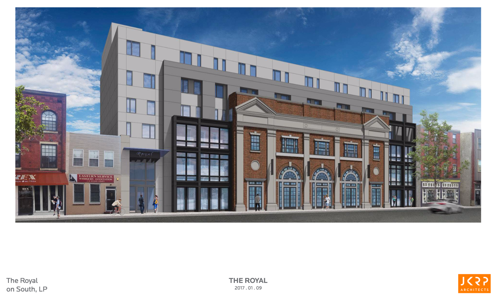
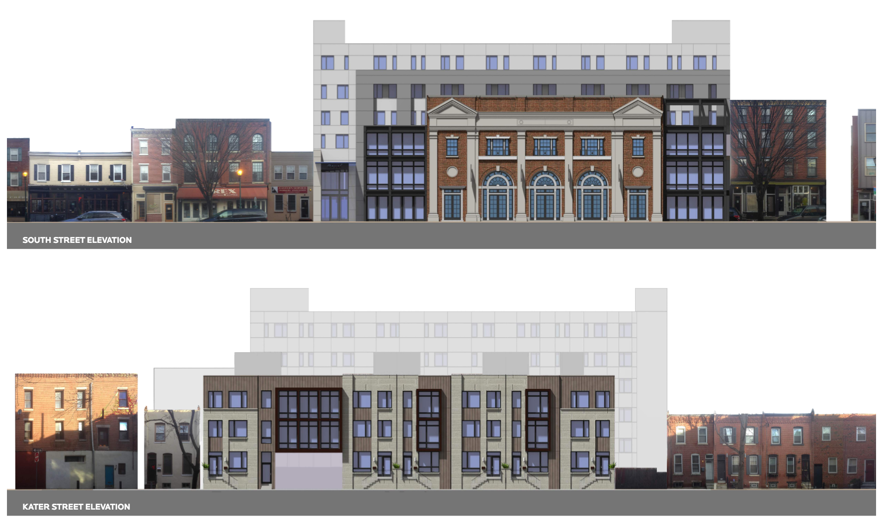
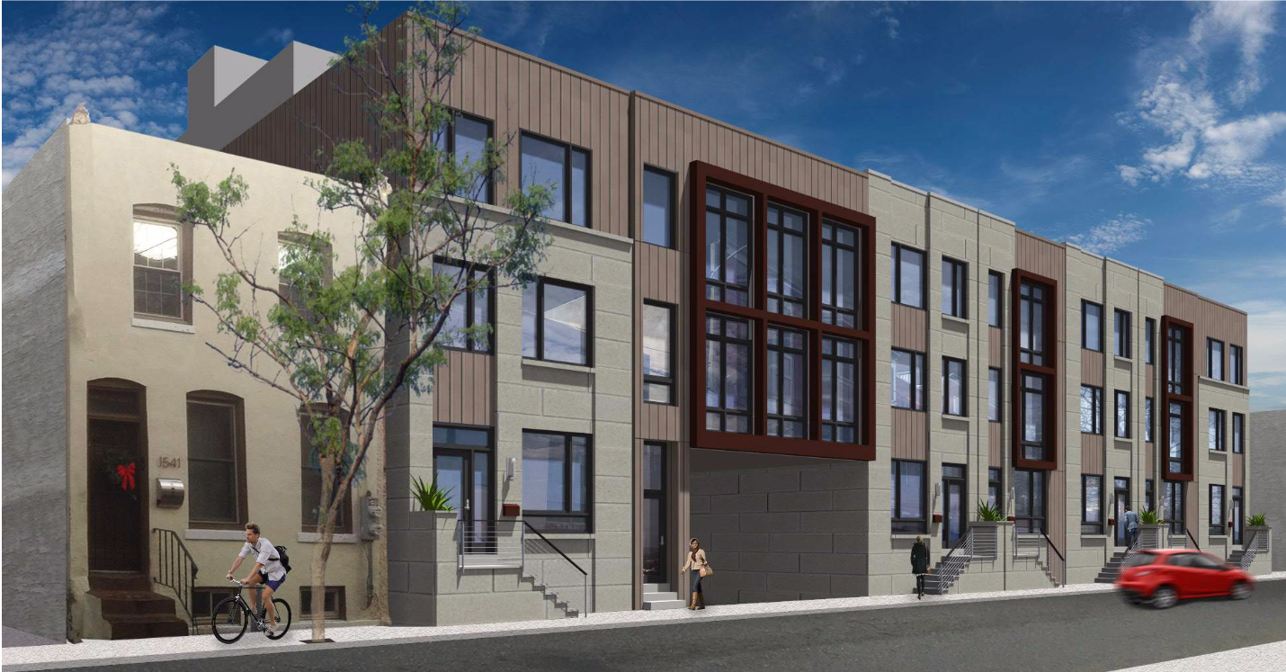
That vision has since fallen through. Now Robert Roskamp is trying his hand at the property. The new plan would still reuse just the old theater’s facade. The apartment building would be smaller by pulling it back from Kater and building townhouses on that street instead (to preserve the single-family nature of the block according to the presentation this morning). The South Street façade of the new building will be retooled as well, although the updated proposal caused some consternation.
“It was the opinion of the staff that the new façade proposed for South Street envelops the historic façade more than the earlier proposed design did,” said Jon Farnham, executive director of the Historical Commission.
This concern would be echoed throughout the meeting. The staff recommended approval of the project with the caveat that the materials or the coloration of the new building be altered to better highlight the old façade.
“This would prevent the appearance of the new building surrounding and standing over the historic façade that will remain,” said Farnham.
Architect and committee member John Cluver agreed, saying that the proposed black metal panels flanking the old brick of the Royal’s surviving frontage clashed mightily. He described the effect as “Escher-like.”
The development team said it was not opposed to using alternate colors, saying black was chosen as a means to make the surviving façade stand out.
The Architectural Committee broadly agreed that the black panels’ effect is dubious at best. They also took issue with the diminished setbacks now proposed, noting that the old plans fit the streetscape better.
“We worry that the newer scheme obscures the façade in a way that was not happening with the previously approved plan,” said Patrick Grossi, advocacy director of the Preservation Alliance, the only person to speak during public testimony. “I would encourage the architect to reconsider either colors or materials. And maybe an increased setback as was previously approved”.
The committee approved the design with the provision that the new construction be further set back. The committee also asked that a pergola on the west side of the structure be removed to match the east side and recommended that the color of the wings be changed to something a little less assertive or aggressive.” Signage wasn’t part of the approval.
“Given the feedback we received from the Architectural Review Committee, we are looking into changes to the design of the building in line with the Committee’s recommendations. We should have formal, revised renderings within the next week and are happy to provide those to you when we receive them,” said Sean Whalen, an attorney representing the developers, in an email to PlanPhilly Tuesday afternoon.

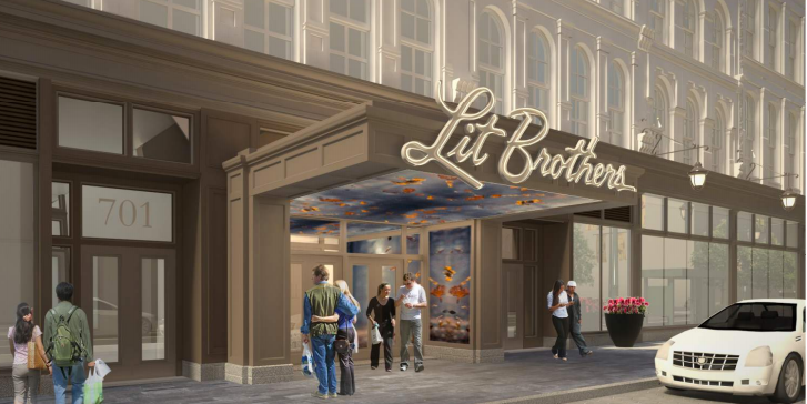
Also before the architectural committee today, Brickstone Realty returned to get final approval of its new entranceway to the Lit Brothers building on Market Street. The project is meant to better delineate the entrance, which isn’t clearly marked right now, and active the building’s street presence.
The change will come as Five Below moves its headquarters from west Market Street to this classic building to the east of City Hall.
The new entrance will include video screens and a large neon white sign spelling out Lit Brothers. Due to prior criticisms of the Architectural Committee, Brickstone reduced the size of the signage from 6’6 to 4’10 It also agreed that the video screens not be included on the outer or fronting sides of the entrance, to minimize annoyance to pedestrians.
The committee picked over the size of the supporting columns, asking these to be slimmed down a bit, and the exact placement of the screens, which the committee recommended to be tucked back into the vestibule.
The proposal will now move on to the Art Commission.
WHYY is your source for fact-based, in-depth journalism and information. As a nonprofit organization, we rely on financial support from readers like you. Please give today.


