Historical Commission gives conceptual go-ahead to Toll Bros. New Market project
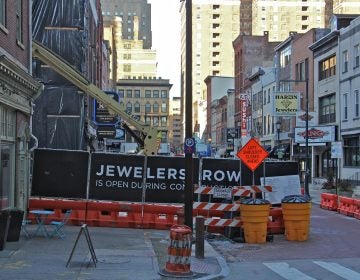
Nearly a year after Toll Brothers first announced its plan to build on the long-vacant New Market site in Society Hill, its proposed four-story, 69-condo development gained conceptual approval Friday from the Philadelphia Historical Commission.
The Commission also green-lighted a proposed expansion of the Rodeph Sholom Synagogue on North Broad Street, and reviewed additions to a pair of two-story carriage houses on Van Pelt Street, in the Rittenhouse Fitler Historic District. The latter two projects were approved in concept, meaning the applicants must return with further design details.
The Toll Brothers’ project, part of a non-contributing site in the Society Hill historic district, came to the table with recommendations for approval by both the Commission’s staff and by its Architectural Committee, provided that certain points were addressed.
First, Commission staffer Jorge Danta mentioned that archaeological concerns had been satisfactorily resolved by the review of 268-page report undertaken at the time of New Market’s construction in the mid-1970s.
In his presentation, Toll Brothers City Living division Vice President, Brian Emmons, then said that the developer will now substantially reduce the amount of limestone cladding the building, from about 12′ to a 4′ water table. (Later, when he added that the builder was considering the use of cast stone instead of better-quality materials in some places to save on costs, a look of surprise crossed the face of Committee Chair Dominique Hawkins. She efficiently batted away the attempt at a hardship claim by suggesting that Toll should view the use of real brick as a fair trade for the extra 8″ of limestone that it would be saving.)
Responding to the Committee’s and neighbors’ concerns, Emmons also promised that Toll Brothers will look at redesigning a proposed plaza so that it doesn’t serve just as an entry to the complex, but acts to integrate it with historic Headhouse Square. The in-concept approval granted is contingent on a review of that new design.
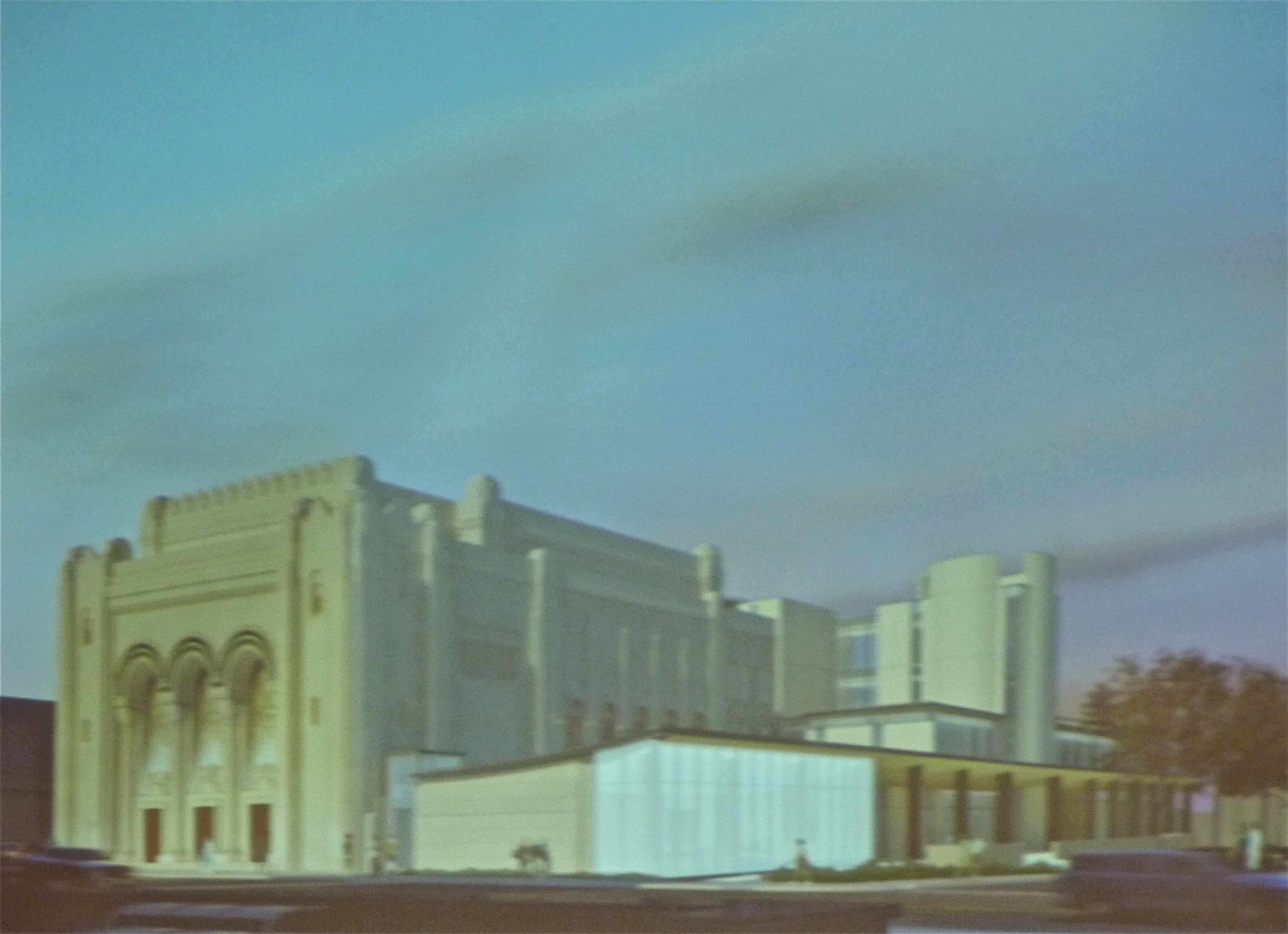
The day’s other big project concerned the proposed 25,000-square-foot Rodeph Sholom extension, to be erected on what is now a surface parking lot on the building’s south side. The synagogue, opened in 1928, is individually designated and is built in Byzantine/Moorish style. with much of its ornamentation on its western side, facing Broad Street.
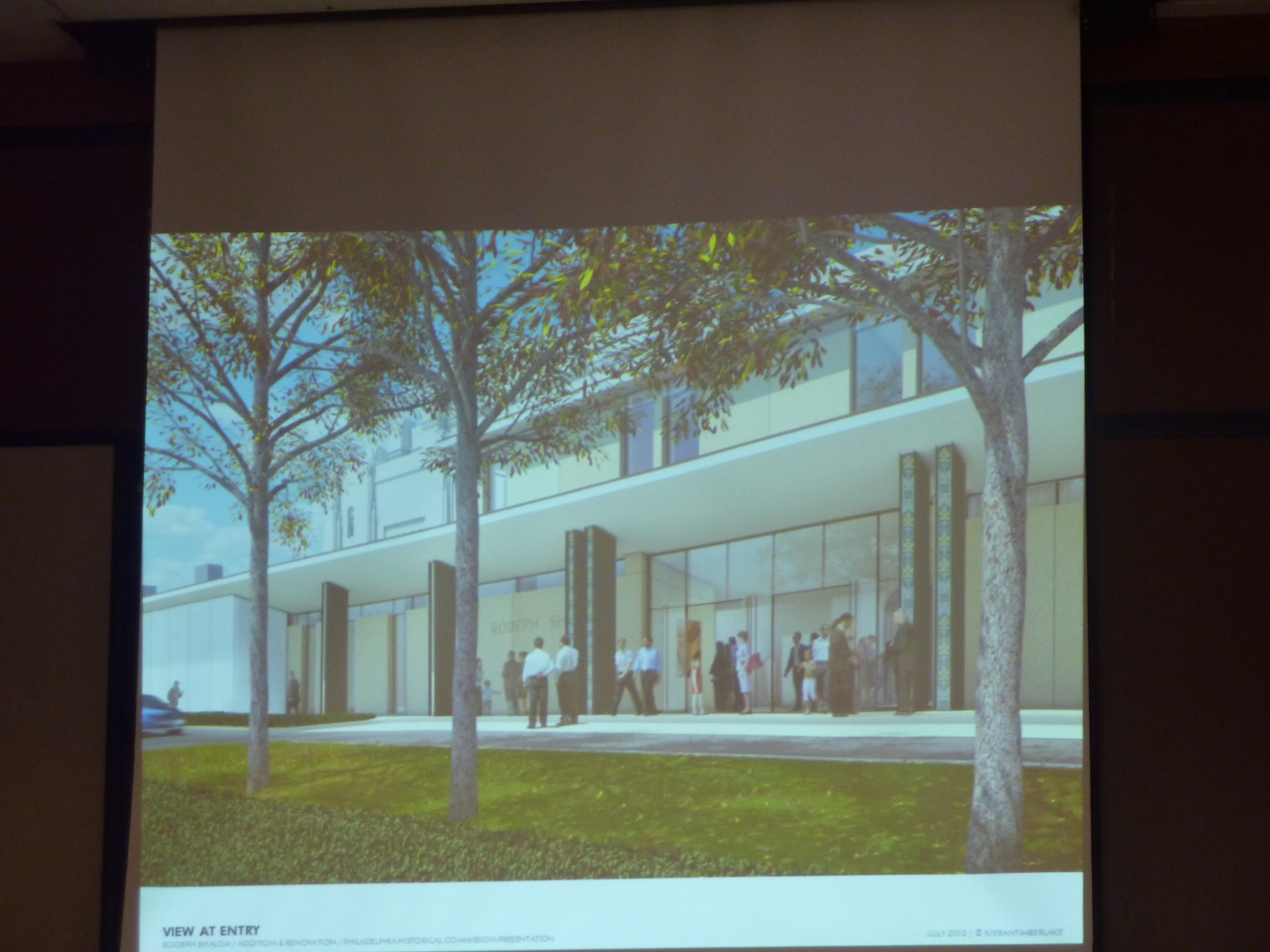
The extension, designed by KieranTimberlake, will house offices, an early learning center, additional worship spaces, and a new entrance. It proposes a “gentle” connection, according to Commission staff, that links below the south-facing stained glass windows and other details, allowing them to retain their prominence.
Still, in opposing the design, John Gallery of the Preservation Alliance, pointed out that the addition does impact on this side, and that the new building should be pushed further back from Broad Street so that it connects only on the plainer, more utilitarian brick rear of the existing structure. Gallery also contended that the new building — which features a limestone facade on Broad, a glass piece at the corner, and portico on the south side — “visually competes” with the landmark and doesn’t “take any cues” from it and so is not in conformance with Secretary of the Interior standards.
In his presentation and in answers to Commissioners’ questions, principal James Timberlake explained that the short bit of plain limestone frontage was intended as an “honorific” referencing the older building’s dominant material, and that the use of glass was intended not only to differentiate it from the synagogue — in conformance with historic preservation standards — but to bring light and a sense of openness to the entire complex.
Thomas Perloff, the synagogue’s director of finance and development, pointed out that congregation administratiors had specifically charged the architects with relieving the building of its sense of “foreboding.” After Commission executive director Jonathan Farnham summed up the staff’s reasons for believing that the project met standards, and Commissioner Hawkins concurred, the addition received full approval.
Last on the agenda were a pair of neighboring residences on tiny S. Van Pelt Street, between 21st and 22nd streets. In the first case, the homeowner is seeking to add an extension that butts right up to the property line, in part, she says, to afford her backyard neighbor room to enjoy her deck.
In the second project, to be designed by the same architect, a different homeowner is content to keep his addition further back from the street, but ran into trouble in his wish to clad it in a brick that resembles the rest of the building. After agreeing to choose another kind of material, his application was quickly granted conceptual approval.
The case of the perhaps-too-conspicuous addition consumed more time. With the guidance of Farnham, commissioners debated the subtleties of what should be deemed conspicuous to the public right of way, and were also exhorted to remember that it was that public perspective — not a neighbor’s — that they were charged with protecting. Not even, when the neighbor in question, the one with the “much-talked about deck,” as she drolly put it, turned out to be Kiki Bolender, an architect familiar to everyone in the room.
Even though Commissioner Hawkins pointed out that the house does contain a garage that could be converted into usable space and that the owners had only purchased the building five months ago and had known its limitations (space, historic registration), the argument eventually came down to the question of how noticeable the addition, a mansard roof suggestive of an artist’s garrett, would be.
Not too, everyone agreed. Except for Hawkins, the lone dissenter.
WHYY is your source for fact-based, in-depth journalism and information. As a nonprofit organization, we rely on financial support from readers like you. Please give today.


