Frank Gehry’s “quiet intervention” at the Philadelphia Museum of Art

Renowned architect Frank Gehry was hired by the Philadelphia Museum of Art in 2006 to develop a master plan for the museum, part of the seismic effect of his highly sculptural design for the Guggenheim in Bilbao, Spain.
After the success of the Guggenheim in Bilbao it became vogue for cultural institutions to hire super-star architects to create works of art to house their collections and serve as a new attraction. Our art museum signed Gehry, but Bilbao this is not.
Instead Gehry’s plan is a deliberately respectful adaptation that plays to the existing building’s strengths, more akin to Gehry’s work at the Norton Simon Museum in Pasadena, California, and puts history in harmony with new interventions.
A new exhibit on Gehry’s plan, running at the museum through September 1, shows that he doesn’t seek to reinvent the landmark museum. Instead he helps our classical museum become a better 21st century version of its early 20th century self.
Rather than add onto the building in some bold or sculptural way, Gehry’s solution is subtlety and restraint. The expansion is by excavation, and removing obstructions inserted into the museum’s original design, which allow for major improvements to light, circulation, and increased exhibition space. Where Bilbao is jazz hands, this is sleight of hand.
Gehry said his task was to figure out how to be an “additive force, not a pest” to this 86-year-old landmark.
“It’s got to be a quiet intervention,” he said. Massive alteration of our temple to art was out of the question.
“I think we’re doing something really exciting,” Gehry told reporters during a preview last week. “I don’t have any need to see myself plastered all over it.”
Gehry arrived at his design solutions by harnessing the building’s “powerful DNA,” a restoration-minded collaboration of sorts with the building’s original architects, Horace Trumbauer and Julian Abele, whose rational Beaux-Arts plan and generous spaces proved a gift.
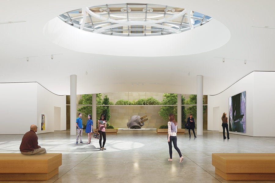
By moving the auditorium out of the museum’s core, its central artery becomes unclogged, creating long sight lines and simplified circulation in the new ground floor gallery spaces.
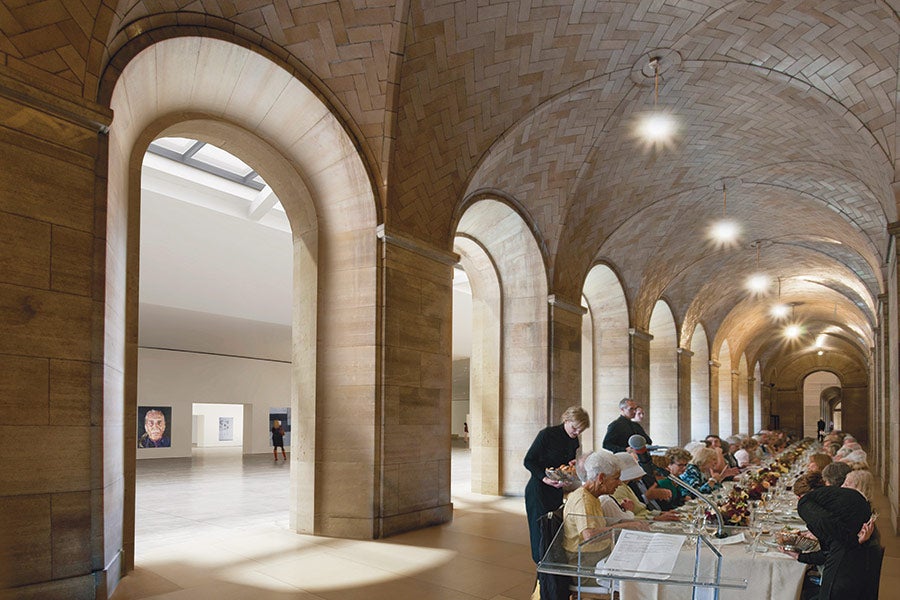
For the first time since the 1970s, the public will be able to use north-south entrances at ground level, and traverse a beautiful 640-foot long passageway, a dramatic space with walls clad in warm Kasota limestone and a vaulted Guastavino tile roof, with soft pools of natural light from the light wells cut into the east terrace.
Those moves will provide access to tall new gallery spaces carved out beneath the eastern terrace, which will give the museum more than 50,000 square feet of new gallery space without radically altering the exterior form.
“You’re not going to see me much on the outside,” Gehry told me. “I could have made a sculpture in the middle of the stairs and stuff like that. On the backside we talked at one point about putting an auditorium on the west elevation. Down the stairs you could’ve put a sculptural object – say a ‘Gehry’ if you want to call it that – that looks like a fish maybe, which I wouldn’t have done,” he said.
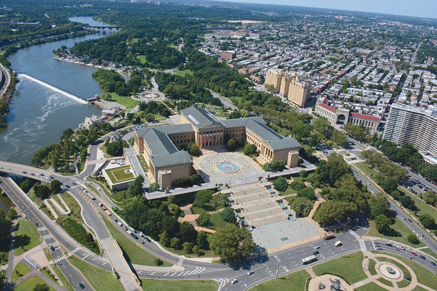
Instead Gehry’s adaptations are deferential to what makes the building such an iconic presence, including its balanced classical form and place on Fairmount.
At minimum we’ll see new fire stair towers – clunky necessities to my eye – on the gable-ends of the north and south wings, camouflaged in the same sunset colored limestone as the museum’s walls. Skylights and light wells in the east terrace will help illuminate new galleries carved out of the bedrock below.

On the more dramatic end of the spectrum, new windows could be cut into the beloved “Rocky Stairs” and inserted into the pediment (now solid brick) above the main entrance’s columns.
Cutting into the grand stairs, to create a pocket-sized amphitheater with a large window to illuminate the galleries beneath the terrace and frame a view of the city down the Parkway, is already the cause of some cocktail party head-scratching.
“These stairways are a conundrum in a way,” Gehry acknowledged. “Nobody has balked at me changing them.”
Gehry said he didn’t have a preference as to whether the main stairs would be altered or not. He added, “I think just opening it in some way, so you see City Hall is going to be beautiful.”
Museum director and CEO Timothy Rub, who curated the new exhibit, told me that there are two options under consideration for the steps: One is to cut in the large window, the other is to do nothing and add skylights into the terrace to day-light the galleries below. The addition of the window, Gehry and Rub emphasized, would provide a new view down the Parkway at the end of the long central axis running through the new gallery spaces. But either solution would provide necessary new light to the large new galleries below.
“My own view is this is probably what we’ll end up with,” Rub said gesturing to the model without the pocket amphitheater, adding that now is the time for public conversation about this intervention.
“There’s such love of the steps, I think there’s some value in opening up the view and having people come here and look in and see the galleries as well, but it’s not necessary.”
My hunch: Philadelphia is too architecturally conservative to stomach cutting into the grand stairs. It rubs against something elemental in our city’s visual identity, no matter how interesting the intervention could look and feel. Plus, Rocky may not constitute significance when it comes to evaluation from the Historical Commission, but those steps certainly have a custom and culture all their own.
Given the restraint Gehry shows elsewhere, I’m not sure that it adds much to the public experience of the museum’s exterior. It feels impatient, as though visitors must be rewarded for climbing halfway up the stairs with a peek inside. From inside, however, I can imagine a view down the Parkway could be marvelous.
But the more spectacular view – and the more interesting flourish to me – could be from the windows Gehry envisions inserted into the museum’s east and west pediments – the triangle shaped areas of the building above the columns that frame the main entrance.
Imagine standing in a room just below the museum’s roofline looking down the Parkway to City Hall to the east or along the Schuylkill to the west.
By transforming an attic housing mechanical systems into a prime space, Gehry finds another creative means to put underutilized areas to work. These new attic-level rooms could be used for private events, showcasing dramatic views, and help the museum bring in needed revenue.
Opening up this attic space also includes returning the clerestory windows at the top of the Great Stair Hall, along hallways connecting the new rooms, which will illuminate the hall below and animate it with the play of natural light. It’s a return to the grand entry’s original condition.
If Gehry was hired to give Philadelphia its Bilbao moment, these new windows alone could let visitors see the city and its august temple to art anew.
WHYY is your source for fact-based, in-depth journalism and information. As a nonprofit organization, we rely on financial support from readers like you. Please give today.


