What role do maps play in solving medical mysteries?
ListenA simple black-and-white street map made a Victorian physician a ‘legend.’
There’s plenty of disagreement about just how much credit Dr. John Snow should get as a “father of epidemiology” or as a pioneer in using maps to solve medical puzzles.
But there’s little dispute that Snow’s map is famous. The College of Physicians of Philadelphia has a copy from 1855.
The simple street map is part of Snow’s treatise “On the Mode of Communication of Cholera.” In the text, he argues that cholera—which swept through London in 1854–was spread by water contaminated by fecal matter.
Cholera is a nasty bit of business and thousands of people suffered vomiting and diarrhea.
The short film “Snow” dramatically chronicles his efforts to convince local public officials and colleagues that bad water was making people sick—not bad air. In the mid-1850s most doctors blamed “miasma”—or foul air–for a long list of illnesses including cholera.
To prove his point, Snow went door-to-door in London’s Soho neighborhood trying to figure out where people got their water. He figured out that many of the people who had died lived near a water pump on Broad Street.
Modern cartographers say when you look at data spatially, you learn things you wouldn’t have known otherwise. So, to make his case, Snow charted his findings. On the map, black lines are stacked up in front of different addresses in the neighborhood. Each line represents one cholera death.
“It’s really kind of simple and kind of visually arresting,” said College of Physicians librarian Annie Brogan. “Because you can see all the deaths concentrated around this one area.”
“The thing about the Broad Street pump was that it was very cold, it tasted good, and it was even kind of fizzy, so people would travel from other areas to get their water from this pump,” Brogan said.
Brogan says Snow conducted some “shoe leather” detective work to figure out that some cholera sufferers–who lived very far from the Broad Street pump—actually did have a connection to the contaminated tap.
The cholera epidemic may have been already waning—anyway–but the local parish council was convinced by Snow’s map and they removed the handle of the Broad Street pump. Soon after, the number of deaths in the area slowed.
Later on the handle was replaced, so John Snow’s grand experiment may not have worked—in his time–but his map did become a legend.
“The authorities didn’t take to his theory, didn’t want to contemplate that their citizens were eating poo. The miasma theory still kind of held sway for a little while afterwards,” Brogan said.
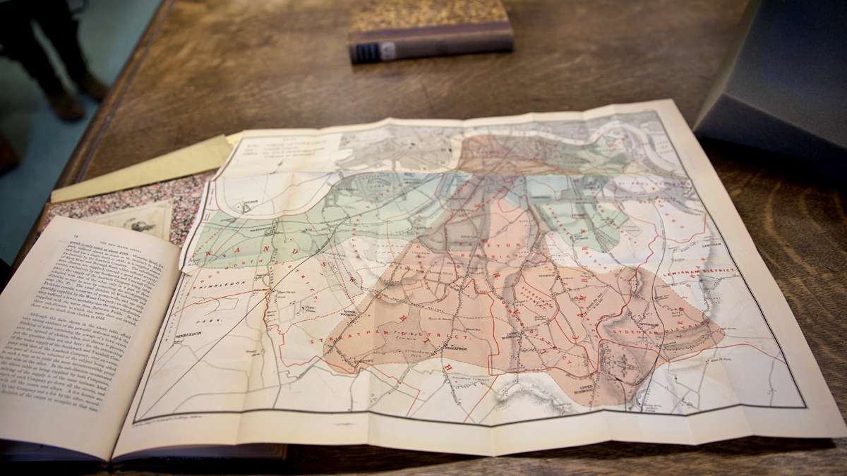
In another, less famous—but more colorful map–Snow charts the companies that supplied water throughout South London. He determined that many people who died of cholera got their water from the Southwark and Vauxhall Company, not Lambeth Water.
——
Our exploration into the history, beauty and science behind maps included a tour of The Harvard Map Collection in Cambridge, Mass. Among the more than 400,000 on hand, GIS librarian Bonnie Burns and curator Joseph Garver shared a few favorites to highlight the scope of the collection.
A map of the heavensA hemispheric view of the Zodiac signs
A map of hellHell, Michigan—that is. Home to about 2,400 residents—15 miles northwest of Ann Arbor, Mich.
The Mercator Celestial GlobeA 16TH Century conception of what lies beyond the earth. Along with the Mercator Terrestrial Globe, part of a “matched set” at Harvard.
Sebastian Adams’ Map of HistoryMore than 22-feet of text and pictures on the march of civilization.
The Turgot AtlasA bird’s eye view of Paris circa 1739
Aphricae tabvla IIA 16th Century atlas based on the work of 2nd Century geographer, Claudius Ptolemy
WHYY is your source for fact-based, in-depth journalism and information. As a nonprofit organization, we rely on financial support from readers like you. Please give today.


