Visualizing Sandy: Satellite images, flooding, crisis response, and wind

I’ve been staring at Sandy-related maps all morning. They’re not only an amazing way to kill time while we wait this thing out, but they’re an incredible resource for understanding the scale, scope, and potential power of this storm. Here are a few most interesting maps and satellite images I’ve come across today that help explain what we’re in for.
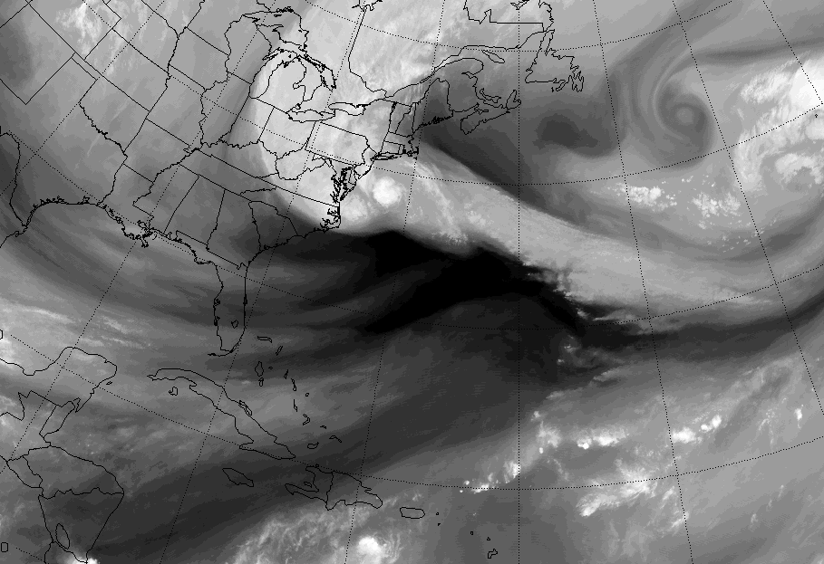
Satellite Sandy
Sandy is a really big storm and this satellite image (an animated gif if you click on the image below) from Penn State’s Department of Meteorology.

FEMA Flooding and Impact Forecast Maps
The Federal Emergency Management is mapping Sandy and has a really interesting interactive mapping interface on its website, plus a few detailed maps that focus on flooding and the forecasted impact of this storm:
Hurricane Sandy Flooding – FEMA
Hurricane Sandy Impact Analysis – FEMA
Google Crisis Response Map
Google has created a Crisis Response Map for Hurricane Sandy to help people follow the storm’s progress and connect people with up-to-date emergency information. Click around the map below, or check out the full map click here.
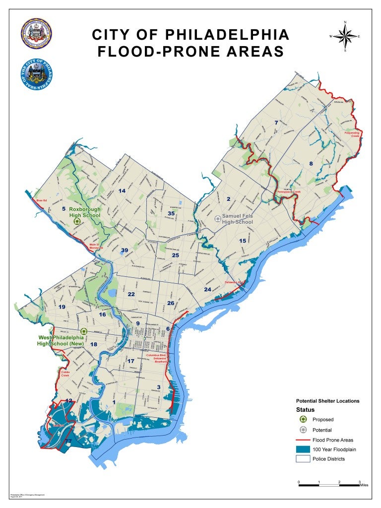
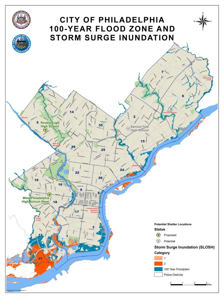
Flood Prone Areas + Inundation Zones
Folks living in flood-prone areas of the city know it, and were instructed by Mayor Nutter to seek shelter on higher ground with friends or family or head out to one of the city’s three emergency shelters. Here are the Office of Emergency Management‘s maps of the city’s flood-prone zones and areas likely to be inundated by varying degrees of storm surge.


Wind Map
Wind Map is a beautiful visualization of wind patterns. Click on the map below to see this map in motion, and look at the wind effects of Sandy along the Eastern third of the country.
OTHER:
- Click around the interactive Sandy map by The New York Times.
- The National Oceanic and Atmospheric Administration also has loads of images and an interactive map up on the National Hurricane Center.
Did I miss one that you’re finding useful? Send it along or comment below.
WHYY is your source for fact-based, in-depth journalism and information. As a nonprofit organization, we rely on financial support from readers like you. Please give today.


