Political ads aim to steer your emotions. Here’s how they do that
How black-and-white photos, rolled-up sleeves and other political ad tropes are being used this election
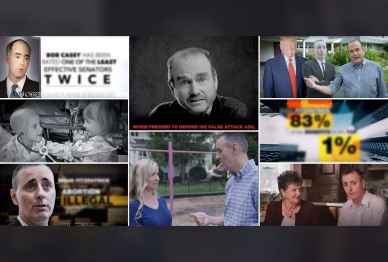
These screen shots of political ads for the 2018 election come from the campaigns for Lou Barletta, Bob Casey, Brian Fitzpatrick and Scott Wallace.
Political ads on TV and online can pass by pretty quickly. But campaigns put a lot of money into those ads and the people who make them put a lot of thought into how the symbols, music and photos in those ads could affect your emotions.
To help break down how those ads might be doing that in subtle and not-so-subtle ways, I talked to two experts about two races:
- In the U. S. Senate race, featuring Democratic incumbent Bob Casey Jr. against Republican challenger Lou Barletta. Casey has led in the polls by double digits.
- And in the 1st Congressional district in suburban Philadelphia where Scott Wallace, a Democrat and wealthy philanthropist, is trying to unseat Republican Congressman Brian Fitzpatrick. The race is considered a toss-up.
Fitzpatrick, a former FBI agent and federal prosecutor, has emphasized his moderate positions, including voting against the repeal of the Affordable Care Act and supporting increased gun restrictions.
The experts looked at four ads:
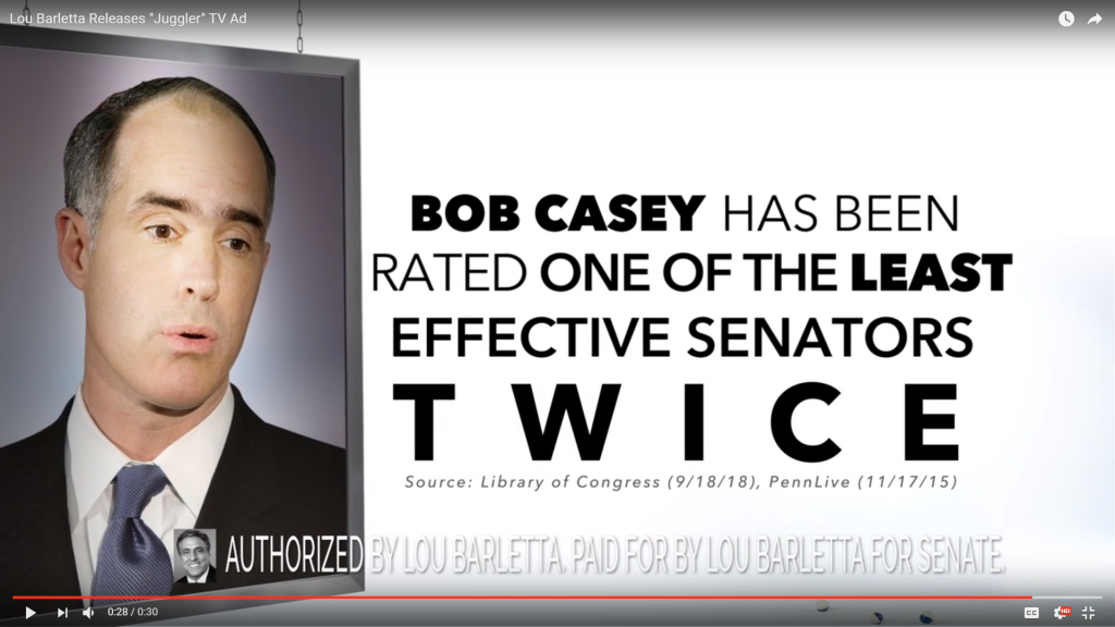
- In “Juggler” from Barletta’s campaign, a woman stands in front of a white screen as a large picture of Casey is lowered down. She starts out by cheerfully saying “I’m here to tell you everything Bob Casey has done as our senator” — and then can’t come up with anything, so kills time instead.
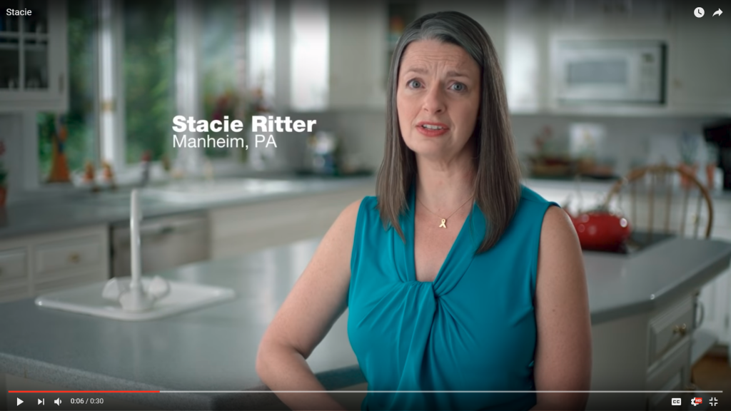
- In “Stacie,” Lancaster County mother Stacie Ritter talks about how her family’s whole world changed after her twin daughters were diagnosed with cancer, and she criticized Barletta over votes to repeal the Affordable Care Act, which contained protections for people with pre-existing conditions. Barletta, who has a grandson with cancer, has called the ad false, insensitive and “might be the lowest thing I’ve ever experienced in my entire political life.”
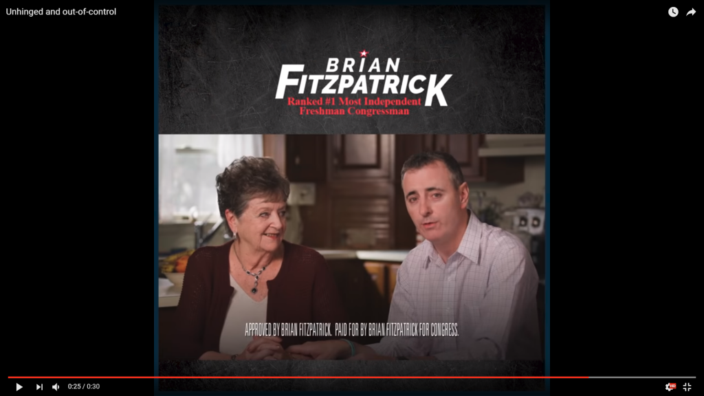
- In “Unhinged and out-of-control,” the Fitzpatrick campaign criticized Wallace after he cursed at a debate.
- In “Independent,” Wallace promises to be an independent voice in Congress, while standing next to cardboard cutouts of Fitzpatrick and Republican President Donald Trump.
The experts are: Shawn Parry-Giles, director of the Mark and Heather Rosenker Center for Political Communication and Civic Leadership at the University of Maryland; and Ted Brader, a political science professor at the University of Michigan and the author of “Campaigning for Hearts and Minds: How Emotional Appeals in Political Ads Work.”
Here’s a look at some tropes in those ads.
Black and white = bad
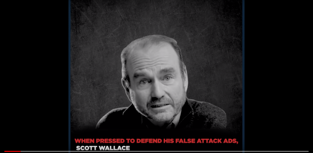
A black and white photo of your opponent is a staple of political ads. “That historically resonates with this idea of the mugshot,” said Parry-Giles.
And sometimes the contrast can be sharper in a black and white photo, bringing more attention to a person’s features or expression in an unflattering photo, Brader said.
Muted colors are used in a sadder context in Casey’s ad featuring the two young girls with cancer. “That just reinforces what a difficult time it was and invokes this kind of negative emotion,” Parry-Giles said.
Later in the ad, after the mother talks about how fortunate the family was to have health insurance, the girls are shown in full color.
Big faces
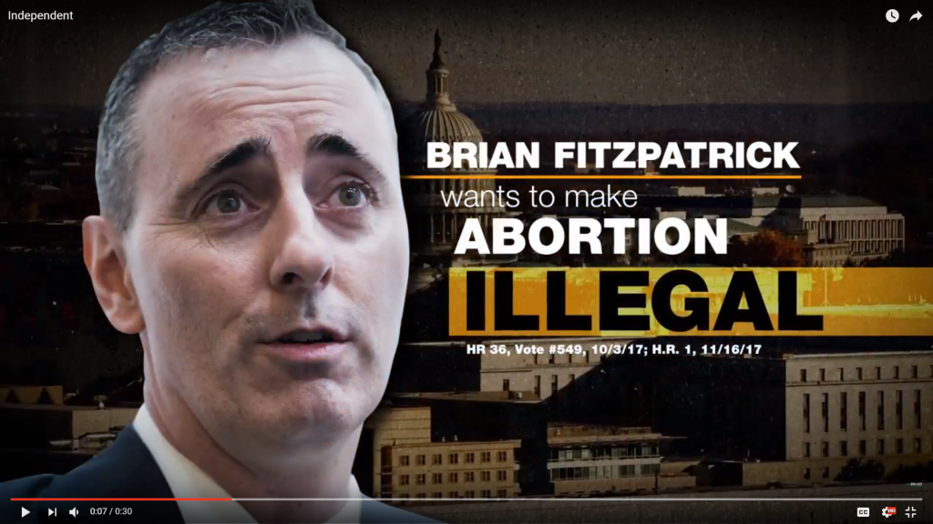
In the Wallace ad, Fitzpatrick’s image appears like it’s right in front of the camera.
The close-up image can feel like a violation of personal space.
“It’s like we’re going to get you so close that you can really study the facial features of this person to look for issues,” said Parry-Giles.
The Barletta ad also used a big image of Casey’s face.
His head and shoulders appear bigger than the grown woman narrating the ad.
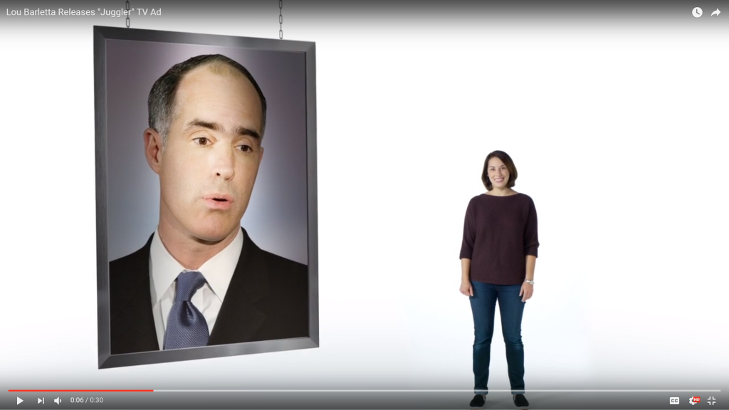
In this ad, Casey appears as a flat character, not a full person — which makes him easier to dismiss.
The message? “He’s just a picture on the wall. He might as well be, because he’s not really been a force,” Brader said. “He’s not lifelike.”
And Casey is looking down in the photo. “He won’t even look at the Pennsylvania voters,” Parry-Giles said. “He’s looking away, as if he’s not being honest.”
Rolled up sleeves
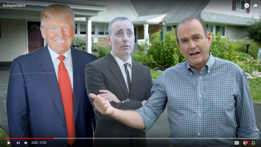
In this Wallace ad, he speaks directly to the camera — that is a move designed to build trust and it is frequently used to combat character attacks, said Parry-Giles. (There have been a lot of character attacks in the Fitzpatrick vs. Wallace race).
Brader pointed out that Wallace had his sleeves rolled up in his ad. It gives hims a folksy look. Plus, he’s standing outside suburban homes — which contrasts with the images of skyscrapers we saw earlier in the ad while Wallace was accusing Fitzpatrick of approving tax cuts for the wealthy.

It’s also worth noting: In his own ad, Fitzpatrick has his sleeves rolled up, too, and he’s also talking in what looks like a nice suburban neighborhood. So there is an area of common ground between the two candidates.

The woman as character witness
Women are often used to testify to someone’s character, said Parry-Giles.
In Fitzpatrick’s case, he is shown sitting next to his mother. (She defended him as the narrator of an earlier ad.)
In the Casey ad, a mother is the one criticizing Barletta.
The small and fast-moving citations
Time on TV costs money, and even online, campaigns are competing for your attention.
But people ought to pay attention to the citations, which oftentimes flash on the screen pretty quickly.
“Voters should just do more research. …They really need to read deeper,” Parry-Giles said.

WHYY is your source for fact-based, in-depth journalism and information. As a nonprofit organization, we rely on financial support from readers like you. Please give today.


