A complex new mix on Market Street
Wednesday morning, the sidewalk was open, the scaffolding was down, and workers were burnishing the steel letters that spell out “National Museum of American Jewish History.”
So began a two-week “soft opening” — the Museum officially opens to the public on Nov. 26 — for this latest addition to the city’s cultural stage.
And, at last, Philadelphians can get up close to a site that’s been tantalizingly obscured for weeks.
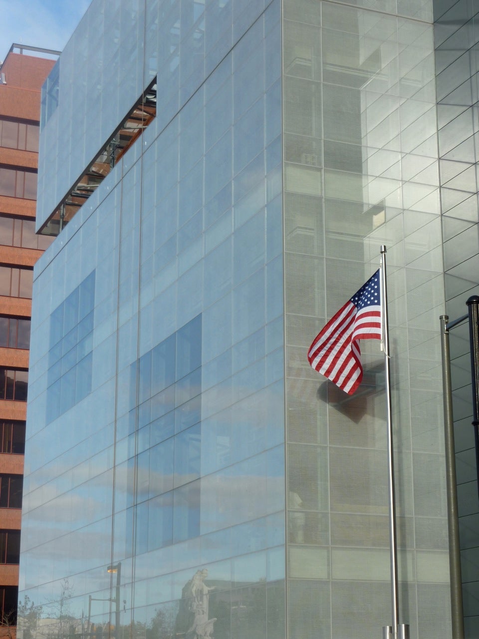
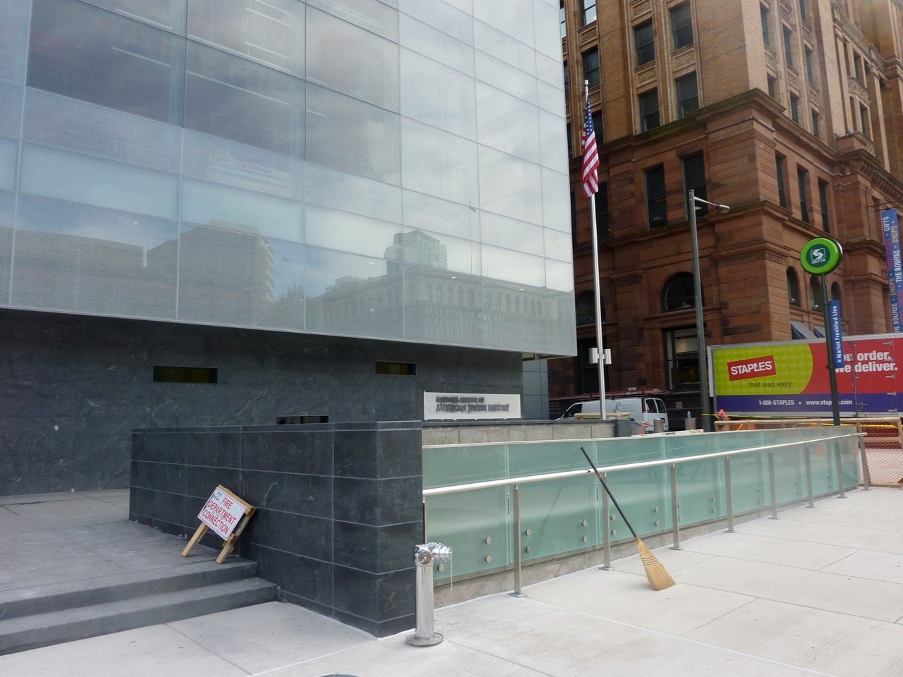
For my first visit, I approached the $150-million, 100,000-square foot building by subway instead of on foot as I normally would. Emerging from underground, I was pleasantly surprised to find myself exiting via a new glass and granite subway enclosure that, I saw, echoed the building that loomed above. The large glass box looks jarring placed next to The Bourse — not out of scale, just strikingly modern. It’s such a dramatic face — a custom, hand-painted design gives the glass a mesh effect — that it all but shouts “main entrance.”
I was confused to discover, then, that there is no entry here. James Polshek of the New York-based Polshek Partnership (now Ennead Architects) says that the pedestrian clutter around the subway, plus the thoroughfare-like aspects of 5th Street, made such an entrance unpractical.
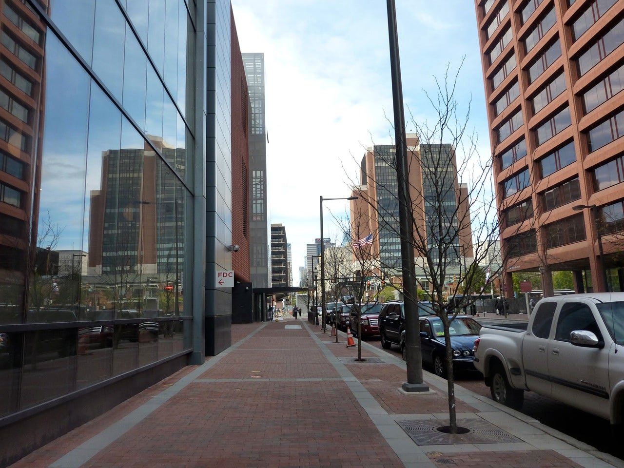
Around the corner, onto Market Street, I went. I noticed that, in contrast to the new concrete that’s been laid down on the 5th Street sidewalk, the familiar Old City red brick sideways have been recreated on this side. It seems a missed opportunity to update dreary Market Street but, according to the architects, Old City District regulations require the brick.
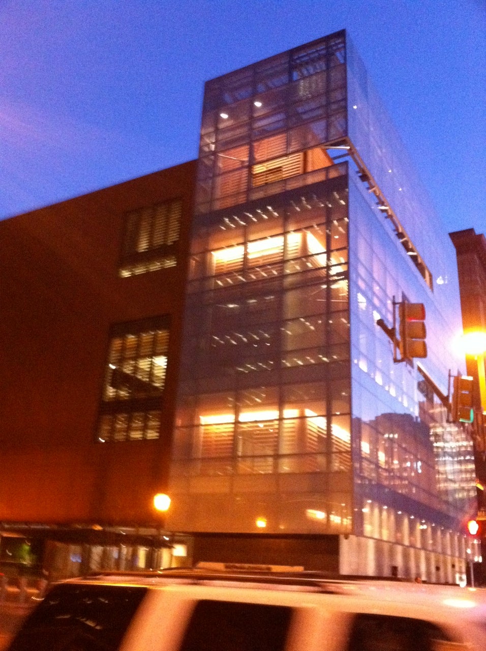
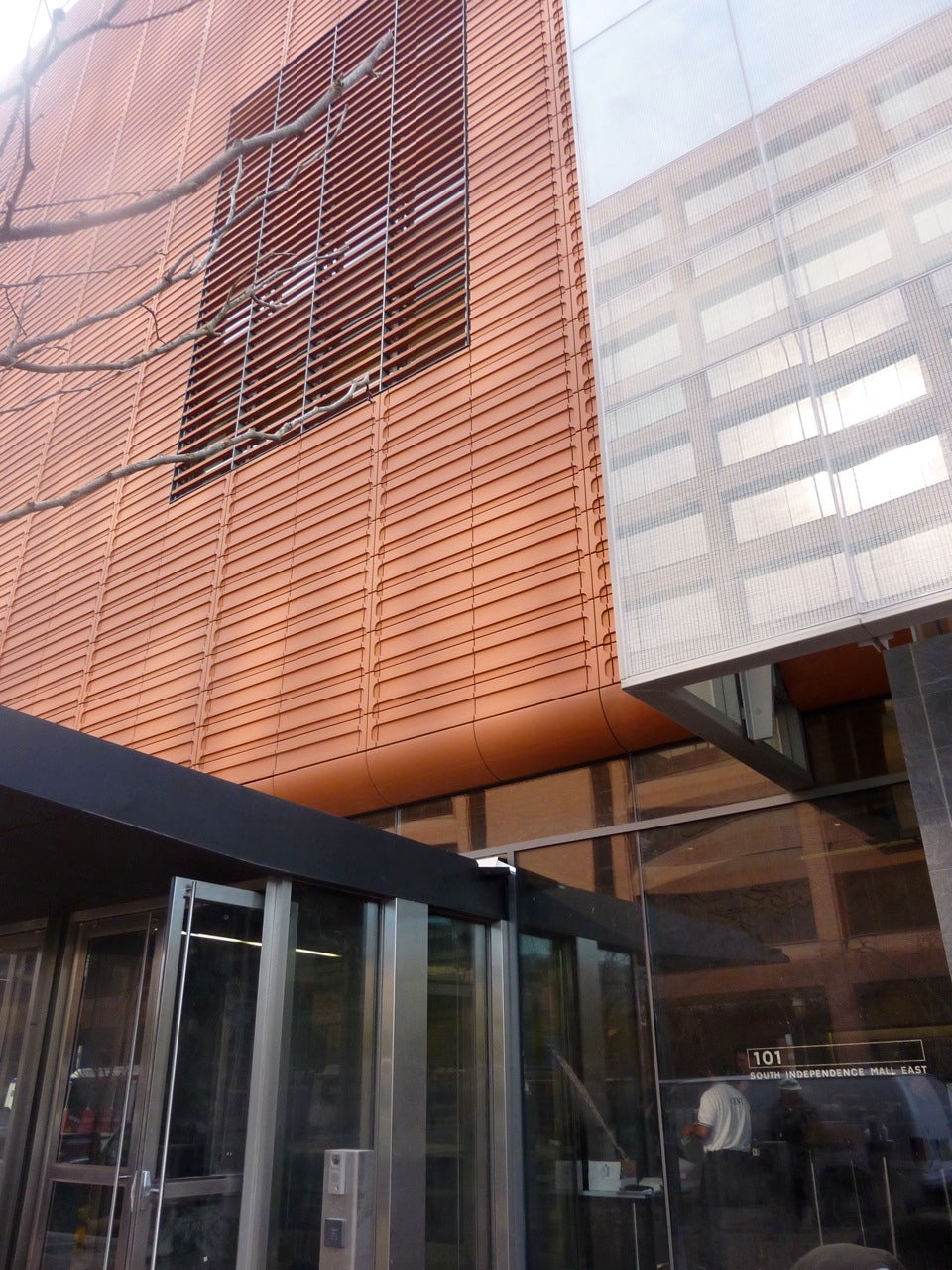
The more I looked at the entire set-up, though, the more the muted reds and grays of the old-fashioned sidewalks felt of a piece. They provide a warm match for the facade of the Museum’s second volume, a rust-hued terra cotta, which calls to mind Corten steel. (A third segment, in silvery steel, houses the fire-stair tower and other back-of-house functions, as well as a cafe and gift shop.)
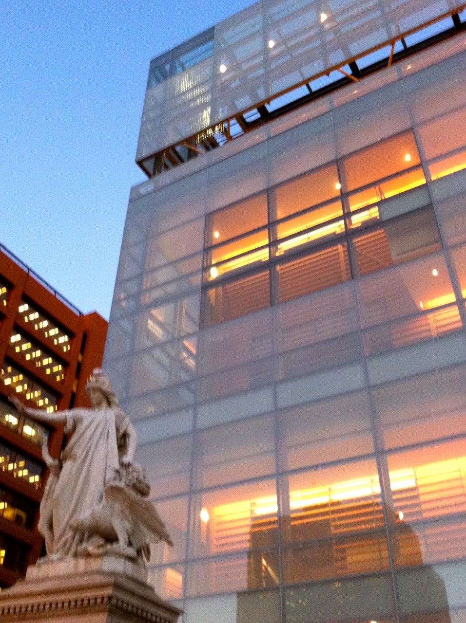
The choice and juxtaposition of so many materials are not arbitrary, according to Polshek. The airy glass facing Independence Mall is supposed to convey a “generous welcome,” while the sturdier terra cotta — which serves as the exhibit space — is a metaphor for Jewish resilience.
Whatever. I see three forms and a too-literal demarcation of spatial functions. I do like the glass facing the open square — it so nicely reflects the sky, greenery and horse-drawn carriages, as well as the Victorian allegorical statue, “Religious Liberty” — and the terra cotta evokes the orange hues of nearby mid-scale structures such as the Wachovia Building, the William J. Green Federal Building, and The Bourse.
Looking at that palette and those separate pieces, I thought of the much-maligned Kimmel Center. As in that case, the museum’s interior feel unconnected to the street. There’s not even a separate entrance for the forthcoming cafe/shop — a security issue, say the architects — and one must walk nearly the entire 400 block of Market to reach the sole entrance to the building.
Architect and project manager Josh Frankel says the firm “worked very hard to animate Market Street.” A mysteriously recessed portion of the exterior, for example, is supposed to provide a view of the museum’s exit ramp — the only way for visitors to leave the building. Unless there’s a wall-to-wall crowd, that doesn’t promise much activity. And with the sun’s glare on the building, it’s pretty difficult to see anything but reflections, anyway.
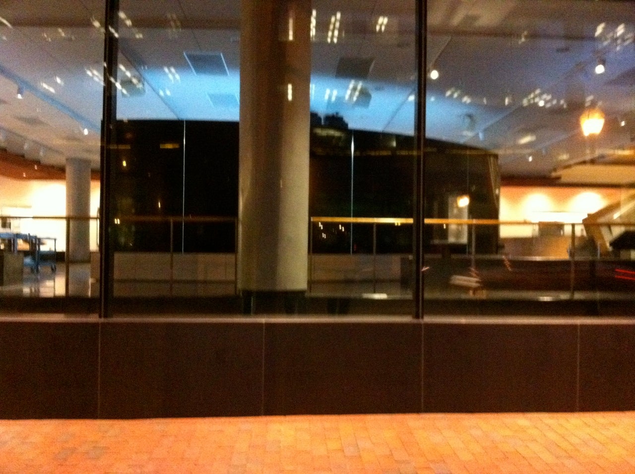
The same goes for the street-side cafe (to be open by the end of the month). It sounds good, but the modesty film on the windows is nearly six-feet high, obscuring most of the scene. These things work better from the perspective of the museum-goer looking out, not from that of the passerby looking in.
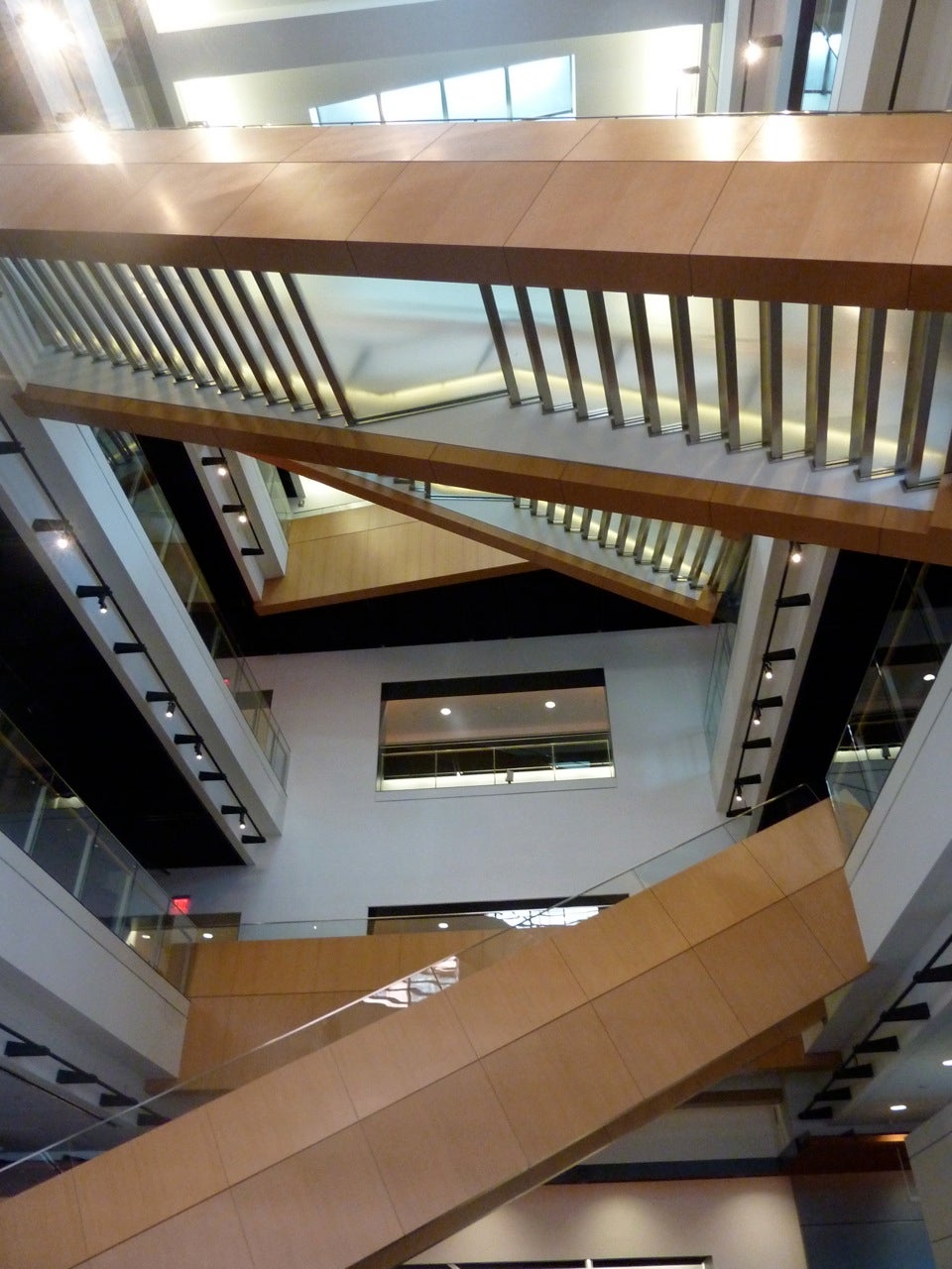
So, let’s go inside. Stepping in from Market Street, the visitor is greeted by a small semi-circular “overlook” that, Frankel says, serves a “higher civic function, where you can experience the architecture and get oriented before going through security and entering the museum.” It’s a scene of simple elegance — a series of glass-treaded staircases draped in anigre wood rising through the 85-foot atrium.
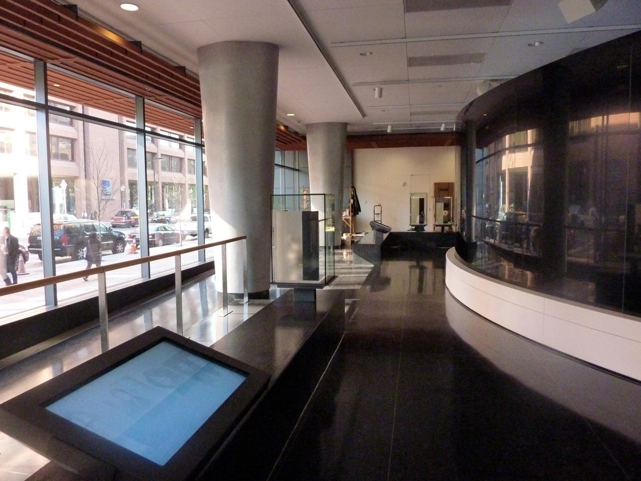
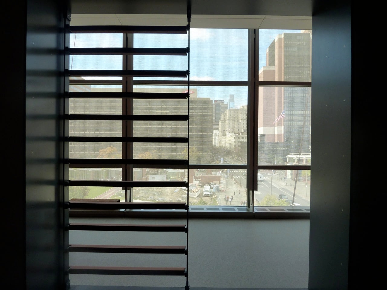
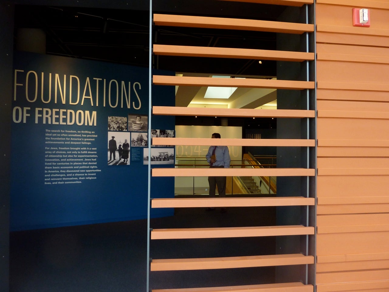
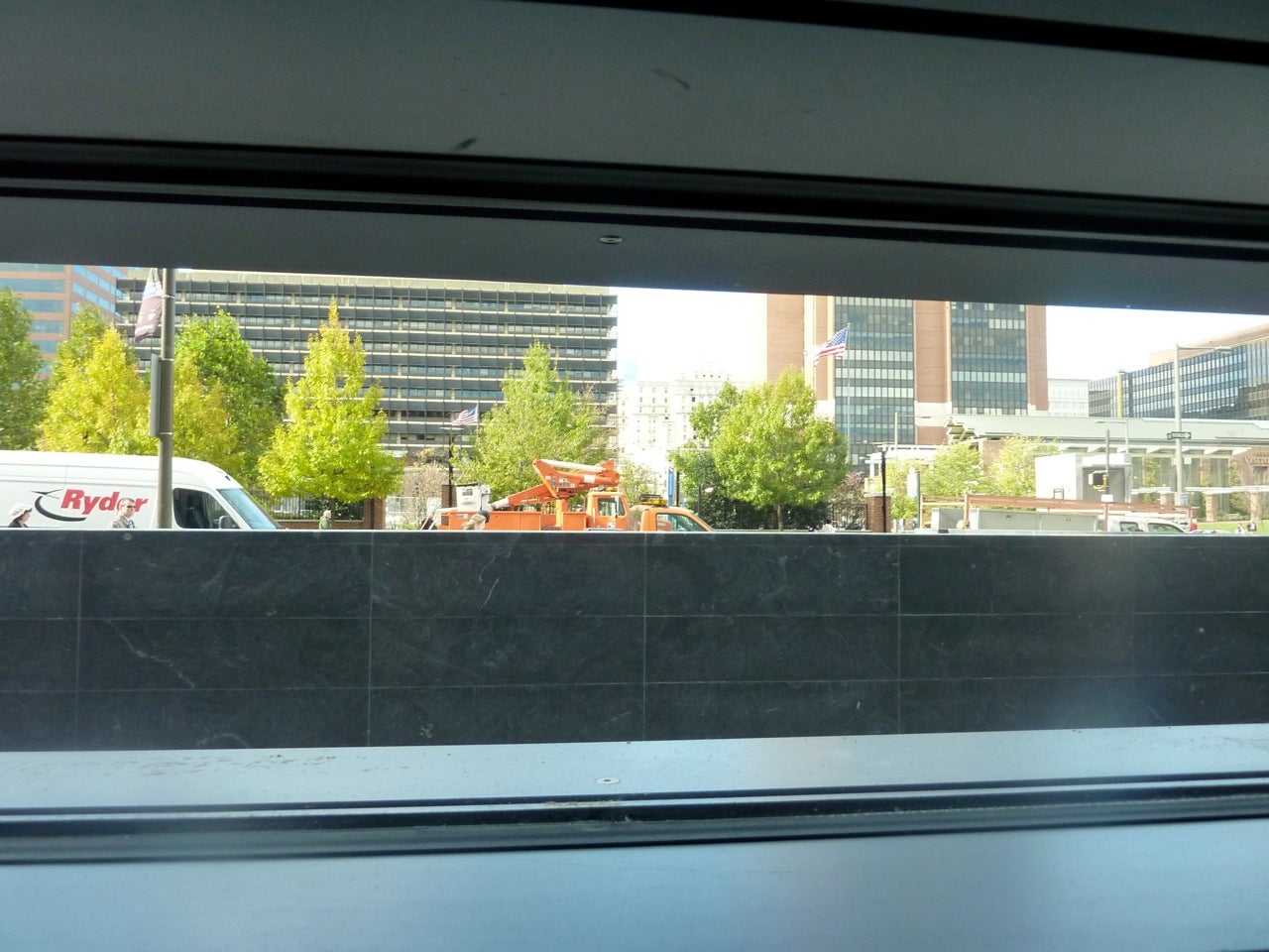
Once past the ticket counter, and through security, the visitor moves along a wall covered in the same dark granite that skirts the base of the exterior. A few strategically placed slat windows — Frankel says they are some of his favorite elements — offer glimpses of 5th Street and the Mall.
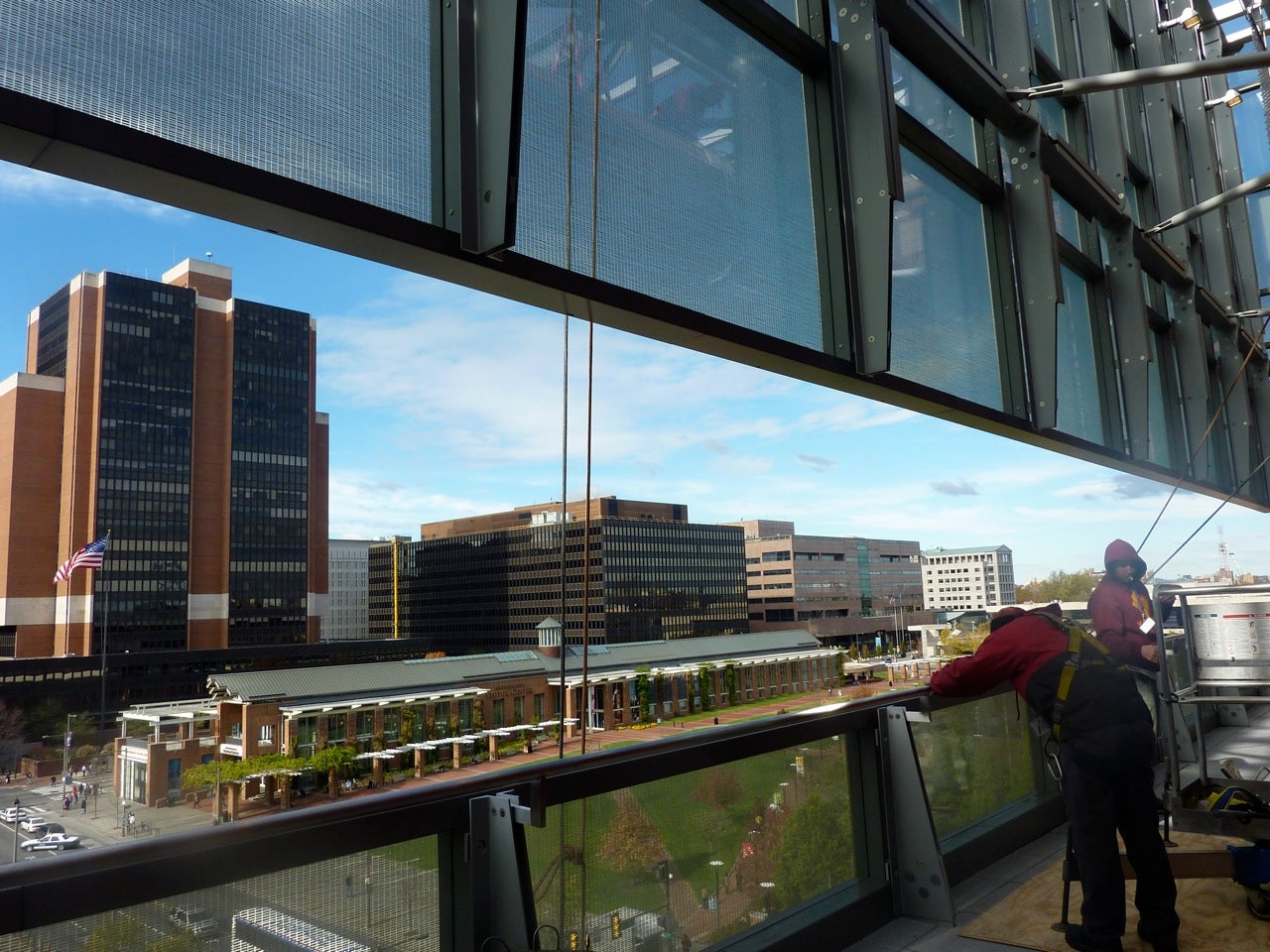
Toward the east lies “Only In America” (a Hall of Fame honoring 18 Jewish Americans, including Leonard Bernstein, Sandy Koufax, Golda Meir, and Steven Spielberg), and beyond that, the cafe and shop. I took the elevator to the 5th floor. This uppermost floor (the sixth level is below-ground and houses a 200-seat auditorium) is reserved for functions and temporary exhibits, but also features an open-air terrace — that’s the cutout that’s visible on the building’s exterior. It offers a great vantage point from which to view the Mall, but, again, I thought of the Kimmel. As with that structure’s “rooftop garden,” how clear will it be to visitors that this space even exists? And will it always be open?
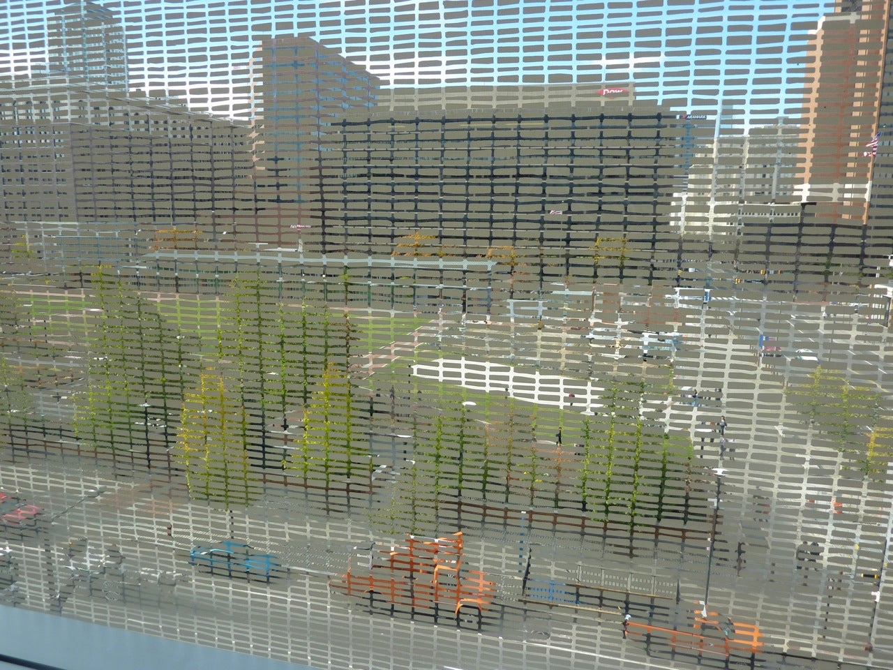
As they move through the museum, visitors can take the elevator down — their banks provide a great way to understand where and how the glass and terra cotta meet — but walking down those graceful staircases is a better way to get a sense of the entire building. On each level, the steps descend to the 5th street side, where you pass through the terra cotta frame to stand on an enclosed terrace wrapped in the glass curtain. The hand-painted “mesh” envelops everything you see in a gauzy veil. It’s as if you were looking through a screened window.
Walking back into the museum proper, and over a short bridge — wrapped in the same warm maple-shaded anigre as the staircases — brings the visitor into the exhibit space. These unravel into a surprisingly extensive warren of rooms. You’re deep in the bowels of the terra cotta structure now, but the layout never leaves you feeling lost or as if you’ve missed something.
When you reach the conclusion of each of the three main exhibit spaces — covering the periods 1654-1880, 1880-1945, and 1945-Today — you’re gently deposited back into the light and airiness of the glass portion.
Upon reaching the ground floor, the museum’s flow steers visitors toward the Hall of Fame, and then the exit (or the cafe or shop).
From all of these spaces, too, there are great street views of the outside — and, of course, the intent is for this to work both ways, for the activity of the museum and its visitors to provide visual delights for passersby.
While it remains questionable how well this will succeed during the day, the evening effect is lovely. When I passed by after dark, I found the building fairly sizzling with energy. The shimmer of interior lighting and the gleam of a rooftop LED installation added a much-needed street presence to this dull stretch of Market Street, and after sun-down, it’s quite easy to see films related to “Only In America,” and the edges of the cafe and shop.
Hmmm, night-time film/lecture programming, anyone?
Contact JoAnn Greco at www.joanngreco.com
Check out her new online magazine, TheCityTraveler at www.thecitytraveler.com
WHYY is your source for fact-based, in-depth journalism and information. As a nonprofit organization, we rely on financial support from readers like you. Please give today.

