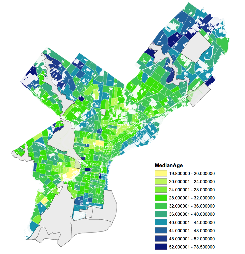
Map: Find the median age in your area of Philly

This morning on Twitter, Aine Doley wanted to know the average age of people in her neighborhood:
I wonder how you can find out the average age of people in the neighborhood, Census? @emaleigh
Lucky for her, PennPraxis is in the middle of a big mapping project related to our Blueprint2015 project, and Ryan Debold was able to put together this map visualizing the median age for each Census tract.
We went with median rather than average age, so the picture wouldn’t be skewed by outliers (very young or very old people.) Each color has a four-year range, except for the oldest and youngest cohorts, which have fewer people.
Is there anything here you’re surprised by? What jumps out at you?
WHYY is your source for fact-based, in-depth journalism and information. As a nonprofit organization, we rely on financial support from readers like you. Please give today.


