Looking at SugarHouse in an architectural context
Good for what it is.
Yes, parking dominates; yes, the prow-shaped building has a bit of a Best Buy about it; and yes, there’s no ground floor retail, as so many had hoped, requested, demanded. But SugarHouse Casino, which opens to the public this Thursday, is after all merely a (rather small) casino, and to expect much of distinction from it is flat out unrealistic.
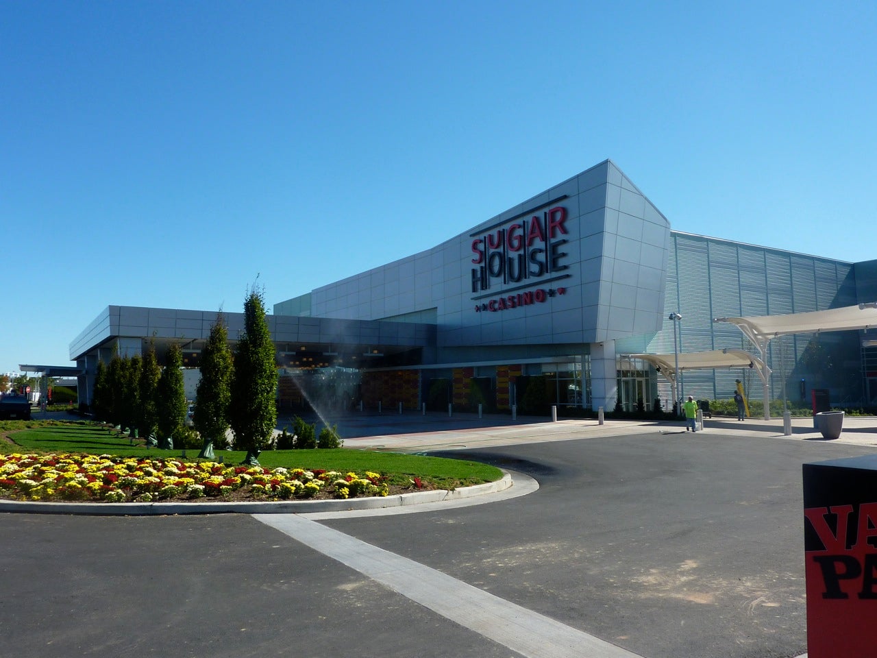
Upon approach, the bluish green, metal-sided 108,000-square foot building emerges from a desert of nothingness. It’s not an oasis, exactly, but its fractured rectangularity — a cutoff corner here, an attached slab there — lends it a crisp modernity that attempts to break out of the boxlike confines of such structures. And, the watery tones of its aluminum skin give a nod to its prime riverfront locale.
Compared to other waterfront casinos, the face this one turns to its host city is not nearly as scornful. Without resorting to gimmickry, SugarHouse has handed the city an uncheesy, unfussy, and unassuming building that is appropriate for its function and respectful of its setting.
“This is a commercial building,” says Ian Cope, managing partner of Cope Linder Architects, the local firm which served as architects, land planners, and landscape architects for the project. “It’s a casino — not a museum.”
Still, some elements, notably the parking, could be improved. Surface lots mar the arrival, and harken to the kind of strip mall hell that sits at the other end of the greater Center City waterfront. Set away from the building, they’re a regrettable necessity — and, on reflection, perhaps preferable to the proposed parking structure that is slated for the near future.
Underground parking would have been the best option. But the site’s proximity to water instantly made that “technically unfeasible,” according to Cope. And while their presence along Delaware Avenue adds one more black mark to an already uninspiring terrain, the lots are sited there for good reason. Instead of pushing parking to the back of the property, the designers have made much better use of the river frontage there, the site’s major asset.
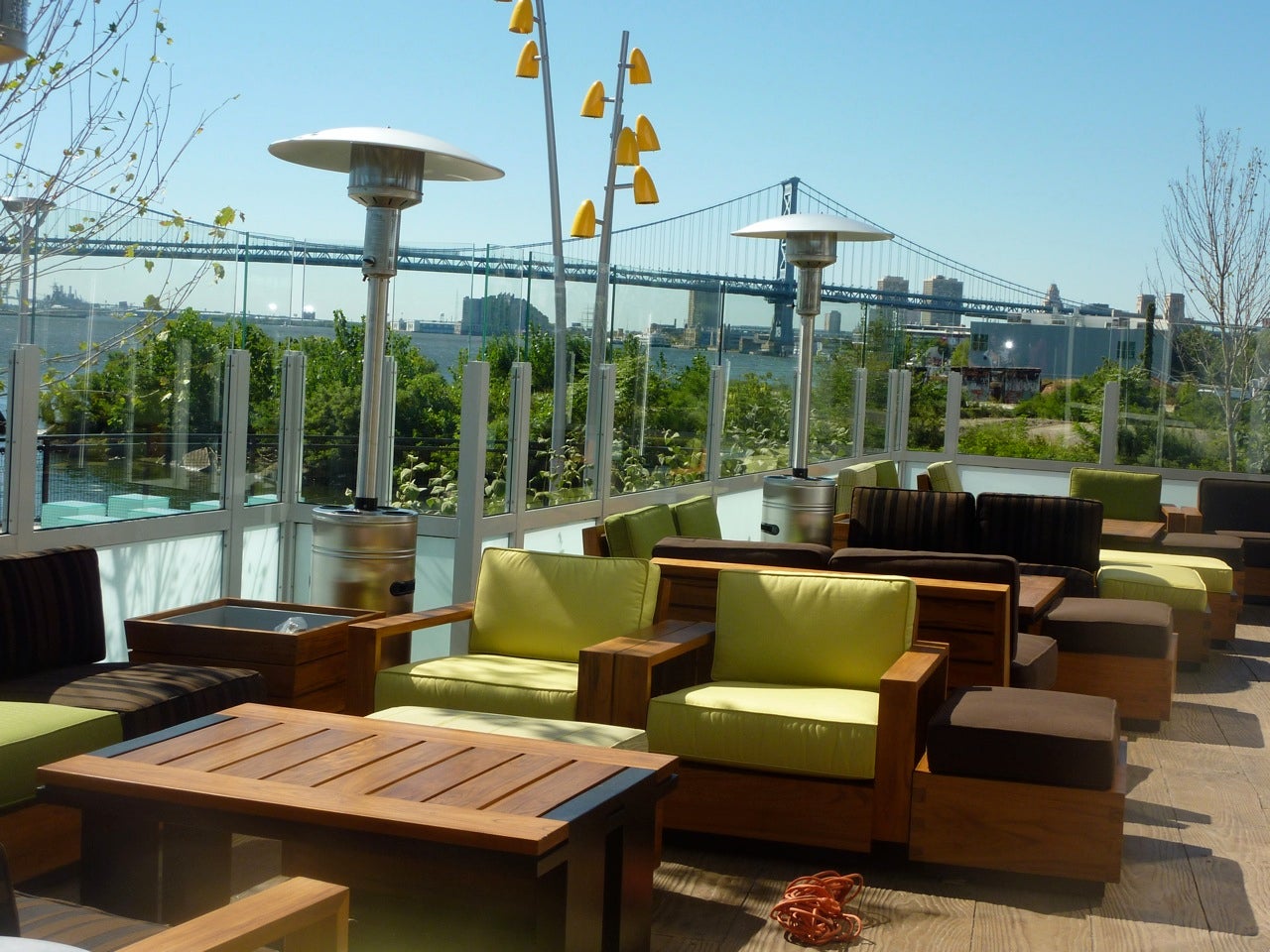
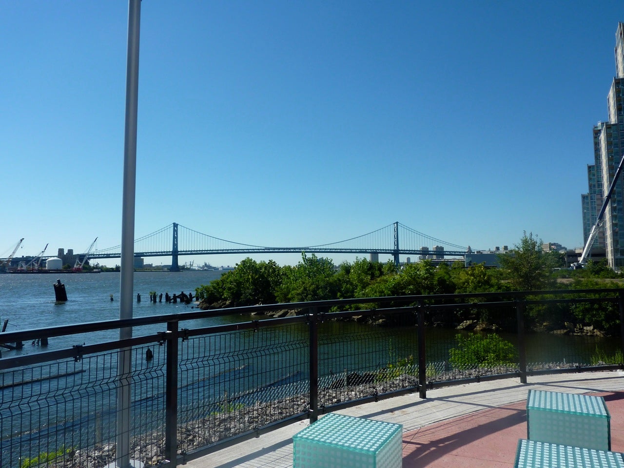
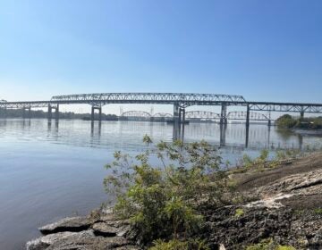
That CLA made this choice is the best thing about the project. Even non-gamers could conceivably — if only, if only, there were still more to do along the river — be drawn here for a happy hour cocktail or brunch, thanks to a comfortable and expansive patio. Nestling on plump celadon cushions and eating off of teak tables, diners will be treated to sweeping views of the Delaware River’s bends, and inspiring photo-ops of the Benjamin Franklin Bridge.
In this fashion — if not in others — the project hews to the recommendations put forth in “A Civic Vision for the Central Delaware,” believes Harris M. Steinberg, of Penn Praxis, the body behind that vision. “The riverwalk is very beautiful,” he says. “They’ve set an extraordinarily high bar for the rest of the river. It’s a tantalizingly small section, and we’d like to see it continue.
“ Steinberg does add that this exemplary element could itself be improved. “From the street, there’s no real indication that this fabulous site exists behind the building,” he says. “There’s plenty of signs about valet parking, self parking, and the like — it’s all about the cars.”
In fact, Steinberg continues, the project is overall decidedly pedestrian-unfriendly. The highway-ish approach, the amount of parking (governed by city Commerical Entertainment District restrictions), the left-turn intersections, and the isolated situation of the building all detract from the urban style development that Penn Praxis would like to see on the river, he says. (For good measure, he adds that the type of building, siting, and lack of active uses all contradict the Civic Vision, as well.)
For now, the pathways on the sides and around the back of the building are indeed a good contribution toward efforts to cobble together a pedestrian and bike trail along, or near, the river. A connection to Penn Treaty Park is increasingly achievable and, once the casino moves ahead with the rest of its Phase I — which will include not only a parking garage, but more gaming and dining spaces — it promises to get nearer still.
For that, the project deserves accolades. ”We were challenged to do a lot of improvements along the waterfront,” says Cope. And, while the architects want to do more still — such as get rid of the ugly drain pipe that’s protruding in the middle of the river — they’re being held up by the Army Corps of Engineers. “We’d like to get obstructions removed and go ahead with dredging,” Cope says, “so the area can be navigable for water taxis.” (The pier pilings that remain, on the other hand, are a picturesque homage to the site’s industrial past, when it housed the Jack Frost Sugar Refinery.)
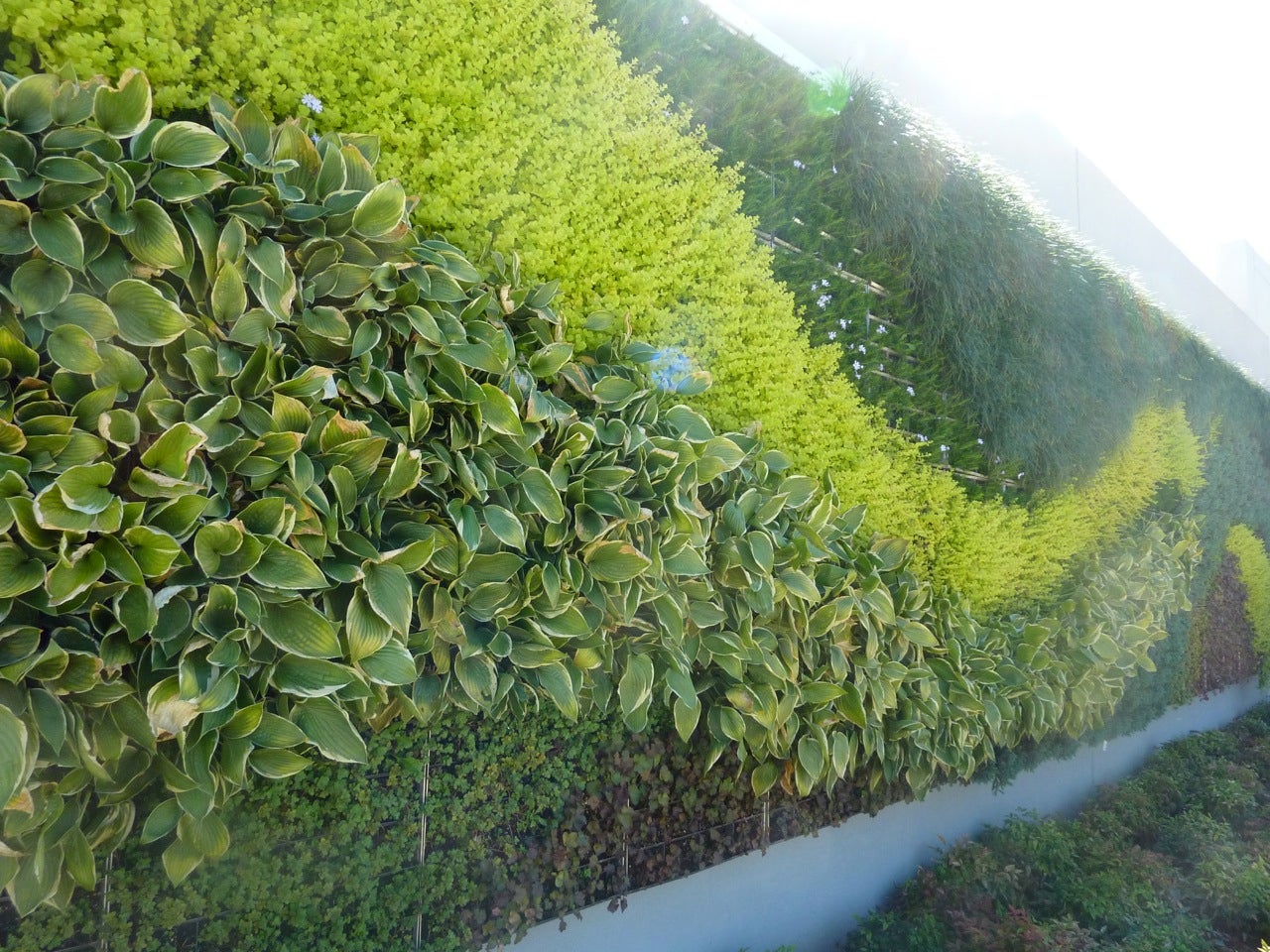
There’s a lot else that works. Plantings of some 450 shade and ornamental trees, ranging from maples and oaks to honey oaks and locusts, and several installations of green walls brimming with variously-hued sedums — all created at a reported cost of $4 million — are positively lush, spilling along the waterfront and enlivening the building’s porte cochere.
And while the large canopy of that entrance makes for an almost too-grand sense of arrival, the gesture is a necessary one since the building’s perch in a sea of empty space requires that strong signals be sent about where exactly its front door is located.
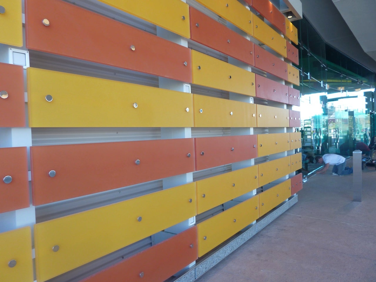
A melody of yellow and orange slats, made from a translucent composite material known as “3form,” is less successful. Cope says it too was chosen to jazz up the building’s portals and to further heighten the arrival, but with colors that bear no resemblance to the casino’s logo or other signage, they seem just there.
The playful sign that hovers above it all, however, is a pleasant surprise, eschewing too-easy mid-century retro references and instead evoking a slot machine in mid-spin. It could be read as a retail-like come-on that carries with it unappetizing connotations. But there’s nothing wrong with that: all who enter know exactly what they’ve come for.
To hit the point home, local interior design firm Floss Barber, Inc. (which, like CLA, also worked on Pittsburgh’s Rivers Casino, majority-owned by the same folks behind SugarHouse) has used luscious metal hues — copper, silver, gold — in the vinyl wallcoverings that line the 51,000-square foot gaming floor. They are, says Barber, “the colors of money.”
The glass-enclosed “high limit” lounge that sits at the middle of the floor is similarly luxe, outfitted in rich leathers and affording big spenders ample opportunity to see and be seen, while remaining shielded from the slot machine “riff raff.”
But there’s not as much of the crassly commercial as we’ve come to expect from these kinds of spaces — notwithstanding, of course, the visual cacophony of 1,600 slot machines like Sex and the City and Ultimate Tower of Power. ”
All casinos have a formula,” says Barber. “An interesting ceiling, a kick-ass carpet, and Dale Chihuly-type lights. We recognize those elements, but we wanted to depart a bit from the norm. This is a Philadelphia casino and should reflect that.”
So, Barber says, the design is inspired by urban loft living. That influence mainly shows up in a few semblances of industrial beams in The Refinery restaurant, and a screen print of the original sign of the Jack Frost refinery in the more casual eatery, Jacks.
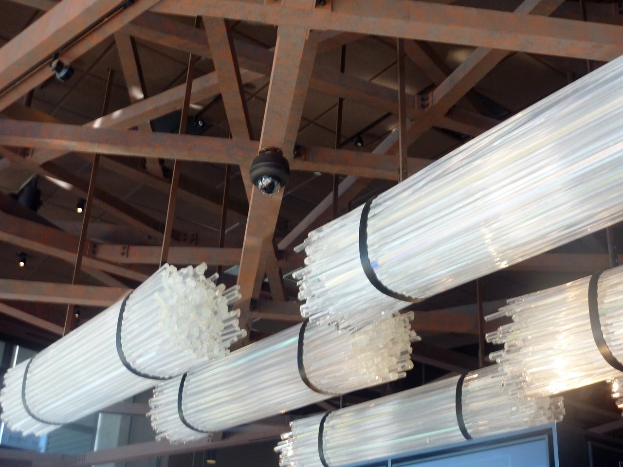
Sugar references, though — now, those are abundant, and wittily evident only upon close inspection. The warm custom-made Irish wool carpet that runs throughout the casino floor — it is indeed instantly noticeable — is woven in sweet honeys and caramels, a glass fixture suspended over one of the bars resembles a tied bunch of sugar swizzle sticks, and mosaic tiles in the restrooms gleam like sugary crystals.
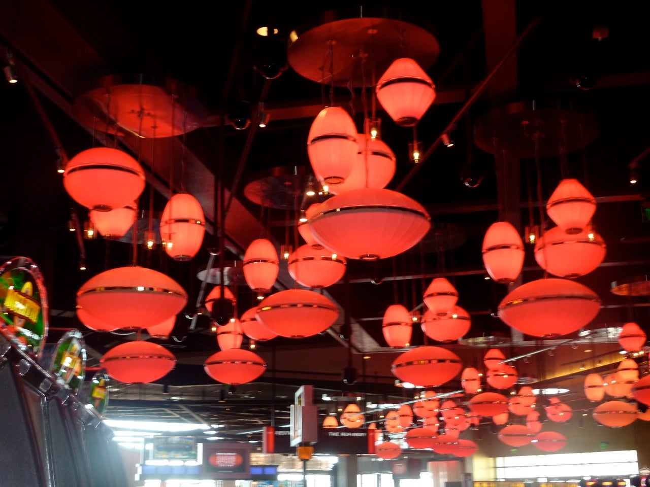
Other design touches are equally subtle. The football-shaped hanging lamps that dot the room like so many UFOs can change color, but are typically red over the Pai Gow tables, and gold over the pits, taking their cues, respectively, from the colors most associated with Asia and with high stakes.
A central red carpet serves as a path for easy navigation through the space — aptly aided by the welcome appearance of daylight on either end. And red is a constant location-helper in other instances: lighting the way towards parking and restrooms, for example.
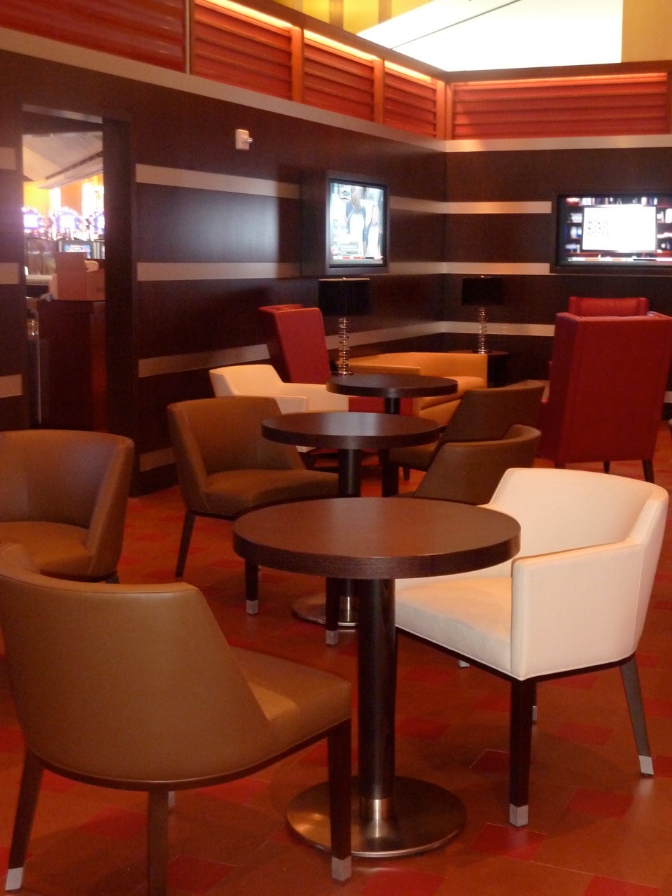
“Because of timing and finances, the challenge here was to work with 85% off-the-shelf products and 15% custom,” says Barber. “Usually it’s the other way around with a casino.” Extras in the main restaurant such as floors laid from end grain wood, banquettes wrapped in a dark blue lace pattern, tables crafted from a grey-and-white stippled stone, and an LED-embedded curtain add distinction and style to what appears to be an understated space.
But that modesty is, it turns out, deceptive. The construction and design budget (between $80 and $90 million) puts this casino squarely on the luxury end, although still nowhere near the mega projects like those in Atlantic City and Las Vegas. Those efforts, though, offer more restaurants, more shops, more parking, and, most significantly, gigantic hotel components.
All of these are included in the master plan for the SugarHouse site. For now, the project is at an “interim” stage, according to general manager Wendy Hamilton. “Phase I itself has yet to be completed,” she says. “It’s our hope that we will expand — dependent on our results. We will build to meet demand and assuming that we go forward, the first priority is the parking garage, more gaming space, and more food and beverage.”
Cope elaborates, saying that the parking garage would supplant most but not all of the current 1,857 surface spots, and would be connected to the main building, while the expanded gaming space would be contiguous to the existing building and could encompass more than one floor. Both expansions would occur on the northern end of the site, where SugarHouse owns additional land.
Steinberg says the way things proceed can make all of the difference. “If they build more parking, but it’s ringed with retail and offices or a hotel, then we’ll start to see more of an urban character,” he observes. “If they simply build large boxes, then it will be detrimental.”
Cope is aware of all of this, of course. “There are ways to landscape that can buffer parking structures,” he says. “And we can certainly strive to put these kinds of buildings in innocuous places, as well as reduce the height of the garages so we break the parapet and preserve site lines.”
Whatever happens, it will be time for a revisit. For now, however, Philadelphians might find that — at least from a design perspective —things have not turned out as badly as they had feared.
Contact JoAnn Greco at www.joanngreco.com
Check out her new online magazine, TheCityTraveler at www.thecitytraveler.com
WHYY is your source for fact-based, in-depth journalism and information. As a nonprofit organization, we rely on financial support from readers like you. Please give today.


