History grafted into contemporary design at Penn’s new Perry World House
These days Penn’s campus is being remade in a new era of major construction projects, each with robust enough budgets to match the university’s high design aspirations. There are show stopping, contemporary works like Weiss/Manfredi’s 2013 Singh Center for Nanotechnology joining preservation-minded projects like the renovations to Louis Kahn’s Richards Medical Research Labs.
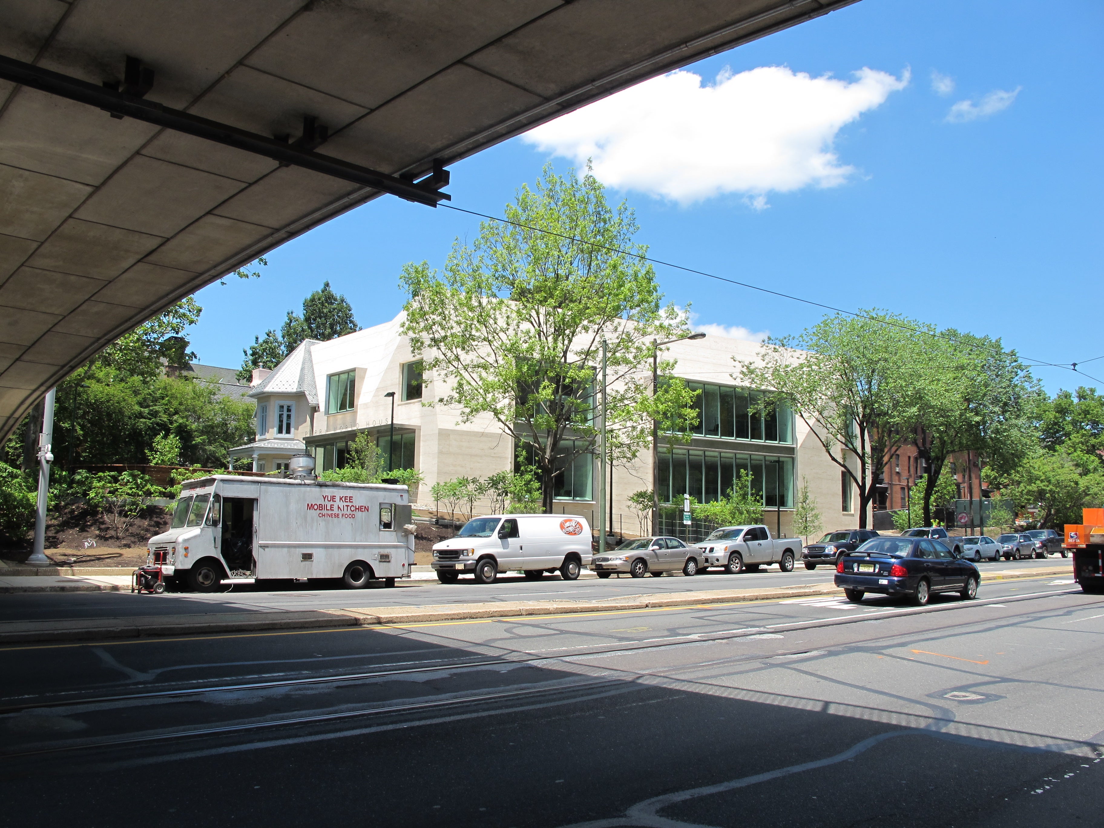
More difficult to categorize is a project like Penn’s new Perry World House, tucked just north of the Locust Walk pedestrian bridge over 38th Street, where 1851 runs headlong into 2016.
For the last century and a half, a romantic little cottage designed by Samuel Sloan stood on this corner, spending its life as suburban home turned frat house. When the fraternity moved out, a question remained: What would become of this tough little Gothic house? Penn found its answer in the desire for a new center to house and link its many global initiatives.
Perry World House, established thanks to a gift from University Trustee Richard Perry and his wife Lisa, will serve as the hub for the global work of Penn’s 12 schools, on campus and abroad. In form, it borrows a page from the site’s history, but it is an unsentimentally contemporary building.
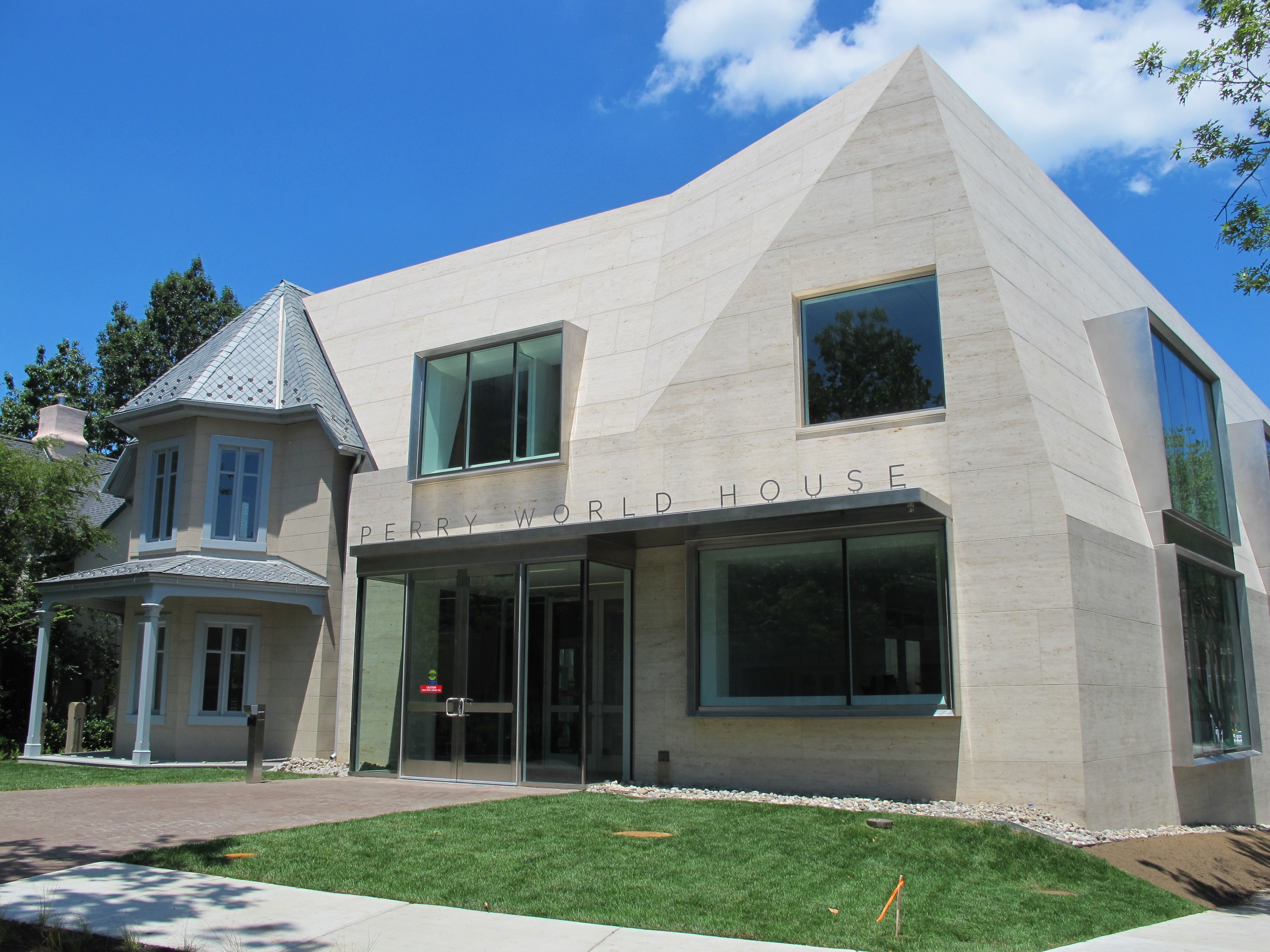
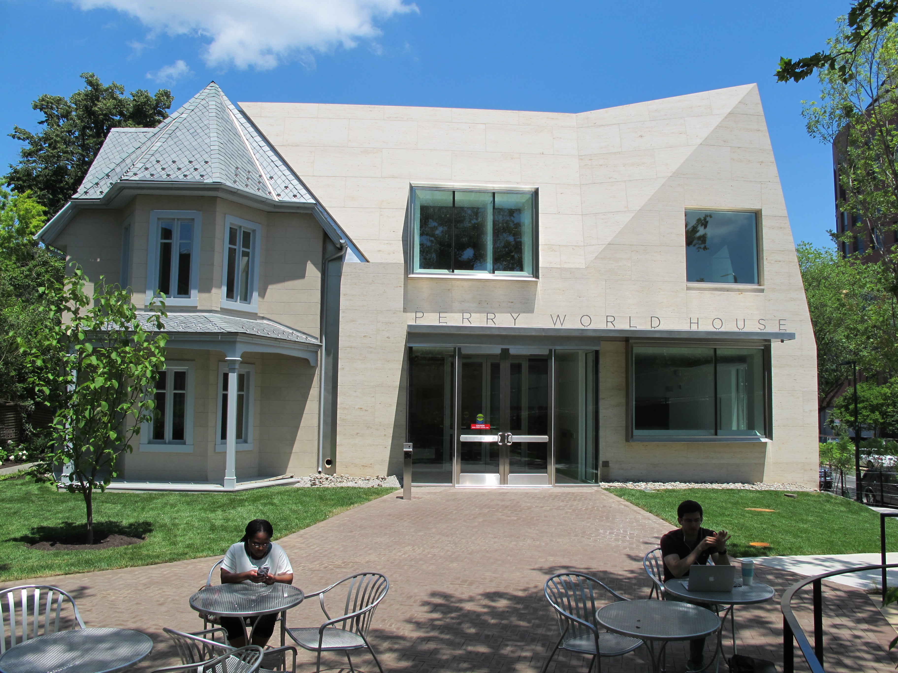
1100 Architect, a Frankfurt- and New York-based firm, formed Perry World House from corner of the Sloan cottage grafted onto a highly contemporary new building.
University Architect David Hollenberg likes to call the design a “collage” approach, blending legible elements of the Sloan cottage remnant with a new building’s sculptural form that takes a few cues from its predecessor.
This is, emphatically, not preservation. It’s not even really the kind of fetishy sculptural facadism of Mitchell/Giurgola Associates’ Penn Mutual Tower at 6th and Walnut, which kept a piece of John Haviland’s 1830s facade. It’s more like the design equivalent of a mythical beast, like a pegasus or a griffin, a new whole formed from radically different elements.
“The relationship is contrast,” Hollenberg said as we toured the building.
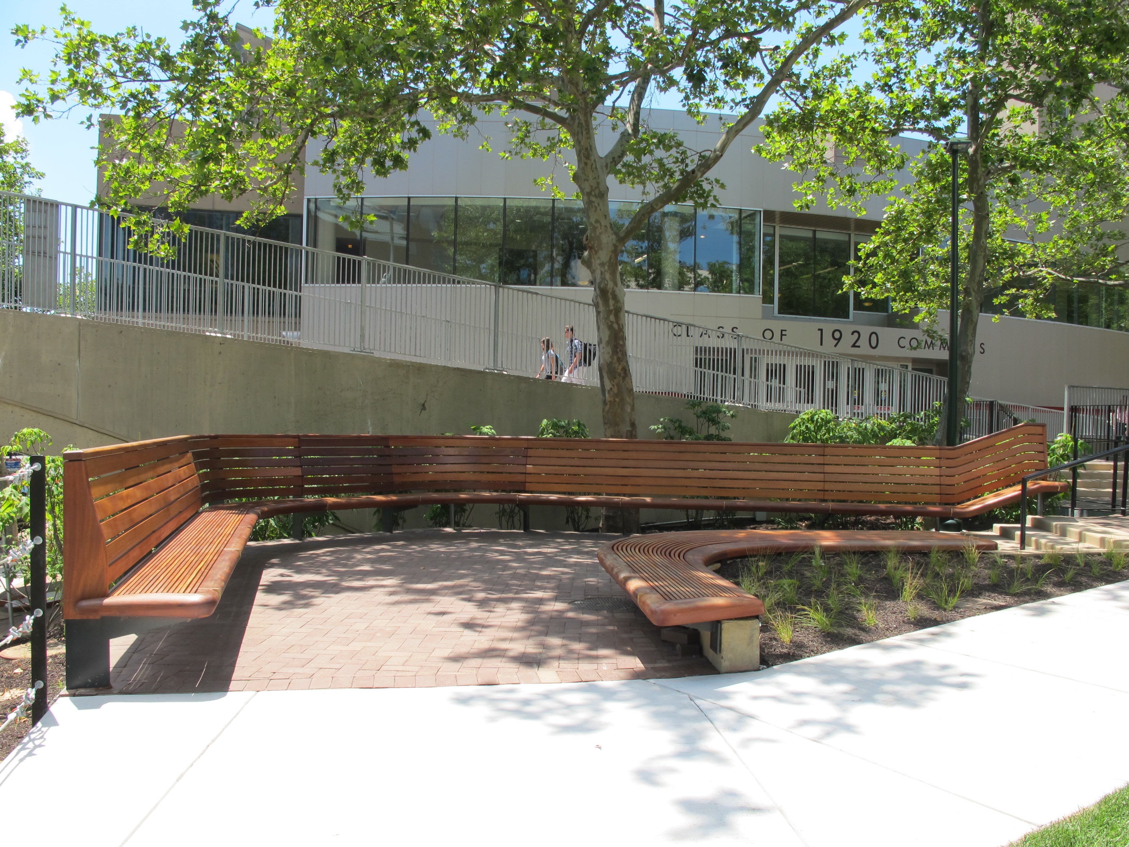
Approaching the building from Locust Walk, Perry World House is set back in a landscaped court with curved wooden slat benches, designed by Studio Bryan Hanes and fabricated by the Challenge Program. It is almost like an eddy, a place to catch campus life off the flow of the pedestrian bridge over 38th Street and connecting to the street below via a ramp.
Face the building’s primary entrance from the court and you see the contrast in high relief. The Sloan section telegraphs “house” — it is Perry World House, after all — through its traditional window forms, a wee porch, dormer windows, and slight slate roofs.
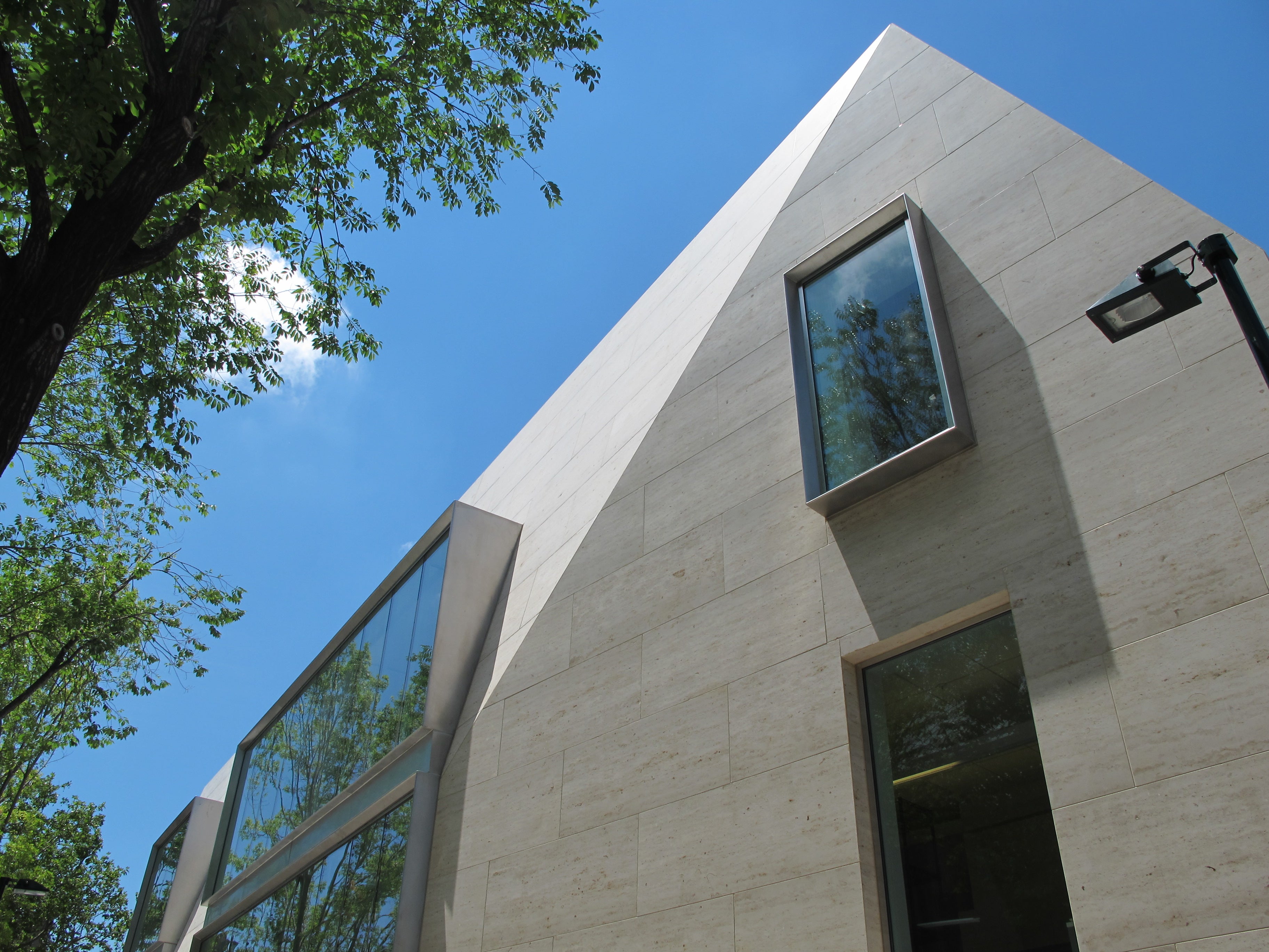
A sharp aluminum zag marks the joint where the Sloan shard and new building meet, outlining the old form into the new. Pointing east from a smooth field of limestone, the roofline of the new structure points skyward like the prow of a crooked ship.
The new building’s boxy aluminum window surrounds deepen as the walls pull away, leaning inward on the upper stories, a nod to the traditional dormers that pierce the Sloan side’s roofline.
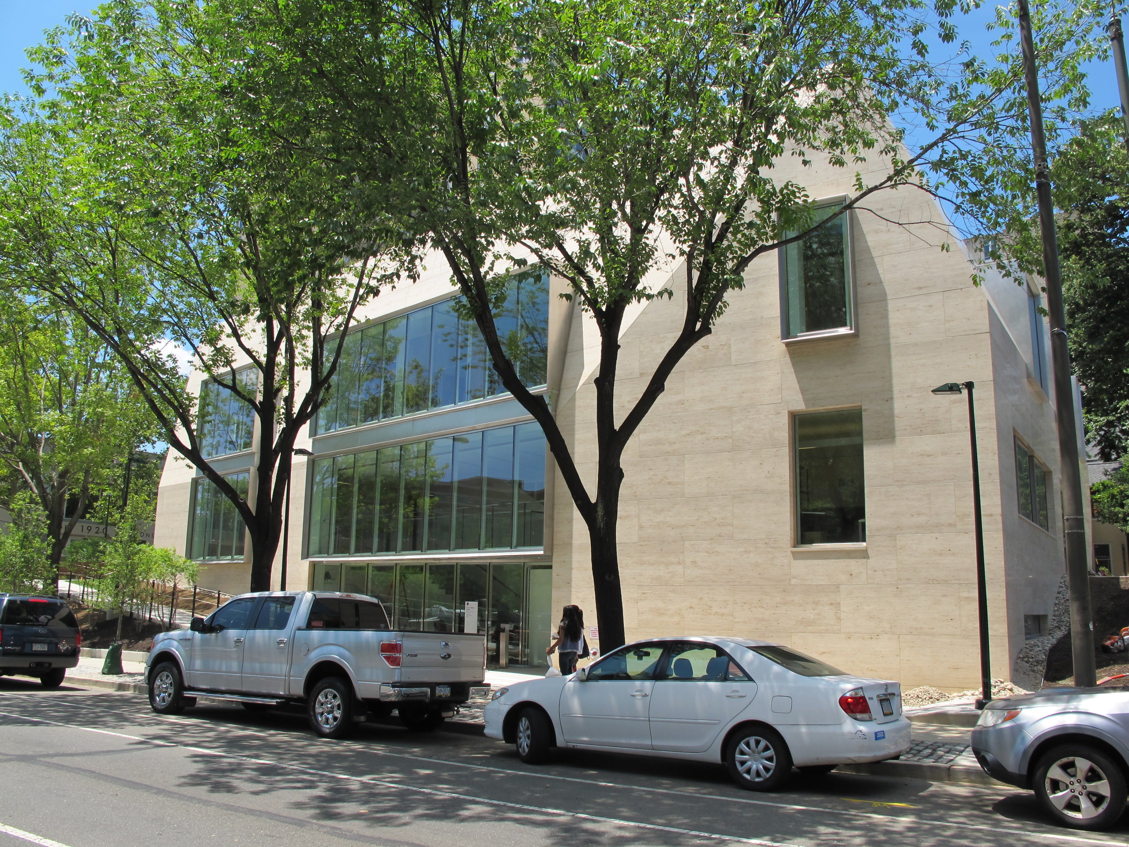
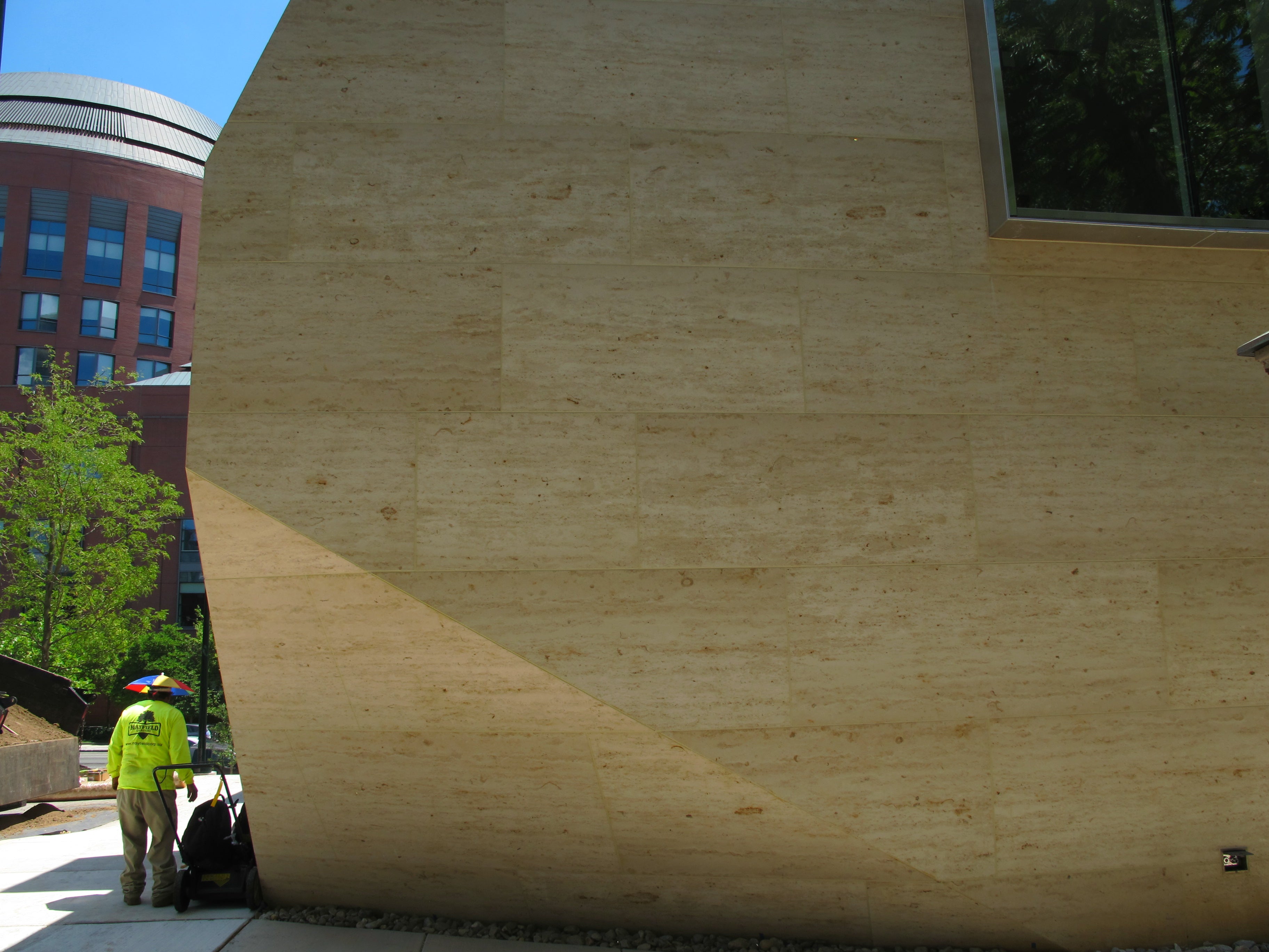
The exterior is clad in a buff German limestone, its blocks set like smooth oversized subway tiles in a running bond. From the northeast corner along 38th Street, it weighs on the site as the building pulls down toward the sidewalk and again points skyward. The solidity of the streetside wall is broken up by a field of windows (some inset, others punched out), a new lower-level entrance, and a ramp leading up from the street to the courtyard outside the primary entrance.
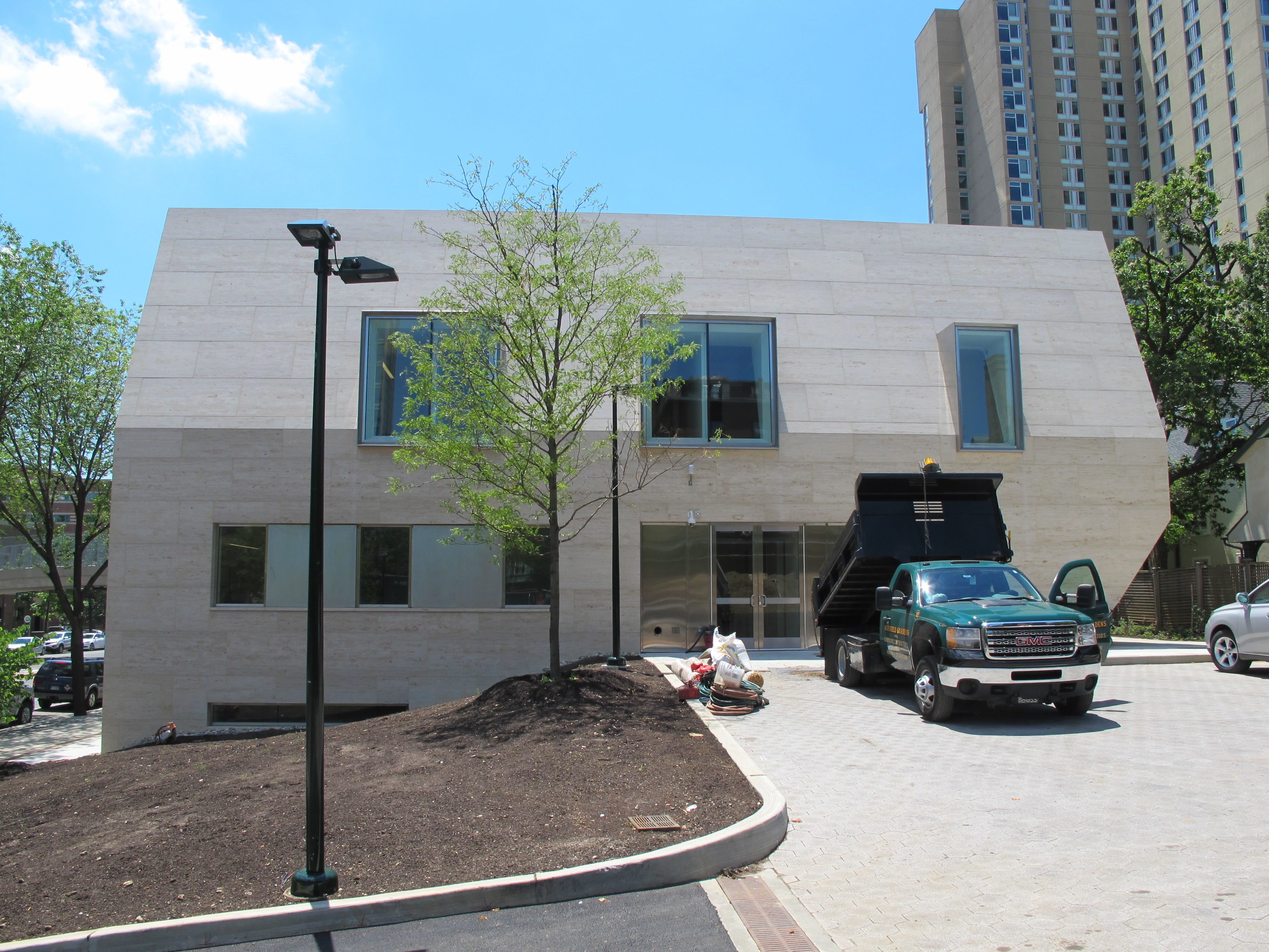
The building’s mass is also undercut at the northwest corner, where the corner is trimmed back at the base of the building. This is the cleverest move on the building’s north end — this side has a service entrance overlooking a driveway, and its form is reminiscent of the shell covering a pickup truck bed.
1100 Architects was charged with creating comfortable, flexible gathering spaces; offices for guests and permanent staff; and a welcoming, open environment. The Perrys, for whom the $17.8 million project is named, also prioritized the aggressively contemporary architecture, Hollenberg said.
The Perrys, he a successful hedge funder and she in fashion, have an extensive collection of pop and contemporary art. Inside you could mistake the building for a private sculpture gallery, playing unobtrusively with lively lines and light. Walls bend inward, windows tip and light abounds. Finishes are a restrained palette: Limestone is used for the floors, glass forms walls and rails, and the crisp white ceilings are split for lighting or perforated for sound baffling.
There is a domestic kind of scale to the two rooms inside the Sloan corner of the building, with interior touches like wood floors and pointed dormer windows. The rest of the building is airy, with virtually no corridors. Offices or meeting spaces open to lounges, which flow to open halls.
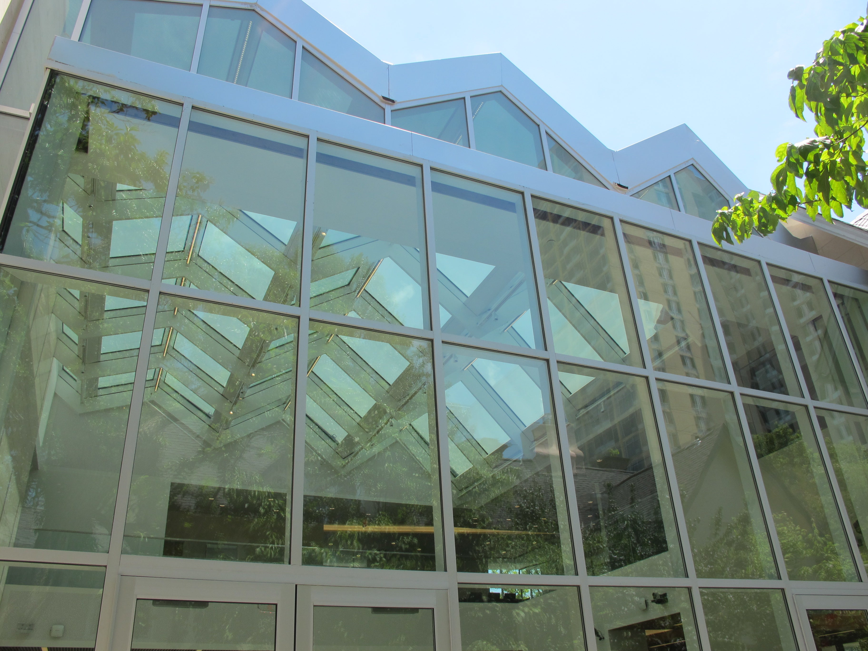
The central portion of the eastern and western walls is glassy. Huge windows to the east grace a powerhouse office and lounge. To the west, the double-height World Forum space features a glass curtain wall facing the garden at Kelly Writers House next door, topped with an irregularly zigzagging glass roofline that allows the forum space and the central stairs to be washed with light. (To these Philly-stained eyes, the roofline also reminds me of one of the old entrances to the Gallery. In a good way.) The glassiness of the World Forum makes the intimate space feel bright and seem bigger than it really is, and it telegraphs a message of transparency. It seats 150 lecture-style, but is intended to be flexible. Its first event was a recent dinner for Trustees.
It’s common to see historic buildings with big new additions that force new designs to defer to the old. At Perry World House elements of Sloan’s design distantly echo in the new building’s form, but it is in no way humble or subservient to the past. Instead it is brashly contemporary in ways that also aim to disarm. Purists may balk, but Perry World House is a fine example of design that incorporates history while finding powerful expression unencumbered by preservation dogma.
WHYY is your source for fact-based, in-depth journalism and information. As a nonprofit organization, we rely on financial support from readers like you. Please give today.
