Dilworth reopens refined: solid, smooth, and splashy
I recently heard an architect describe the old Dilworth Plaza as optimistic. Vincent Kling’s design, he said, was perhaps overly charitable in its estimation of how people would use the space. When the plaza was built in the 1970s few foresaw that its ledges, subterranean nooks, and shifting levels would prove most popular among a shiftless population and that its generous hardscape would be loved by skaters.
About the best thing I can say about the old Dilworth Plaza, between its tree cover, dark corners, and inhabitants, is that it was shady. Now it is just the opposite.
After nearly three years of work, the plaza on City Hall’s extended western apron has been remade, its Bicentennial-era funk thoroughly ironed out, at the hands of public and private partners to the tune of $55 million.
On September 4 two-thirds of the new public space, recast as Dilworth Park, opened with much pomp – speeches, Temple’s marching band, fireworks and streamers. Meanwhile workers press on to complete the southern third of Dilworth Park, which should be fully open in November. Sometime next year the public art element, a mist sculpture by Janet Echelman, will be installed.
It is too soon to judge how well Dilworth Park will function as a public space and how Philadelphians will adopt it. It will remain incomplete for months and these early days are packed with events intended to fill the space with people. But some early impressions are already revealing.
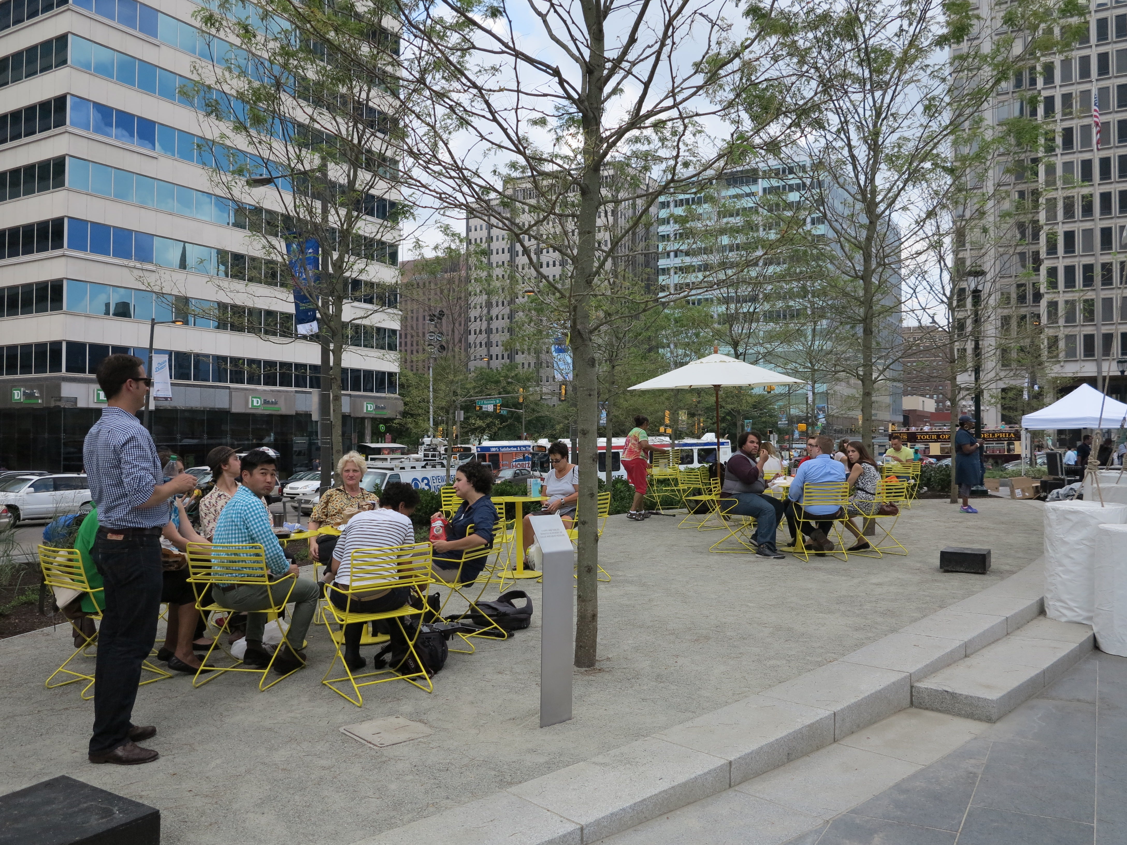
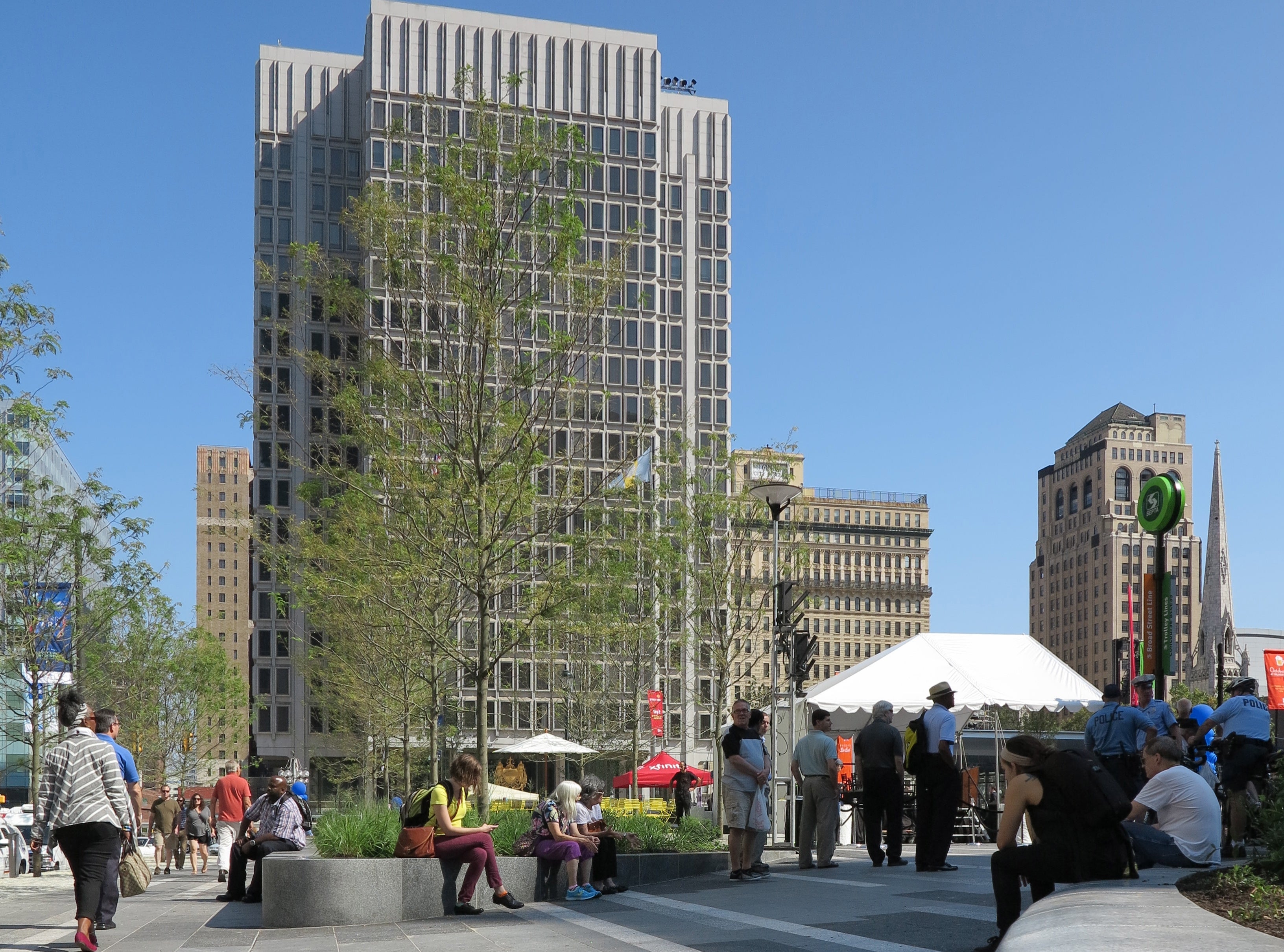
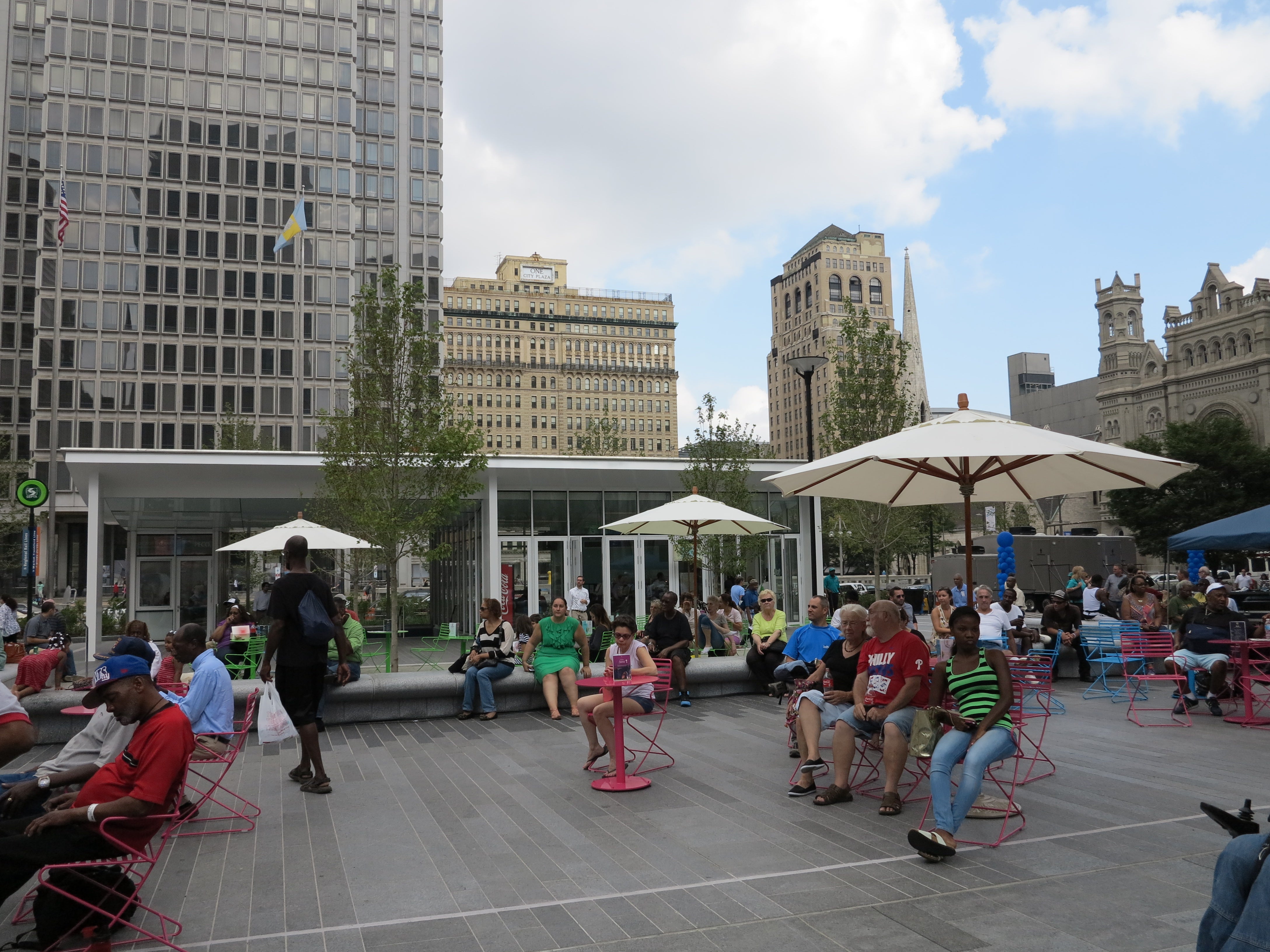
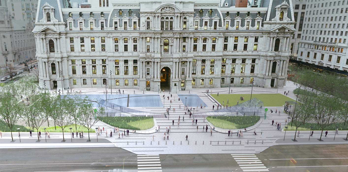
The new Dilworth “Park” embraces the current playbook for placemaking advanced by groups like the Project for Public Spaces. Low stone planters and curvy benches, designed by OLIN, offer places to pause, as do the cheery movable tables and chairs set in the tree groves. A major water feature animates the plaza’s vast granite heart, adding pleasant sounds and inviting kids to splash. There’s also a café and the promise of extensive programming, both intended to draw visitors and give them reasons to linger.
Thanks to these shifts alone the new Dilworth is going to be active and safe in ways that the old plaza could never muster.
The redesigned Dilworth also affords City Hall a dignified setting. Stand back and you can actually admire the building’s magnificent architecture, no longer obscured by the old plaza’s thick trees, its exuberant grandeur complemented by new life at the ground.
In an effort to signify all of this change Center City District (CCD), which has a 20-year agreement with the city to manage the plaza, rebranded the space as Dilworth Park. CCD wants to emphasize the space’s new parklike features: tree groves, a lawn, fountain, and green design elements. Plus Center City District believes “plaza” carries the gloomy baggage of the dead, hard spaces created during urban renewal. Yet Dilworth is still very much a plaza, and they should have simply reclaimed the word. (I intend to simply refer to it as Dilworth.)
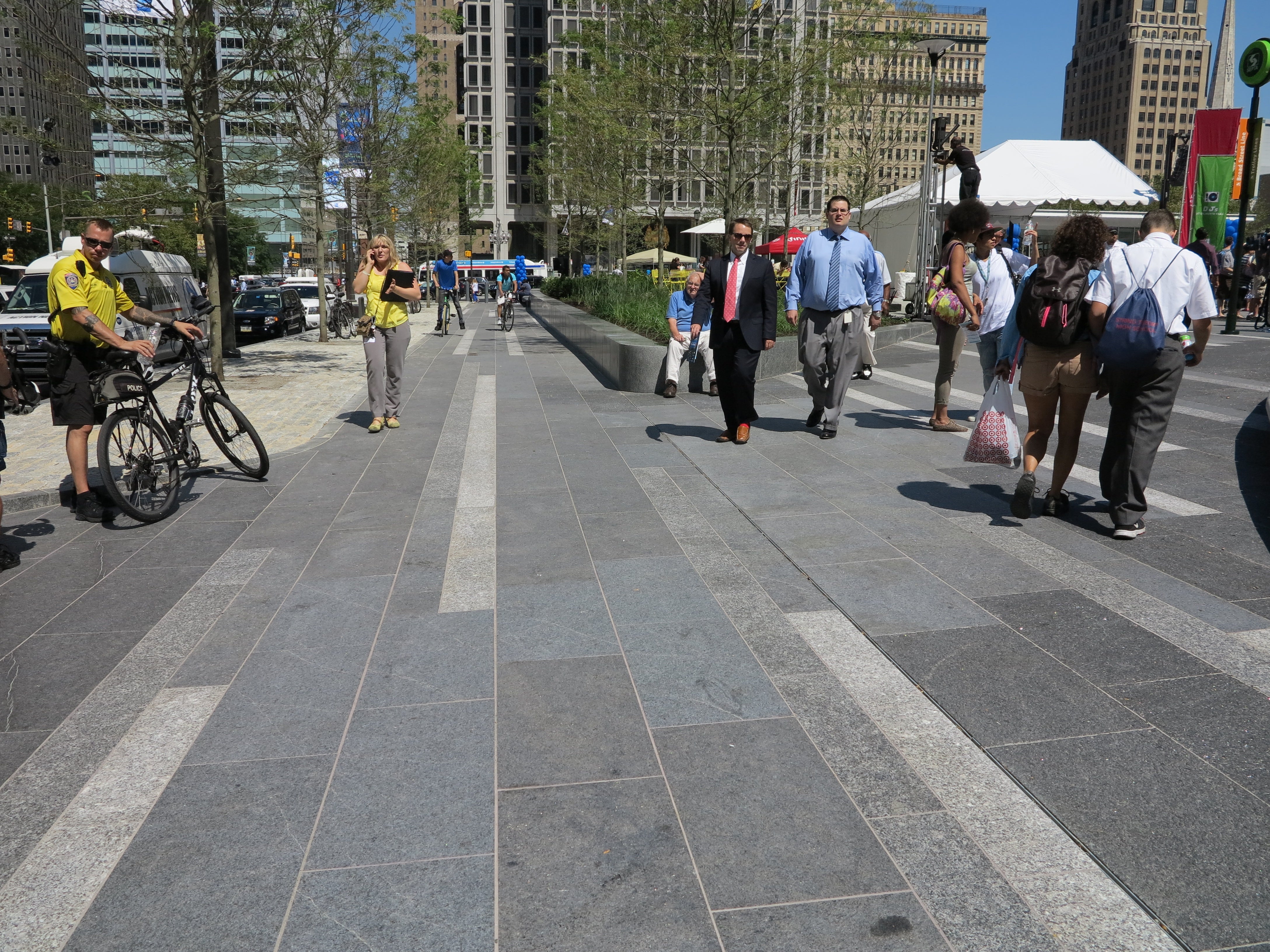
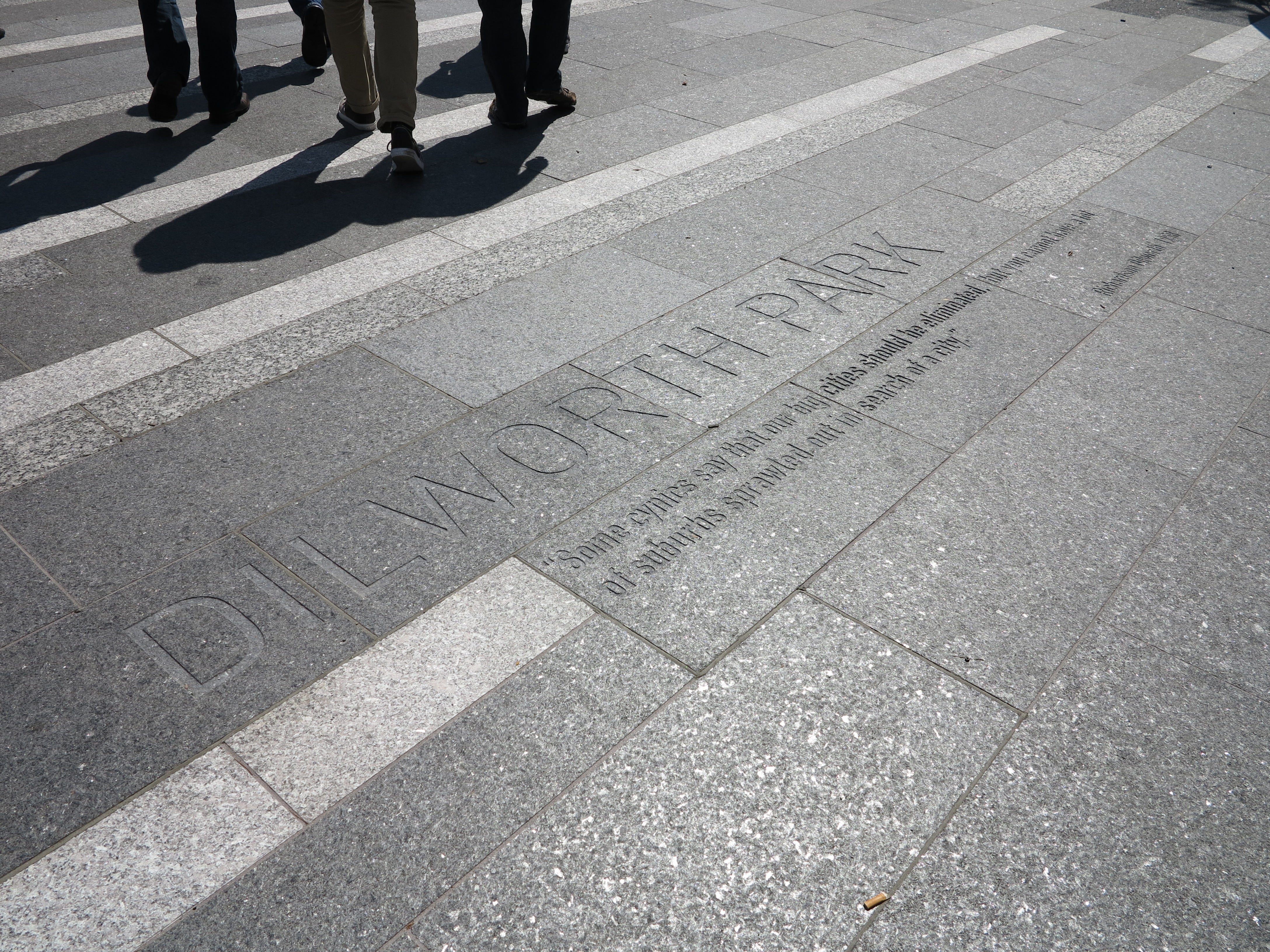
Dilworth is primarily composed of hardscape: Some 24,000 pieces of granite, in varying textures, scales, and shades that add dimension to the vast space. Lush it is not, but there is some greenery to help break up all of that granite. Stone planters are filled with trees and plants, which will help create a green transition zone between the sidewalk and plaza once the vegetation matures. The forthcoming lawn on the south side should also help soften the space.
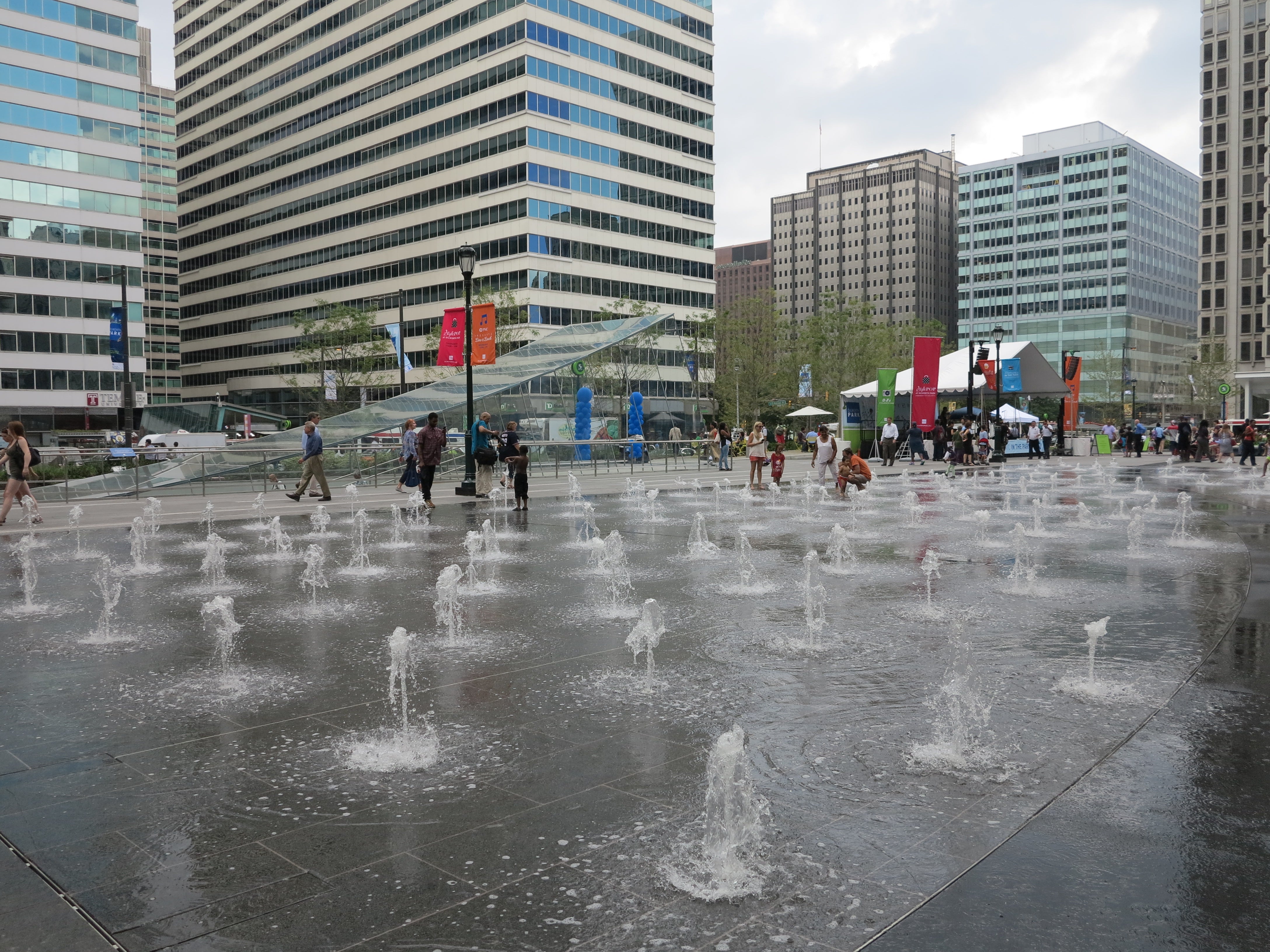
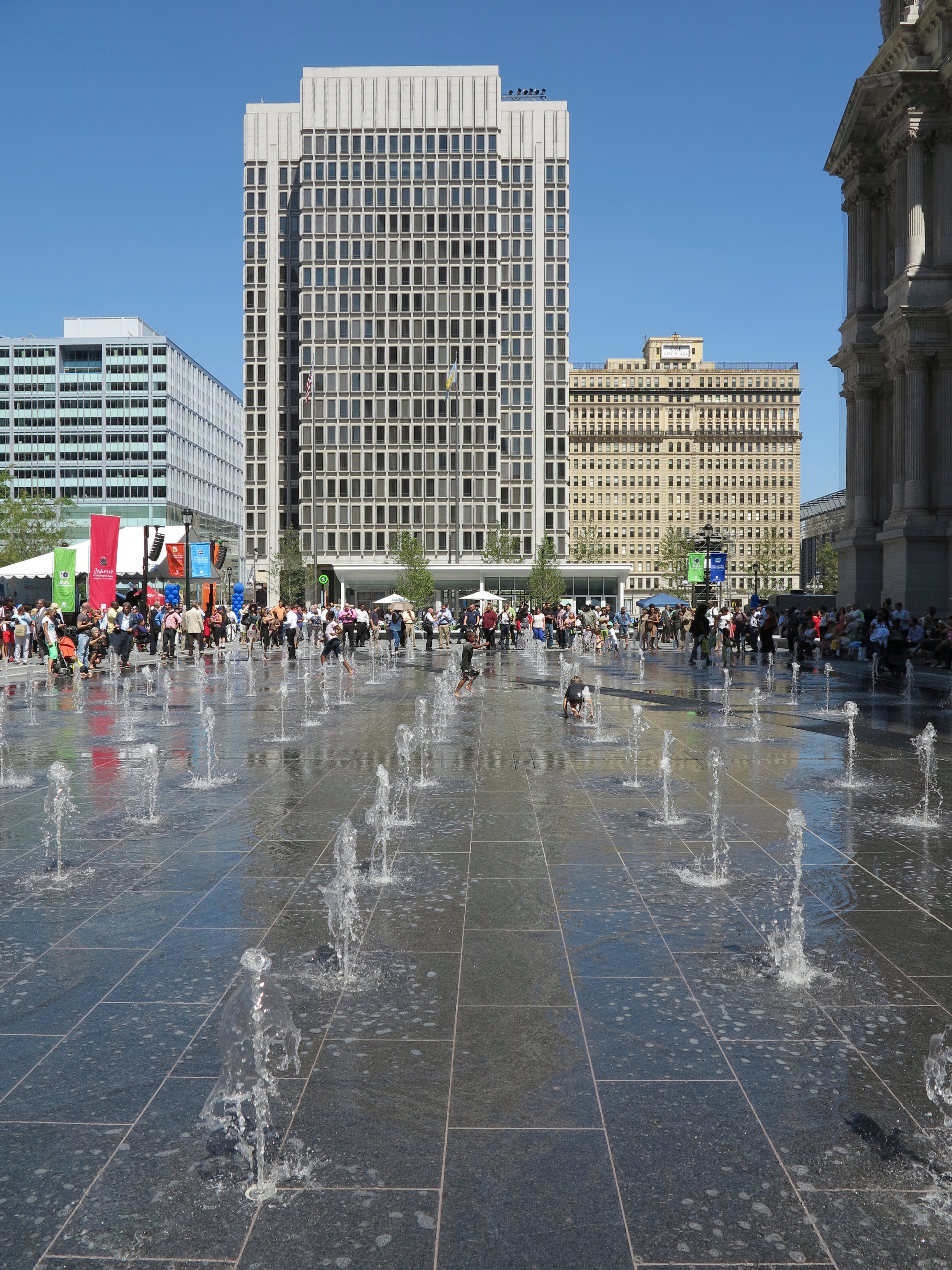
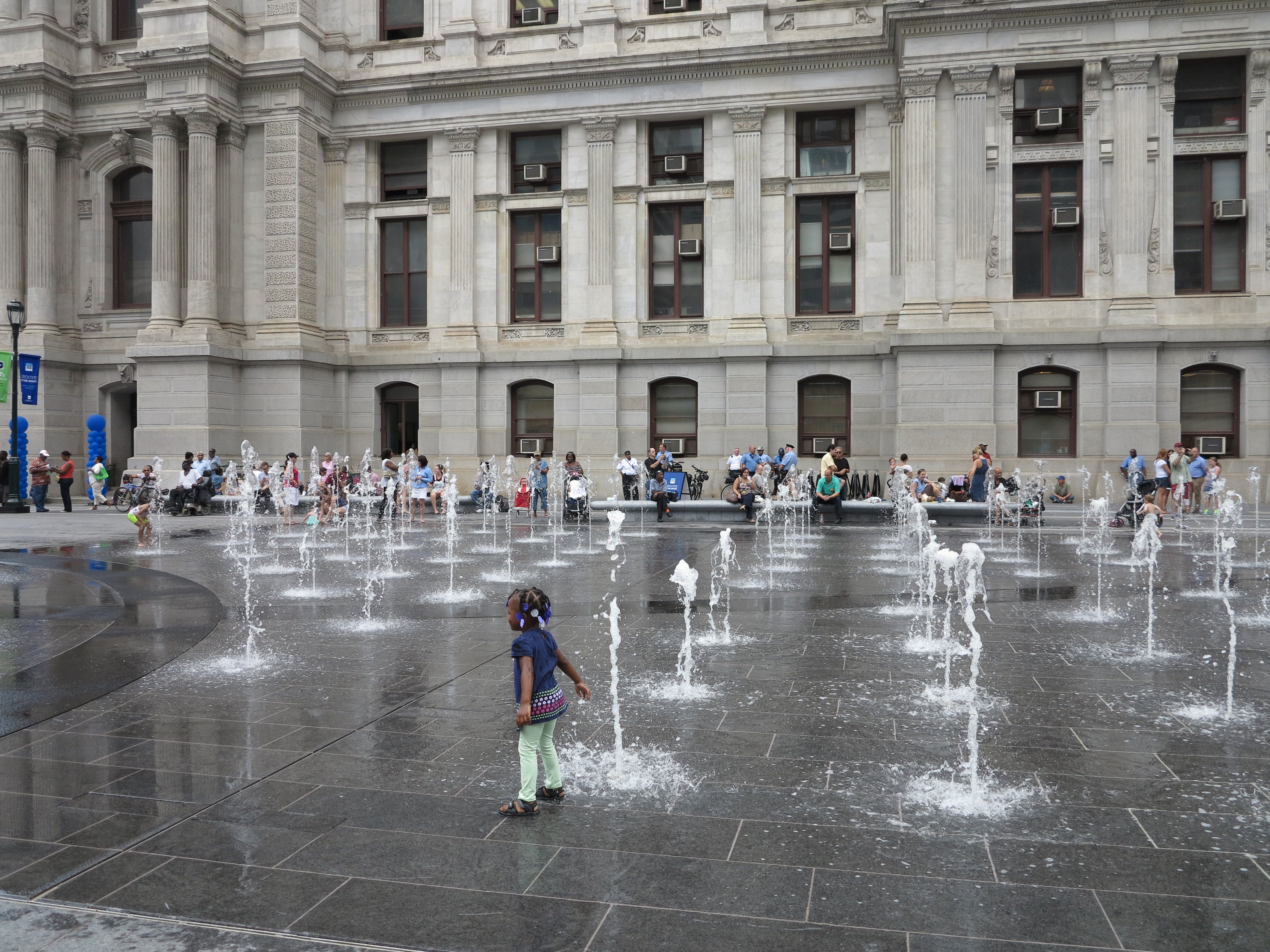
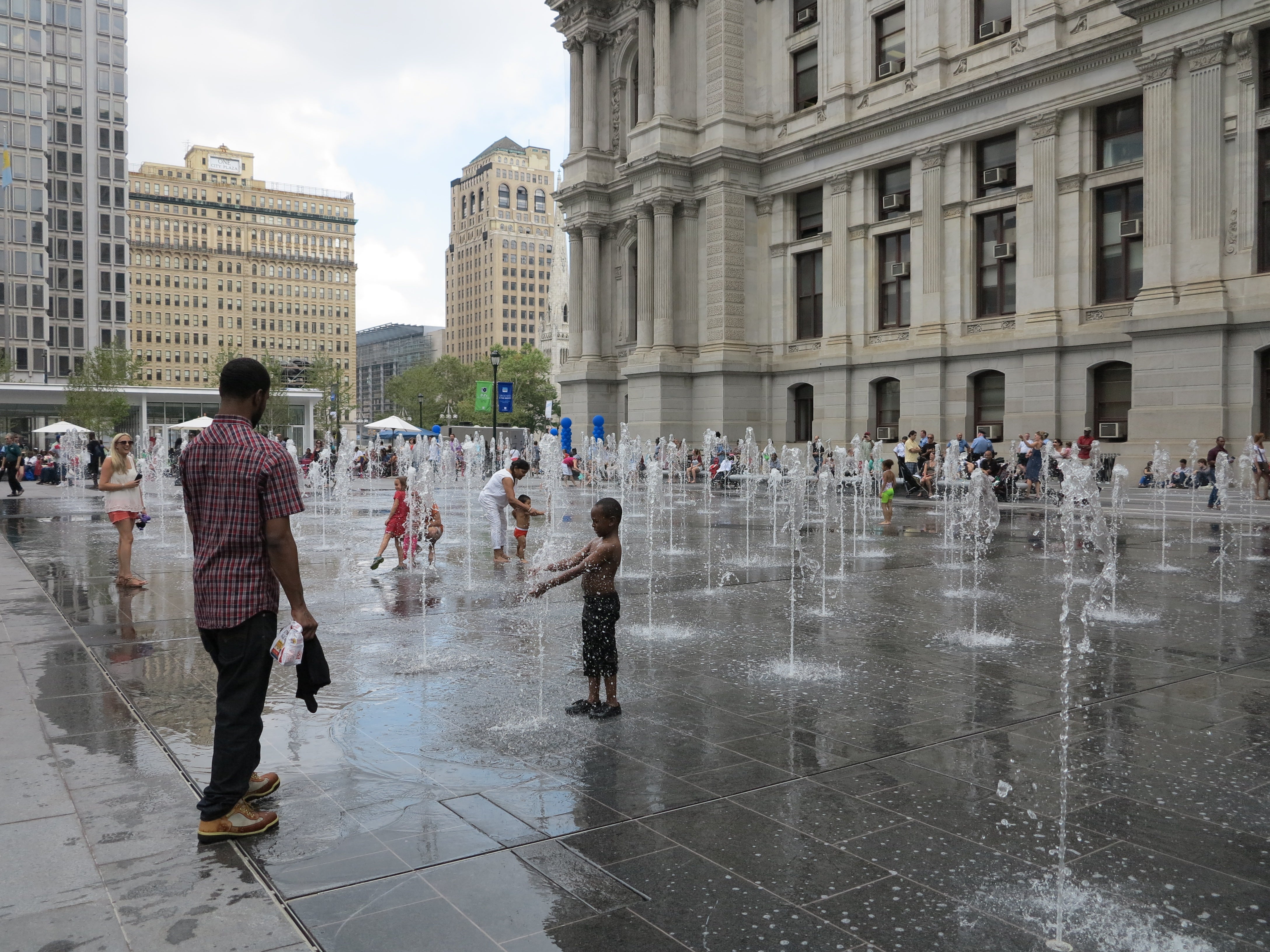
Much of Dilworth’s granite-clad core is filled by a shallow six-section programmable fountain, with spouts arranged in a grid. (Sometime next year Janet Echelman’s mist sculpture will also wind through the fountain.) The water feature serves a couple clear purposes: It will add life to the plaza when people are scarce and it invites families to linger as kids play in it – an already popular activity thanks to last week’s heat.
But the fountain feels less like a playful gesture than a way to fill the space and direct traffic. Its design drives pedestrians to nearby walkways, creating a more intimate sidewalk-scale circulation pattern in spite of Dilworth’s overall size. The fountain will probably also deter the most frequent users of the old Dilworth Plaza, skateboarders and the homeless, from reclaiming the broad space.
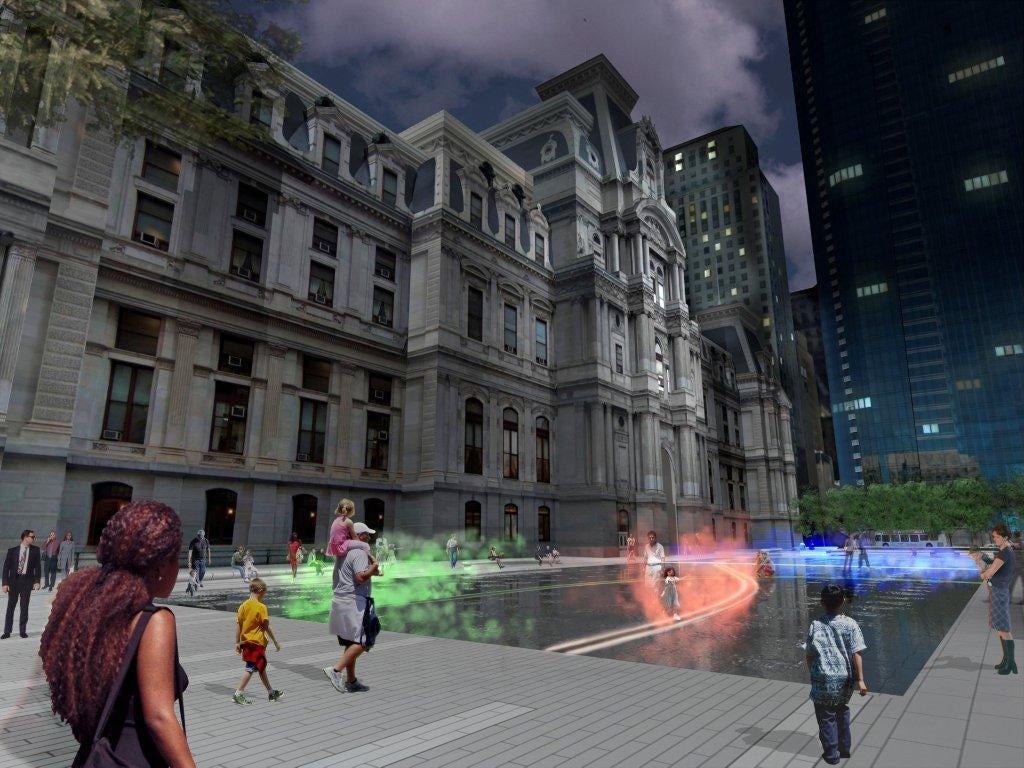
For now, splashing kids make the fountain seem fun. My hope is that the mist sculpture will do the same in a more enduring, less seasonal way. Janet Echelman’s sculpture interprets the movement of three transit lines below the plaza. Bands of “dry” mist, illuminated in the colors of the transit lines, will sweep through the fountain signifying the real-time arrival of a train or trolley below. These ribbons of SEPTA-hued mist should offer a welcome and freeing contrast to the fountain’s rigid formality.
I’m also hopeful that Dilworth will sparkle a bit with winter magic when an ice skating rink replaces the fountain. Come December, imagine KieranTimberlake’s swooping glass transit entrances as icebergs, acting as gates to a winter wonderland where skaters glide over the rink at the base of City Hall, a glorious ice castle. A little lighting and imagination and the scene could be spectacular against the backdrop of winter gloom.
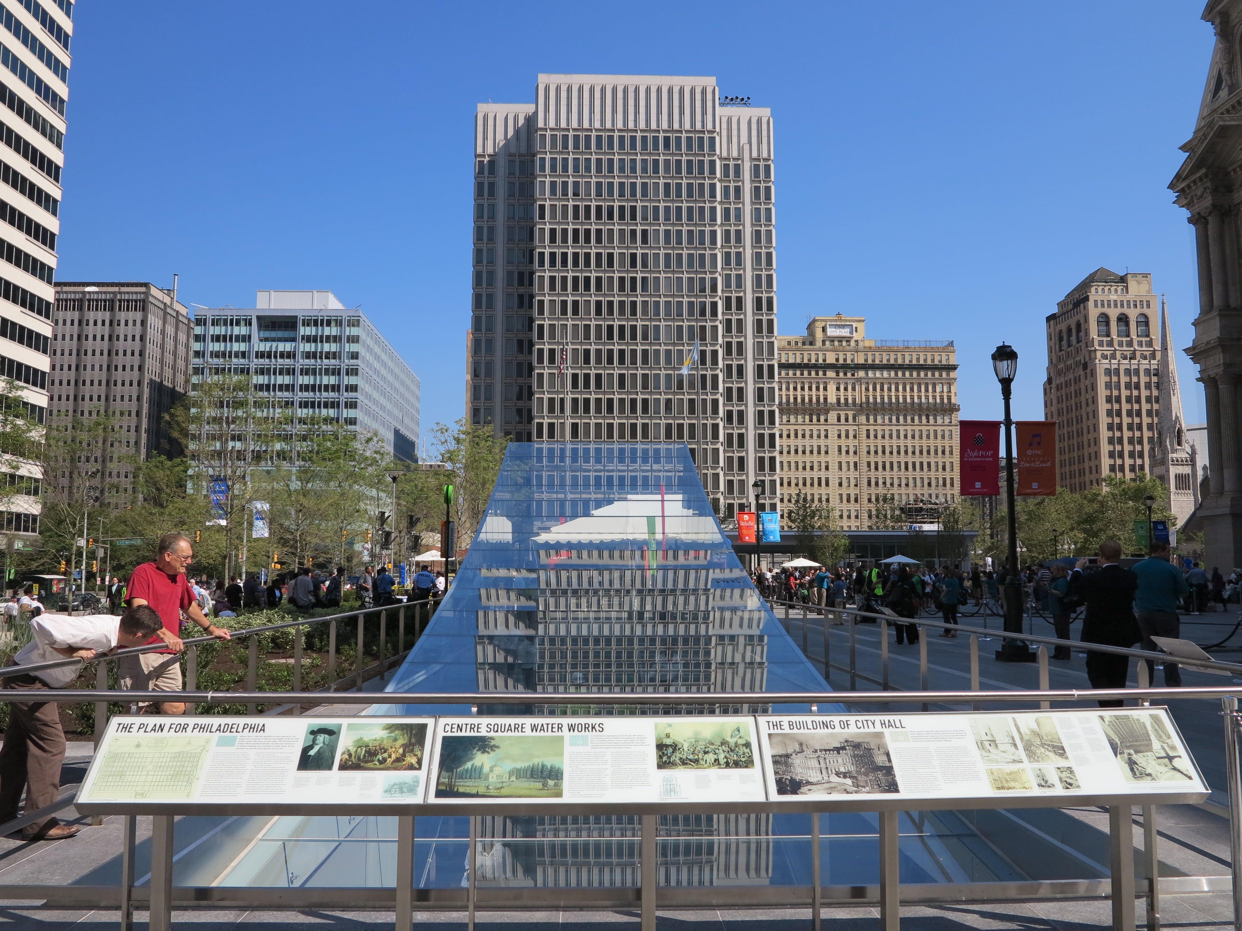
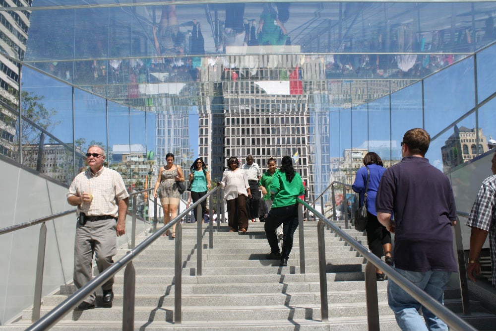
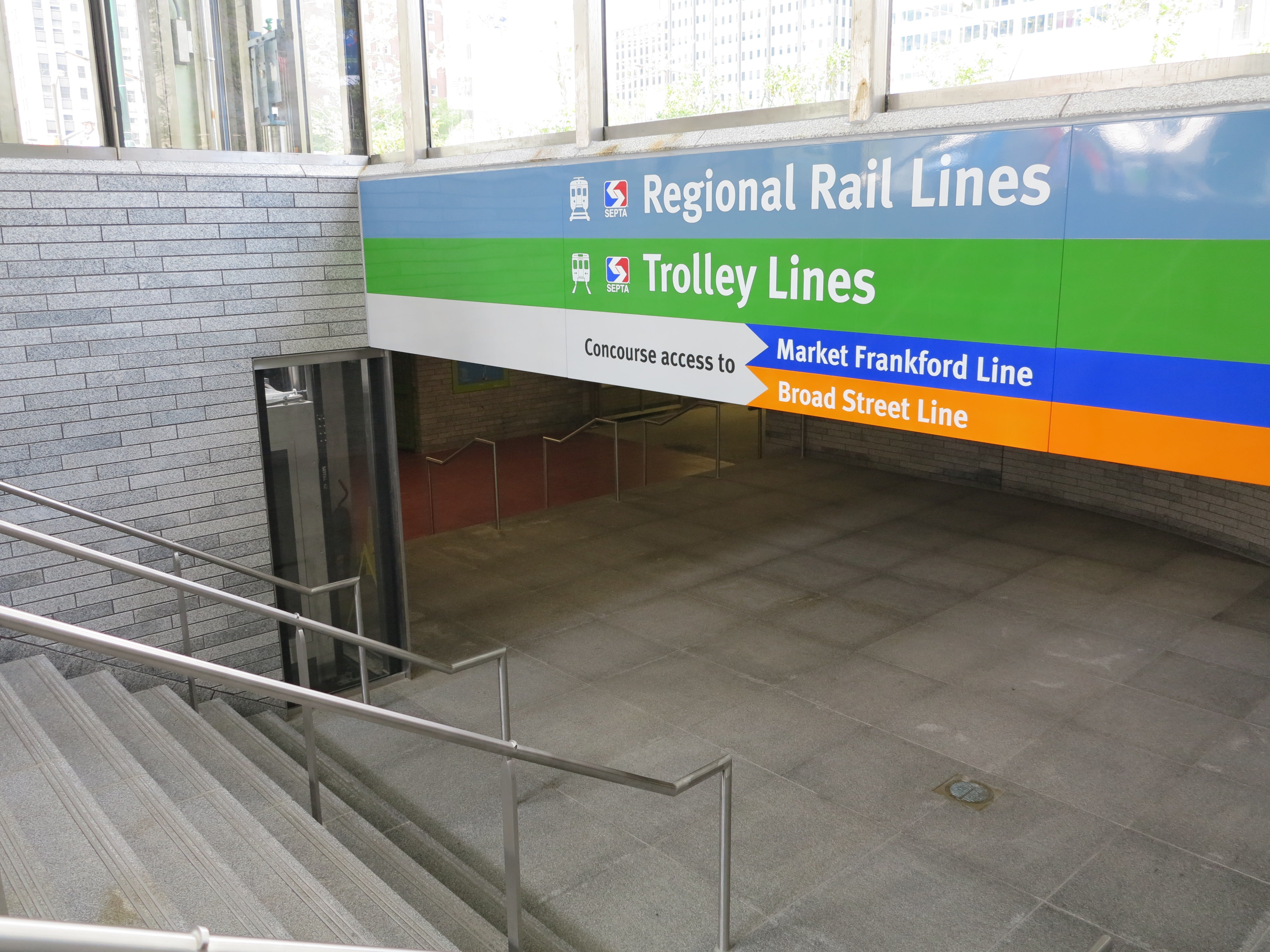
The new Dilworth is part public space project, part transit improvement project geared at making clearer connections to the transit stops and the concourse below. New elevators, swooping glass headhouses, and an entrance clad with polished granite are far more attractive and user-friendly than the old plaza’s entrances.
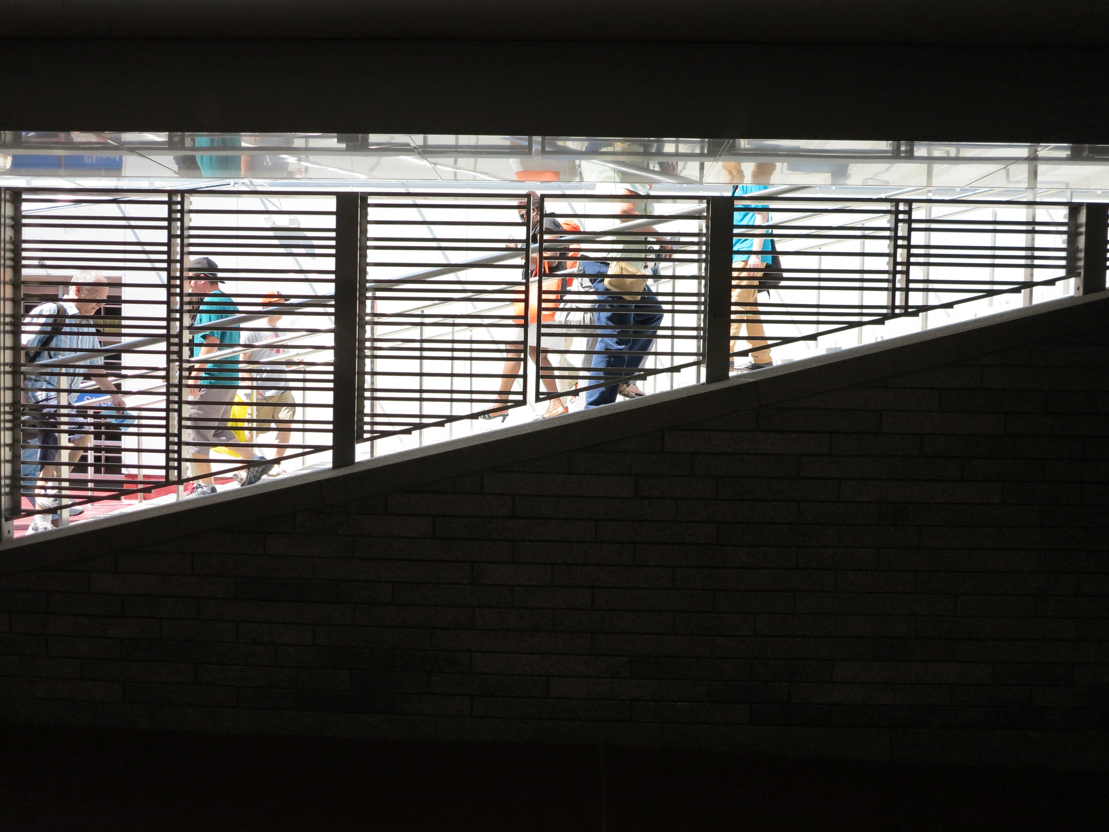
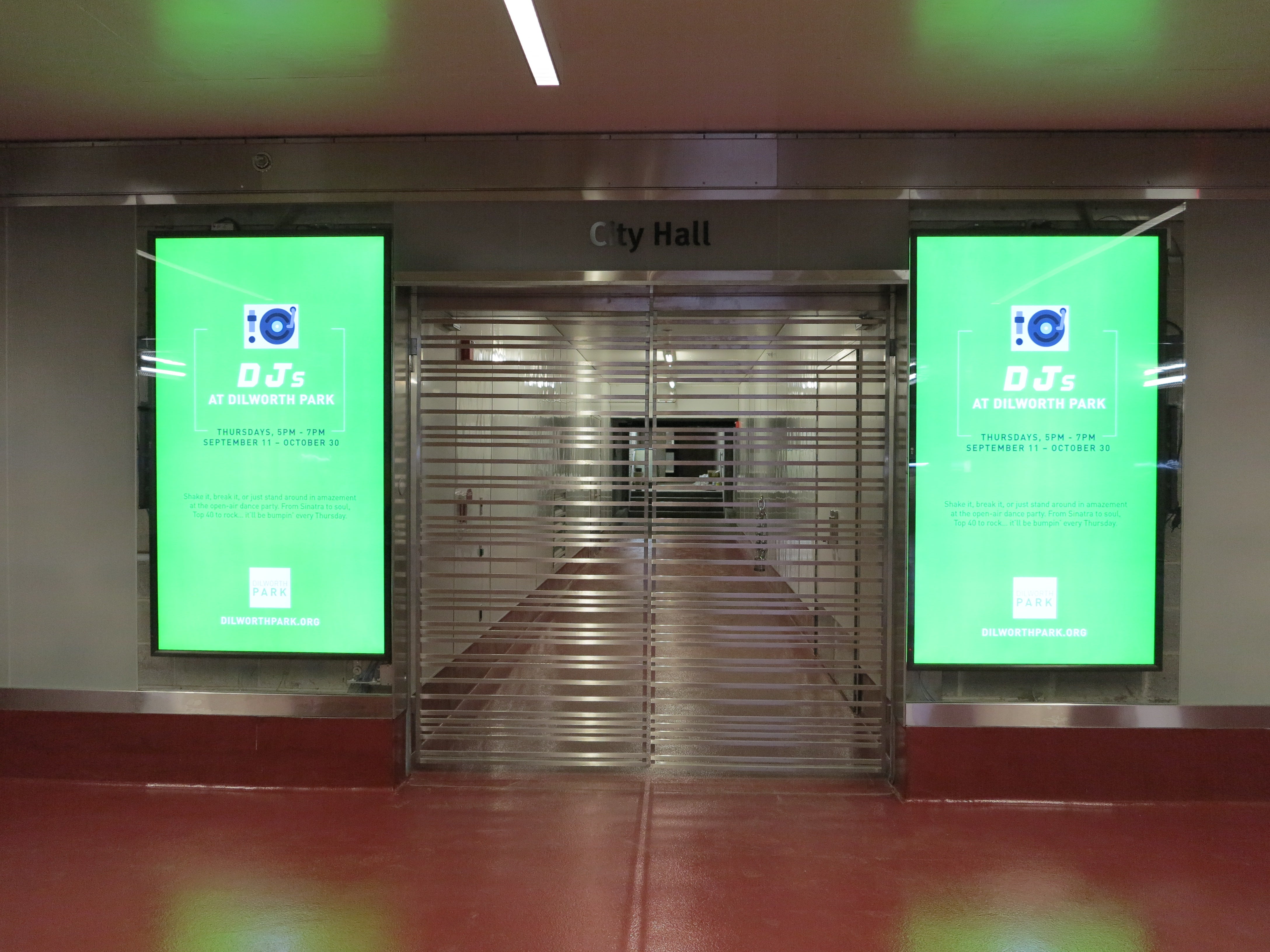
The glass pavilions are reflective and light, creating a luminous transition between Dilworth and the station areas below, while framing views of City Hall. Polished granite recycled from the old plaza adds a refined (and easy to clean) finish to the northern stairwell and walls, particularly along with digital display screens and milky glass on the long concourse.
It’s enough to make one believe that we live in a city with plenty of money to spend on a quality transit experience. If only the improvements SEPTA made in time for the Dilworth project were more harmonious with those made by CCD’s team.
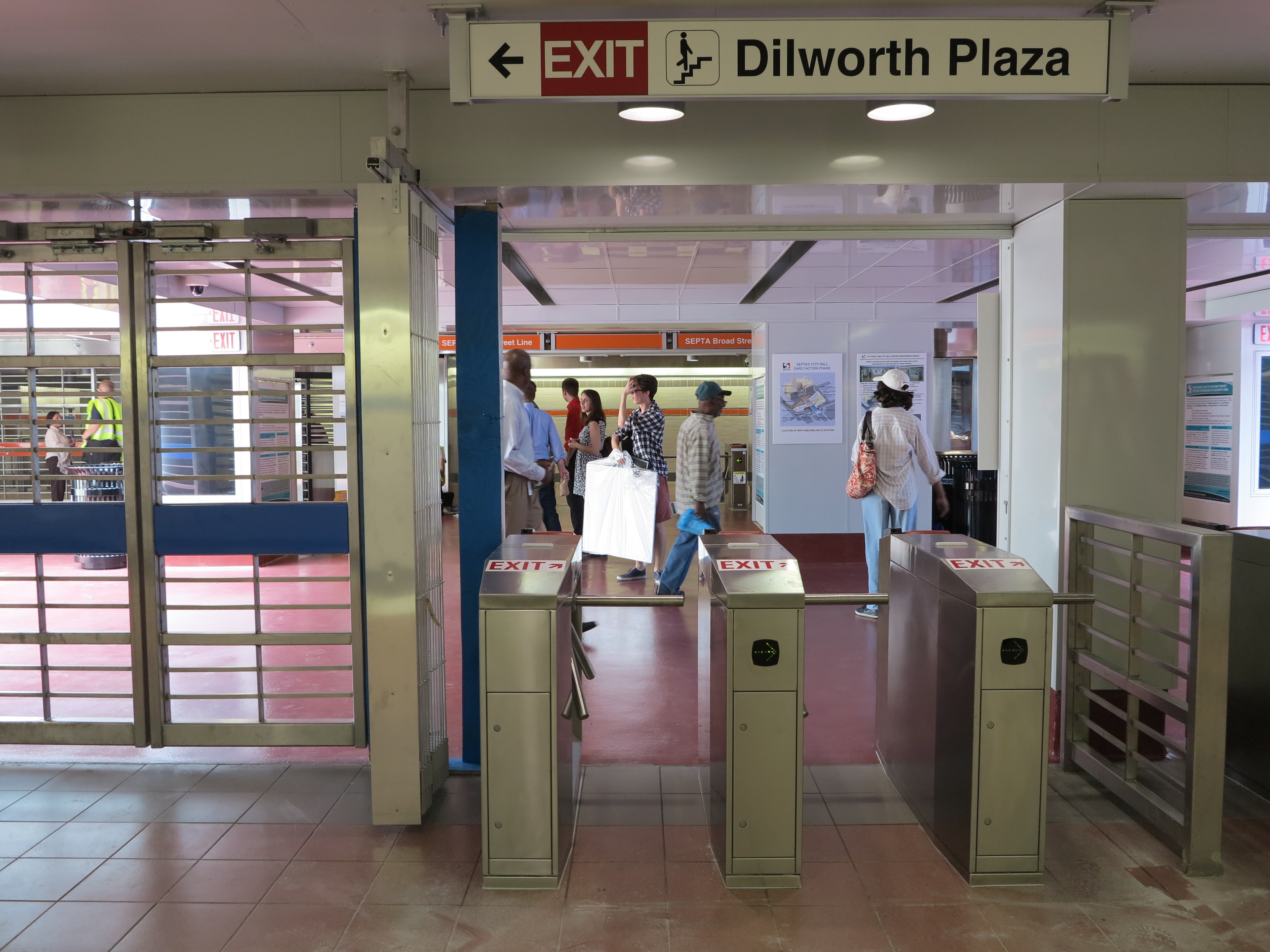
SEPTA’s choice of materials hardly relate to the improvements made as part of the Dilworth Park project seen on the other side of the fareline. Evidently SEPTA and the Dilworth team didn’t even use the same color of white paint for ceilings. Still, the refurbished station entrance areas are clean, bright, and offer a preview of SEPTA’s updated entrance look. The new station entrances have turnstiles and gates designed for SEPTA’s forthcoming New Payment Technology. (For now transit riders without passes must pay via token at the single booth and then navigate to the correct platform.)
Despite the design discord, there is an otherwise tantalizing promise: SEPTA says it will embark on a long overdue City Hall Station overhaul, transforming that tangled and grungy space into something more fitting for Philly’s civic heart.
That, of course, is also the optimism embedded in the new Dilworth – that grit and decrepitude don’t have to define our prime public spaces. Instead Dilworth offers a fresh face for visitors and an opportunity to reboot public life outside City Hall. Like Philly itself, Dilworth may have an exterior as hard as granite but there’s lively potential bubbling up too.
WHYY is your source for fact-based, in-depth journalism and information. As a nonprofit organization, we rely on financial support from readers like you. Please give today.


