Pro-Trump counties continue to suffer far higher COVID death tolls

People hold signs as they stand near parked semi-trucks during a protest against COVID-19 vaccine mandates and other issues, Saturday, March 5, 2022, at the Capitol in Olympia, Wash. (AP Photo/Ted S. Warren)
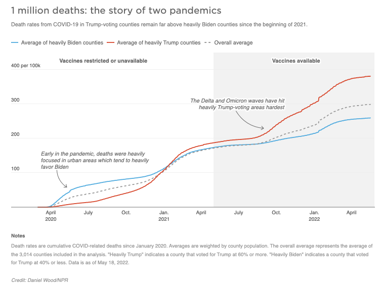
Even with widely available vaccines and newly effective treatments, residents of counties that went heavily for Donald Trump in the last presidential election are more than twice as likely to die from COVID-19 than those that live in areas that went for President Biden. That’s according to a newly-updated analysis from NPR, examining how partisanship and misinformation are shaping the pandemic.
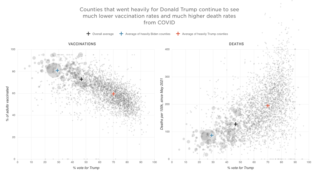
NPR examined COVID deaths per 100,000 people in roughly 3,000 counties across the U.S. from May 2021, the point at which most Americans could find a vaccine if they wanted one. Those living in counties that voted 60% or higher for Trump in November 2020 had 2.26 times the death rate of those that went by the same margin for Biden. Counties with a higher share of Trump votes had even higher mortality rates.

The scale of the preventable loss of life is staggering. According to a recent analysis by Brown University, nearly 320,000 lives nationwide could have been saved if more people had chosen to get vaccinated. The Brown analysis also shows a partisan split in how those preventable deaths are distributed. States that went most heavily for Trump – including Wyoming and West Virginia – have among the highest rates of preventable deaths, while states that voted heavily for Biden – such as Massachusetts and Vermont – had among the lowest.
“How you vote should not predict whether you die of COVID,” says Jennifer Nuzzo, an epidemiologist at Brown University School of Public Health. The social causes of the divide are complex, but the immediate reason is dead simple: Trump-leaning counties have far lower vaccination rates than those that went for President Biden. NPR’s analysis showed that the gap was 21 points, with 81% of adults vaccinated in heavily-Biden counties compared to 60% of adults in counties that went for Trump.
According to the CDC, vaccinated individuals are 10 times less likely to die from a COVID-19 infection than the unvaccinated.
Nuzzo says she sees the partisan divide in COVID deaths as one of the major failures of public health messaging in this pandemic. “Public health advice about vaccines often says, ‘Talk to your doctor,'” Nuzzo says. But many people don’t have one.

Meanwhile anti-vaccine advocates have found new audiences on social media, often by feeding into conspiracy theories on the political right. Trusted conservative sources of information tend to have far higher levels of vaccine misinformation than liberal sources. “It’s hard for people to actually find the facts, particularly if they are of certain political persuasion,” she says.
Political affiliation continues to be the largest predictor of vaccination status, says Liz Hamel, director of public opinion and survey research at the Kaiser Family Foundation, a non-partisan think tank. Roughly 90% of Democrats say they are vaccinated compared to just 55% of Republicans. Moreover, Hamel says that 37% of Republicans now say they will definitely not get vaccinated. “It does appear that there’s a sort of hardening of attitudes among those who have decided not to get the vaccine,” she says.
Hamel says that previous polling has shown that belief in misinformation is highly correlated with being unvaccinated. Kaiser examined several common pieces of misinformation such as the idea that the government is exaggerating the severity of the pandemic, or that the vaccines contain a microchip. Kaiser’s poll found that 94% of Republicans believed one or more false statements about the vaccines.
“There was some indication that people who trusted conservative news media sources for COVID information were more likely to believe misinformation than those who trusted more mainstream news sources,” Hamel says.
Despite these factors, the death gap between the pro-Trump and pro-Biden counties did shrink slightly over the winter from 2.73 to 2.26.
That likely was mostly down to the Omicron variant, according to William Hanage, an epidemiologist at Harvard University. Hanage says that Omicron is much more effective at evading masks and other measures to prevent infection. “Before Omicron, actions that people were taking, like masks in schools, would have a really significant impact,” he says. “After Omicron they have far less.”
The variant’s high transmissibility has likely allowed Omicron to reach communities in more Democrat-leaning parts of the country that were previously able to protect themselves. Nuzzo also suspects that the narrowing gap is partially due to older Americans of all political persuasions who are not getting a booster shot, even when eligible. According to recent Kaiser data, 30% of Americans 65 and older remain unboosted. “It’s a huge factor,” she says.
Nuzzo and Hanage both say they expect the gap in deaths by political affiliation to shrink with time. As more Americans survive COVID infections, their chances of death from subsequent bouts with COVID will decrease. But Nuzzo says, new people are being born every day, and others are aging into different risk categories. Vaccination will likely remain an important tool for controlling COVID into the future. “The fact that we haven’t gotten to the bottom of this hesitation,” she warns, “is setting us up for bigger problems.”
And Hanage foresees even deeper problems if a subset of far-right politicians are willing to “take vaccines and turn them into a wedge issue for political gain.” He worries that deeply Republican parts of the country will soon start to refuse vital childhood vaccines, such as the measles, mumps and rubella shot, which prevent outbreaks of other infectious diseases. “It’s part of the long-term damage that happens when you have politicians relentlessly trying to denigrate it and turn it into a political football,” he says.
Methodology
COVID-19 deaths per 100,000 residents are calculated by dividing total cumulative deaths from COVID-19 by the county or group of counties’ populations. County population data come from the U.S. Census Bureau’s 2020 decennial census.
The line chart is a calculation of cumulative COVID-19 deaths per 100,000 residents since March 1, 2020 among the three groups analyzed: counties that voted heavily for Donald Trump in 2020, counties that voted heavily for Joe Biden in 2020 and the overall average. Death data are collected by the Center for Systems Science and Engineering (CSSE) at Johns Hopkins University and are current as of May 18, 2022.
The dot chart shows COVID-19 deaths per 100,000 residents by county since May 1, 2021. May 1, 2021 was chosen as the start date of our analysis because that is roughly the time when vaccines became universally available to adults ages 18 and older. Death data are also from Johns Hopkins University except for data from Utah, Ohio and Missouri, which came from the CDC Community Profile Report, produced by the White House COVID-19 Team.
Vaccination rate data are the rate of full vaccination among all people 18 years of age or older, as of May 18, 2022. They are from the Centers for Disease Control and Prevention.
2020 election result data are from MIT Election Data and Science Lab.
Nebraska, Hawaii and Alaska were excluded from all analyses due to insufficient data.
All averages are weighted by county population. A total of 3014 counties are used in this analysis.
Thanks to Beth Blauer from the Centers for Civic Impact at Johns Hopkins University for discussions about our methodology.
9(MDAzMzI1ODY3MDEyMzkzOTE3NjIxNDg3MQ001))


![CoronavirusPandemic_1024x512[1]](https://whyy.org/wp-content/uploads/2020/03/CoronavirusPandemic_1024x5121-300x150.jpg)


