Font controversy may lead to deeper understanding

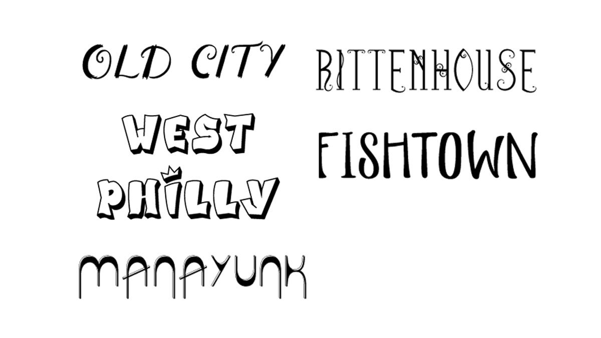
A Philadelphia advertising agency created a controversy when it’s North Philadelphia font was inspired by “rough and blighted neighborhoods.” The font has since been removed from its website. (Fonts by Cliff Ross)
An advertising executive says he has learned an important lesson from his firm’s offensive depiction of North Philadelphia.
Cliff Ross, creative director of his namesake Philadelphia-based advertising agency, says he has learned an important lesson from his firm’s offensive depiction of North Philadelphia and is now attempting to right a wrong.
“I’ve learned it’s really hard to put the whole personality of a neighborhood in one font,” he said.
Ross says he didn’t expect the kind backlash he received from outraged Philadelphians and social media when he recently introduced Philly Fonts — a Philadelphia neighborhood typeface collection — as a custom font design service.
While Ross designed typefaces with descriptors such as “elegant,” “edgy hip,” and “regal and stately” for other Philadelphia neighborhoods, North Philadelphians were none too pleased to discover their custom design depicted a plank board typeface “inspired by some of the rough and blighted neighborhoods that still exist there,” according to the company’s website. The font has since been removed from the site, but you can see it here.
“I was appalled,” said Linda Richardson, a North Philly native who is president and CEO of Uptown Theater Entertainment, which is working to restore the Uptown Theater on North Broad Street. “The North Philly font depicted a narrow view of outsiders that basically says the neighborhood is abandoned and opened for whatever developers want to do.”
North Philadelphia, say those who know it well, possesses a rich history of jazz and other forms of entertainment; of arts and activism; and of an educational mecca in Temple University which has stood on North Broad Street for 125 years.
“I welcome anybody coming up with new and different ways to brand, but the execution of this was offensive,” said Malcolm Kenyatta, a North Philly activist and resident. “The font was a trite, lazy way of looking at this area. Blight does not describe our resilience; it does not describe us.”
Many commenters on Philly.com pointed out the fonts depicted carried racist undertones: West Philadelphia and North Philadelphia, they noted, were the only neighborhoods described in what could be considered negative language. West Philly’s typeface, according to the ad agency’s website was “inspired by the amazing graffiti artwork that can be found in the area.”
“The two neighborhoods listed that have large minority populations were given fonts that represent “blight” and “graffiti” while the fonts for white neighborhoods celebrate architecture, history, elegance, art galleries and wealth,” one commenter wrote.
Khalia Robinson, program director of Mighty Writers, a West Philadelphia nonprofit that teaches children how to write, says she wasn’t as offended with the West Philadelphia font as much as she was with its lack of originality.
“The West Philly font reminds me of the logo on The Fresh Prince of Bel Air,” said Robinson, a graduate of University City High School in West Philadelphia. “That’s not what I quite think of when I think of graffiti.”
For his part, Ross, who designed the fonts, has asked to meet with Richardson to get her input for a rebranded North Philadelphia typeface that will be used for certain parts of the neighborhood, he said.
“We could have picked something more positive. We made a mistake, which we all make,” he said.
The controversy could wind up being a invaluable learning experience for anyone who lives in a culturally diverse city of neighborhoods like Philadelphia, Richardson said.
“If he’s talking to people to get a deeper understanding of the neighborhood, and design a font that gives a better perspective of North Philly as a place to live, work and study, then that’s a good thing.”
WHYY is your source for fact-based, in-depth journalism and information. As a nonprofit organization, we rely on financial support from readers like you. Please give today.


