Six months of Cycle Philly data shows which streets cyclists like best
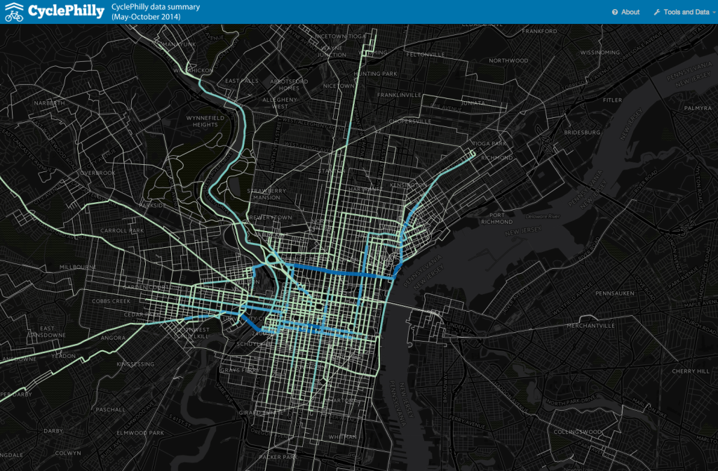
The CyclePhilly app, a product of Code for Philly, the Bicycle Coalition, DVRPC, SEPTA, and the City of Philadelphia that logs cyclist trip data for planning purposes, has been up and running for a few months, and now we have a first look at the first six months of data they collected between May and October. You can play with the map here.
For those not yet acquainted, the way the app works is that cyclists select a type of trip like Work Commute, Social, Errand, or Exercise, turn on the tracker before they start riding, and then turn it off at their destination. The app logs the route and adds the trip to a map visualization. The most popular streets on the map get darker colored as more biking trips are layered on them. Six months in, 220 unique users have logged 8,340 individual trips on the app.
If you checked in on the Cycle Philly map a few months ago, all the lines had left the map looking a bit scraggly, but the team at DVRPC cleaned it up and color-coded the street segments to correspond with ridership frequency.
Will Tsay from DVRPC’s Modeling and Analysis group “snapped [the raw trip data] to the nearest road or trail segment using a special algorithm so that total volumes by segment could be calculated and compared.” He was also able to “prune” trip ends to protect user privacy and to capture actual biking time, since some people would forget to turn the app off at the end and leave it running in their pockets.
The team at DVRPC want you to know that this is absolutely not a reflection of all cycling trips, just trips made by app users. But as someone who rides a bike most days, and always forgets to turn on the app, the popular route choices revealed on the CyclePhilly map are also the routes I tend to prefer. Unsurprisingly, people tend to gravitate to the streets with the best cycling facilities, like buffered bike lanes or regular bike lanes.
Here are some of the trip patterns DVRPC’s Greg Hiller found in the first six months of data:
- 40% were on streets with no bike facilities
- 26% were on streets with bike lanes
- 12% were on trails
- 9% were on streets with buffered bike lanes
- 9% were on bike-friendly streets
- 1.8% were the wrong-way on one-way streets
- 1% were on streets with sharrows.
We’ve reached out to Greg for a future post on some research he’s doing comparing cyclists’ actual route choices to the shortest route choices, as a way to determine the value of high quality bike facilities. In other words, how far are people willing to travel out of their way to access better safety infrastructure?
In the future, DVRPC will make trip-by-trip GIS data available (anonymized of course) for those looking to conduct additional analysis on specific areas or facilities, which includes much more information on speeds, times, cyclist experience levels, and trip origins and destinations, among other variables.
WHYY is your source for fact-based, in-depth journalism and information. As a nonprofit organization, we rely on financial support from readers like you. Please give today.
