Designers show Saucer some LOVE

Exhale, Saucer Heads: Saucer Watch 2015 is over.
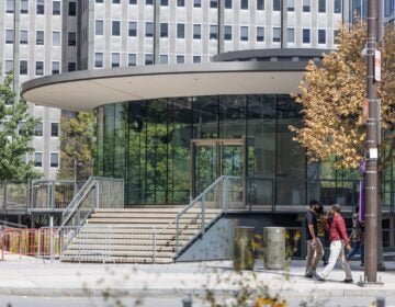
When JFK Plaza / LOVE Park reopens in 2017 it will feature a refreshed version of the iconic Fairmount Park Welcome Center, the round mid-century modern pavilion in the southwest corner of the park, which will be outfitted for a “significant food and beverage operation.”
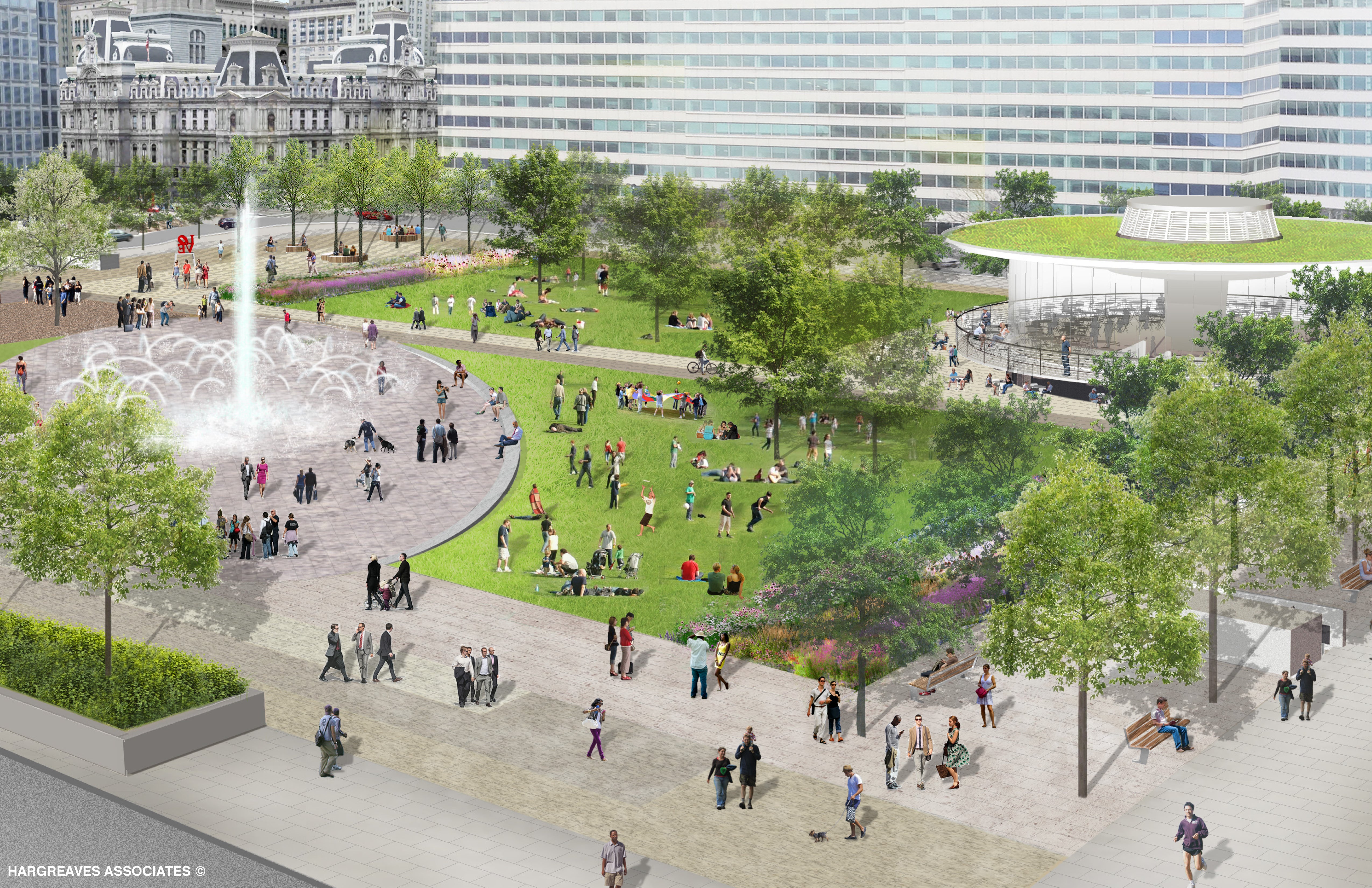
At a public meeting Thursday night, the LOVE Park design team, led by Hargreaves Associates, announced that the saucer is part of the final design concept for the public space between the Parkway and City Hall.
Since the last public meeting about LOVE Park’s redesign in March, KieranTimberlake, the architecture firm on the design team, finalized an analysis of the saucer building.
While keenly aware of the building’s historic significance, they approached the structure first from an agnostic and practical standpoint: Can it be reused and at what cost?
KieranTimberlake found the saucer – essentially a concrete umbrella – is structurally viable, and it turns out, nicely adaptable. But that’s not to say there isn’t major reconstructive surgery to be done.
Other than the structure, most aspects of the building have outlived their useful lifespans, said architect Richard Maimon, the partner at KieranTimberlake leading their work on this project.
The single-pane tinted windows will be replaced with more transparent and energy-efficient glazing. That, combined with new lighting, will help restore the saucer to its light and luminous past. The old roof will be replaced with a green roofing system. And the building’s largely original systems will be modernized as well. When it reopens the saucer will at last have an ADA accessible ramp and bathrooms that can be entered from the park. These upgrades will be selected to ensure affordable operating and maintenance costs, durability, and environmental sensitivity.
“What has diminished the building over the years are precisely the elements beyond their usable life, the glazing, finishes, railings, stairs and ramp. All those issues allow us to bring the building back to the kind of luster that was in the original architects’ idea of a pavilion open to the city,” Maimon said. “This allows us to really reimagine the building and reinvent it in a way in the spirit of the original conception.”

Beyond structural viability, the decision to retain and rehab the saucer was driven by cost.
Compared to a new building of the same square footage, the saucer proved cheaper to reuse by an estimated $1.6-$2 million. The estimated cost to renovate and outfit the building is $3.2 million, but constructing a new building of the same size on the park’s southwest corner could cost at least $4.8-$5 million. Complicating that gap is the unknown structural carrying capacity of the commuter tunnel below the saucer, the reinforcement of which could add significant expense.
“Its important that everyone realize that the entire block is above other structures,” said Maimon. Sections of the park that aren’t above the tunnel are above the parking garage, which is not built to support structures above. “Given that we’re over the existing railroad right of way with its complicated structural elements, the idea of a new foundation … brings in a much higher cost than conventional new construction.”
The case to reuse the saucer was also bolstered by both broad public support and the marketability of the building’s unique character.
“Far and away more people have said the round building should be retained than removed,” said First Deputy Commissioner for Parks and Recreation Mark Focht. Public feedback lined up 9 to 1 in favor of keeping the saucer, he said. That theme came forward during the PennPraxis* led civic engagement process that preceded the design work as well. And since then emails poured in and the project team monitored responses on social media, such as the #SaveTheSaucer campaign led by the Young Friends of the Preservation Alliance for Greater Philadelphia. It turns out hashtag activism really can work.
Given the building’s viability and cost advantages, Maimon said designers started asking, Why replace one moment in history with another?

The great trump card is the saucer’s unique character and location. The project team convened three owners of a combined 23 businesses in Center City to discuss the possibility of opening a significant food and beverage operation in the saucer. They said in not uncertain terms that the round building’s design was a huge selling point.
The message, Focht said, was “no matter how beautiful new pavilion would be… it would never have the panache the round building has.”
It’s an iconic design in a great location, and it has the potential to draw different users – a local family stopping by the fountain, tourists getting a map from an information kiosk inside or taking photos at LOVE, or the after-work crowd (if it gets a liquor license) – especially with generous outdoor seating.
“Imagine, perhaps walking in and to the immediate left would be an information desk and to the right as you’re circling counter clockwise a seating area. An open kitchen and serving zone tucked adjacent to the circular column,” Maimon said explaining a potential floor plan. Maybe a bar, too?
The grand hope, Maimon explained, is to create a new reciprocal relationship between the park and the saucer pavilion. That will be facilitated by returning the building’s transparency, obscured by tinted window film and decals, bold lighting, and orienting the seating to the park and around the saucer.
To Maimon the saucer expresses a “kind of optimism about city living in a period that was at the beginning of turning away from living in central cities.” As cities were suburbanizing, this building “was looking differently at central cities as places of excitement and meeting and history with a modernity at the same time. I think that capturing some of that spirit in the renewal of the building is meaningful to me and to KieranTimberlake.”
In addition to reviving the saucer, the designers have been busy refining a final design concept that’s different than any of the four presented at the public meeting in March.
The biggest change is LOVE Park’s center. The central fountain will be a monumental single jet with a smaller cluster of jets that crisscross in interwoven arches, in a kind of birds’ nest pattern. The new fountain will be set in what Focht calls an “elegant oval” of paving oriented to the Parkway’s strong diagonal and will let people move through on that axis easily. Both the major water feature and the diagonal desire line are responses to public feedback.
Rounding out the design are two garden zones, two large lawns, and tree groves that will continue to support the park’s diverse uses, from food trucks to seasonal festivals, dancing to demonstrations.
These design plans will be presented to the Art Commission on Wednesday, May 6th for conceptual approval, and seek final approval in fall.
*PlanPhilly was incubated at PennPraxis, the nonprofit arm of PennDesign. During the LOVE Park civic engagement process, PlanPhilly was a part of PennPraxis.
WHYY is your source for fact-based, in-depth journalism and information. As a nonprofit organization, we rely on financial support from readers like you. Please give today.


